Circular Progress
The “Circular Progress” is an amazing widget for showcasing statistics on your web page. What’s great about it is that it offers a wide range of options to make it look just the way you want.
You have the flexibility to choose between displaying a complete circle or just a half circle, and you can also decide if the progress bar should have a circular or square outline.
You can use this widget to present various types of information, including a title, description, and numerical value. Plus, you can customize the value with different units or symbols. You also have the choice to add icons, images, or Lottie animations to make it visually appealing. And if you don’t want to display certain pieces of information, that’s entirely up to you.
You can decide if you want this information to appear inside the circle or below it, and you can move it around easily by just clicking and then dragging it.
The Circular Progress widget features the following controls.
Content
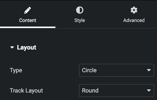
Layout
- Type: Select the type of circle, either Circle or Half Circle.
- Track layout: Select the track layout as Circle or Square.
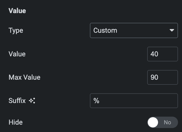
Value
- Type: Select the type of value either in percentage or add custom value.
- Value: Enter the percentage value.
- Max Value: Enter the max value(applicable for custom value type)
- Suffix: Enter the suffix.
- Hide: Enable the option to hide the value.
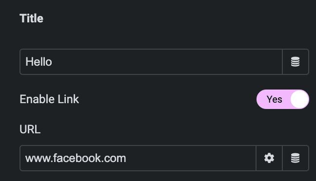
Title
- Title: Enter the title.
- Enable Link: Enable the option to link URL with title.
- URL: Enter the URL.
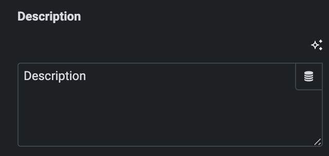
Description
- Description: Enter the description.
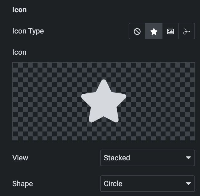
Icon
- Icon Type: Select from icon, image, or Lottie.
- View: Choose from Stacked or frame.
- Shape: Choose a shape from a Circle or a Square.
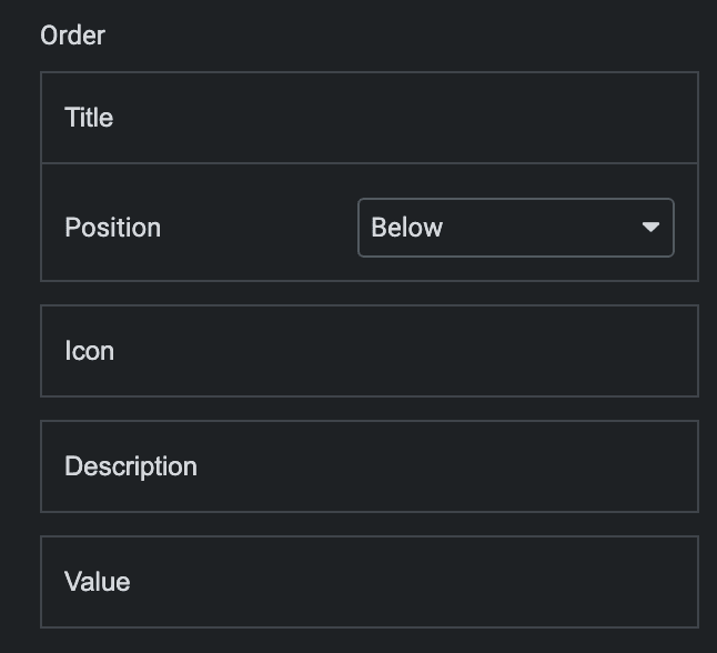
Order
Note: To change the order of the items, you can just click on them and then move them by dragging.
- Position: Select either Below or Outside.
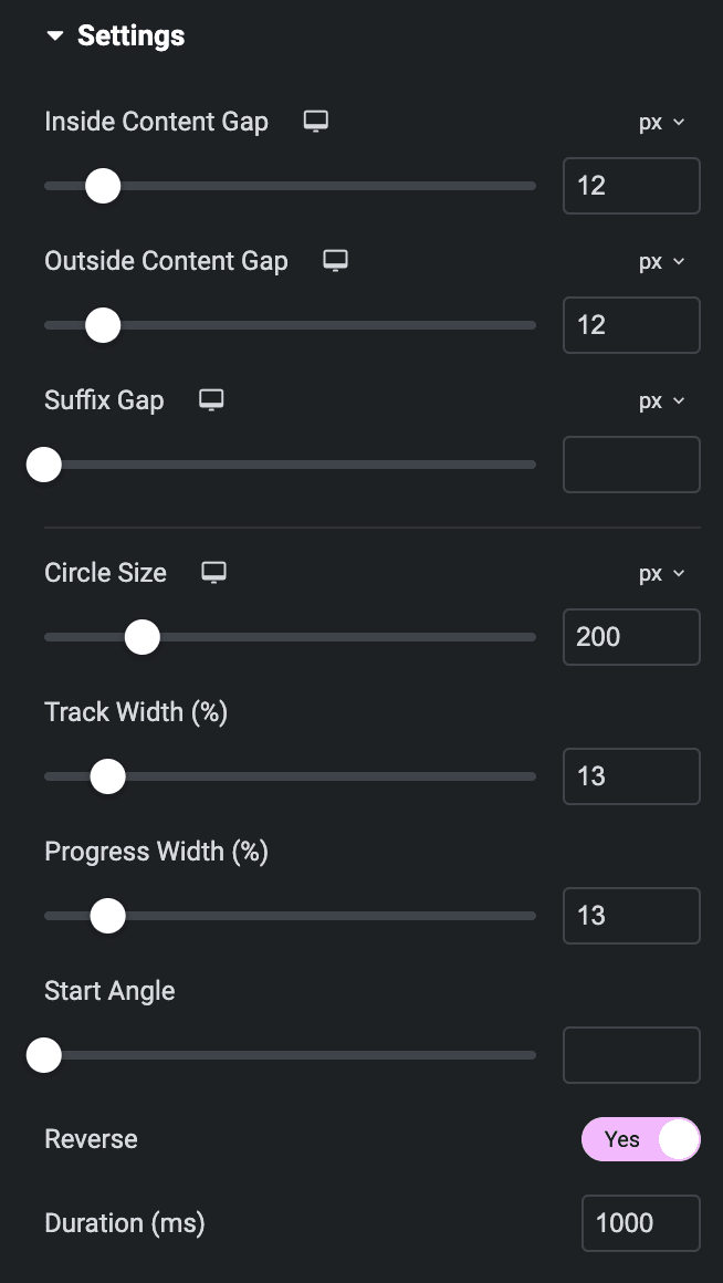
Settings
- Inside Content Gap: Specify the gap between items that are inside the circle.
- Outside Content Gap: Specify the gap between items that are outside the circle.
- Circular Size: Specify the size of cirlce.
- Track Width: Specify the width of track.
- Progress Width: Specify the width of progress.
- Reverse: Enable the option to display progress in reverse format.
- Duration: Specify the duration.
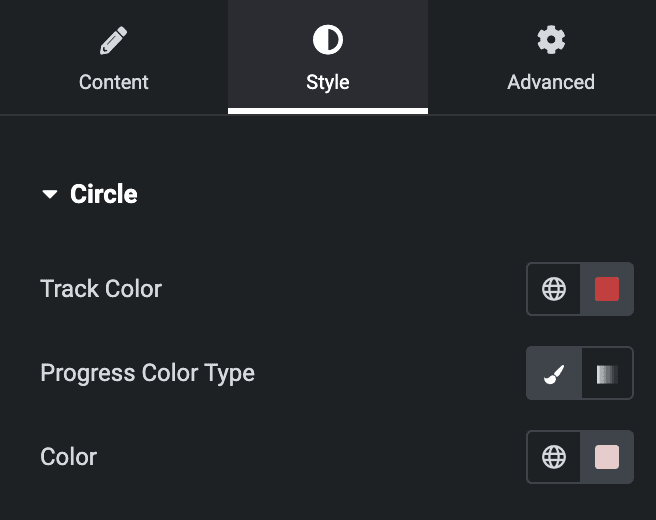
Style
Circle
- Track Color: Select the color of track.
- Progress Color Type: Choose from classic or gradient.
Content
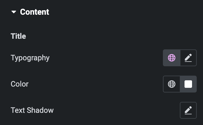
Title
- Typography: Set the typography.
- Color: Select the color of title.
- Text Shadow: Set the text shadow.
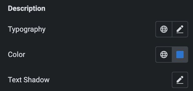
Description
- Typography: Set the typography.
- Color: Select the color of description.
- Text Shadow: Set the text shadow.
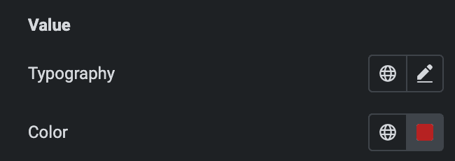
Value
- Typography: Set the typography.
- Color: Select the color of value.
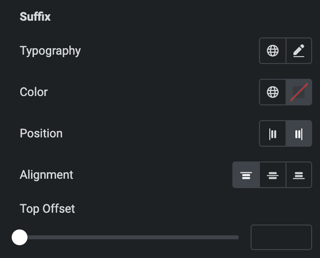
Suffix
- Typography: Set the typography.
- Color: Select the color of suffix.
- Position: Select suffix position from Left or Right.
- Alignment: Select suffix alignment from Top, Center, or Bottom.
- Top Offset: Specify the top offset of suffix.
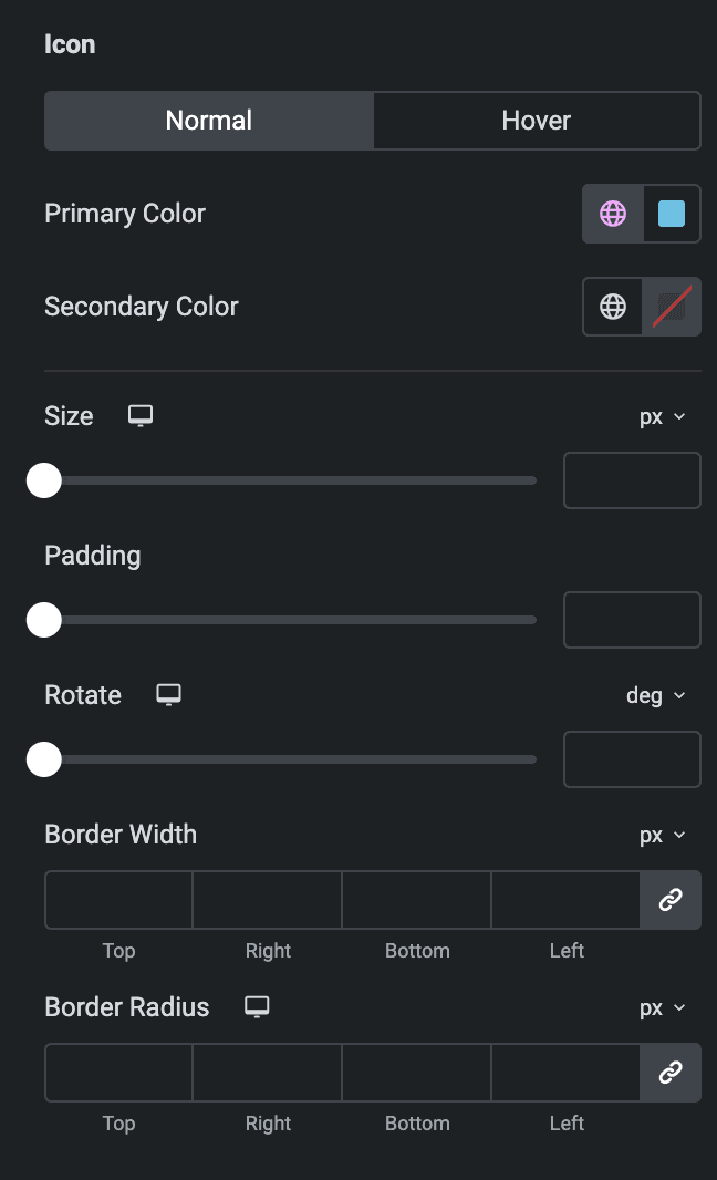
Icon
Normal
- Primary Color: Select the primary color of icon.
- Secondary Color: Select the secondary color of icon.
Hover
Styling controls for the hover state are under this section. It will be applied when someone hovers the icon.
- Size: Specify the size of icon.
- Padding: Set the padding.
- Rotate: Set the rotation.
- Border Width: Set the width of border.
- Border Radius: Set border radius.
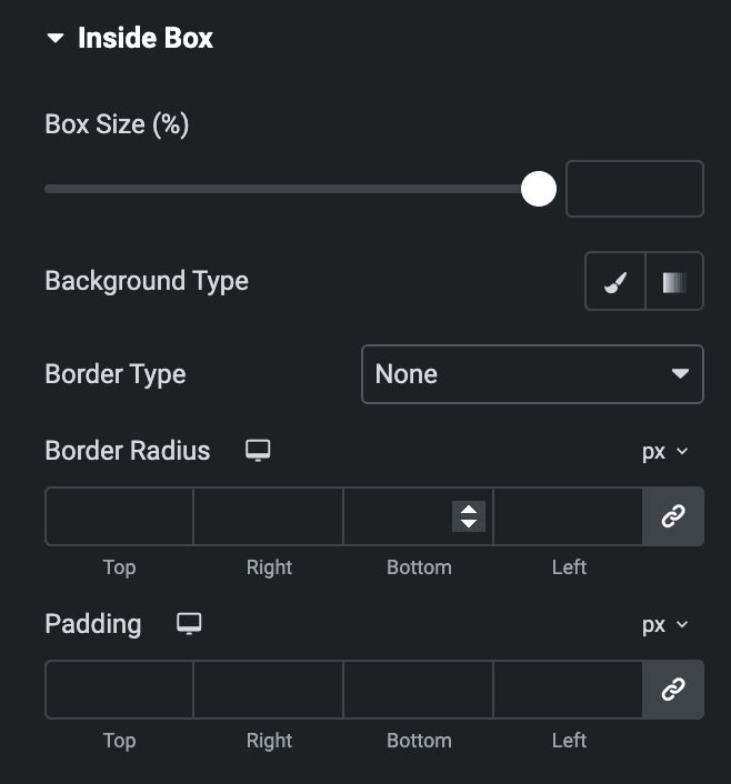
Inside Box
- Box Size: Specify the size of inside box.
- Background Type: Select from classic or gradient.
- Border Type: Set the border type.
- Padding: Set the padding.
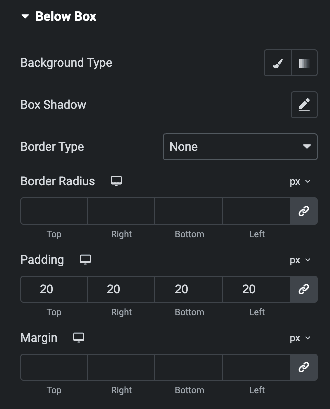
Below Box
- Background Type: Select from classic or gradient.
- Box Shadow: Set the box shadow.
- Border Type: Set the border type.
- Border Radius: Set the border radius.
- Padding: Set the padding.
- Margin: Set the margin.
Check out the Demo page of Circular Progress.

