Google Reviews
This widget empowers you to seamlessly integrate Google reviews directly onto your website, providing valuable insights and social proof to your visitors. With customizable options, you can showcase the overall rating alongside icons tailored to your brand’s aesthetic. Whether you prefer to display the title dynamically or customize it to suit your needs.
Users can also be redirected from your site to write reviews. Additionally, you can display or hide the reviewer’s name, review text, and all features, granting you control over the level of detail shown.
Additionally, a convenient button allows users to access the full review on Google effortlessly. Whether you prefer displaying reviews through icons or numerically, this widget offers versatile styling options and customization features for every element.
Before you begin using Google Reviews, ensure you’ve added your Google Map API key in the Settings. Check out the guide: “Generate a Google Map API Key.”
Content
General
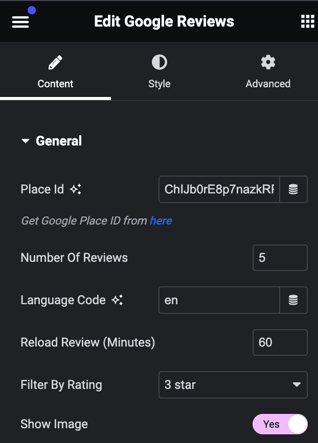
- Place ID: Enter the place ID. You can find the Place ID by clicking on the provided link.
- Number of Reviews: Specify the number of reviews to be shown.
- Language Code: Enter the language code.
- Reload Reviews(Minutes): Specify the time in minutes to reload the review on your webpage.
- Filter By Ratings: Choose the filter option on which basis you want to show review.
- Show Image: Enable the option to display user image.
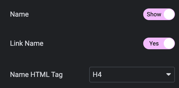
- Name: Enable the option to display the name.
- Link: Enable the option to open the reviewer’s profile by clicking on their name.
- Name HTML Tag: Select the name HTML tag.
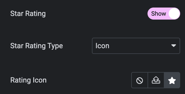
- Star Rating: Enable the option to display the rating.
- Star Rating Type: Choose from Icon or Numeric.
- Rating Icon: Select the rating icon.
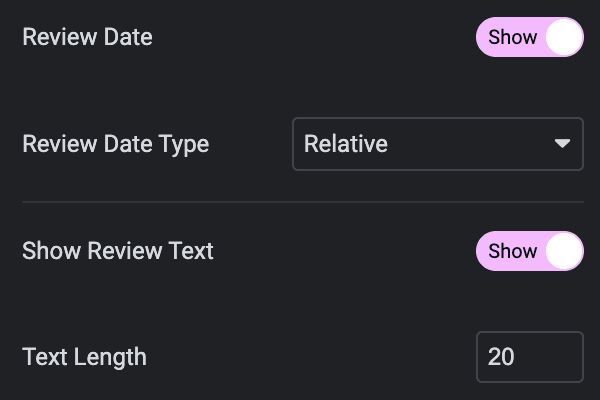
- Review Date: Enable the option to display the review date.
- Review Date Type: Choose from Numeric or Relative.
- Show Review Text: Enable the option to show the feedback provided by the user
- Text Length: Specify the text length.
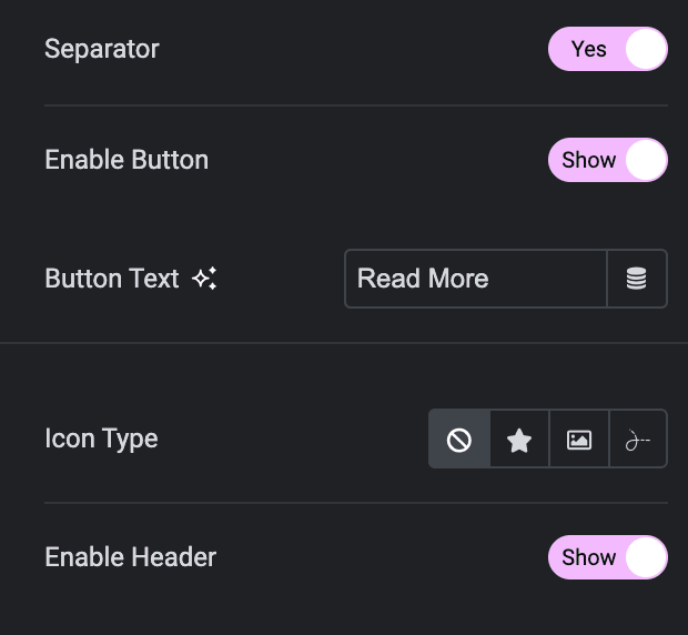
- Separator: Enable the option to show the separator.
- Enable Button: Enable the option to display button.
- Button Text: Enter the text for button.
- Icon type: Choose from a list of Icons, Images, or Lottie animations.
- Icon
- Icon: Select from the Font Awesome icon library or upload an SVG image.
- Image
- Image: Either upload an image or select a dynamic tag for display.
- Image size: Choose the size for your icon image display.
- Lottie Animation
- Source: Choose the source of the Icon by either adding an External URL or selecting a media file.
- Loop: Enable the loop option to display the animation continuously.
- Reverse: Activate the reverse option to display the animation in reverse order.
- Icon
- View: Select from default, stacked, or framed display options.
- Shape: Select either Circle or Square shape for the stack or frame.
- Enable Header: Enable the option to show the header.
Layout
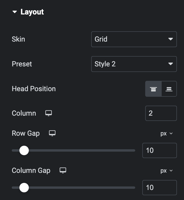
- Skin: Choose from Grid or Carousel.
- Preset: Choose preset style from available options.
- Head Position: Choose position from top or bottom(applicable for Preset Style 2).
- Column: Specify the number of columns to be shown in each row(applicable for Grid Layout).
- Row Gap: Specify the gap between rows(applicable for Grid Layout).
- Column Gap: Specify the gap between columns(applicable for Grid Layout).
Header
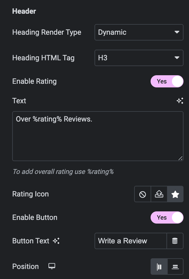
- Heading Render Type: Choose “dynamic” if you want the location name as the heading, or select “custom” to write your own heading.
- Heading HTML Tag: Select an HTML tag for the heading.
- Enable Rating: Enable the option to display rating.
- Text: Enter the text for the rating(To include the overall rating in the text, use “%rating%” as shown in the screenshot).
- Rating Icon: Select the rating icon.
- Enable Button: Enable the option to display button in header.
- Button Text: Enter the button text.
- Position: Select the position of button from inline or block.
Slider Options
Note: These options are only applicable if you select Carousel in the Layout Section.
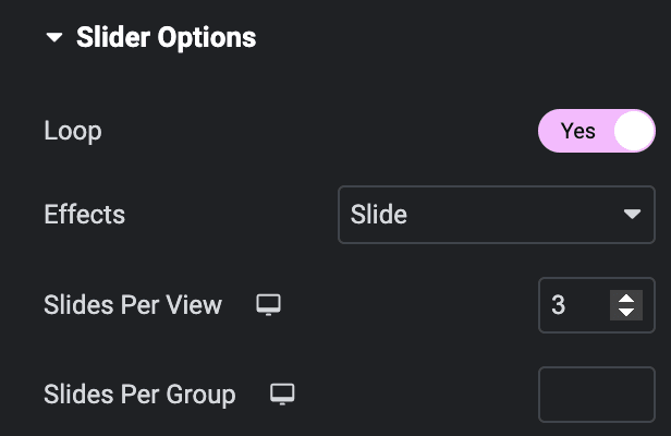
- Loop: Activate the option to enable slide looping.
- Effects: Choose from Fade, Slide, Coverflow, or Flip.
- Multirow: Enable the option if needed(applicable if the above Loop option is not enabled).
Note: These options are only applicable for Slide and Coverflow effects.
- Slides Per View: Specify the number of slides to be displayed in a row.
- Slides Per Group: Specify how many slides should move together when navigating through the slider.
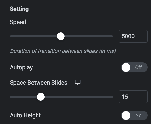
Setting
- Speed: Set the transition speed when moving one slide to next in ms.
- Autoplay: Activate the option to enable autoplay while onload.
- Duration: Set the duration for transition.
- Space Between Slides: Set the space between slides.
- Auto Height: Enable the option to set the auto height.
Pagination
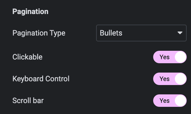
- Pagination: Set the pagination type.
- Clickable: Enable the option to make arrows clickable(only applicable for Bullets Pagination type).
- Keyboard Control: Activate the option to enable keyword control.
- Scroll bar: Enable the option to display the scroll bar.
Prev/Next Navigation
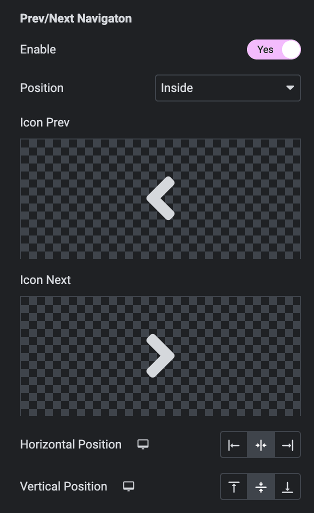
- Enable: Activate the option to display the arrows.
- Position: Choose either from Outside or Inside.
- Icon Prev: Set previous icon either from the library or upload SVG.
- Icon Next: Set Next icon either from the library or upload SVG.
- Horizontal Position: Select from Left, Center, or Right.
- Vertical Position: Select from Top, Middle, or Bottom.
Order
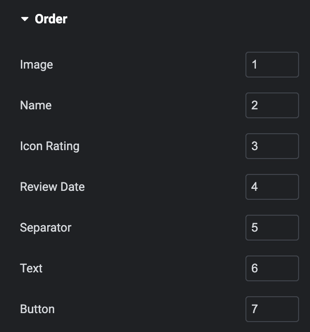
Note: This is not applicable to Style Preset 2, and If any of these elements have a lower priority than others, they can be placed first on the webpage.
Choose the order of displaying individual elements, such as
- Image
- Name
- Icon Rating
- Review Date
- Separator
- Text
- Button
Style
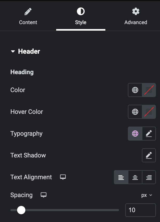
Header
Heading
- Color: Select the color of heading.
- Hover Color: Select the color of heading when hover state.
- Typography: Set the typography.
- Text Shadow: Set text shadow properties.
- Text Alignment: Select the alignment of heading.
- Spacing: Specify the gap between heading and other items.
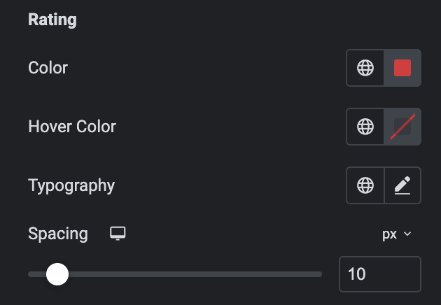
Rating
- Color: Select the color of rating number.
- Hover Color: Select the color of rating text when hover state.
- Typography: Set the typography.
- Spacing: Specify the gap between rating number and other items.
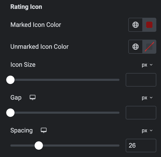
Rating Icon
- Marked Icon Color: Select the marked rating icon color.
- Unmarked Icon Color: Select the unmarked rating icon color.
- Icon Size: Specify the icon size.
- Gap: Specify the gap between icons.
- Spacing: Specify the spacing between rating icons and rating text.
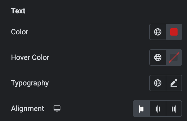
Text
- Color: Select the color of rating text.
- Hover Color: Select the color of rating text when hover state.
- Typography: Set the typography.
- Alignment: Select the alignment of rating text.
Button
- Typography: Set the typography of button.
Normal
- Color: Select the color of button text.
- Background Type: Select either Classic or Gradient.
- Classic
- Color: Choose the color for the background.
- Image: Either upload an image or select a dynamic tag for display.
- Gradient
- Color: Select the color for the background.
- Location: Determine the position of the color on the background by specifying their location in percentage.
- Second Color: Select the second color for the background.
- Location: Determine the position of the second color on the background by specifying their location in percentage.
- Type: Select either Radial or Linear.
- Radial
- Position: Set the position.
- Linear
- Angle: Set the angle using DEG, GRAD, RAD, and TURN.
- Radial
- Classic
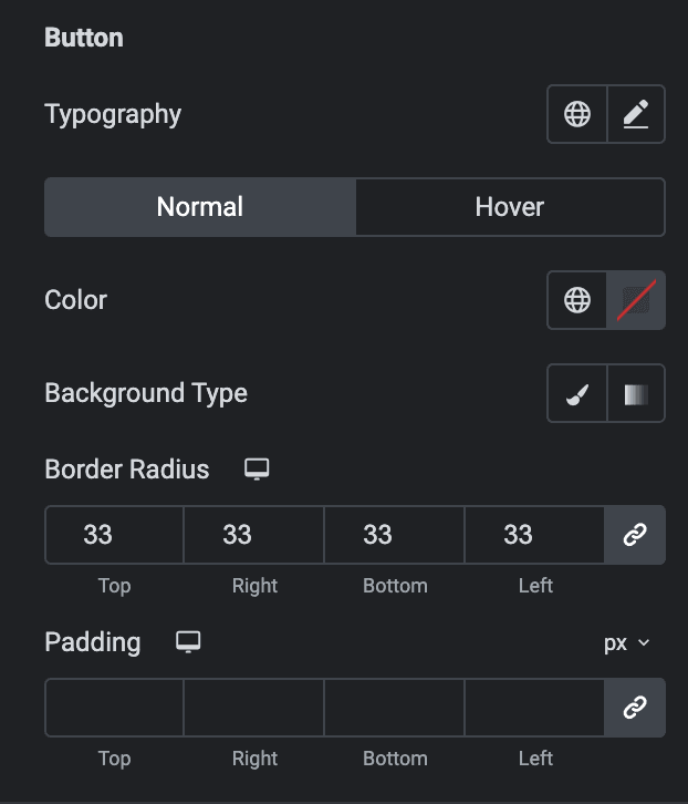
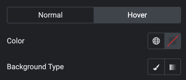
Hover
Styling controls for the hover state are available under this section. These settings will be applied when Someone hovers the button.
- Border Radius: Set the border radius.
- Padding: Set the padding.
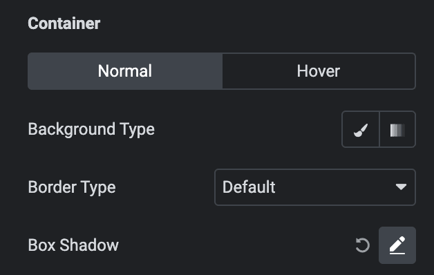
Container
Normal
- Background Type: As we mentioned above, you can select either Classic or Gradient. Click here.
- Border Type: Select the border type.
- Box Shadow: Set the box shadow.
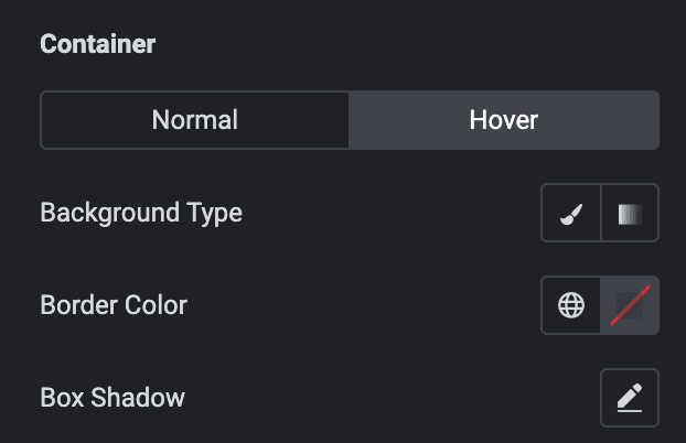
Hover
Styling controls for the hover state are available under this section. These settings will be applied when Someone hovers the box.
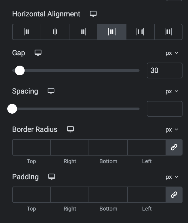
- Horizontal Alignment: Select the horizontal alignment of header content.
- Gap: Specify the gap between header content.
- Spacing: Specify the spacing between header box and rating box.
- Border Radius: Set the border radius.
- Padding: Set the padding.
Review
Image
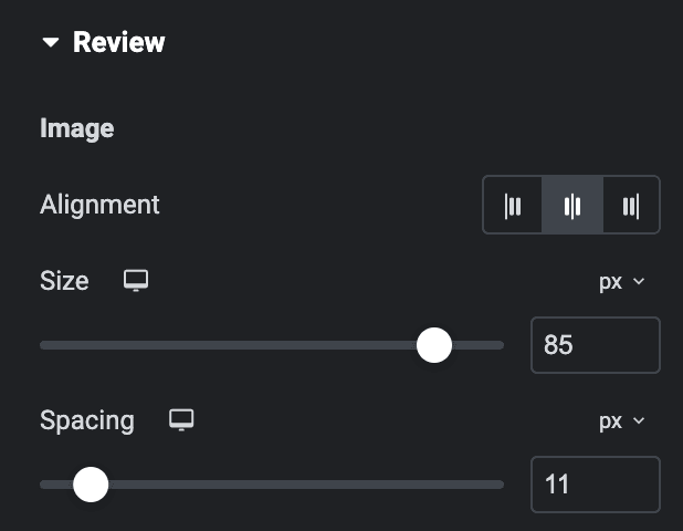
- Alignment: Select the alignment of image.
- Position: Select position from left or right(applicable for Preset Style 2).
- Size: Specify the size of image.
- Gap: Specify the gap between items(applicable for Preset Style 2).
- Spacing: Specify the spacing between image and other content.
Name
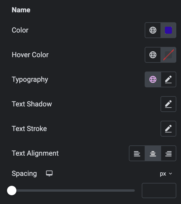
- Color: Select the color of name.
- Hover Color: Select the color of name when hover state.
- Typography: Set the typography.
- Text Shadow: Set the text shadow.
- Text Stroke: Set the text stroke properties.
- Text Alignment: Select the alignment of name.
- Spacing: Specify the spacing between name and other content.
Review Date
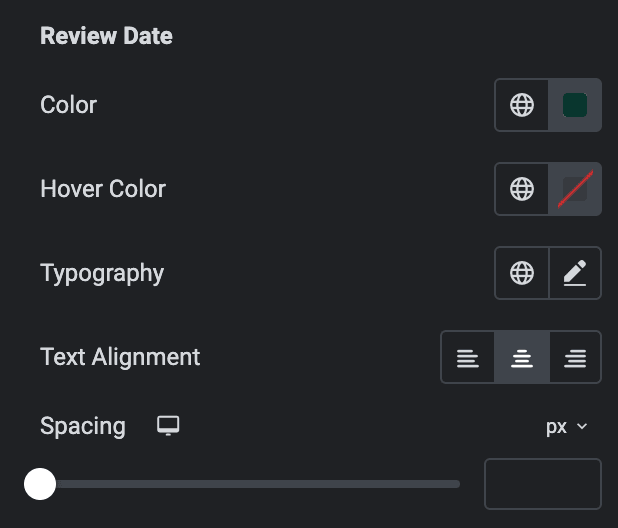
- Color: Select the color of review date.
- Hover Color: Select the color of review date when hover state.
- Typography: Set the typography.
- Text Alignment: Select the alignment of review date.
- Spacing: Specify the spacing between review date and other content.
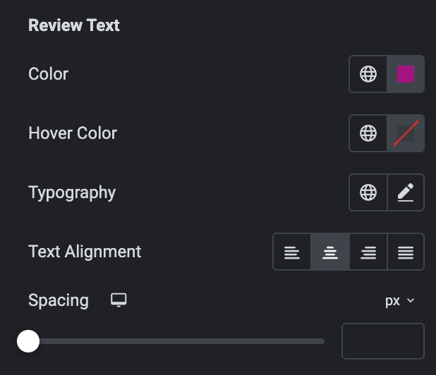
Review Text
- Color: Select the color of review text.
- Hover Color: Select the color of review text when hover state.
- Typography: Set the typography.
- Text Alignment: Select the alignment of review text.
- Spacing: Specify the spacing between review text and other content.
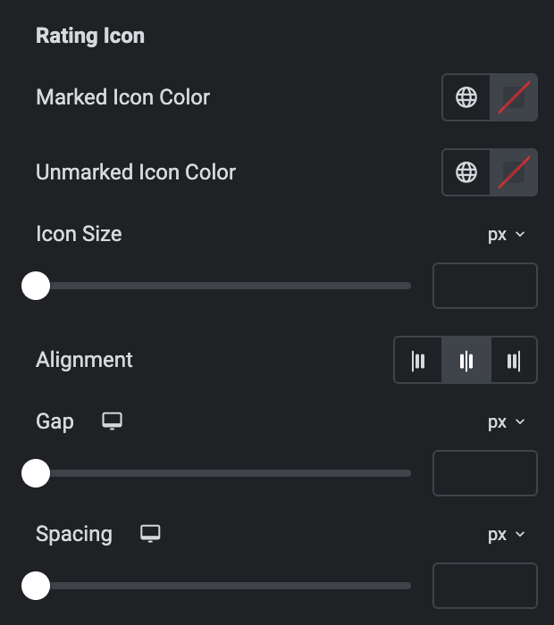
Rating Icon
- Marked Icon Color: Select the marked rating icon color.
- Unmarked Icon Color: Select the unmarked rating icon color.
- Icon Size: Specify the icon size.
- Alignment: Select the alignment of icon.
- Gap: Specify the gap between icons.
- Spacing: Specify the spacing between rating icons and other content.
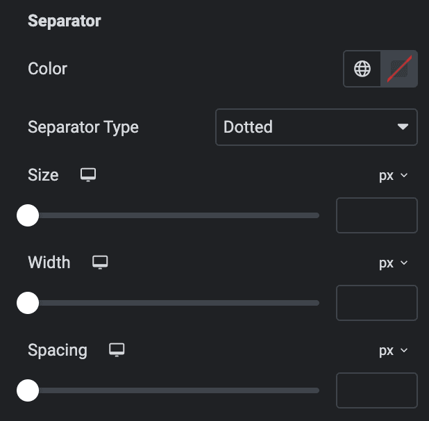
Separator
- Color: Select the color of separator.
- Separator Type: Select the separator type from available options.
- Size: Specify the size of separator.
- Width: Specify the width of separator.
- Spacing: Specify the spacing between separator and other content.
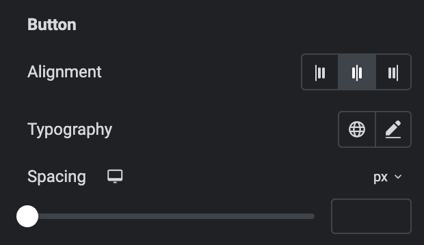
Button
- Alignment: Select the alignment of button.
- Typography: Set the typography.
- Spacing: Specify the spacing between button and other content.
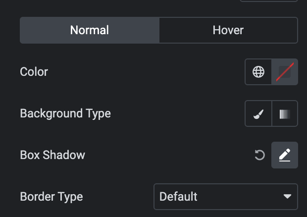
Normal
- Color: Select the color of button text.
- Background Type: As we mentioned above, you can select either Classic or Gradient. Click here.
- Box Shadow: Set the box shadow.
- Border Type: Select the border type.
Hover
Styling controls for the hover state are available under this section. These settings will be applied when Someone hovers the button.
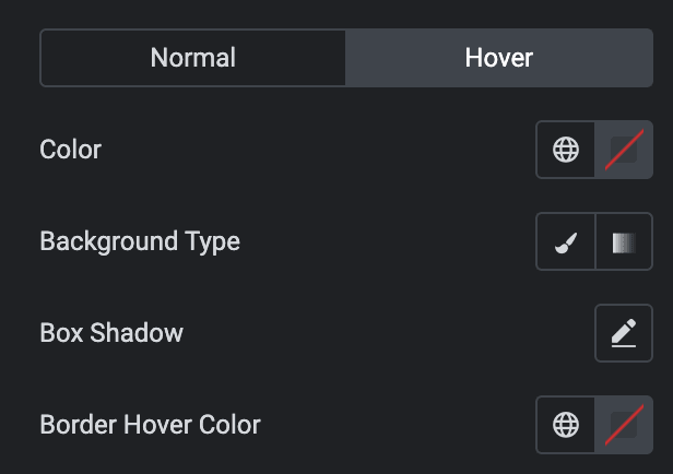
- Border Radius: Set the border radius.
- Padding: Set the padding.
Container
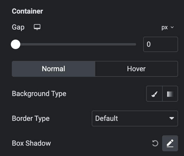
- Gap: Specify the gap between content.
Normal
- Background Type: As we mentioned above, you can select either Classic or Gradient. Click here.
- Border Type: Select the border type.
- Box Shadow: Set the box shadow.
Hover
Styling controls for the hover state are available under this section. These settings will be applied when Someone hovers the box.
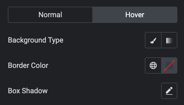
- Border Radius: Set the border radius.
- Padding: Set the padding.
Carousel
Note: These options are only applicable if you select Carousel in the Layout Section.
Prev/Next Navigation
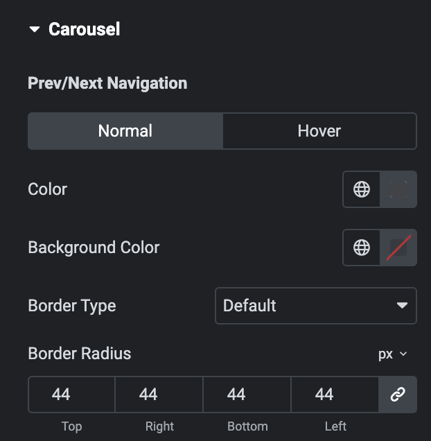
Normal
- Color: Select the color of navigation.
- Background Color: Select the background color of navigation.
- Border Type: Select the border type.
- Width: Enter the width of border.
- Color: Select the color for border.
- Border Radius: Set the border radius.
Hover
Styling controls for the hover state are available under this section. These settings will be applied when Someone hovers the Navigation.
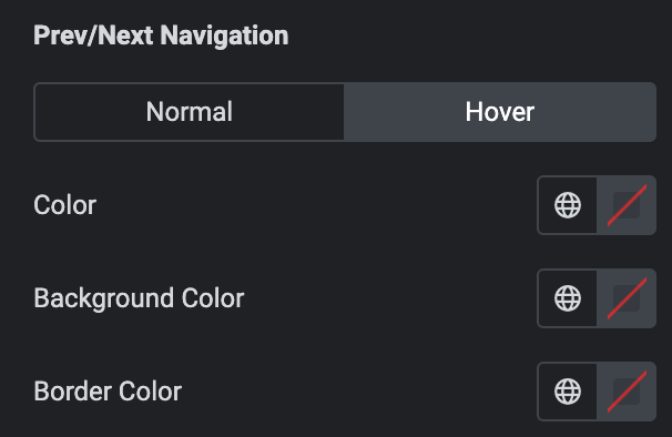
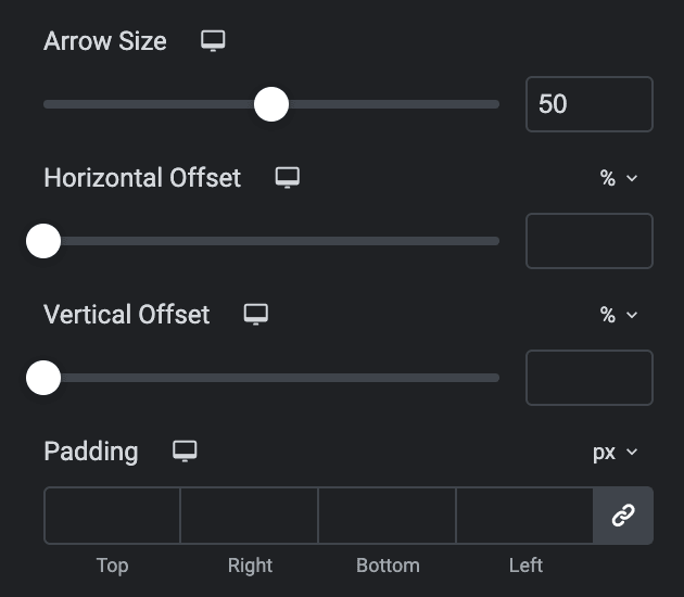
- Arrow Size: Set the size of arrow.
- Horizontal Offset: Set the horizontal offset.
- Vertical Offset: Set the Vertical offset.
- Padding: Set the padding.
Note: Only applicable when selecting Pagination Type in Slider Options section, Section name and features vary based on the selected Pagination Type.
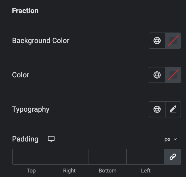
Fraction
- Background Color: Select the background color of pagination.
- Color: Select the color of pagination.
- Typography: Set the typography.
- Padding: Set the padding.
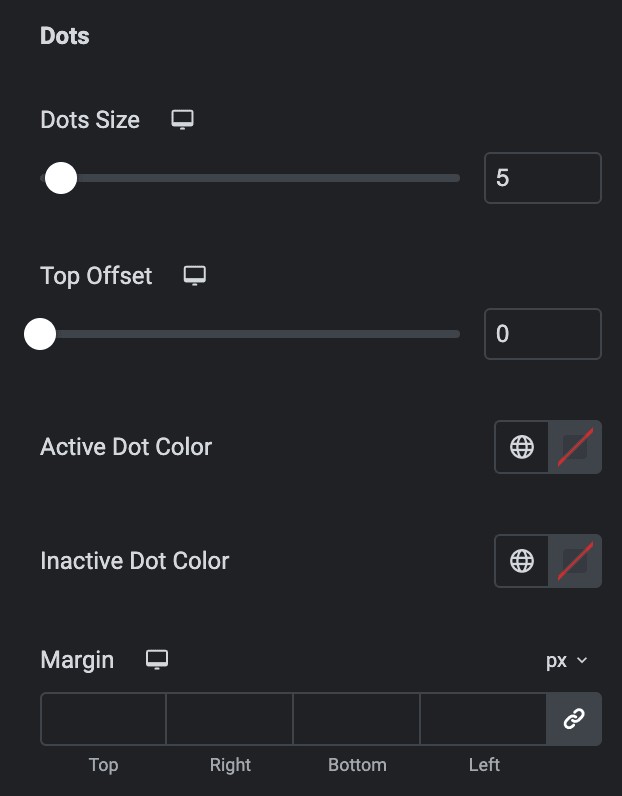
Dots
- Dot Size: Set the bullet dot size.
- Top Offset: Set the offset from the Top.
- Active Dot Color: Select the color for active state.
- Inactive Dot Color: Select the color for inactive state.
- Margin: Set the margin.
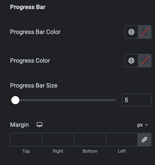
Progress Bar
- Progress Bar Color: Select the color of progress bar.
- Progress Color: Select the color of progress.
- Progress Bar Size: Enter the size of progress bar.
- Margin: Set the margin.
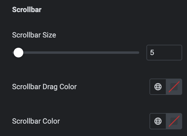
Scrollbar
Note: Only applicable when enabling Scroll bar Type in the Slider Options section.
- Scrollbar Size: Set the size of the scrollbar.
- Scrollbar Drag Color: Select the color for scrollbar drag.
- Scrollbar Color: Select the scrollbar color.
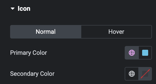
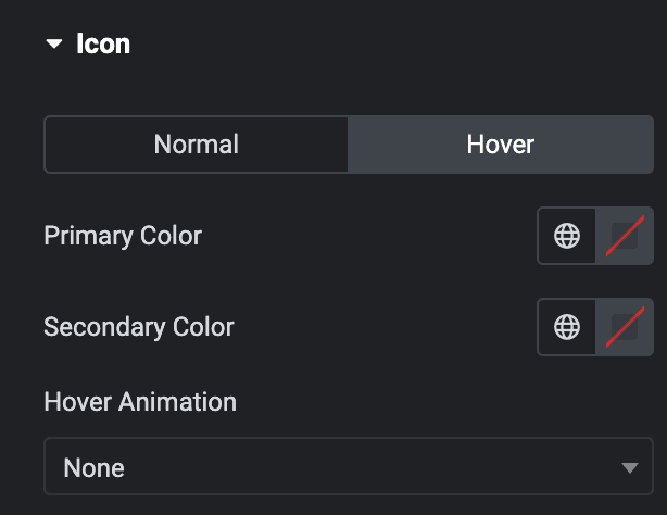
Icon
Normal
- Primary Color: Choose the primary color for the icon.
- Secondary Color: Choose the secondary color for the icon.
Hover
Styling controls for the hover state are available under this section. These settings will be applied when Someone hovers the icon.
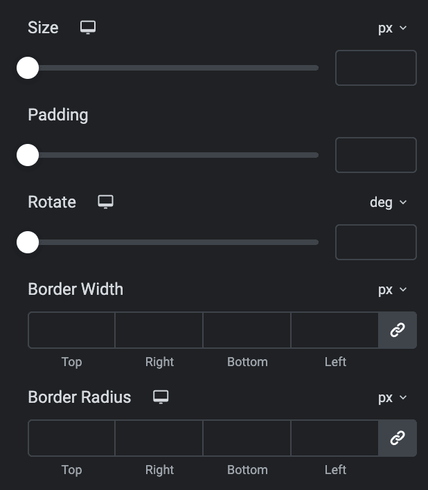
- Size: Set the size of the Icon.
- Padding: Set the padding for the Icon.
- Rotate: Set the rotation of your Icon in degrees.
- Border Width: Set the border’s width.
- Border Radius: Set the border’s radius.
Check out the Demo Page of Google Reviews.

