Woo Products
This widget is designed to showcase your WooCommerce products in various layouts, giving you lots of options to customize how they appear. It lets you choose different styles and layouts to make your product information look great.
One cool thing about it is that it helps users find products easily by offering filters. For example, you can show Featured Products that are on Sale and more. You can also filter products based on their status, like published or draft, or organize them by categories and tags.
You can choose which products to exclude by their IDs. Plus, you can add buttons like “Add to Cart,” “Buy Now,” “Quick View,” or “Links” to make it easy for customers to interact with your products. Just remember, the “Buy Now” button only works for Simple Products.
To make your products stand out, you can add badges in different styles to highlight special offers or important information. And if you don’t want to clutter things up, you can choose whether to display badges for “Out of Stock” items or those that are on sale.
The Woo Products widget features the following controls.
Content
Layout
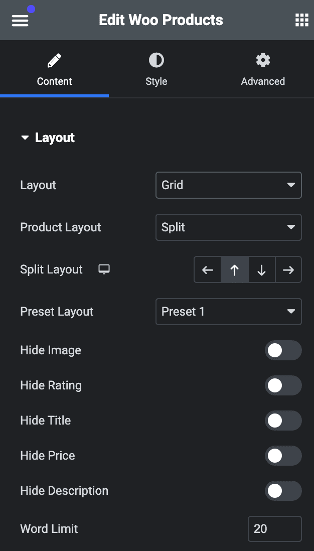
- Layout: Select layout from Grid or Carousel.
- Product Layout: Select product layout from split or cover.
- Split Layout: Choose from Up, down, left, or right(applicable for split layout).
- Preset Layout: Select a preset layout from available options.
- Hide Image: Enable the option to hide the product image.
- Hide Rating: Enable the option to hide the product rating.
- Hide Title: Enable the option to hide the product title.
- Hide Price: Enable the option to hide the product price.
- Hide Description: Enable the option to hide the product description.
- Word Limit: Specify the word limit to show description.
Product Query
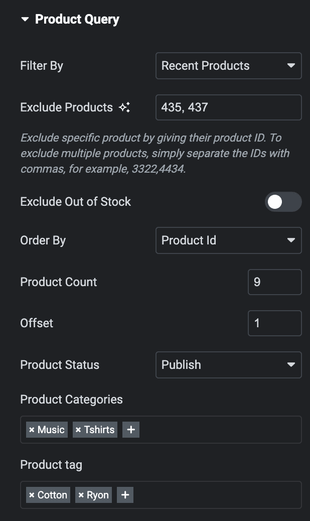
- Filter By: Choose the appropriate option corresponding to the filter you desire to display products.
- Exclude Products: Enter the product IDs that you don’t want to display.
- Exclude Out Of Stock: Enable the option to hide Out of Stock products.
- Order By: Choose the criteria on which you want to perform the “order by” operation.
- Product Count: Specify the number of products you want to display on a page.
- Offset: Enter the offset value.
- Product Status: Display your products based on their status.
- Product Categories: Display your products as per their categories.
- Product Tags: Display your products based on their tags.
Rating
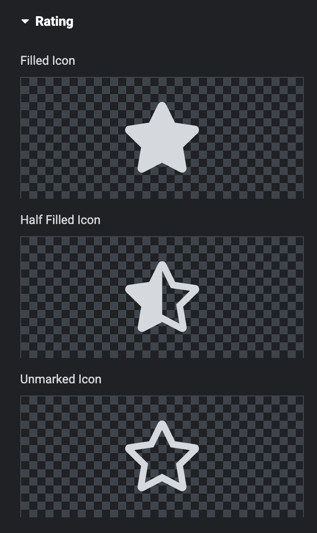
- Filled Icon: Select the filled icon of the rating.
- Half Filled Icon: Select the half filled icon of rating.
- Marked Icon: Select the marked icon of rating.
Button
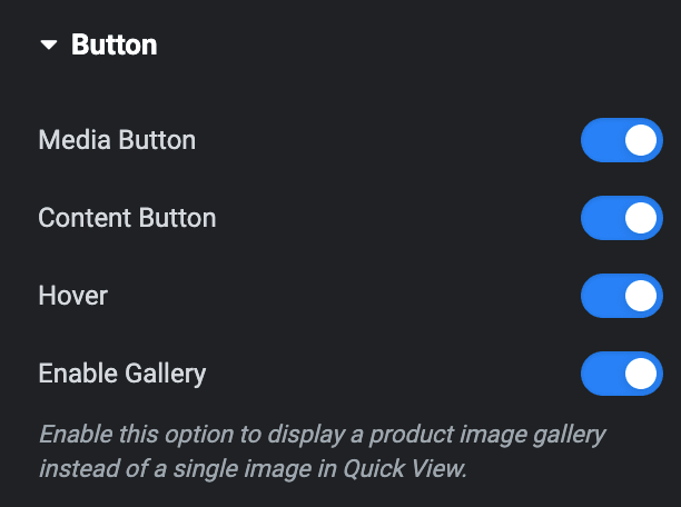
- Media Buttons: Enable the option to display media buttons.
- Content Buttons: Enable the option to display content buttons.
- Hover: Enable the option to display media buttons on hover.
- Enable Gallery: Activate this option to display a product image gallery instead of a single image in Quick View.
Media
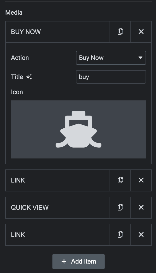
- Add Item: Used to add the buttons.
- Action: Select the button type you want to add.
- Title: Enter the title of the button.
- Icon: Select the icon for the button.
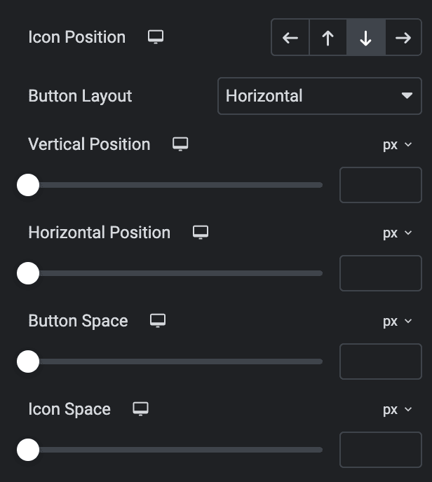
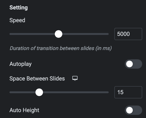
- Icon Position: Select the position of the icon.
- Button Layout: Select the layout of the button.
- Vertical Position: Specify the vertical position of media buttons.
- Horizontal Position: Specify the horizontal position of media buttons.
- Button Space: Specify the gap between buttons.
- Icon Space: Specify the gap between button icon and text.
Content
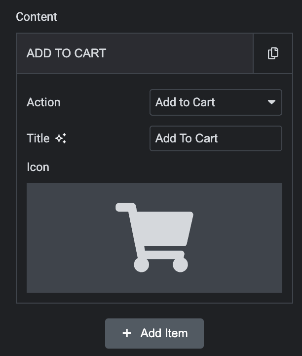
- Add Item: Used to add the buttons.
- Action: Select the button type you want to add.
- Title: Enter the title of the button.
- Icon: Select the icon for the button.
- Icon Position: Select the position of the icon.
- Button Layout: Select the layout of the button.
- Button Position: Choose the position of button.
- Button Alignment: Choose the alignment of button.
- Icon Size: Specify the size of button icon.
- Button Space: Enter the gap between buttons.
- Icon Space: Specify the gap between button icon and text.
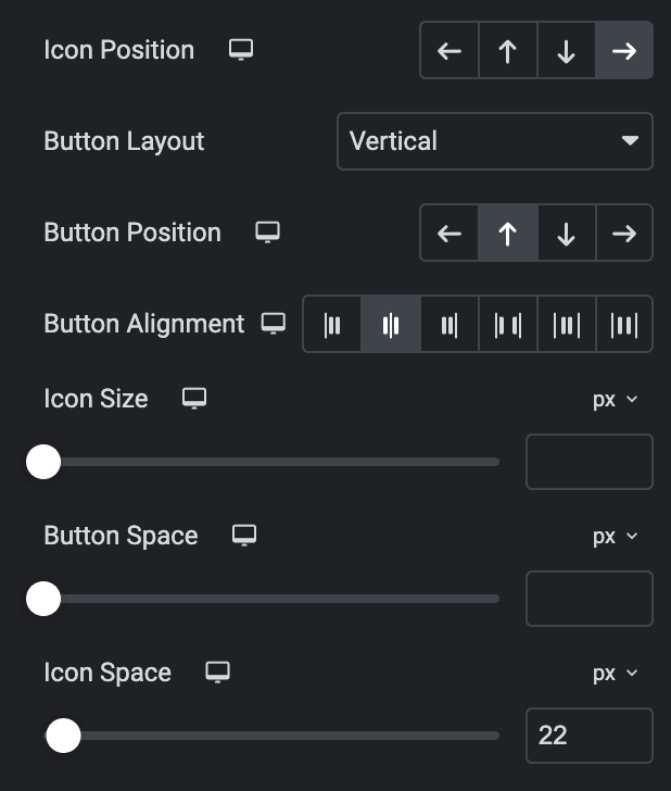
Product Badges
- Hide Sales/Out of Stock Badge: Enable the option to hide sales and out of stock badge.
- Hide Out of Stock Badge: Enable the option to hide out of stock badge.
- Layout: Select badge layout from available options.
- Position: Select the position of badge.
- Sales Badge Text: Enter the sale badge text.
- Out of Stock Text: Enter the out of stock badge text.
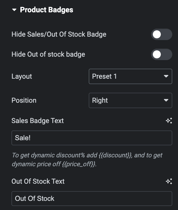
Slider Options
- Loop: Activate the option to enable slide looping.
- Effects: Choose from Fade, Slide, Coverflow, or Flip.
Note: These options are only applicable for Slide and Coverflow effects.
- Slides Per View: Specify the number of slides to be displayed in a row.
- Slides Per Group: Specify how many slides should move together when navigating through the slider.
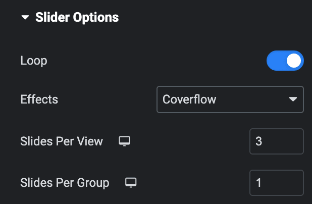
Settings
- Speed: Set the transition speed when moving one slide to next in ms.
- Autoplay: Activate the option to enable autoplay while onload.
- Duration: Set the duration for transition.
- Space Between Slides: Set the space between slides.
- Auto Height: Enable the option to set the auto height.
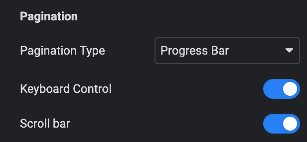
Pagination
- Pagination: Set the pagination type.
- Clickable: Enable the option to make arrows clickable(only applicable for Bullets Pagination type).
- Keyboard Control: Activate the option to enable keyword control.
- Scroll bar: Enable the option to display the scroll bar.
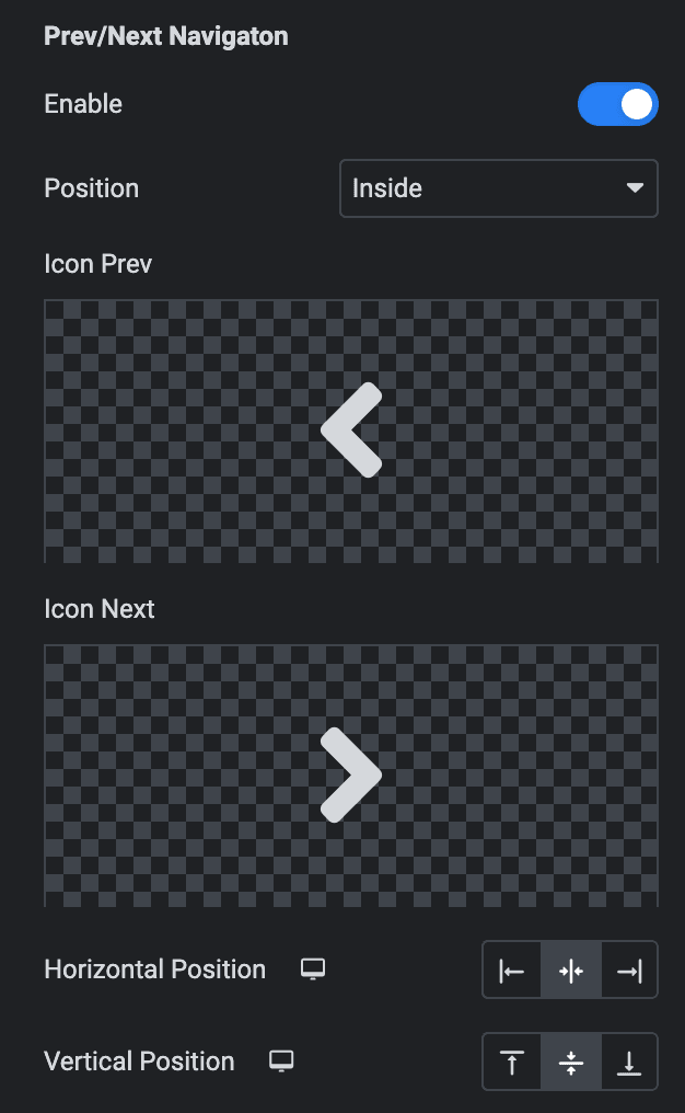
Prev/Next Navigation
- Enable: Activate the option to display the arrows.
- Position: Choose either from Outside or Inside.
- Icon Prev: Set previous icon either from the library or upload SVG.
- Icon Next: Set Next icon either from the library or upload SVG.
- Horizontal Position: Select from Left, Center, or Right.
- Vertical Position: Select from Top, Middle, or Bottom.
Order
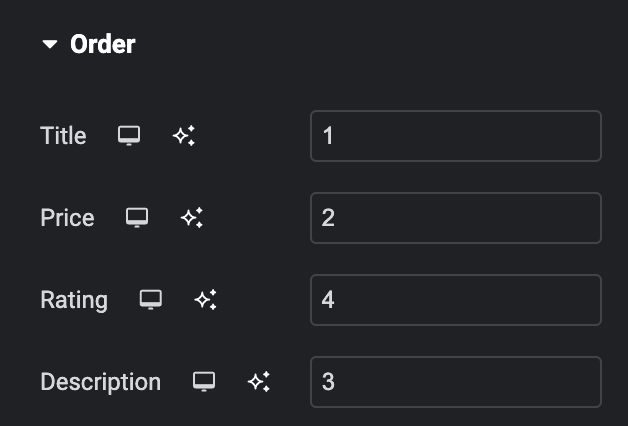
Note: If any of these elements have a lower priority than others, they can be placed first on the webpage. This feature gives you greater control over the visual hierarchy of your webpage.
Choose the order of displaying individual elements, such as
- Title
- Price
- Rating
- Description
Style
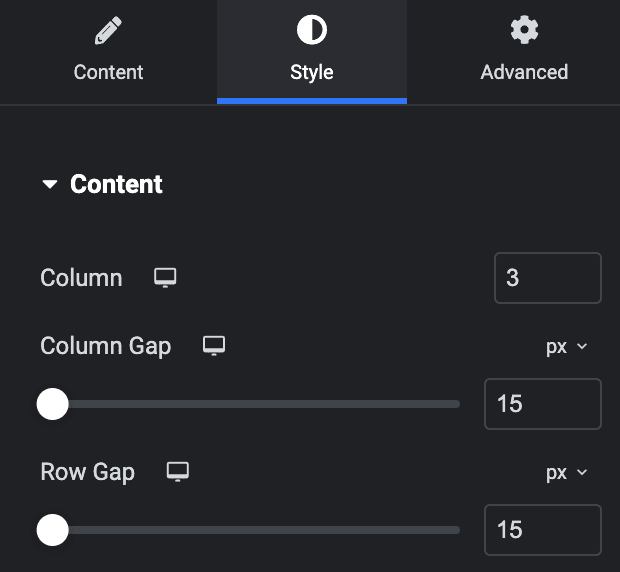
Content
- Column: Specify the number of columns to display in each row.
- Column Gap: Specify the column gap.
- Row Gap: Specify the row gap.
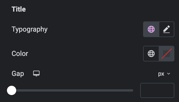
Title
- Typography: Set the typography.
- Color: Select the color of title.
- Gap: Specify the gap between title and other content.
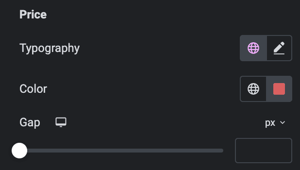
Price
- Typography: Set the typography.
- Color: Select the color of price.
- Gap: Specify the gap between price and other content.
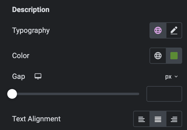
Description
- Typography: Set the typography.
- Color: Select the color of description.
- Gap: Specify the gap between description and other content.
- Text Alignment: Select the alignment of description.
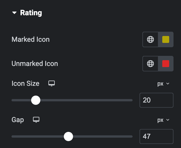
Rating Icon
- Marked Icon: Select the color of marked icon.
- Unmarked Icon: Select the color of unmarked icon.
- Icon Size: Specify the size of icon.
- Gap: Specify the gap between icons.
Button
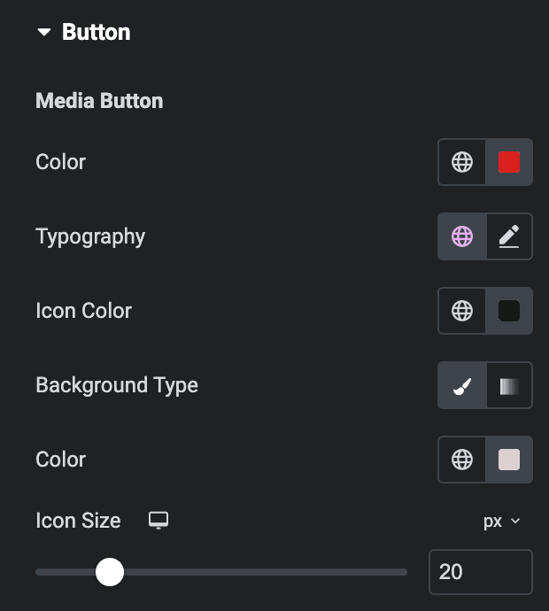
Media Button
Note: These Options are only applicable when you select Split as Product Layout.
- Color: Select the color of media button text.
- Typography: Set the typography.
- Icon Color: Select the icon color of media button.
- Background Type: Select either Classic or Gradient.
- Classic
- Color: Choose the color for the background.
- Gradient
- Color: Select the color for the background.
- Location: Determine the position of the color on the background by specifying their location in percentage.
- Second Color: Select the second color for the background.
- Location: Determine the position of the second color on the background by specifying their location in percentage.
- Type: Select either Radial or Linear.
- Radial
- Position: Set the position.
- Linear
- Angle: Set the angle using DEG, GRAD, RAD, and TURN.
- Radial
- Classic
- Icon Size: Specify the size of icon.
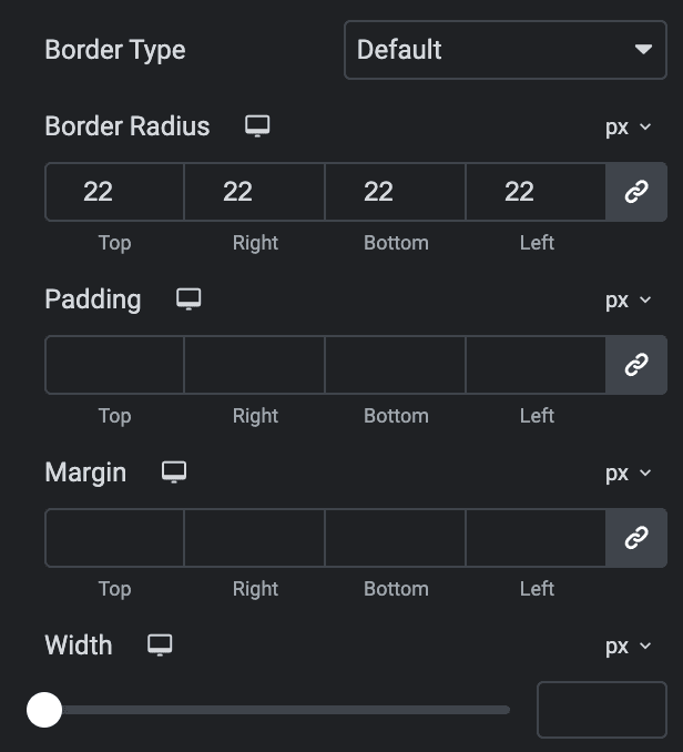
- Border Type: Select the border type.
- Border Radius: Set the border radius.
- Padding: Set the padding.
- Margin: Set the margin.
- Width: Set the width.
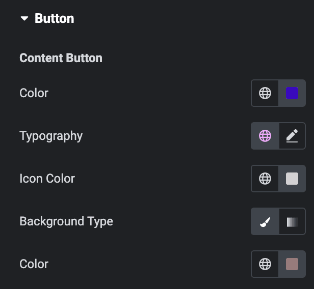
Content Button
- Color: Select the color of content buttons.
- Typography: Set the typography.
- Icon Color: Select the icon color of buttons.
- Background Type: As we mentioned above, Select either Classic or Gradient. Click here. Use anchor link.
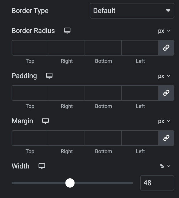
- Border Type: Select the border type.
- Border Radius: Set the border radius.
- Padding: Set the padding.
- Margin: Set the margin.
- Width: Set the width.
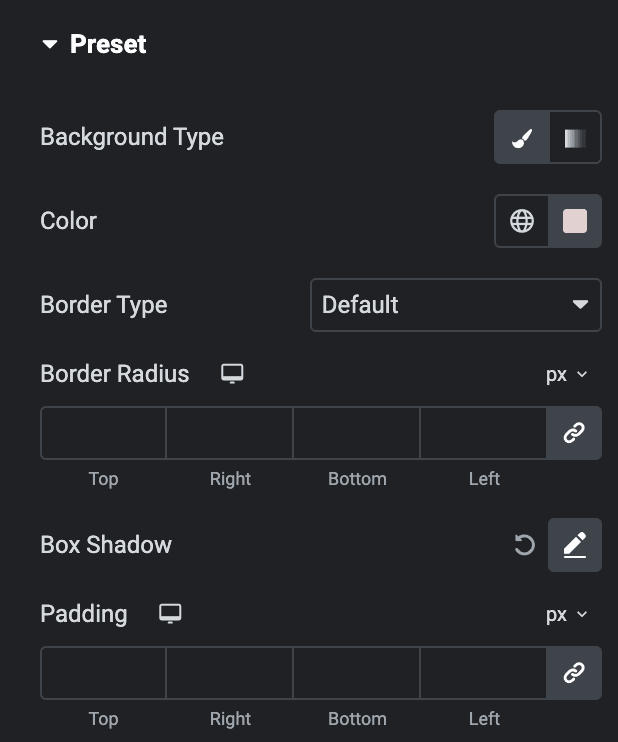
Preset
- Background Type: As we mentioned above, Select either Classic or Gradient. Click here. Use anchor link.
- Border Type: Select the border type.
- Border Radius: Set border radius.
- Box Shadow: Set the box shadow.
- Padding: Set the padding.
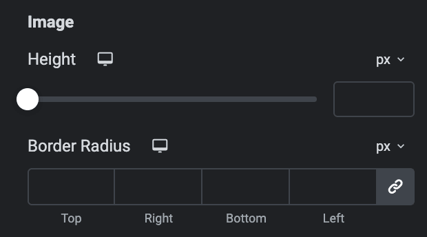
Image
Note: These options are applicable when you select Split Layout.
- Height: Specify the height of image.
- Border Radius: Set border radius.
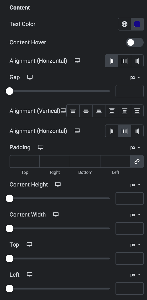
Content
Option Applicable for Cover Layout
- Text Color: Select the text color of content.
- Content Hover Color: Select the text color of content when hover.
- Alignment: Select the alignment of content.
- Gap: Specify the gap between content.
- Alignment(Vertical): Choose the vertical alignment.
- Alignment(Horizontal): Choose the horizontal alignment.
- Padding: Set the padding.
- Content Height: Specify the height of content box.
- Content Width: Specify the height of content width.
- Top: Specify the spacing from top.
- Left: Specify the spacing from left.
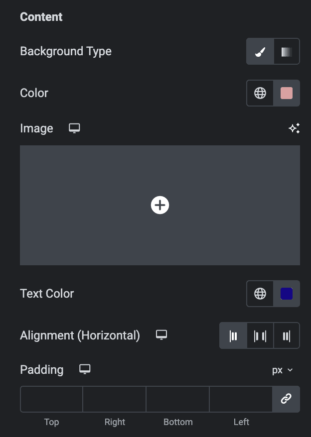
Option Applicable for Split Layout
- Background Type: As we mentioned above, Select either Classic or Gradient. Click here. Use anchor link.
- Text Color: Select the text color of content.
- Alignment: Choose the alignment of content.
- Content Space: Specify the spacing between content(applicable for Preset Layout Style 2).
- Padding: Set the padding.
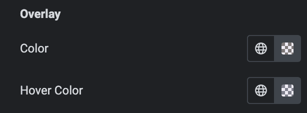
Overlay
- Color: Select the overlay color.
- Hover Color: Select the overlay color when hover state.
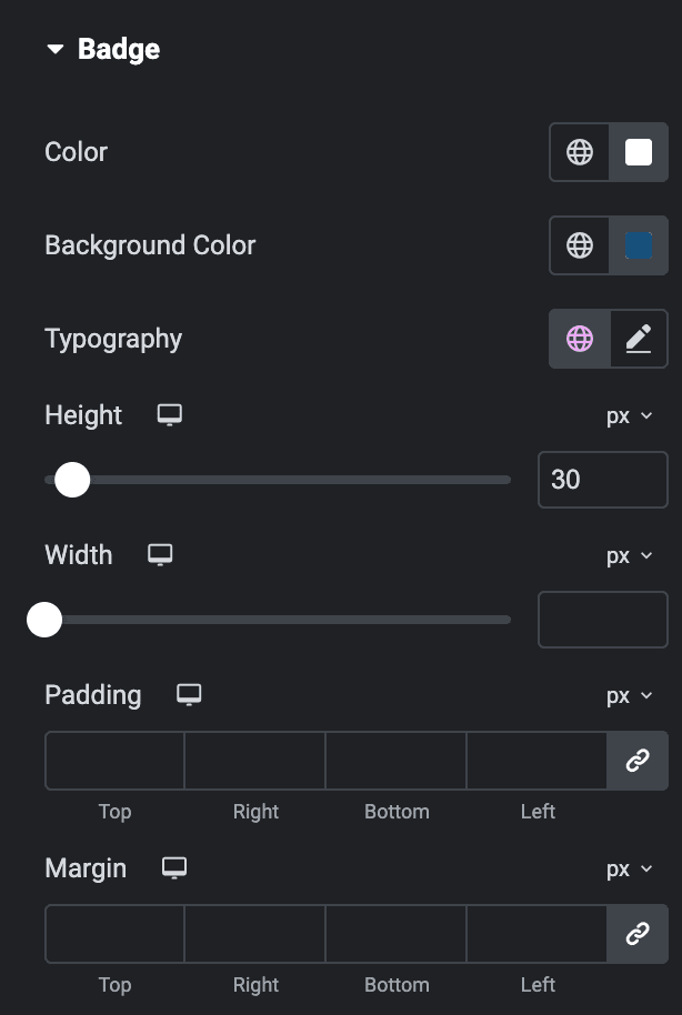
Badge
- Color: Select the sale badge text color.
- Background Color: Select the background color of badge.
- Typography: Set the typography.
- Height: Specify the height of badge.
- Width: Specify the width of badge.
- Padding: Set the padding.
- Margin: Set the margin.
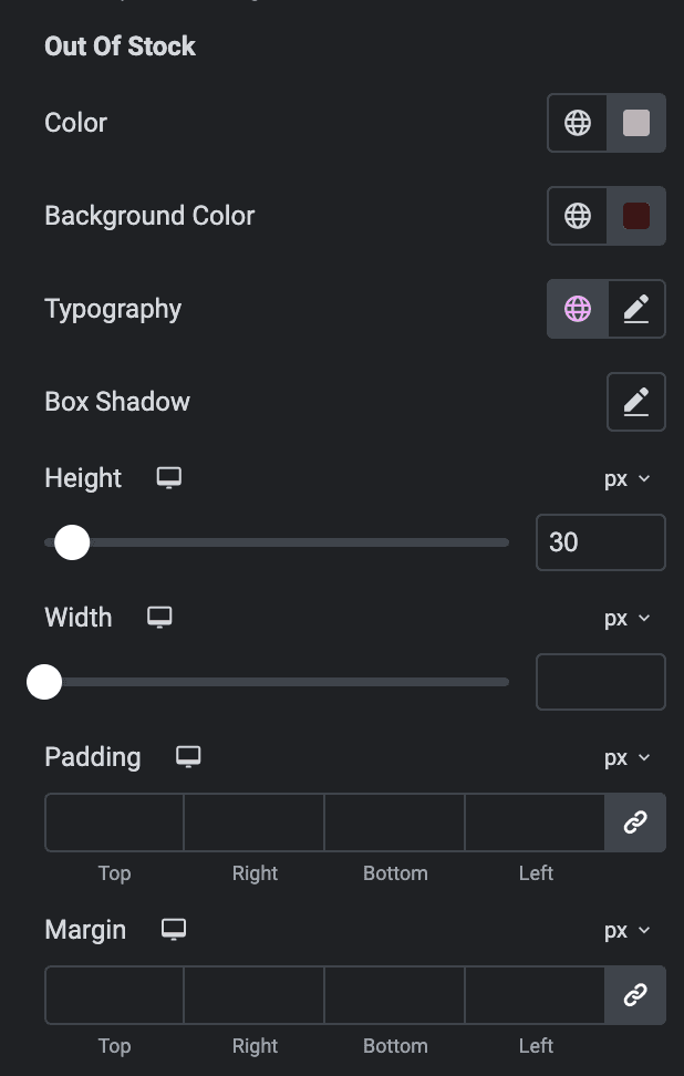
Out of Stock
- Color: Select the out of stock badge text color.
- Background Color: Select the background color of badge.
- Typography: Set the typography.
- Box Shadow: Set the box shadow properties.
- Height: Specify the height of badge.
- Width: Specify the width of badge.
- Padding: Set the padding.
- Margin: Set the margin.
Slider
Note: These options are only applicable if you select Slider as Layout in the Layout Section.
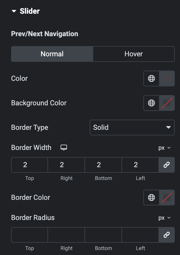
Prev/Next Navigation
Normal
- Color: Select the color of navigation.
- Background Color: Select the background color of navigation.
- Border Type: Select the border type.
- Width: Enter the width of border.
- Color: Select the color for border.
- Border Radius: Set the border radius.
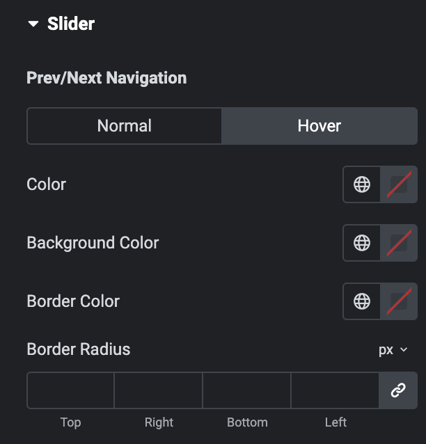
Hover
Styling controls for the hover state are available under this section. These settings will be applied when Someone hovers the Navigation icon.
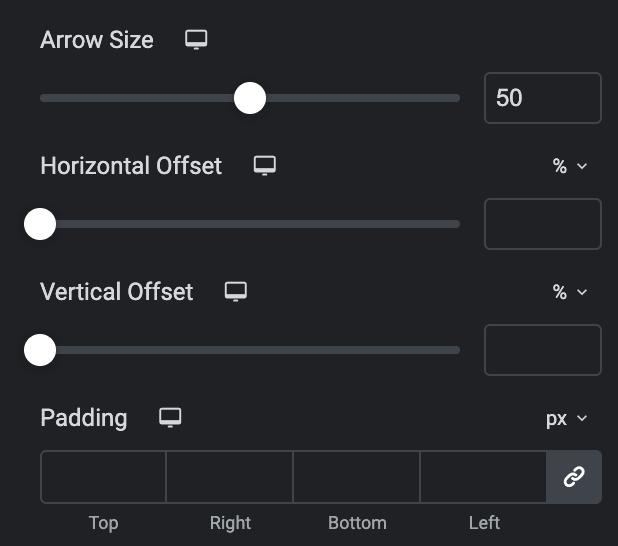
- Arrow Size: Set the size of arrow.
- Horizontal Offset: Set the horizontal offset.
- Vertical Offset: Set the vertical offset.
- Padding: Set the padding.
Note: Only applicable when enabling Scroll bar Type in Slider Options section.
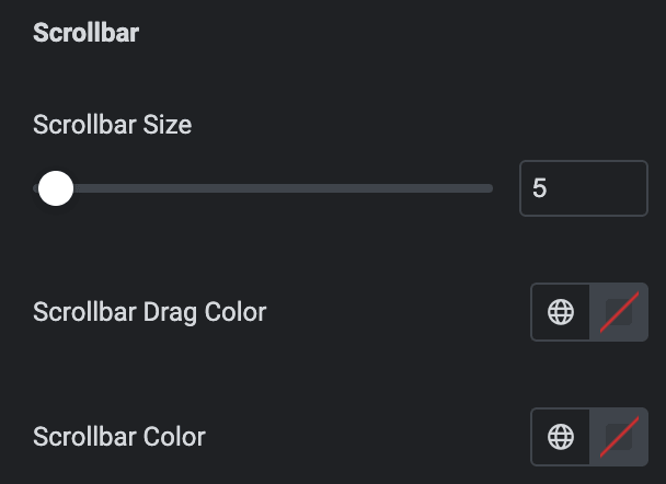
Scrollbar
- Scrollbar Size: Set the size of scrollbar.
- Scrollbar Drag Color: Select the color for scrollbar drag.
- Scrollbar Color: Select the scrollbar color.
Note: Below are the options that are only applicable when selecting the Pagination Type in the Slider Options section. Section names and features vary based on the selected Pagination Type.
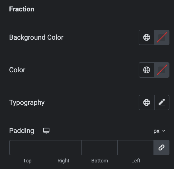
Fraction
- Background Color: Select the background color of pagination.
- Color: Select the color of pagination.
- Typography: Set the typography.
- Padding: Set the padding.
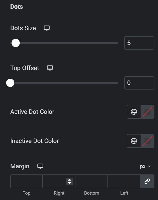
Dots
- Dot Size: Set the bullet dot size.
- Top Offset: Set the offset from the Top.
- Active Dot Color: Select the color for active state.
- Inactive Dot Color: Select the color for inactive state.
- Margin: Set the margin.
Progress Bar
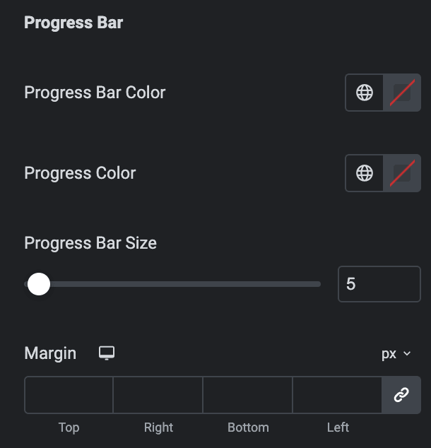
- Progress Bar Color: Select the color of progress bar.
- Progress Color: Select the color of progress.
- Progress Bar Size: Enter the size of progress bar.
- Margin: Set the margin.
Quick View
Note: Quick View feature can work only when you are using the Split Layout.
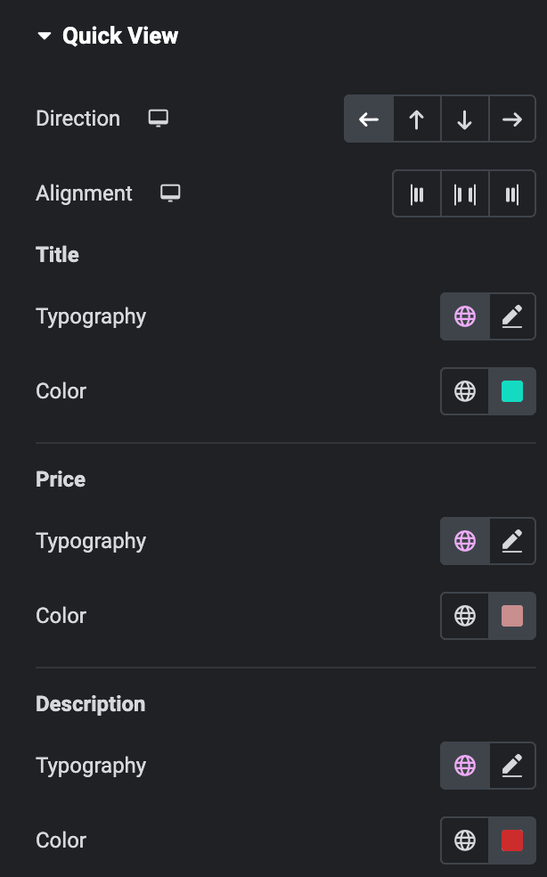
- Direction: Select the content direction of Quick View.
- Alignment: Select the alignment of content.
Title
- Typography: Set the typography.
- Color: Select the color of title.
Price
- Typography: Set the typography.
- Color: Select the color of price.
Description
- Typography: Set the typography.
- Color: Select the color of description.
