Widgets
Dropbar
The Dropbar widget lets you create a dropdown bar that opens when a button is clicked or hovered over. It’s a perfect way to display additional content without taking up extra space on your webpage. You can add content directly through the editor or use AE templates, saved containers, sections, or pages. This widget is an excellent solution for keeping your webpage clean and organized while still providing access to important information.
The “Dropbar” widget features the following controls.
Content
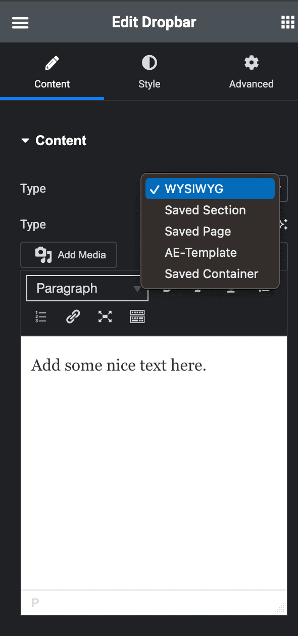
Content
- Type: Select how you want to display your content. You can choose from the editor, AE templates, saved sections, saved containers, or saved pages.
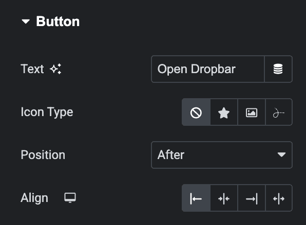
Button
- Text: Enter the text for button.
- Icon Type: Select the icon type from icon, image, or Lottie.
- Position: Choose the position of button icon.
- Align: Specify the alignment of button.
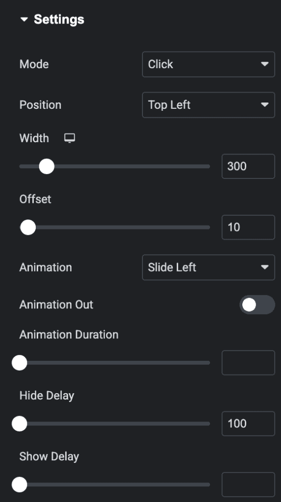
Settings
- Mode: Choose the button trigger mode from hover or click.
- Position: Decide where the dropbar will appear on the page.
- Width: Set how wide you want the dropbar to be.
- Offset: Set the offset value.
- Animation: Pick an animation style to display the dropbar content.
- Animation Out: Turn on this option if you want the dropbar to have an exit animation.
- Animation Duration: Set how long the animation will take.
- Hide Delay: Add a delay before the dropbar disappears.
- Show Delay: Add a delay before the dropbar appears.
Style
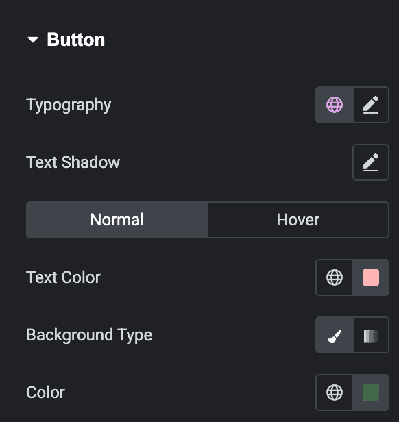
Button
- Typography: Set the typography for button.
- Text Shadow: Apply the shadow effect to text.
Normal
- Text Color: Select the color of button text.
- Background Type: Choose either a Classic or a Gradient.
- Classic
- Color: Choose the color for the background.
- Gradient
- Color: Select the color for the background.
- Location: Determine the position of the color on the background by specifying their location in percentage.
- Second Color: Select the second color for the background.
- Location: Determine the position of the second color on the background by specifying their location in percentage.
- Type: Select either Radial or Linear.
- Radial
- Position: Set the position.
- Linear
- Angle: Set the angle using DEG, GRAD, RAD, and TURN
- Radial
- Classic
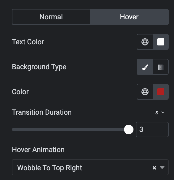
Hover
Styling controls for the hover state are available under this section. These settings will be applied when Someone hovers the button.
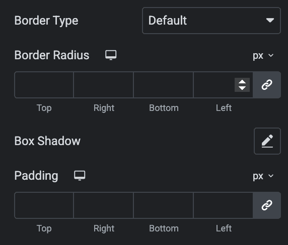
- Border Type: Adjust the setting of border.
- Border Radius: Set the border radius.
- Box Shadow: Adjust the box shadow properties.
- Padding: Set the padding.
Content
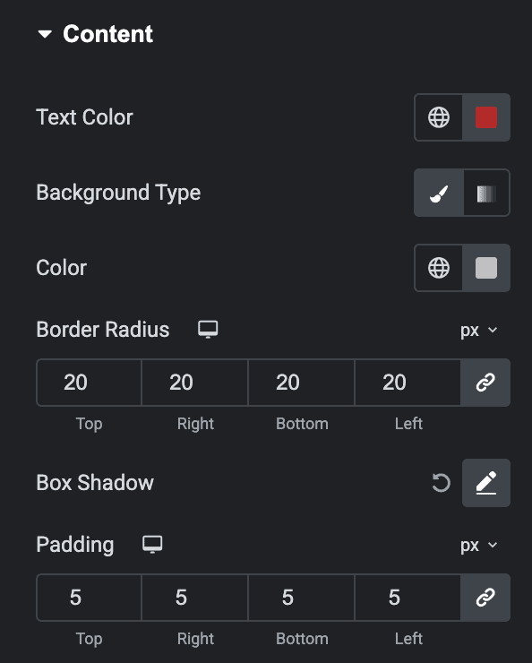
- Text Color: Select the text color of dropbar content.
- Background Type: Choose either classic or gradient. anchor link
- Border Radius: Select the border radius for content box.
- Box Shadow: Set the box shadow.
- Padding: Set the padding.
Check out the demo page for the Dropbar.

