Blob Shape
The Blob Shape is a versatile widget that allows you to create unique and eye-catching blob shapes with ease. You can customize the shape by adding animations, filling it with solid colors, images, or gradients, and even adding content like titles, descriptions, and buttons.
The buttons can also be linked to any URL, making it perfect for creating interactive and visually appealing designs. Whether you’re designing a website or enhancing your creative projects, this widget makes it simple to add a modern, artistic touch.
The “Blob Shape” widget features the following controls.
Content
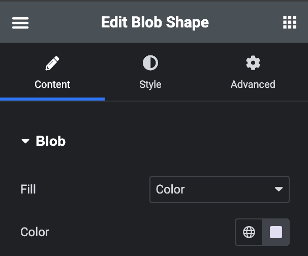
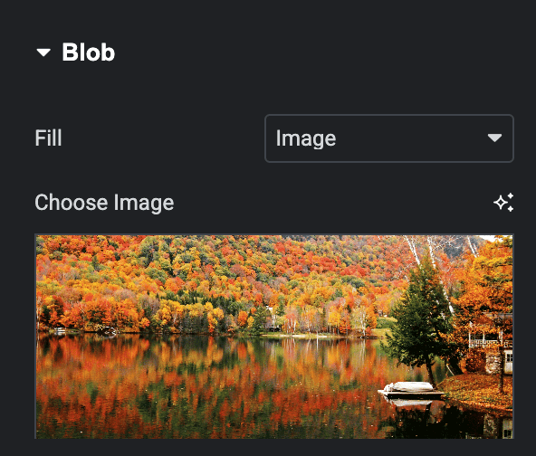
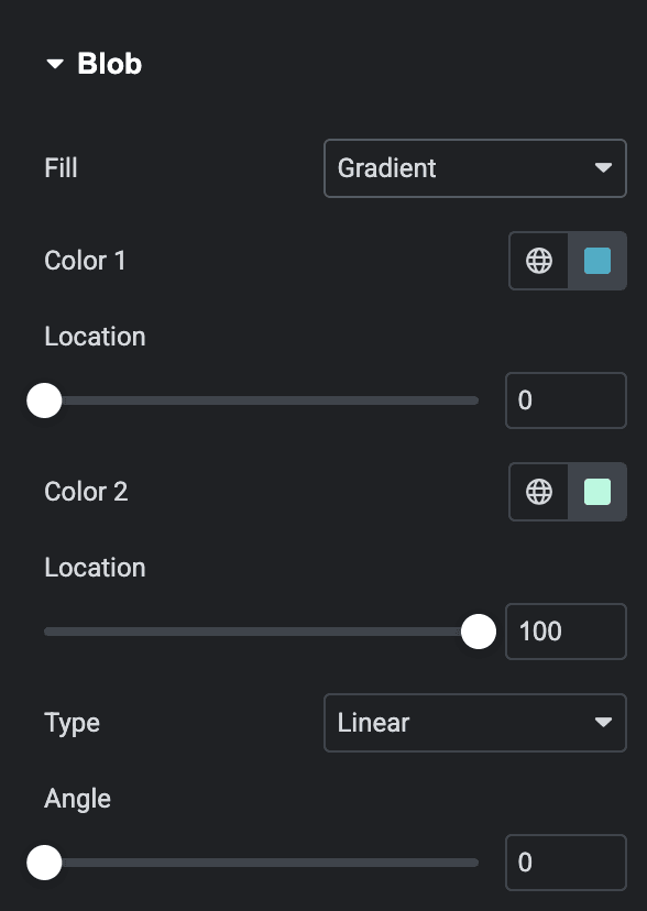
Blob
- Fill: Select the option to fill the blob shape using a Color, Image, or Gradient.
Color
- Color: Select the color to fill the shape.
Image
- Choose Image: Upload an image to fill the shape(applicable when you select Image as fill type).
- X Position: Specify the horizontal position of image.
- Y Position: Specify the vertical position of image.
Gradient
- Color 1: Pick the first color for the gradient.
- Location: Adjust where the first color starts.
- Color 2: Pick the second color for the gradient.
- Location: Adjust where the second color ends.
- Type: Select the type from linear or radial.
- Angle: Set the angel.
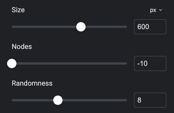
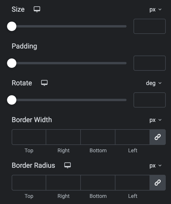
- Size: Specify the size of blob shape.
- Nodes: Adjust the number of points or curves that define the blob’s shape.
- Randomness: Control how unique the blob shape appears
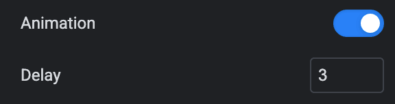
- Animation: Activate the option to apply the animation to the shape.
- Delay: Specify the value of how much it is delayed.
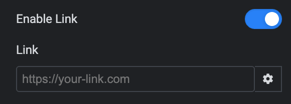
- Enable Link: Activate the option to add the link to the shape.
- Link: Specify the URL.
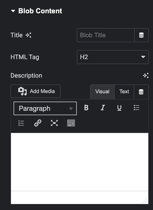
Blob Content
- Title: Enter the title that display under shape.
- HTML Tag: Select the HTML tag for title.
- Description: Enter the description.
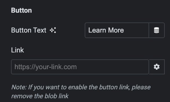
Button
Note: If you want to add the link-in button, then remove the blob link if added so that it works properly.
- Button Text: Enter the text for button.
- Link: Specify the URL that you want to link with the button.
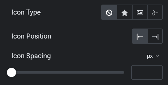
- Icon Type: Choose from icon, image, or lottie.
- Icon Position: Select the position of icon.
- Icon Spacing: Specify the space between button icon and text.
Style
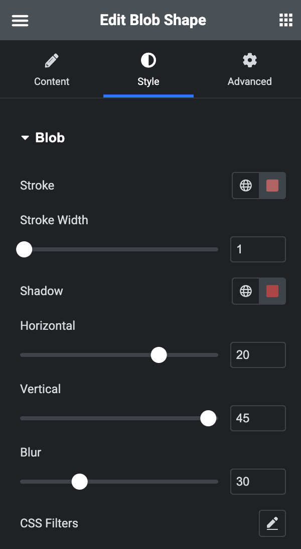
Blob
- Stroke: Select the stroke color for shape.
- Stroke Width: Specify the stroke width.
- Shadow: Apply the shadow to the shape.
- Horizontal: Select the horizontal position of shape.
- Vertical: Select the vertical position of shape.
- Blur: Apply the blur effect to shape.
- CSS Filters: Adjust the CSS filters(applicable when you select Image as Fill type).
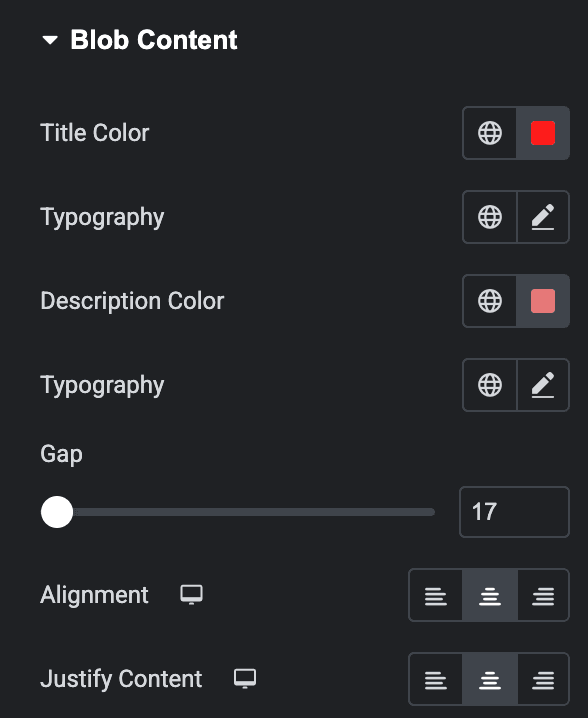
Blob Content
- Title Color: Select the title color.
- Typography: Set the typography.
- Description Color: Select the description color.
- Typography: Set the typography of description.
- Gap: Specify the gap between blob content.
- Alignment: Select the alignment of content.
- Justify Content: Justify the content properly.
Button
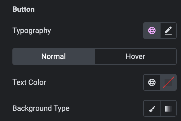
- Typography: Set the typography for button.
Normal
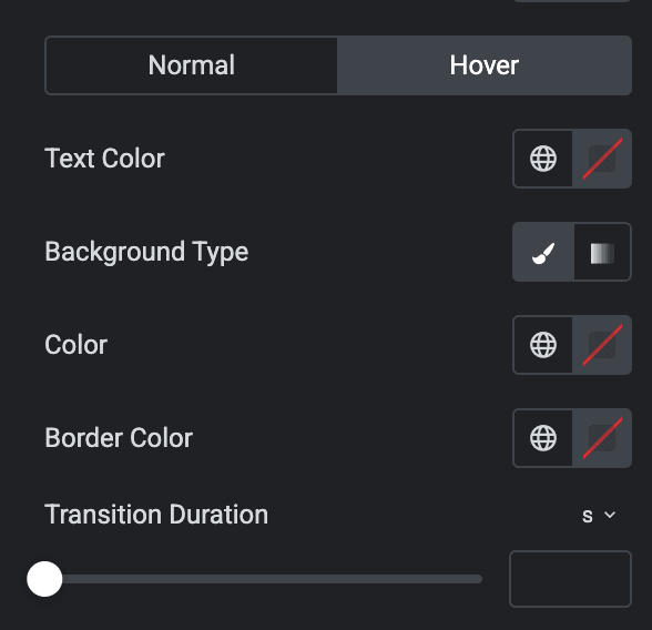
- Text Color: Select the text color of button.
- Background Type: Choose either classic or gradient.
Hover
Styling control for hover state comes under this section. This will be applicable when someone clicks on the button.
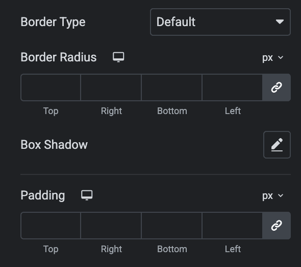
- Border Type: Select the border type.
- Border Radius: Set the border radius.
- Box Shadow: Set the box shadow properties.
- Padding: Set the padding.
Icon
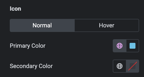
Normal
- Primary Color: Select the primary color of icon.
- Secondary Color: Select the secondary color of icon.
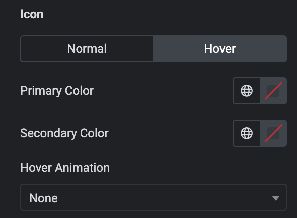
Hover
Styling controls for the hover state are available under this section. These settings will be applied when Someone hovers the icon.
- Size: Specify the size of icon.
- Padding: Set the padding.
- Rotate: Adjust the rotation.
- Border Width: Specify the border width.
- Border Radius: Set the border radius.
