Widgets
Info Circle
The versatile widget improves how you display information on your website using engaging and interactive infographics. It lets you put many different pieces of information into one element. It makes your information easy to understand by using focus or hover effects, which means when you pay attention to it or hover your mouse over it, it shows the details. Plus, it helps save space on your webpage by neatly putting all the items together. This way, it creates a clear and immersive experience for your website visitors.
Content
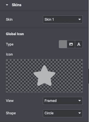
Skins
- Skin: Select the layout from the pre-build layout styles.
Global Icon
- Type: Choose the icon type like FontAwesome icon, image, or text to display.
- Icon: Select an icon from the FontAwesome library or upload.
- View: Choose the default icon view, or select Stacked or Framed.
- Shape: If Stacked or Framed is chosen, choose Circle or Square.
Info Circle Items
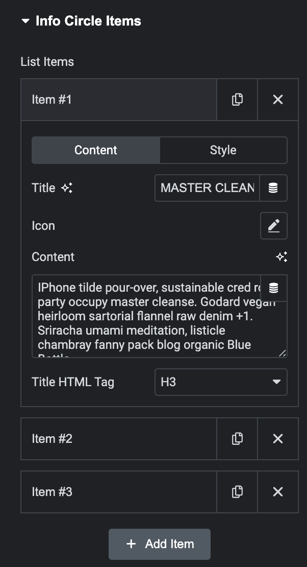
List Items
Content
- Title: Give a title to each item of the info circle.
- Icon: To give each item of the info circle a separate icon.
- Content: Write a short description of the item.
- Title HTML Tag: Select the HTML tag for title.
Style
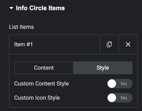
Note: The following settings offer various styling options for each individual timeline style.
- Custom Content Style: Enable this to apply custom style to content.
- Custom Icon Style: Enable this to apply custom style to icon.
Style
Content
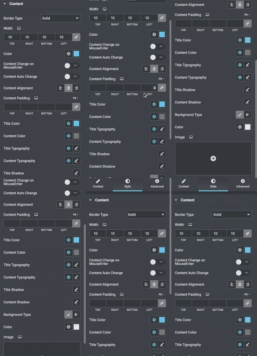
- Border Type: Set a border around the content.
- Border Width: If a border type is chosen, set a width for the border.
- Border Color: Select a color for the border.
- Content change on mouse enter: Enable it to change on mouse enter.
- Content auto change: Enable it to change automatically.
- Content Alignment: Align the content Left, Center, and Right.
- Content Padding: Choose the padding for the content.
- Title Color: Choose any color for the title.
- Content Color: Choose any color for the content.
- Title Typography: Change the title typography.
- Content Typography: Set content typography.
- Title Shadow: Set the shadow for title.
- Background Type: Select the background type from Classic or Gradient.
- Box Shadow: Add a box shadow effect to the circle.
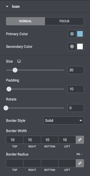
Icon
- Primary Color: Choose the primary color of the icon for both normal and active states.
- Secondary Color: Choose the secondary color of the icon for the normal and active state.
- Icon Size: Set the size of the icon.
- Padding: Set the amount of padding around the icon.
- Rotate: Select the number of degrees to rotate the icon from 0 to 360.
- Border Style: Select the type of border, choosing from none, solid, double, dotted, dashed, or grooved.
- Border Width: Set the width of the icon border.
- Border Radius: Set the radius of the icon border to control corner roundness.
Check out the Demo page of Info Circle.

