Image Accordion
The “Image Accordion” is a powerful widget for displaying a large amount of information in a compact and visually appealing way. By collapsing text, images, and icons into a single widget, it effectively saves screen space without sacrificing the user’s ability to access and understand the content.
Its ability to display content in a condensed, collapsed format allows for efficient use of screen real estate while maintaining high visual appeal.
The “Image Accordion” widget features the following controls:
Content
Content
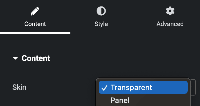
- Skin: Select the skin type, either Transparent or Panel.
- Item
Content
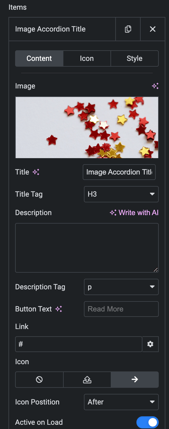
- Image: Set the background image for the Image Accordion(In Transparent Skin, it will work as Overlay).
- Title: Enter the title.
- Title Tag: Select the tag for the title.
- Description: Enter the description.
- Description Tag: Select the tag for the description.
- Button Text: Enter the text for button.
- Link: Enter the URL that needs to be linked upon button.
- Icon: Select from the Font Awesome icon library or upload an SVG image.
- Icon Position: Set the position of the Icon either before or after the link text.
- Active On Load: Enable the option to display this panel upon OnLoad.
Icon
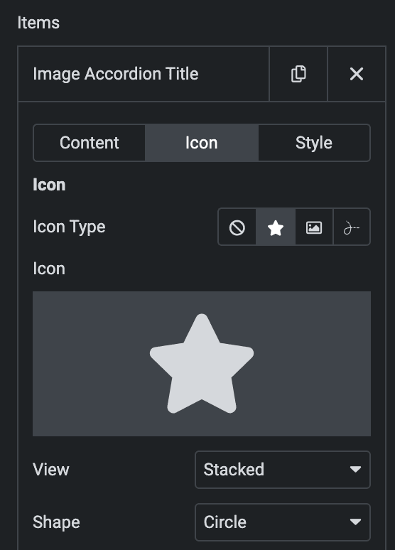
- Icon Type- Choose from a list of Icons, Images, or Lottie animations.
- Icon
- Icon: Select from the Font Awesome icon library or upload an SVG image.
- Image
- Image: Either upload an image or select a dynamic tag for display.
- Image size: Choose the size for your icon image display.
- Lottie Animation
- Source: Choose the source of the Icon by either adding an External URL or selecting a media file.
- Loop:Enable the loop option to display the animation continuously.
- Reverse: Activate the reverse option to display the animation in reverse order.
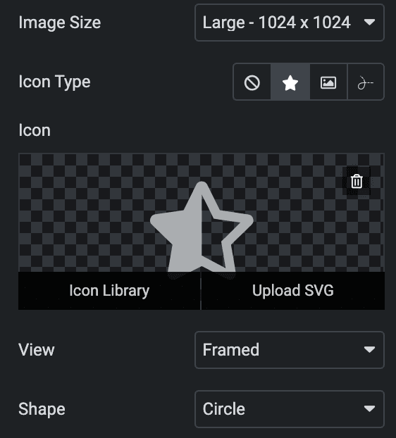
- View – Select from default, stacked, or framed display options.
- Shape– Select either Circle or Square.
- Icon
Style(for individual item)
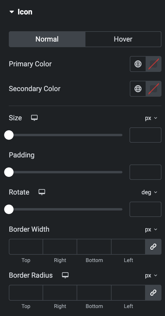
- Icon
- Normal
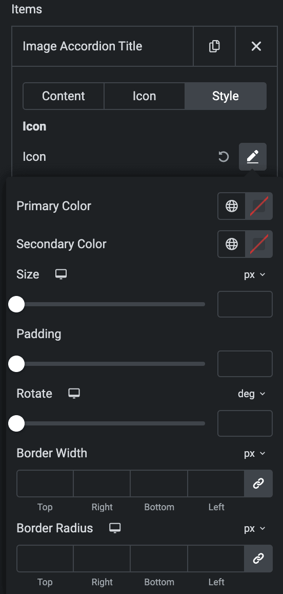
- Primary Color: Choose the primary color for the icon.
- Secondary Color: Choose the secondary color for the icon.
- Size: Set the size of the Icon using %, EM, REM, VW, or PX.
- Padding: Set the padding.
- Rotate: Set the rotation of your Icon.
- Border Width: Set the border’s width using %, EM, REM, VW, or PX.
- Border Radius: Set the border’s radius using PX, %, EM, or REM.
- Normal
- Hover
- Styling controls for the hover state are available under this section. These settings will be applied when Someone hovers the icon.

Panel
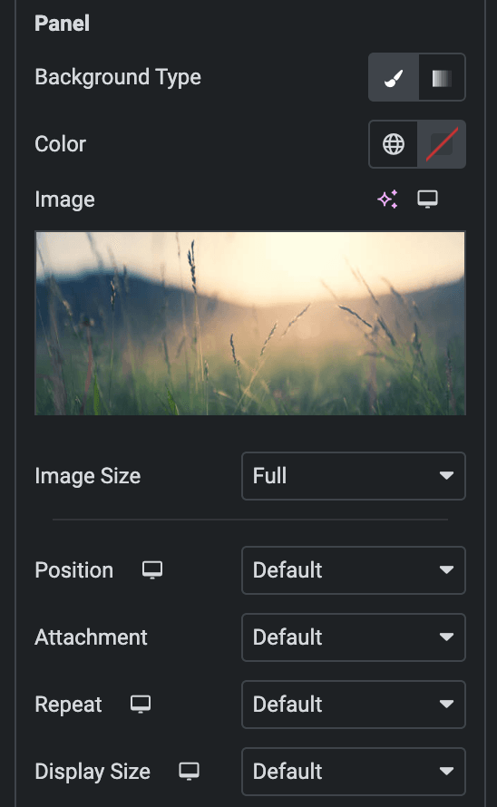
- Background Type: Please choose between a classic or gradient background type for the panel.
- Classic
- Color: Choose the color for the background.
- Image: Either upload an image or select a dynamic tag for display.
- Image Size: Choose the size of the image, from thumbnail to full.
- Position: Set the position of the background image.
- Attachment: Choose either scroll or fixed.
- Repeat: Specify the repeat pattern for the background image.
- Display size: Choose between contain, cover, and auto options, or add custom values for the background display size.
- Classic
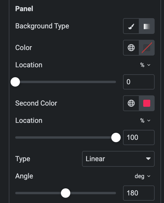
- Gradient
- Color: Select the color for the background.
- Location: Determine the position of the color on the background by specifying their location in percentage.
- Second Color: Select the second color for the background.
- Location: Determine the position of the second color on the background by specifying their location in percentage.
- Type: Select either Radial or Linear.
- Radial
- Position: Set the position.
- Linear
- Angle: Set the angle using DEG, GRAD, RAD, and TURN.
- Radial
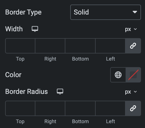
- Border Type: Select the type of border.
- Width: Enter the width for the border.
- Color: Specify the color of the border
- Border Radius: Set the border radius for a panel.
Content
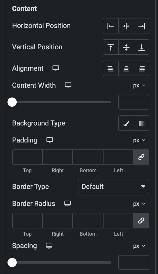
- Horizontal Position: Set the horizontal position of the content.
- Vertical Position: Set the Vertical position of the content.
- Alignment: Set the alignment
- Content Width: Specify the content width.
- Background Type: As we mentioned above, Choose between a classic or gradient background type. Click here.
- Padding: Set the padding.
- Border Type: Select the type of border.
- Width: Enter the width for the border.
- Color: Specify the color of the border
- Border Radius: Enter the border-radius.
- Spacing: Specify the gap.
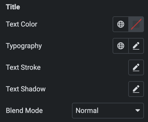
Title
- Text Color: Choose the text color of the title.
- Typography: Set the typography.
- Text Shadow: Set the text shadow for the title.
- Text Stroke: Set the text stroke.
- Blend Mode: Select the blend mode.
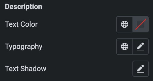
Description
- Text Color: Choose the text color of the description.
- Typography: Set the typography.
- Text Shadow: Set the text shadow for the description.
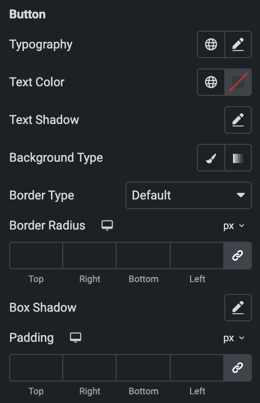
Button
- Normal
- Typography: Set the typography.
- Text Color: Choose the text color of the Button.
- Text Shadow: Set the text shadow for the Button.
- Background Type: As we mentioned above, Choose between a classic or gradient background type for the button. Click here.
- Border Type: Select the type of border.
- Width: Enter the width for the border.
- Color: Specify the color of the border
- Border Radius: Set the border-radius.
- Box Shadow: Set the box shadow.
- Padding: Set the padding.
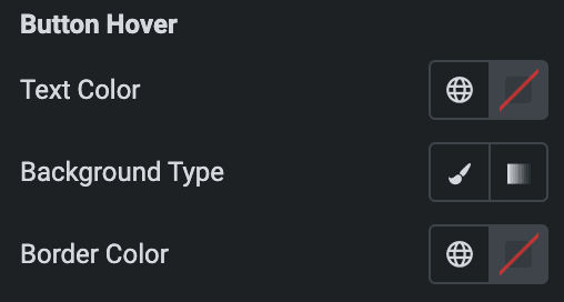
- Button Hover
- Styling controls for the hover state are available under this section. These settings will be applied when Someone hovers the button.
- Image Size: Set the size of an image.
- Icon Type: As we mentioned above, Choose from a list of Icons, Images, or Lottie animations. Click here.
Settings
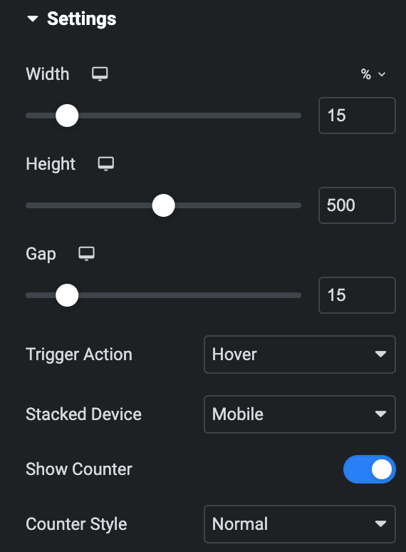
- Width: Set the width of Image accordion items.
- Height: Set the height of Image accordion items.
- Gap: Specify the gap between the accordion items(applicable when Panel is selected as Skin).
- Trigger Action: Select trigger action either hover or click.
- Stacked Device: Choose a stacked device, either a phone or tablet.
- Show Counter: Enable the option if desired.
- Counter Style: Specify the counter style.
Style
Panel
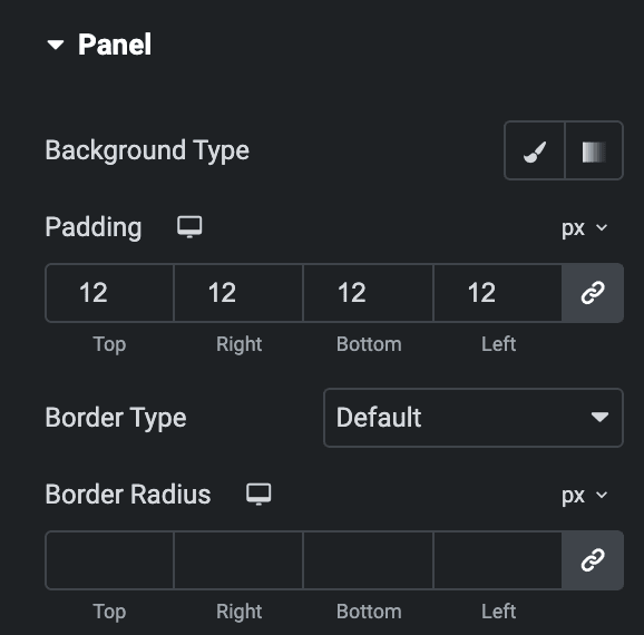
- Background Type: As we mentioned above, Choose between a classic or gradient background type for the panel. Click here.
- Padding: Set the padding.
- Border Type: Select the type of border.
- Width: Enter the width for the border.
- Color: Specify the color of the border
- Border Radius: Set the border’s radius using PX, %, EM, or REM.
Content Options
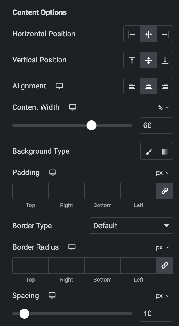
- Horizontal Position: Set the horizontal position of the content.
- Vertical Position: Set the Vertical position of the content.
- Alignment: Set the alignment
- Content Width: Specify the content width.
- Background Type: Choose between a classic or gradient background type. Click here.
- Padding: Set the padding.
- Border Type: Select the type of border.
- Width: Enter the width for the border.
- Color: Specify the color of the border
- Border Radius: Enter the border-radius.
- Spacing: Specify the gap.
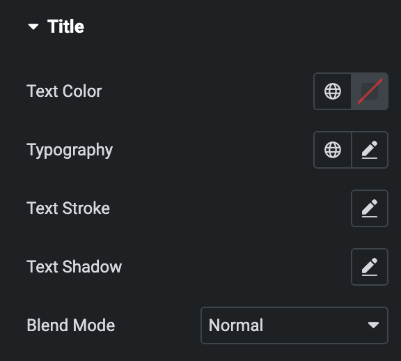
Title
- Text Color: Choose the text color of the title.
- Typography: Set the typography.
- Text Shadow: Set the text shadow for the title.
- Text Stroke: Set the text stroke.
- Blend Mode: Select the blend mode.
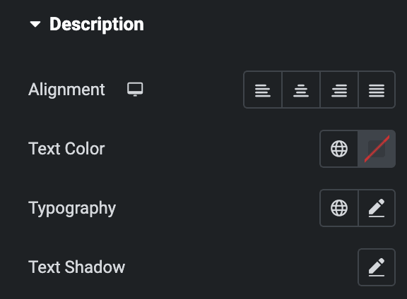
Description
- Alignment: Set the alignment of the description.
- Text Color: Choose the text color of the description.
- Typography: Set the typography.
- Text Shadow: Set the text shadow for the description.
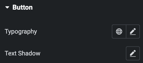
Button
- Typography: Set the typography.
- Text Shadow: Set the text shadow for the button
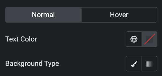
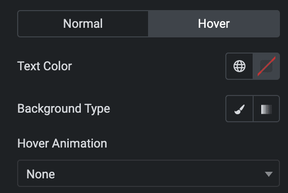
- Normal
- Text Color: Choose the text color of the Button.
- Background Type: Choose between a classic or gradient background type for the button. Click here.
- Hover
- Styling controls for the hover state are available under this section. These settings will be applied when Someone hovers the button.
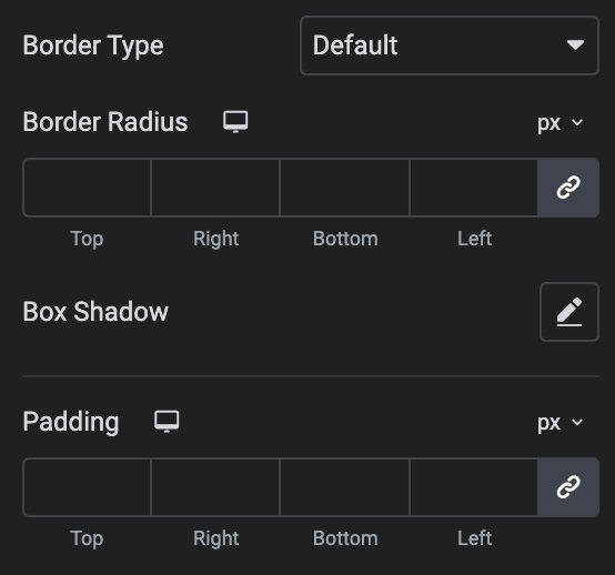
- Border Type: Select the type of border.
- Width: Enter the width for the border.
- Color: Specify the color of the border
- Border Radius: Set the border’s radius using PX, %, EM, or REM.
- Box Shadow: Set the box shadow.
- Padding: Set the padding.
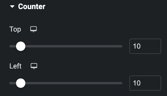
Counter
Note: This is applicable when Show Counter is enabled in the Settings section.
- Top: Adjust the position of the counter from the top.
- Left: Adjust the position of the counter from the top.
- Normal
- Color: Set the color of the counter text.
- Typography: Set the typography.
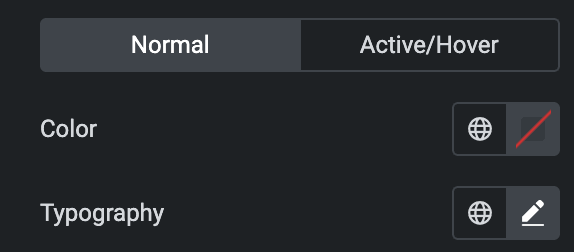
- Active/Hover
- Color: Set the color of text for counter Active/Hover.
Icon
Styling controls for the hover and normal state are available under this section. Hover settings will be applied when Someone hovers the icon. Click here.
Check out the Demo page of Image Accordion.

