FAQ
This is a powerful widget; you can effortlessly create a comprehensive and visually appealing FAQ section for your website. This widget offers you the flexibility to customize each FAQ item to suit your needs perfectly.
Stand out from the crowd with our unique feature that allows you to showcase your content from various sources, such as Content Blocks, Elementor’s Saved Container and Saved Section, or even AE template(if Anywhere Elementor Pro is installed). This flexibility allows you to showcase your FAQs in the most effective and engaging way.
One of the key features of the widget is the ability to add multiple types of graphics, which can help to make your FAQs more engaging and visually appealing.
It provides you with three different layouts to choose from – Accordion, List, or Grid – so you can choose the style that best suits your needs and preferences.
The “FAQ” widget features the following controls:
Content
FAQs
- Add FAQs: Use Add Item button to add FAQ items.
Content
- Question: Add your question here.
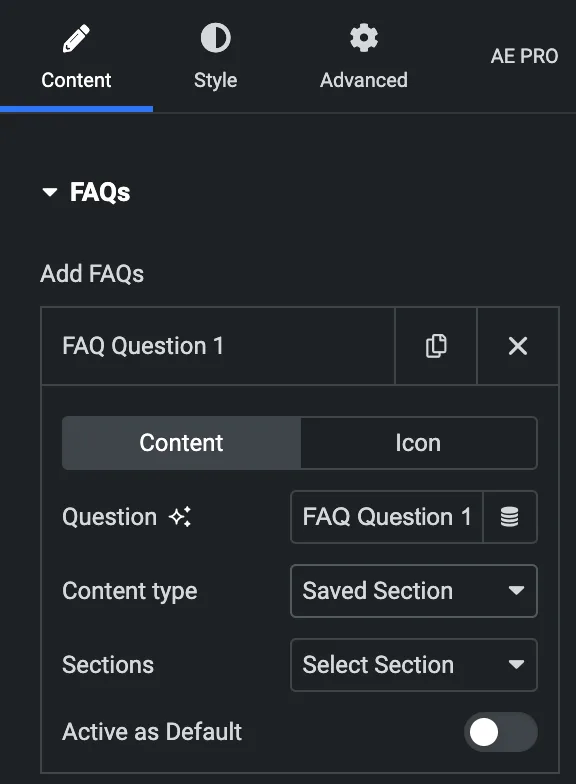
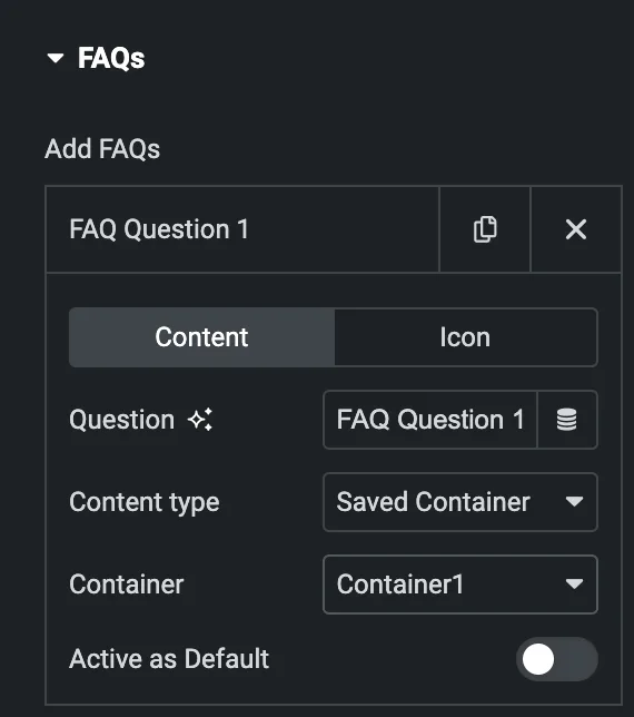
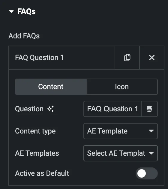
- Content Type: Select from Content, Saved Section, Saved Container, AE Template.
- Content(for individual item)
- Answer: Enter your content in content box.
- Content(for individual item)
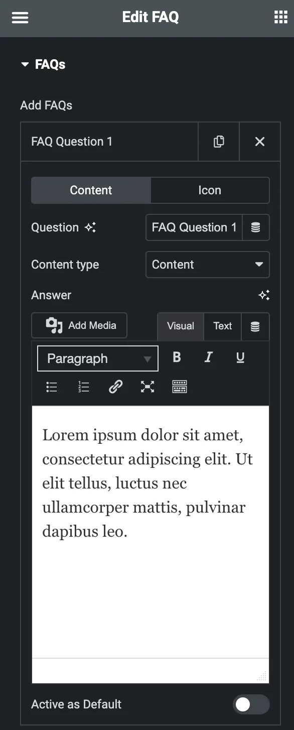
- Saved Section
- Section: Select the specific section from which you wish to display your content.
- Saved Container
- Container: Select the container from which you wish to display your content.
- AE Template
- AE Templates: Select the AE template from which you wish to display your content.
- Active as Default: Activate the option to display a particular item as active during onload.
Icon
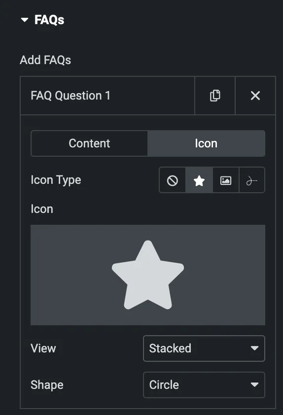
- Icon Type: Choose from a list of Icons, Images, or Lottie animations.
- Icon
- Icon: Select from the Font Awesome icon library or upload an SVG image.
- Image
- Image: Either upload an image or select a dynamic tag for display.
- Image size: Choose the size for your icon image display.
- Lottie Animation
- Source – Choose the source of the Icon by either adding an External URL or selecting a media file.
- Loop – Enable the loop option to display the animation continuously.
- Reverse – Activate the reverse option to display the animation in reverse order.
- Icon
- View – Select from default, stacked, or framed display options.
- Shape – Select either Circle or Square shape for the stack or frame.
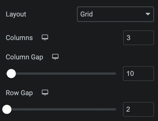
- Layout: Select from List, Grid, or Accordion.
- Grid
- Columns: Specify the number of columns to be displayed in each row.
- Columns Gap: Set the gap between columns.
- Row Gap: Set the gap between rows.
- Grid
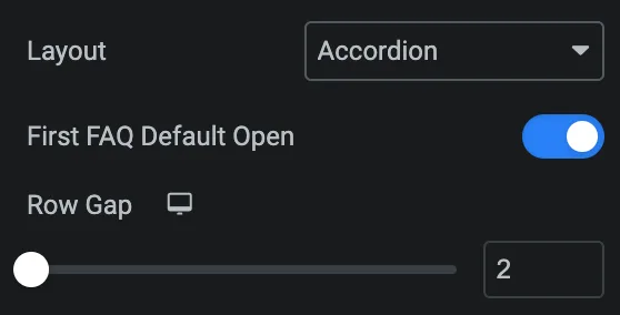
- Accordion
- First FAQ Default Open: Enable the option to display the first item in open state.
- Row Gap: Set the gap between rows.
- Question HTML Tag: Select the HTML tag for question.
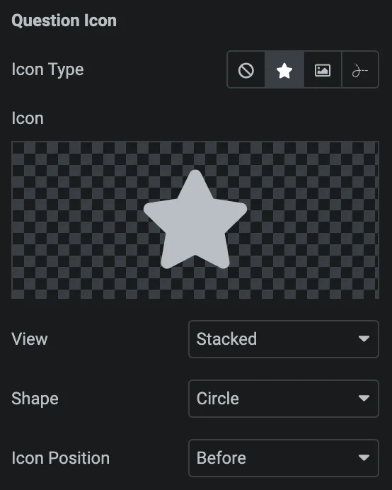
Question Icon
- Icon Type: As we mentioned above, Choose from a list of Icons, Images, or Lottie animations. Click here.
- Icon Position: Select either before or after.
- FAQ Schema: Enable the option to activate the FAQ schema.

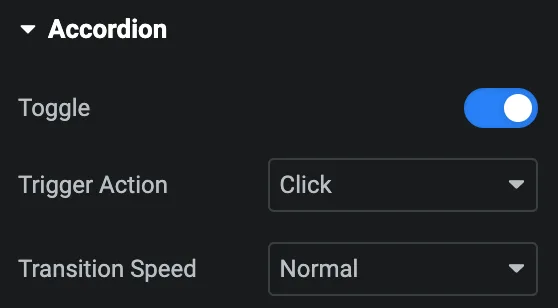
Accordion
Note: This option is only applicable if the Layout is selected as Accordion.
- Toggle: Enable the option to activate the toggle.
- Trigger Action: Select from Click or Hover.
- Transition Speed: Set the transition speed.
Navigation
Note: This option is only applicable if the Layout is selected as Accordion.
- Alignment: Select the alignment for navigation icon.

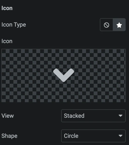
Icon
- Icon Type: Select either Icon or None.
- Icon: Select the icon from icon library or upload an SVG.
- View: Select either Stacked or framed.
- Shape: Choose either square or circle.
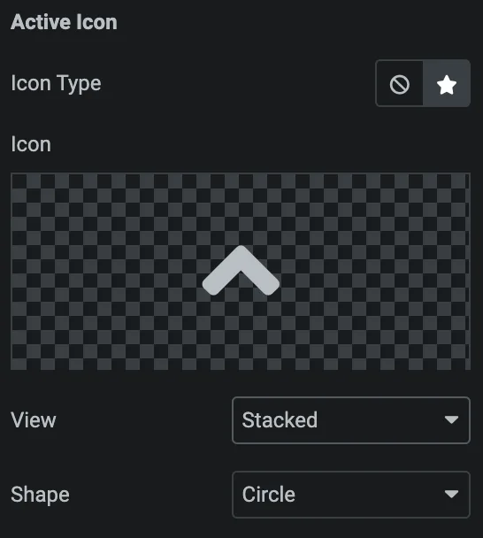
Active Icon
Styling controls for the hover state are available under this section. These settings will be applied when the icon is in active state.
Style
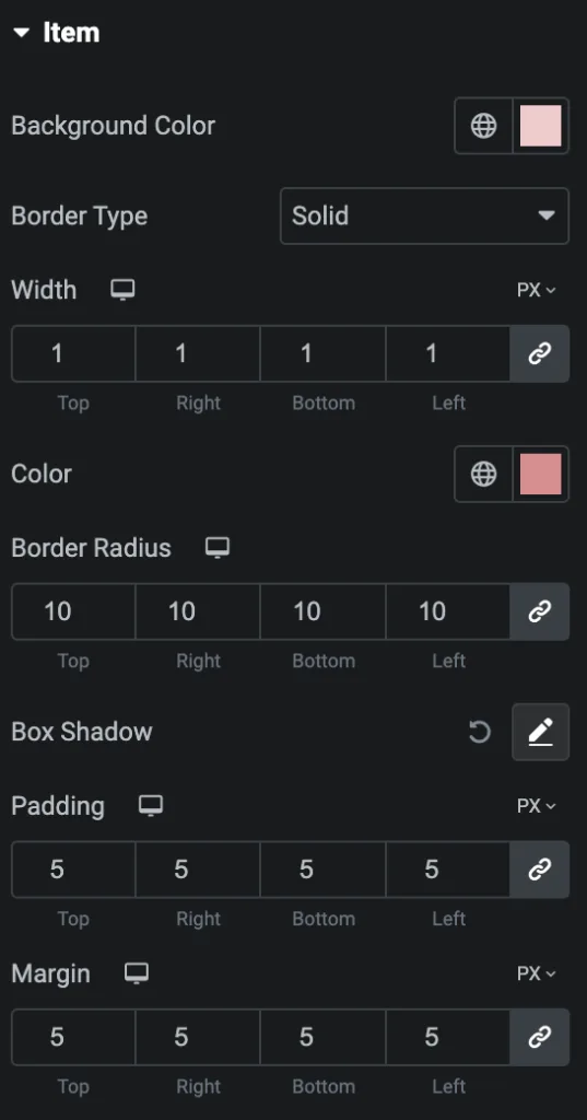
Item
- Background Color: Select the background color for item box.
- Border Type: Select the border type.
- Width: Set the width of border.
- Color: Select the color of border.
- Border Radius: Set the border radius.
- Box Shadow: Set the box shadow properties.
- Padding: Set the padding.
- Margin: Set the margin.
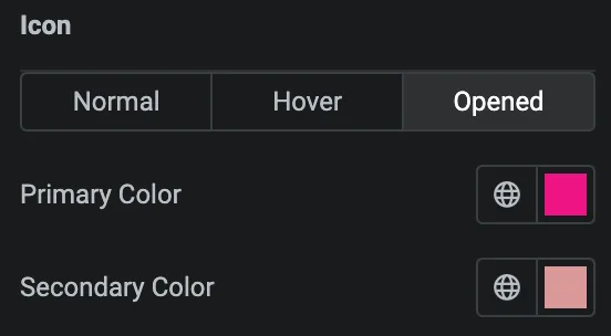
Question
Note: When selecting the Accordion layout, you have some different options to apply styling on both Closed and Opened states of the accordion.
- Alignment: Set the alignment of question.
- Typography: Set the typography.
- Text Stroke: Set the text stroke.
- Text Shadow: Set the text shadow properties.
- Blend Mode: Select the blend mode from the given options.
- Color: Select the color of question when it is in closed state.
- Background Type: Select either classic or gradient.
- Border Type: Select the border type.
- Width: Set the width of border.
- Color: Select the color of border.
- Border Radius: Set the border radius.
- Box Shadow: Set the box shadow properties.
- Padding: Set the padding.
- Margin: Set the margin.
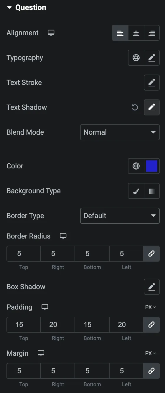
Icon
- Normal
- Primary Color: Select the primary color of icon.
- Secondary Color: Select the secondary color of icon.
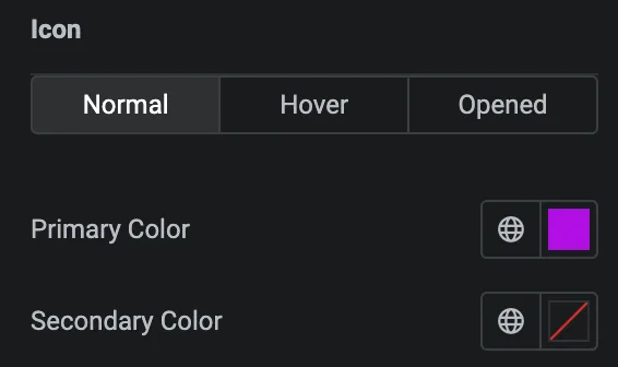
Hover
Styling controls for the hover state are available under this section. These settings will be applied when Someone hovers the icon.
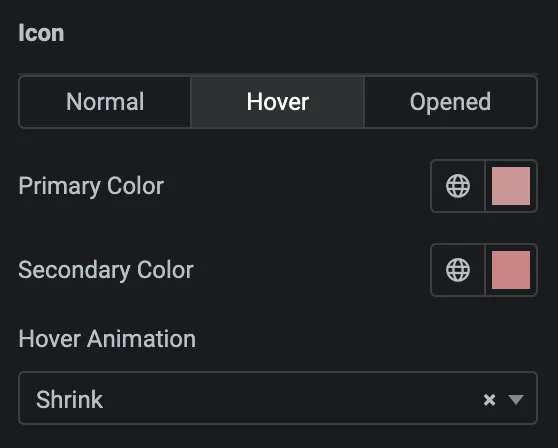
Opened
Styling controls for the opened state are available under this section. These settings will be applied when the icon is in open state.
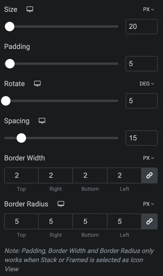
- Size: Set the size of the Icon using %, EM, REM, VW, or PX.
- Padding: Set the padding for the Icon.
- Rotate: Set the rotation of your Icon in degrees.
- Spacing: Set the spacing.
- Border Width: Set the border’s width using %, EM, REM, VW, or PX.
- Border Radius: Set the border’s radius using PX,%, EM, or REM.
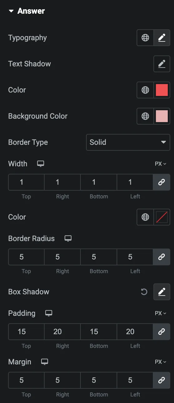
Answer
- Typography: Set the typography.
- Text Shadow: Set the text shadow.
- Color: Select the color of answer.
- Background Color: Select the background color of answer.
- Border Type: Select the border type.
- Width: Set the width of border.
- Color: Select the color of border.
- Border Radius: Set the border radius.
- Box Shadow: Set the box shadow.
- Padding: Set the padding.
- Margin: Set the margin.
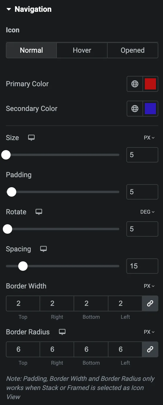
Navigation
Note: This option is only applicable if the Layout is selected as Accordion
Icon: As we mentioned above, Set the navigation icon styling for Normal, Hover & Opened state. Click here.
Check out the Demo page of FAQ.

