Widgets
Add To Calendar
This widget has a convenient feature available on your website that enables your users to easily add an event to their preferred calendar platform, such as Google Calendar, ICS, Outlook, or Yahoo Calendar. Users can seamlessly integrate the event into their calendar without manual data entry by simply clicking on the button.
The “Add to Calendar” widget features the following controls:
Content
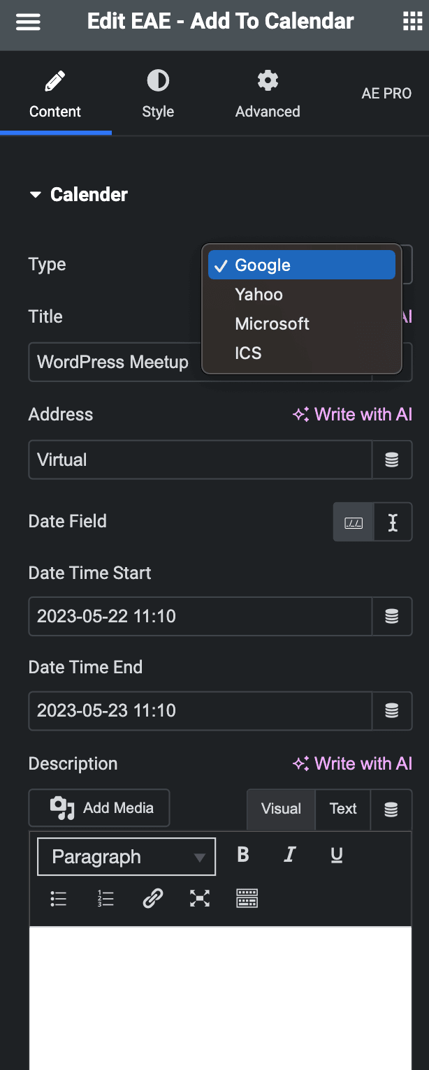
Calendar
- Type: Select your preferred calendar type, such as Google Calendar, ICS(iCalendar), Yahoo, or Outlook.
- Title: You can either enter the event title or choose a dynamic tag.
- Address: Set the event location.
- Date Field: Set the event date and time using either a Date Time Picker or a dynamic string.
- Date Time Start: Set the start date and time of the event.
- Date Time End: Set the end date and time of the event.
- Description: Enter the event description.
Button
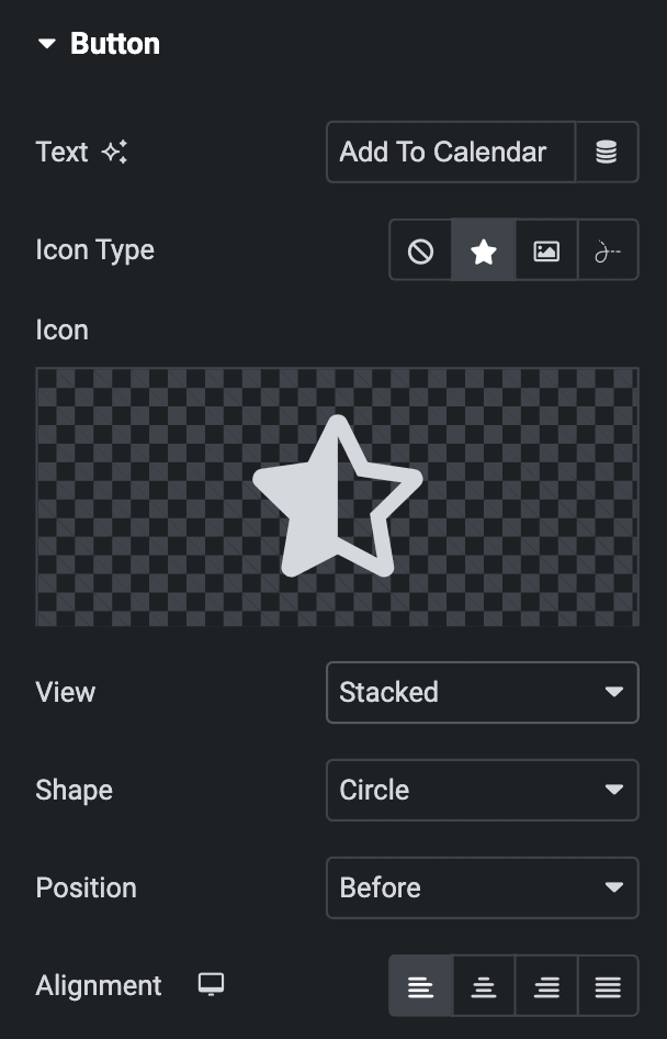
- Text: Enter the text for the button or choose the dynamic tag.
- Icon Type: Choose from a list of Icons, Images, or Lottie animations.
- Icon
- Icon: Select from the Font Awesome icon library or upload an SVG image.
- Image
- Image: Either upload an image or select a dynamic tag for display.
- Image size: Choose the size for your icon image display.
- Lottie Animation
- Source: Choose the source of the Icon by either adding an External URL or selecting a media file.
- Loop: Enable the loop option to display the animation continuously.
- Reverse: Activate the reverse option to display the animation in reverse order.
- View – Select from default, stacked, or framed display options.
- Shape – Select either Circle or Square shape for the stack or frame.
- Icon
- Position: Choose the position of the Icon, either before or after the heading.
- Alignment: Choose the alignment of the button, whether left, right, center, or justified.
Style
Button
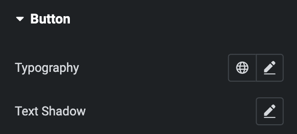
- Typography: Set the typography for the button.
- Text Shadow: Apply a shadow to the heading if desired.
Normal
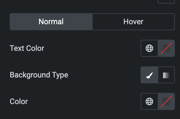
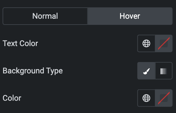
- Text Color: Select the text color of a button.
- Background Type: Choose either a Classic or a Gradient.
- Classic
- Color: Choose the color for the background.
- Gradient
- Color: Select the color for the background.
- Location: Determine the position of the color on the background by specifying their location in percentage.
- Second Color: Select the second color for the background.
- Location: Determine the position of the second color on the background by specifying their location in percentage.
- Type: Select either Radial or Linear.
- Radial
- Position: Set the position.
- Linear
- Angle: Set the angle using DEG, GRAD, RAD, and TURN.
- Radial
- Classic
Hover
Styling controls for the hover state are available under this section. These settings will be applied when Someone hovers the button.
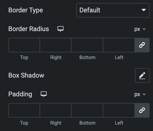
- Border Type: Select the type of border.
- Width: Set the width of the border.
- Color: Set the color of the border.
- Border Radius: Set the border’s radius using PX,%, or EM.
- Box Shadow: Set the box shadow.
- Padding: Set the padding using PX,%, or EM.
Icon
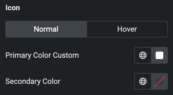
- Normal
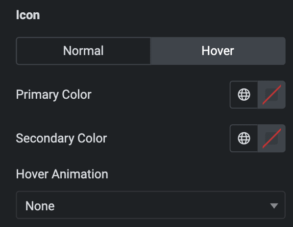
- Primary Color: Choose the primary color for the icon.
- Secondary Color: Choose the secondary color for the icon.
- Hover
- Styling controls for the hover state are available under this section. These settings will be applied when Someone hovers the icon.
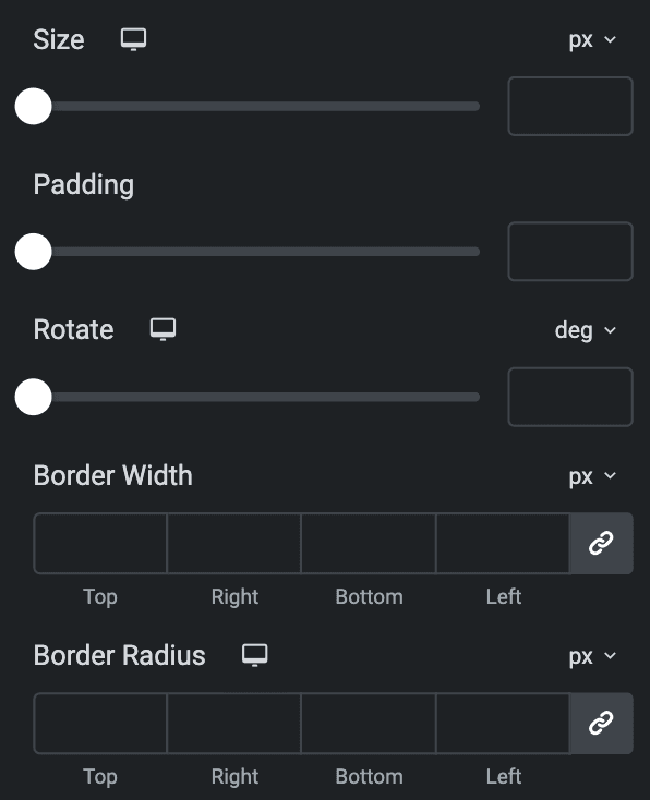
- Size: Set the size of the Icon using %, EM, REM, VW, or PX.
- Padding: Set the padding.
- Rotate: Set the rotation of your Icon.
- Border Width: Set the border’s width using %, EM, REM, VW, or PX.
- Border Radius: Set the border’s radius using PX, %, EM, or REM.
Check out the Demo page of Add To Calendar.

