Widgets
Advanced Button
This widget offers an optimal solution for individuals looking for interactive buttons that effortlessly combine headlines and descriptions into a unified button. With its adaptable features, users can create visually appealing buttons that instantly capture attention and effectively communicate messages, guiding users toward desired outcomes.
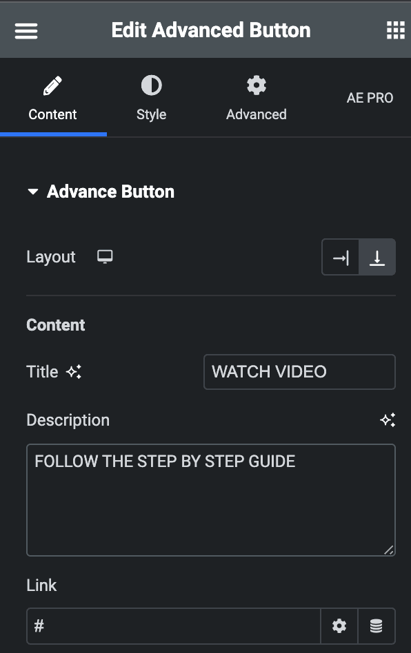
Content
Advance Button
- Layout: Set the layout of the advance button to either the right or bottom.
- Title: Write the title of the Advance button.
- Description: Write the description of the advance button.
- Link: Set the link type and add a link.
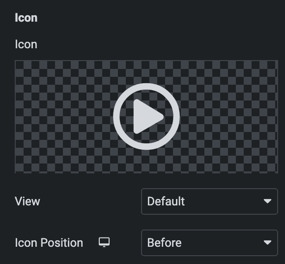
Icon
- Icon: Choose an icon from the options.
- View: Set the view of the icon from default, stacked, or framed.
- Icon position: Adjust the icon position to either left or right.
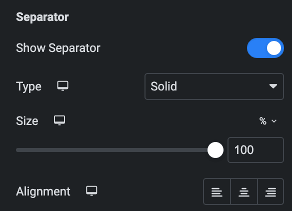
Separator
- Show Separator: Enable to show a separator
- Type: Set separator type from solid, dashed, or dotted.
- Size: Control the size of the separator.
- Alignment: Set the alignment of the separator.
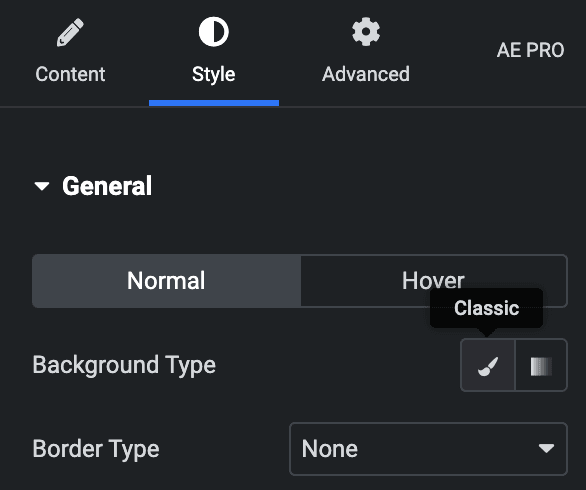
Style
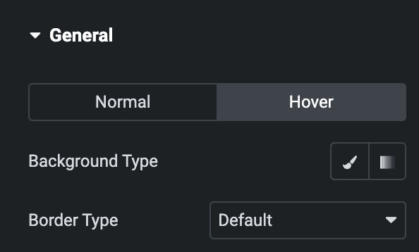
Normal
- Background Type: Choose the background type, either color or gradient.
- Border Type: Choose from the following options for border type.
Hover
Styling control for hover state are available under this section. These settings will be applied when someone hovers the button box.
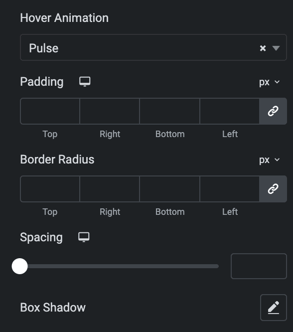
- Hover Animation: Choose any hover animation from the following options.
- Padding: Set the padding.
- Border radius: Set the border radius of the advance button.
- Spacing: Set the spacing for the advance button.
- Box Shadow: Set the box shadow of the advance button.
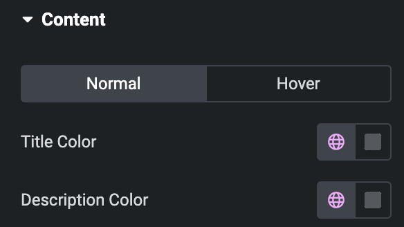
Content
- Title color: Set the color of the title.
- Description color: Set the color of the description.
Hover
Styling control for hover state are available under this section. These settings will be applied when someone hovers the button box.
Title
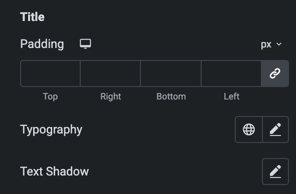
- Padding: Set the padding of the title.
- Typography: Set the typography.
- Text Shadow: Add a Text shadow effect to the title.
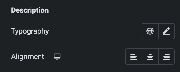
Description
- Typography: Set the description typography.
- Alignment: Set the alignment of the description.
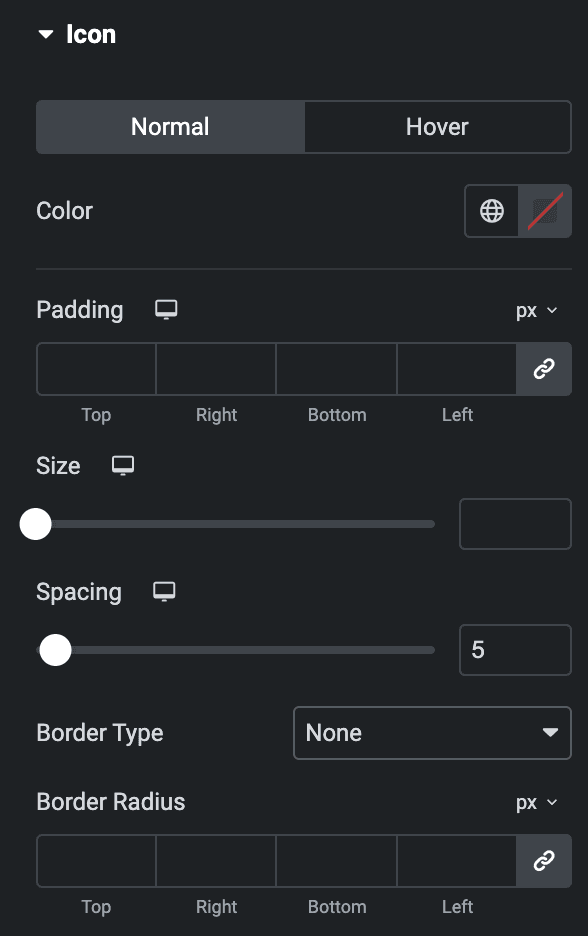
Icon
- Color: Set the primary color of the icon.
- Padding: Set the padding.
- Size: Set the size of the icons according to your choice.
- Spacing: Adjust the spacing between the icon and the button’s title.
- Border Type: Set the border from the following options.
- Border Radius: Set the border radius of the icon.
Separator
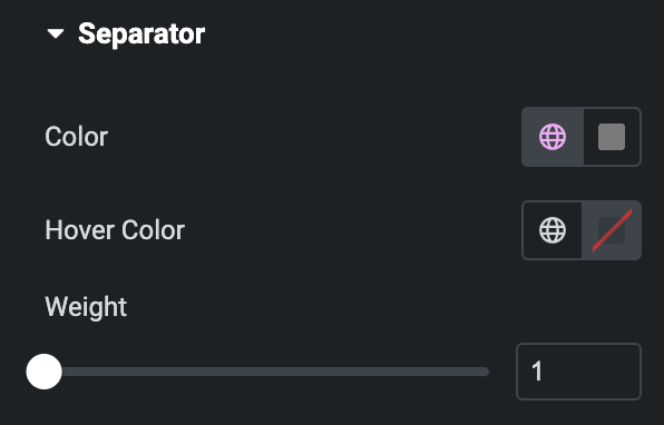
- Color: Set the color of the separator.
- Hover Color: Set the hover color of separator.
- Width: Set the width of the separator.
Check out the Demo page of Advanced Button.
