Advanced Price Table
It is an essential widget for showcasing pricing information in an effective and engaging manner. This widget offers a combination of elements to be displayed, including title, description, icon, price, button, and more. With this widget, you can create and showcase any number of price boxes, allowing for easy comparison and selection.
One of the standout features of this widget is its ability to highlight sale prices, drawing attention to special offers and promotional discounts. It also supports tab features, allowing you to present your prices in a dual tab format, making it easy for users to differentiate between different options. Additionally, tooltips seamlessly integrate with the widget, providing additional information or descriptions when users hover over specific features or by adding an info icon.
Moreover, it can highlight specific price boxes, allowing you to draw attention to key offerings or promotional deals. You can further enhance the display by adding badges to particular price boxes, enabling you to include additional information.
The “Advanced Price Table” widget features the following controls.
Content
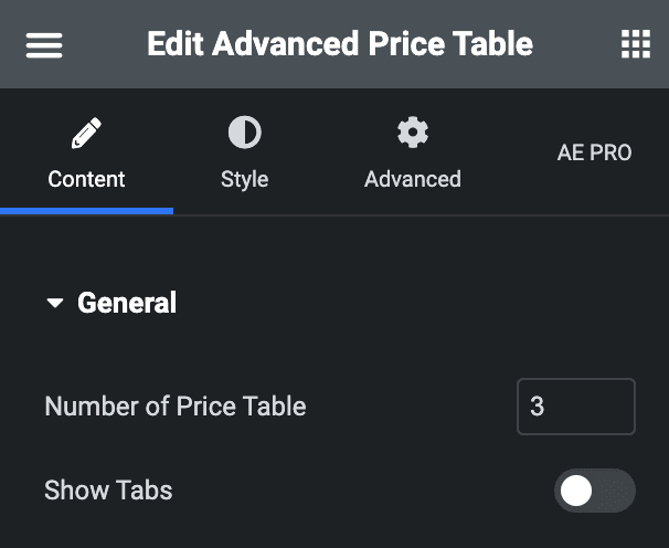
General
- Number of Price Table: Specify the number of tables to be shown.
- Show Tabs: Enable the option to display dual tabs pricing.
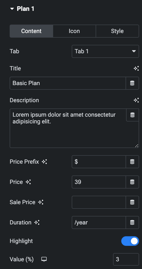
Plan
Content
- Tab: Select tab preference for displaying individual plans(applicable when “Show Tabs” is enabled in the General section).
- Title: Enter the title.
- Description: Enter the description.
- Price Prefix: Specify the prefix of price.
- Price: Enter the price value.
- Sale Price: Enter the sale price value.
- Duration: Specify pricing duration: monthly, yearly, or other.
- Highlight: Enable the option to highlight the particular price table.
- Value: Enter the highlighted value in percentage.
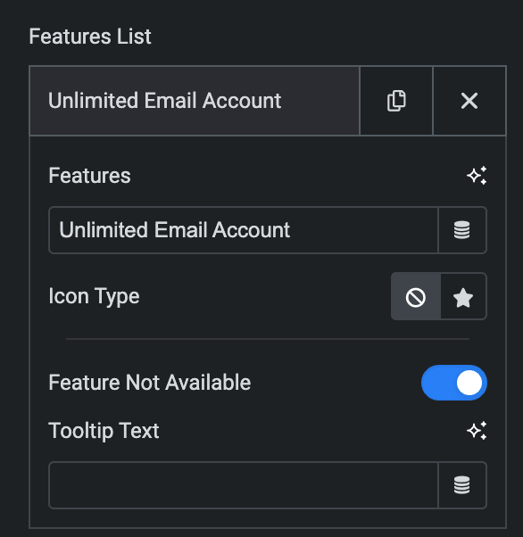
- Feature List
- Features: Enter the feature.
- Icon Type: Select from the icon library or upload an SVG.
- Feature not available: Enable the option to display Feature currently unavailable.
- Tooltip Text: Enter the tooltip text, if needed.
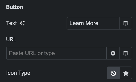
- Button
- Text: Enter the text for the button.
- URL: Enter the URL to link with the button.
- Icon Type: Select from the icon library or upload an SVG.
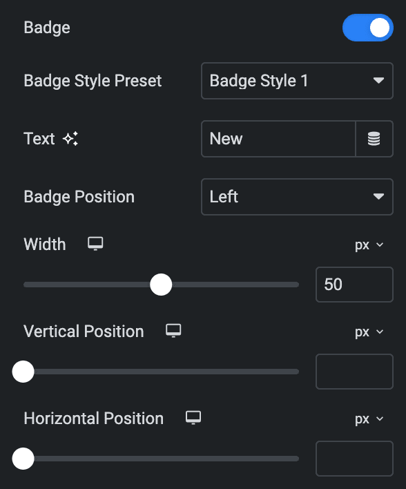
Badge: Enable the option to apply a badge on price table.
Note: There are different settings controls available for each badge style preset.
- Badge Style Preset: Choose a preset from available styles.
- Text: Enter the text of the badge.
- Badge Position: Select the position of the badge.
- Width: Specify the width.
- Vertical Position: Select the vertical position.
- Horizontal Position: Select the horizontal position.
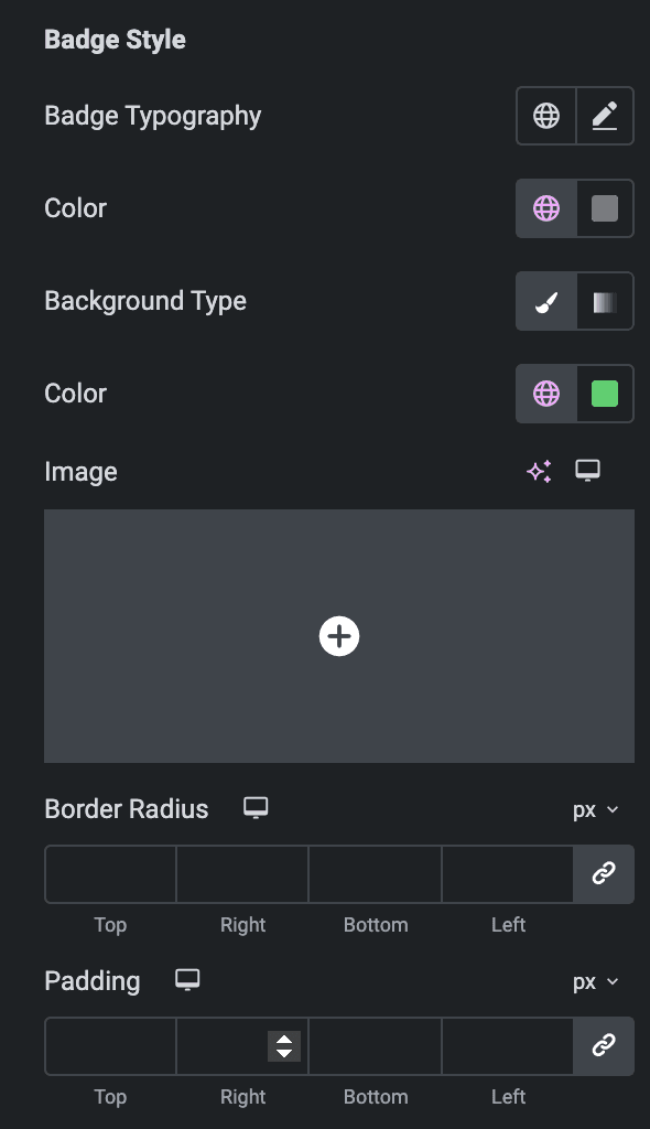
- Badge Style
- Badge Typography: Set the typography.
- Color: Select the color of the badge.
- Background Type: As we mentioned below, you can select either classic or gradient. Check here.
- Border Radius: Set the border radius.
- Padding: Set the padding.
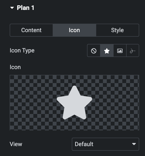
Icon
- Icon Type: Choose from a list of Icons, Images, or Lottie animations.
- Icon
- Icon: Select from the Font Awesome icon library or upload an SVG image.
- Image
- Image: Either upload an image or select a dynamic tag for display.
- Image size: Choose the size for your icon image display.
- Lottie Animation
- Source – Choose the source of the Icon by either adding an External URL or selecting a media file.
- Loop – Enable the loop option to display the animation continuously.
- Reverse – Activate the reverse option to display the animation in reverse order.
- Icon
- View – Select from default, stacked, or framed display options.
- Shape – Select either Circle or Square shape for the stack or frame.
Style
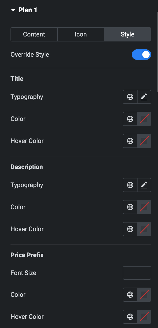
- Override style: Enable the option to override the styling options.
- Title
- Typography: Set the typography.
- Color: Select the color of the title.
- Hover Color: Select the hover color of the title.
- Description
- Typography: Set the typography.
- Color: Select the color of the description.
- Hover Color: Select the hover color of the description.
- Price Prefix
- Font Size: Enter the font size of the prefix.
- Color: Select the color of the prefix.
- Hover Color: Select the hover color of the prefix.
- Title
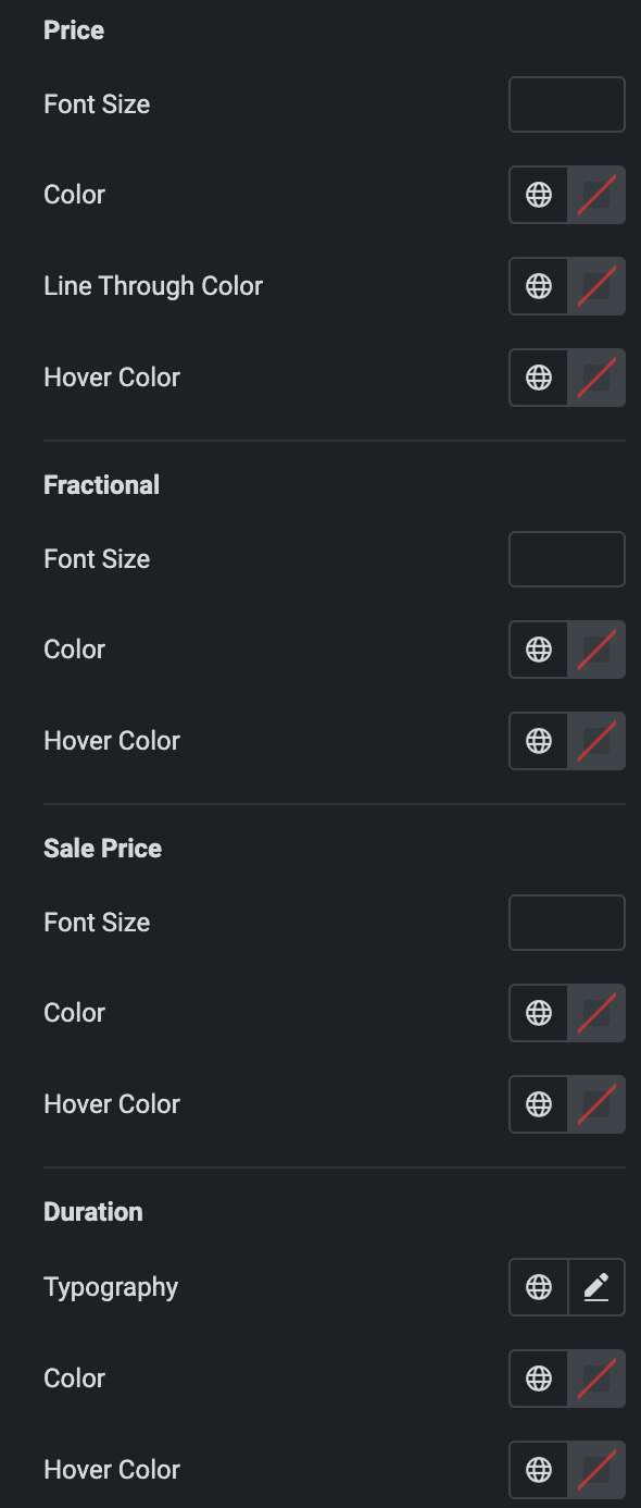
- Price
- Font Size: Enter the font size of the price.
- Color: Select the color of the price.
- Line Through Color: Select the strike-through color of the price.
- Hover Color: Select the hover color of the price.
- Fractional
- Font Size: Enter the font size of the fractional value.
- Color: Select the color of the fractional value.
- Hover Color: Select the hover color of the fractional value.
- Sale Price
- Font Size: Enter the font size of the sale price.
- Color: Select the color of the sale price.
- Hover Color: Select the hover color of the sale price.
- Duration
- Typography: Set the typography.
- Color: Select the color of duration.
- Hover Color: Select the hover color of duration.
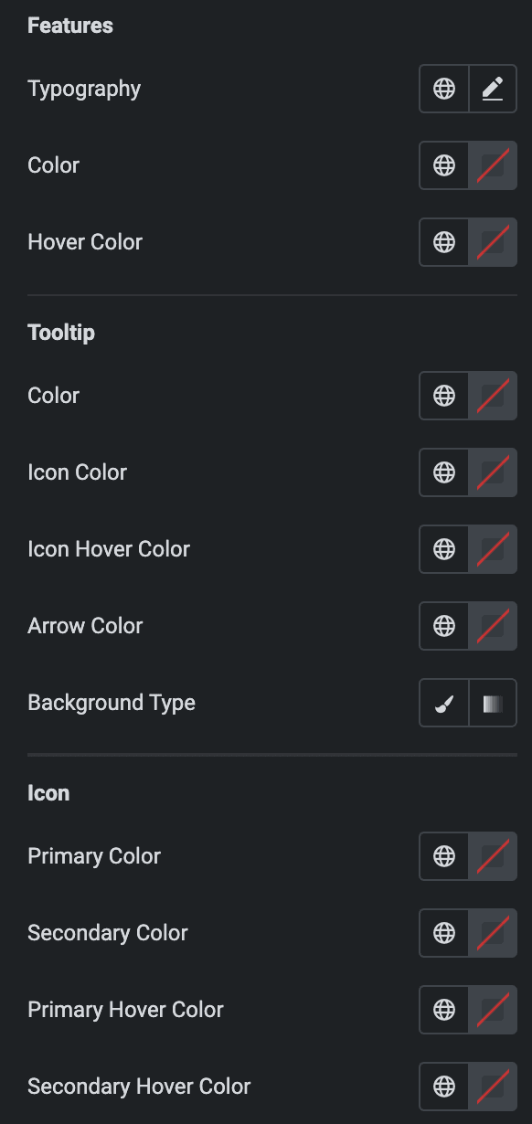
- Features
- Typography: Set the typography.
- Color: Select the color of the features.
- Hover Color: Select the hover color of features.
- Tooltip
- Color: Select the color of the tooltip.
- Icon Color: Select the icon color of the tooltip.
- Icon Hover Color: Select the icon hover color of the tooltip.
- Arrow Color: Select the arrow color of the tooltip.
- Background Type: Select either Classic or Gradient.
Classic
- Color: Choose the color for the background.
- Image: Either upload an image or select a dynamic tag for display.
Gradient
- Color: Select the color for the background.
- Location: Determine the position of the color on the background by specifying their location in percentage.
- Second Color: Select the second color for the background.
- Location: Determine the position of the second color on the background by specifying their location in percentage.
- Type: Select either Radial or Linear.
- Radial
- Position: Set the position.
- Linear
- Angle: Set the angle using DEG, GRAD, RAD, and TURN.
- Radial
- Type: Select either Radial or Linear.
- Icon
- Primary Color: Select the primary color of icon.
- Secondary Color: Select the secondary color of icon.
- Primary Hover Color: Select the primary hover color of icon.
- Secondary Hover Color: Select the secondary hover color of icon.
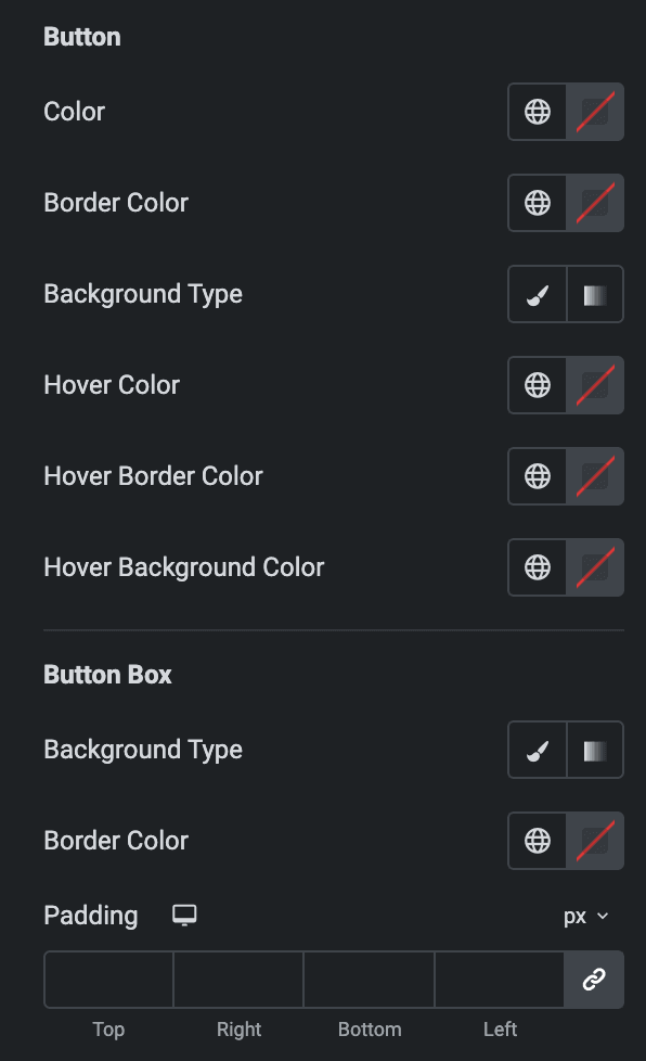
- Button
- Color: Select the button text color.
- Border Color: Select the border color.
- Background Type: As we mentioned above, you can select either classic or gradient. Check Here.
- Hover Color: Select the button hover text color.
- Hover Border Color: Select the button hover border color.
- Hover Background Color: Select the button hover background color.
- Button Box
- Background Type: As we mentioned above, you can select either classic or gradient. Check Here.
- Border Color: Select the border color.
- Padding: Set the padding.
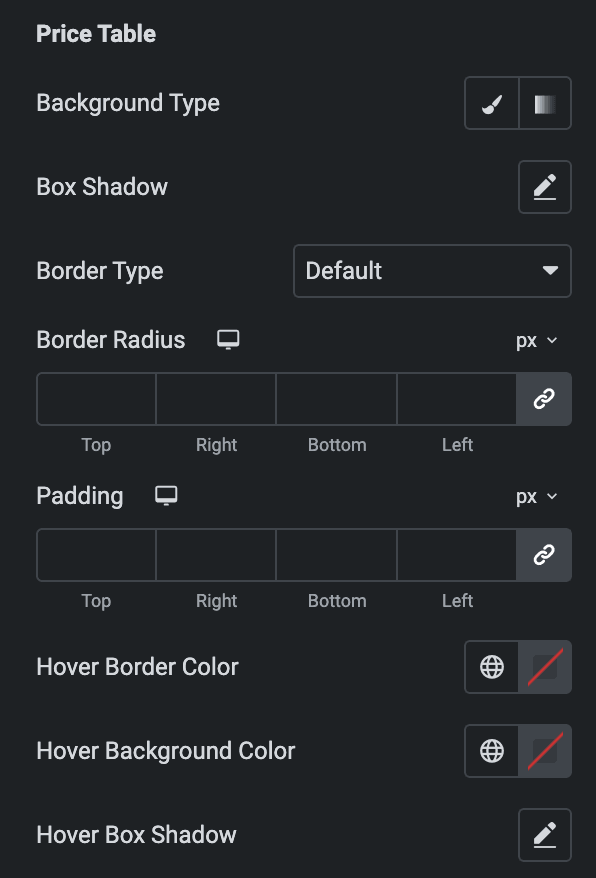
- Price Table
- Background Type: As we mentioned above, you can select either classic or gradient. Check Here.
- Box Shadow: Set the box shadow.
- Border Type: Select the border type.
- Border Radius: Set the border radius.
- Padding: Set the padding.
- Hover Border Color: Select the hover border color.
- Hover Background Color: Select the hover background color.
- Hover Box Shadow: Select the hover box shadow.
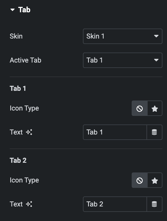
Tab
Note: This section will be only available when the “Show Tabs” option is enabled in General Section.
- Skin: Select the skin from available skin styles.
- Active Tab: Choose the tab which you want to active on load.
- Tab 1
- Icon Type: Select from icon library or upload an SVG.
- Text: Enter the text for tab 1.
- Tab 2
- Icon Type: Select from the icon library or upload an SVG.
- Text: Enter the text for tab 2.
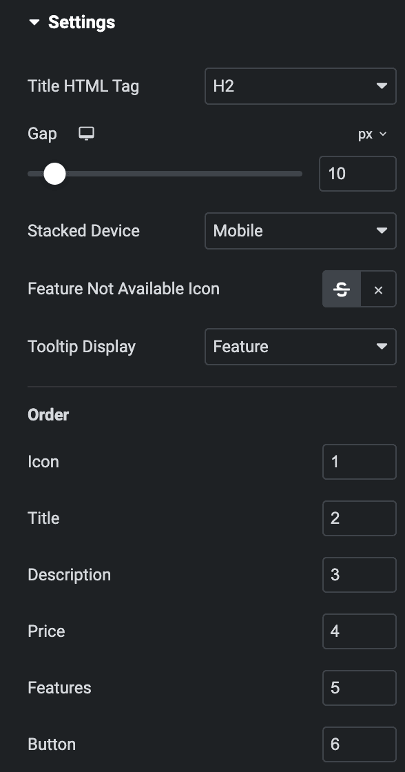
Settings
- Title HTML Tag: Select the HTML tag of the title.
- Gap: Specify the gap between the price tables.
- Stacked device: Select either Mobile or Tablet.
- Feature not available icon: Select either from Line Through(StrikeThrough) or Icon.
- Tooltip Display: Choose either “features” or “icons.” If you select “features,” the tooltip text will appear when you hover to features text; else, in icon, the tooltip will be displayed when you hover to the icon.
Order: Choose the order of displaying individual items.
Note: If any of these elements have a lower priority than others, they can be placed first on the webpage. This feature gives you greater control over the visual hierarchy of your webpage.
- Icon
- Title
- Description
- Price
- Features
- Button
Style
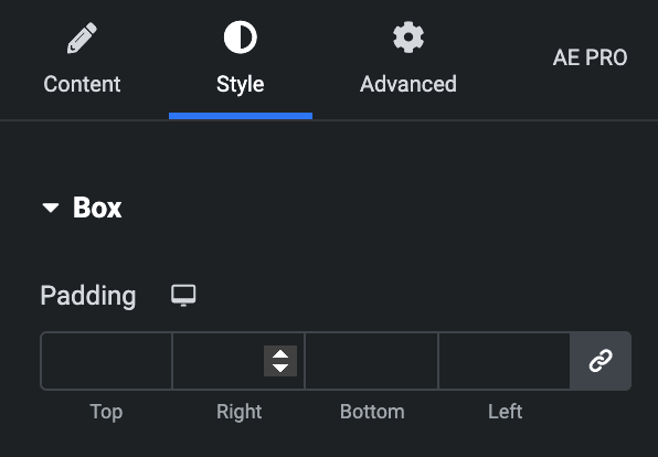
Box
- Padding: Set the padding of the box.
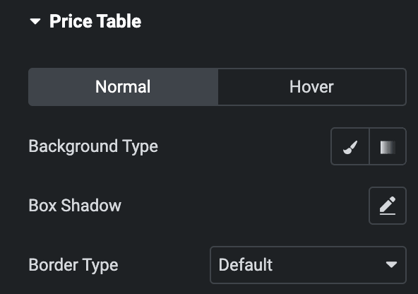
Price Table
Normal
- Background Type: As we mentioned above, you can select either classic or gradient. Check Here.
- Box Shadow: Set the box shadow.
- Border Type: Select the border type.
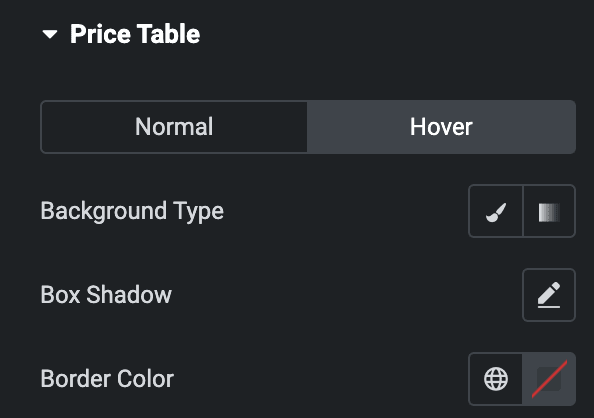
Hover
Styling controls for the hover state are available under this section. These settings will be applied when someone hovers over the price table.
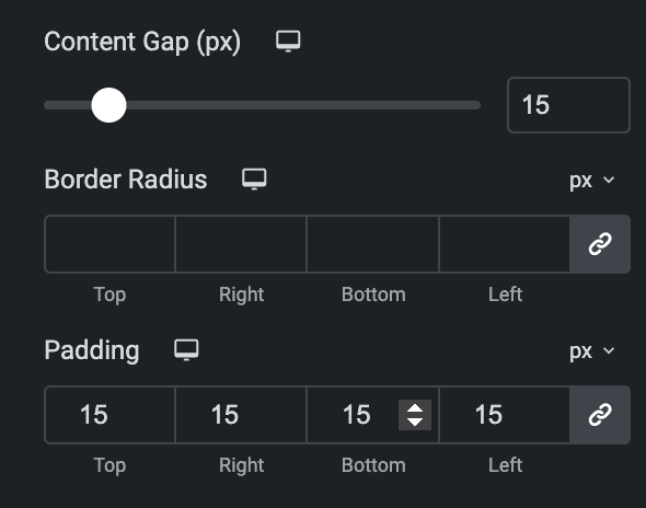
- Content Gap: Specify the gap between content in px.
- Border Radius: Set the border radius.
- Padding: Set the padding.
Content
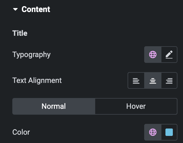
Title
- Typography: Set the typography.
- Text alignment: Select the alignment of the title.
- Normal
- Color: Select the color of the title.
- Hover
- Color: Select the hover color of the title.
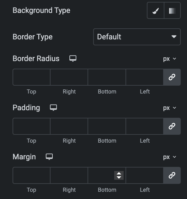
- Background Type: As we mentioned above, you can select either classic or gradient. Click Here.
- Border Type: Select the border type.
- Border Radius: Set the border radius.
- Padding: Set the padding.
- Margin: Set the margin.
Description
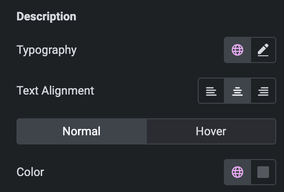
- Typography: Set the typography.
- Text alignment: Select alignment from Left, Right, or Center.
- Normal
- Color: Select the color of the description.
- Hover
- Color: Select the hover color of the description.
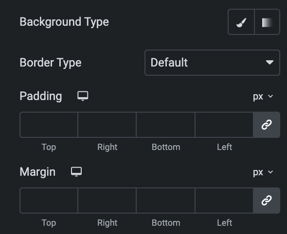
- Background Type: As we mentioned above, you can select either classic or gradient.Click Here.
- Border Type: Select the border type.
- Border Radius: Set the border radius.
- Padding: Set the padding.
- Margin: Set the margin.
Icon
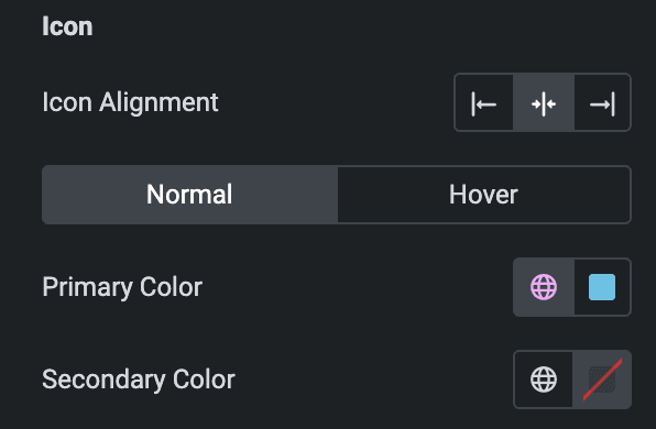
- Icon Alignment: Select the alignment of the icon.
Normal
- Primary Color: Choose the primary color for the icon.
- Secondary Color: Choose the secondary color for the icon.
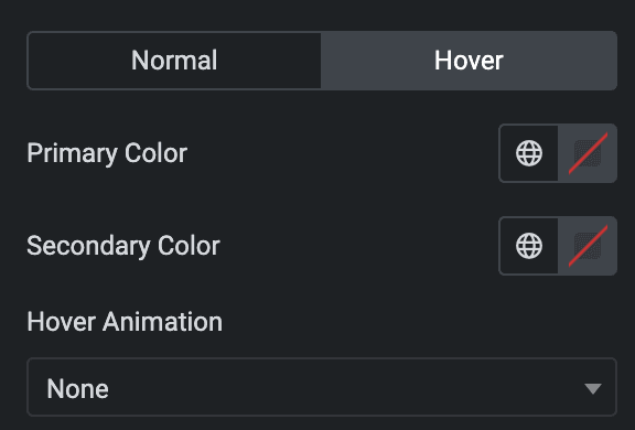
Hover
Styling controls for hover state are available under this section. These settings will be applied when someone hovers the icon.
- Size: Set the size of the Icon.
- Padding: Set the padding for the Icon.
- Rotate: Set the rotation of your Icon in degrees.
- Border Width: Set the border’s width.
- Border Radius: Set the border’s radius.
- Margin: Set the margin.

Price
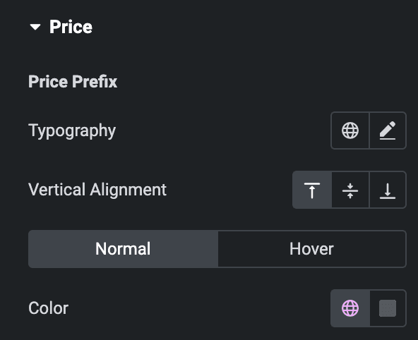
- Price Prefix
- Typography: Set the typography.
- Vertical alignment: Select the alignment.
- Normal
- Color: Select the color of the price prefix.
- Hover
- Color: Select the hover color of the price prefix.
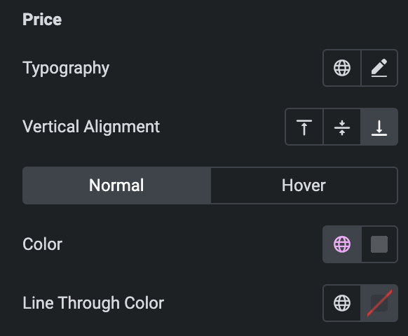
- Price
- Typography: Set the typography.
- Vertical alignment: Select the alignment.
- Normal
- Color: Select the color of the price.
- Hover
- Color: Select the hover color of the price.
- Line through color: Select the strikethrough color on the price.
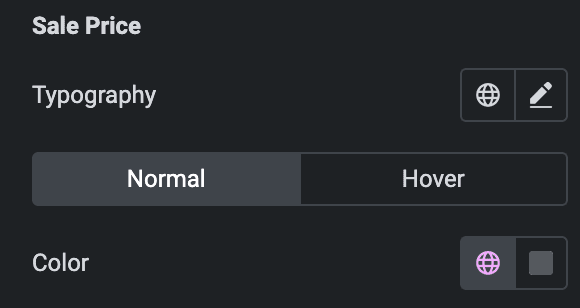
- Sale Price
- Typography: Set the typography.
- Normal
- Color: Select the color of the sale price.
- Hover
- Color: Select the hover color of the sale price.
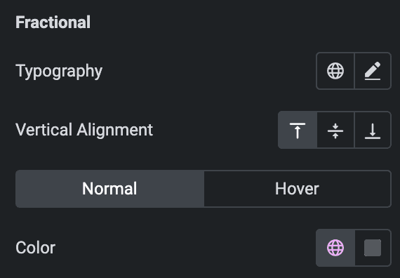
- Fractional
- Typography: Set the typography.
- Vertical alignment: Select the alignment.
- Normal
- Color: Select the color of the fractional price value.
- Hover
- Color: Select the hover color of the fractional price value.
- Duration
- Typography: Set the typography.
- Vertical alignment: Select the vertical alignment.
- Alignment: Select the alignment.
- Normal
- Color: Select the color of duration.
- Hover
- Color: Select the hover color of duration.
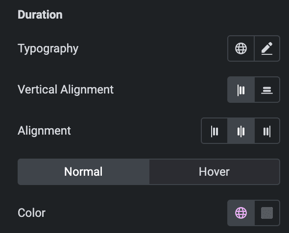
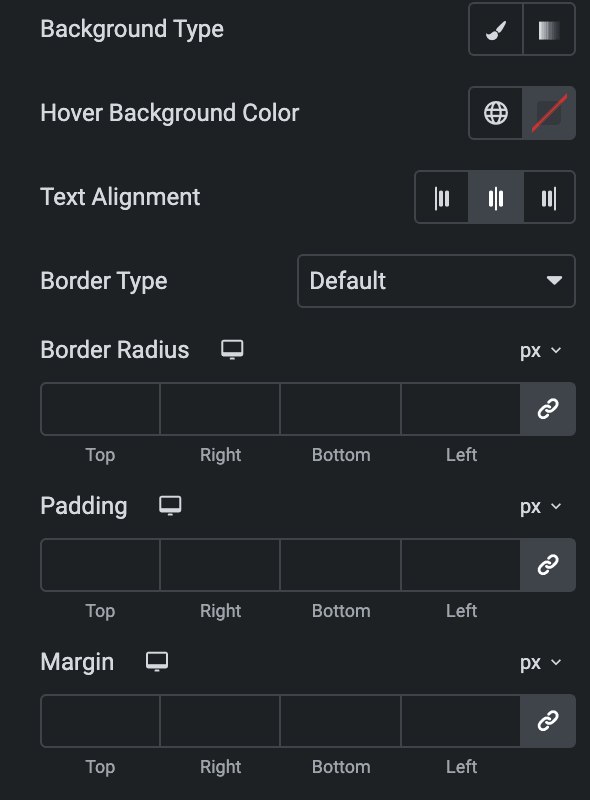
- Background Type: As we mentioned above, you can select either classic or gradient. Check Here.
- Hover Background Color: Select the hover background color.
- Text alignment: Select the alignment.
- Border Type: Select the border type.
- Border Radius: Set the border radius.
- Padding: Set the padding.
- Margin: Set the margin.
Features
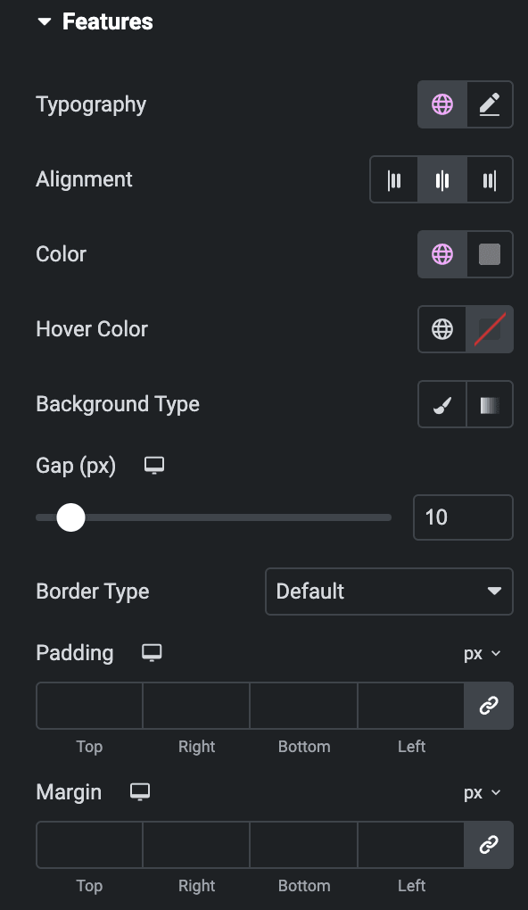
- Typography: Set the typography.
- Alignment: Select the alignment.
- Color: Select the color of the features.
- Hover Color: Select the hover color of features.
- Background Type: As we mentioned above, you can select either classic or gradient. Click Here.
- Gap: Specify the gap.
- Border Type: Select the border type.
- Padding: Set the Padding.
- Margin: Set the margin.
Icon
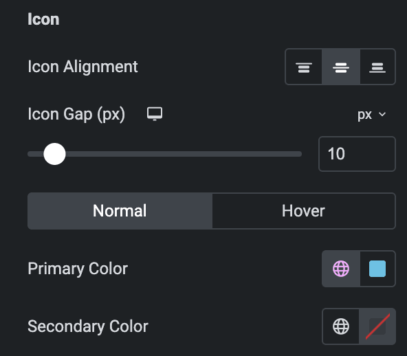
- Icon alignment: Select the alignment.
- Icon gap: Specify the gap between the features and the icon.
- Normal
- Primary Color: Choose the primary color for the icon.
- Secondary Color: Choose the secondary color for the icon.
Hover
Styling controls for the hover state are available under this section. These settings will be applied when someone hovers the icon.
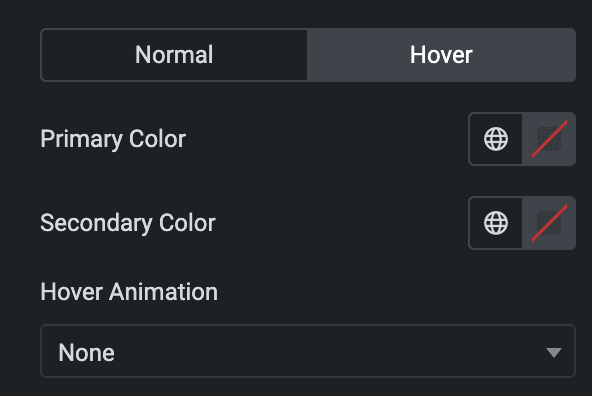
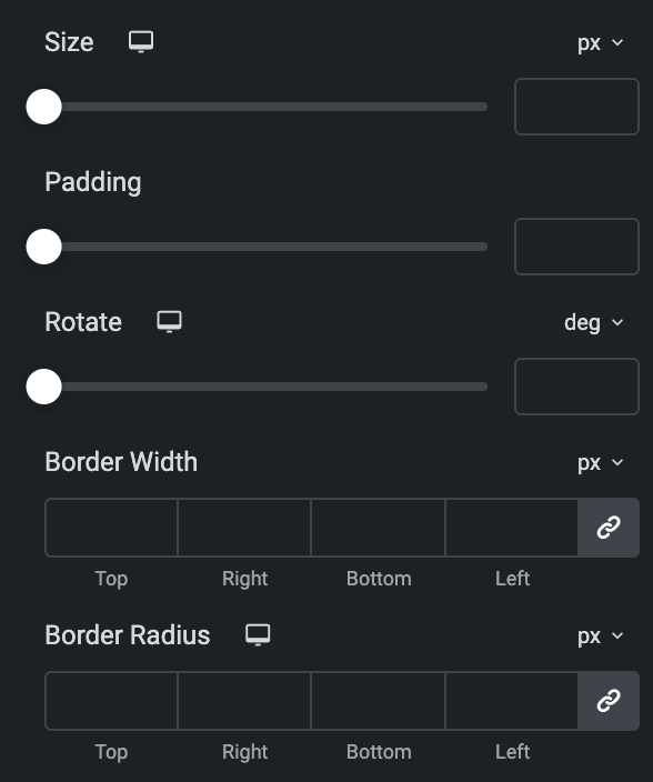
- Size: Set the size of the Icon.
- Padding: Set the padding for the Icon.
- Rotate: Set the rotation of your Icon in degrees.
- Border Width: Set the border’s width.
- Border Radius: Set the border’s radius.
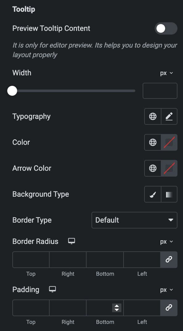
- Tooltip
- Preview Tooltip Content: Enable the option to display the tooltip preview(for editor purposes only).
- Width: Set the width of the tooltip.
- Typography: Set the typography.
- Color: Select the text color of the tooltip.
- Arrow Color: Select the arrow color.
- Background Type: As we mentioned above, you can select either classic or gradient. Click Here.
- Border Type: Select the border type.
- Border Radius: Set border radius.
- Padding: Set the padding.
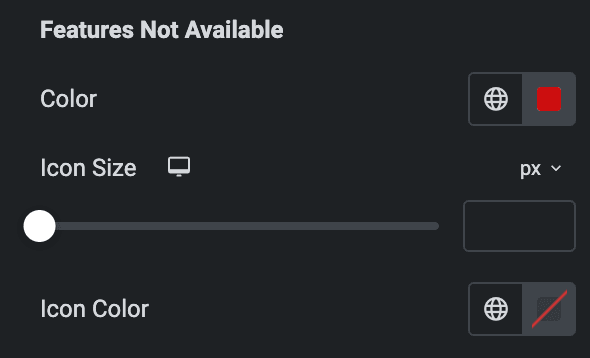
- Features Not Available
- Color: Select the color of the not available features.
- Icon Size: Set the icon size.
- Icon Color: Select the icon color.
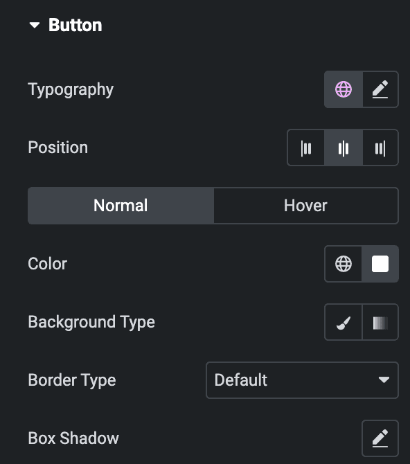
Button
- Typography: Set the typography.
- Position: Select the position of button.
- Normal
- Color: Select the text color of the button.
- Background Type: As we mentioned above, you can select either classic or gradient. Check Here.
- Border Type: Select the border type.
- Box Shadow: Set the box shadow.
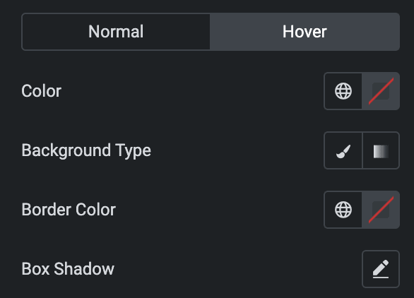
- Hover
Styling controls for the hover state are available under this section. These settings will be applied when someone hovers the button.
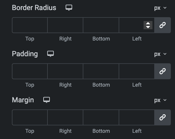
- Border Radius: Set the border radius.
- Padding: Set the padding.
- Margin: Set the margin.
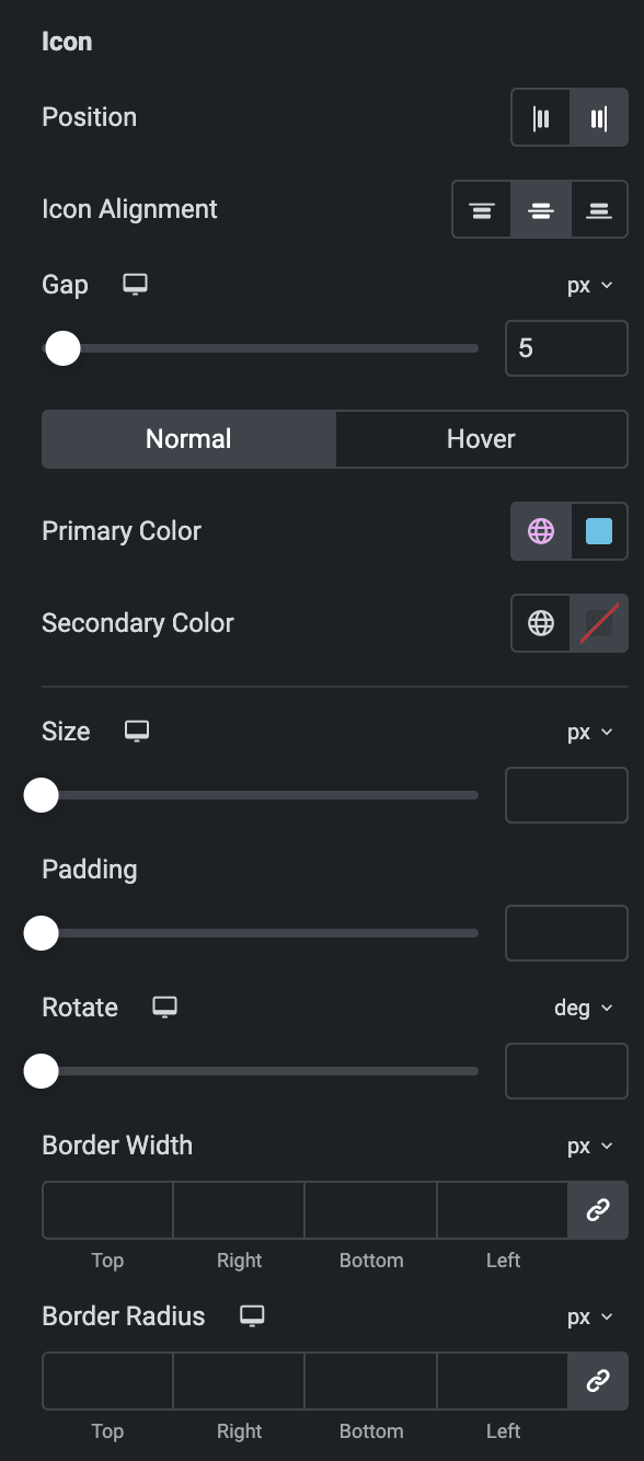
Icon
- Position: Select the position of the icon.
As we mentioned above regarding Icon styling, you can Check Here.
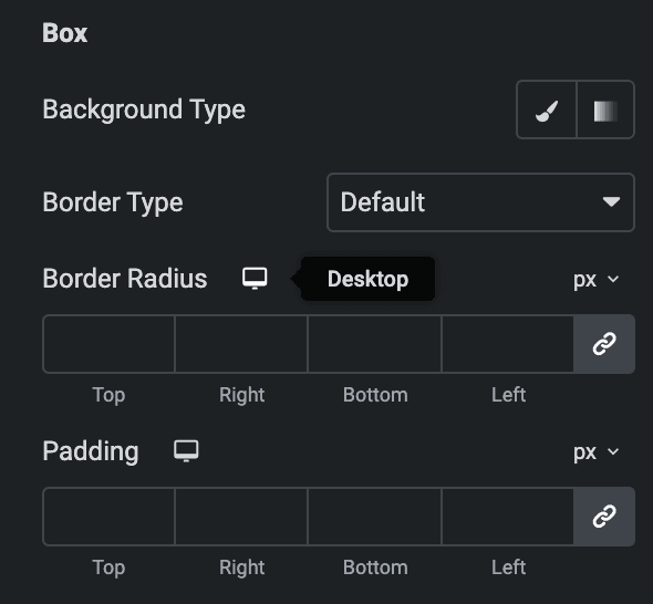
Box
- Background Type: As we mentioned above, you can select either classic or gradient. Click Here.
- Border Type: Select border type.
- Border Radius: Set border radius.
- Padding: Set the padding.
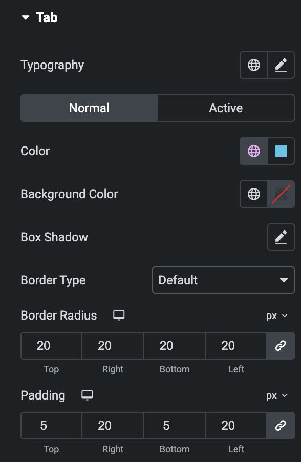
Tab
Note: This section will be only available when the “Show Tabs” option is enabled in General Section.
- Typography: Set the typography.
- Normal
- Color: Select the text color of the tab.
- Background Color: Select the background color of the tab.
- Box Shadow: Set the box shadow.
- Border Type: Set border type.
- Hover
Styling controls for the hover state are available under this section. These settings will be applied when someone hovers over the tab.
- Border Radius: Set border radius.
- Padding: Set padding.
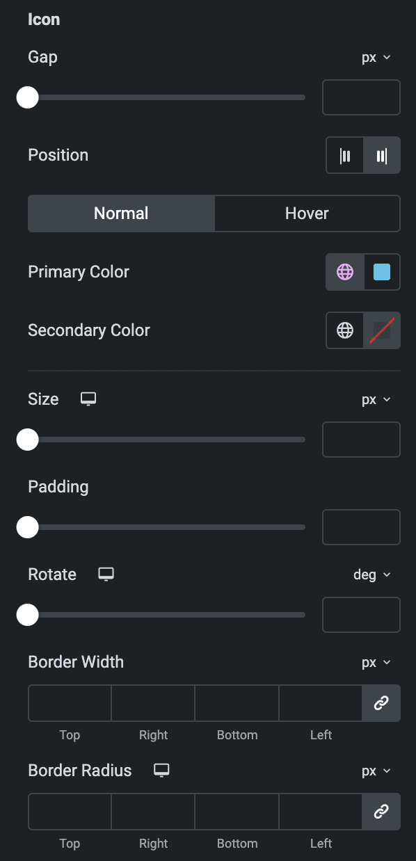
Icon
- Gap: Specify the gap between the tab icon and to text.
- Position: Select the position of the icon.
As we mentioned above regarding Icon styling, you can Check Here.
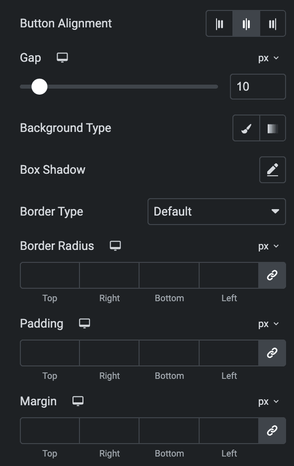
- Button alignment: Select the alignment of the button.
- Gap: Specify the gap.
- Background Type: As we mentioned above, you can select either classic or gradient. Click Here.
- Box Shadow: Set the box shadow.
- Border Type: Select border type.
- Border Radius: Set border radius.
- Padding: Set the padding.
- Margin: Set the margin.
Check out the Demo page of Advanced Price Table.

