Call To Action
This is a powerful widget for WordPress users looking to boost their marketing efforts. It lets you easily add attention-grabbing buttons throughout your website to guide visitors where you want them to go. Whether you want to showcase a special offer, highlight a featured product, or direct users to a specific page, this widget has got you covered.
With the Call to Action widget, you can create eye-catching buttons with a title, subtitle, description, and multiple buttons for redirecting users. You have the freedom to choose from different layouts and icons and even add customizable ribbons to make your call to action stand out. It’s a fantastic way to promote sales or special schemes on your website in a user-friendly and engaging manner.
The “Call To Action” widget features the following controls.
Content
Content
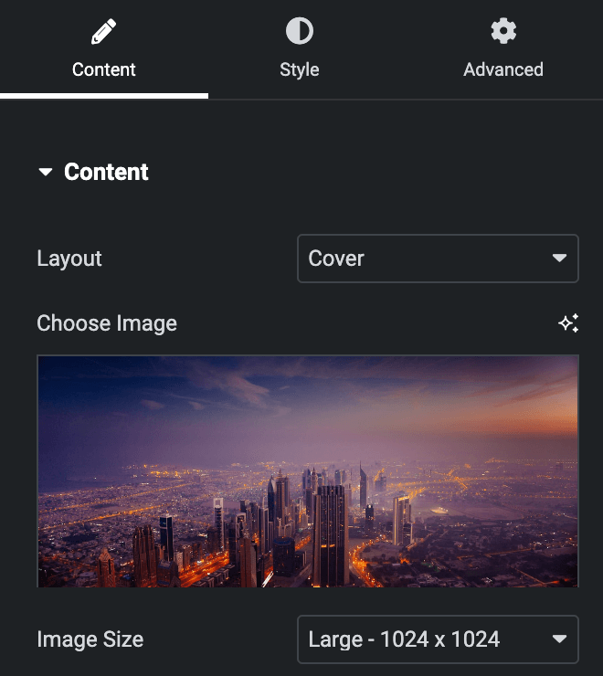
- Layout: Select from Cover or Split.
- Image Position: Select image position from Left, Right, Up, or Down(applicable for Split Layout)
- Choose Image: Upload an image.
- Image Size: Select the image size.
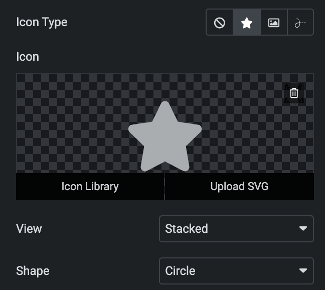
- Icon Type: Choose from a list of Icons, Images, or Lottie animations.
- Icon
- Icon: Select from the Font Awesome icon library or upload an SVG image.
- Image
- Image: Either upload an image or select a dynamic tag for display.
- Image size: Choose the size for your icon image display.
- Lottie Animation
- Source: Choose the source of the Icon by either adding an External URL or selecting a media file.
- Loop: Enable the loop option to display the animation continuously.
- Reverse: Activate the reverse option to display the animation in reverse order.
- Icon
- View: Select from default, stacked, or framed display options.
- Shape: Select either a Circle or Square shape for the stack or frame.
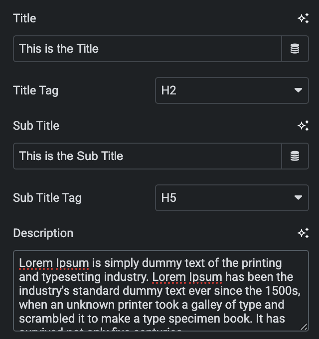
- Title: Enter the title.
- Title Tag: Select the tag for title.
- Sub Title: Enter the sub title.
- Sub Title Tag: Select the tag for sub title.
- Description: Enter the description.
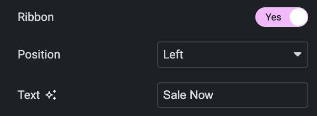
- Ribbon: Enable the option to display the ribbon.
- Position: Choose ribbon position from Left or Right.
- Text: Enter the text for a ribbon.
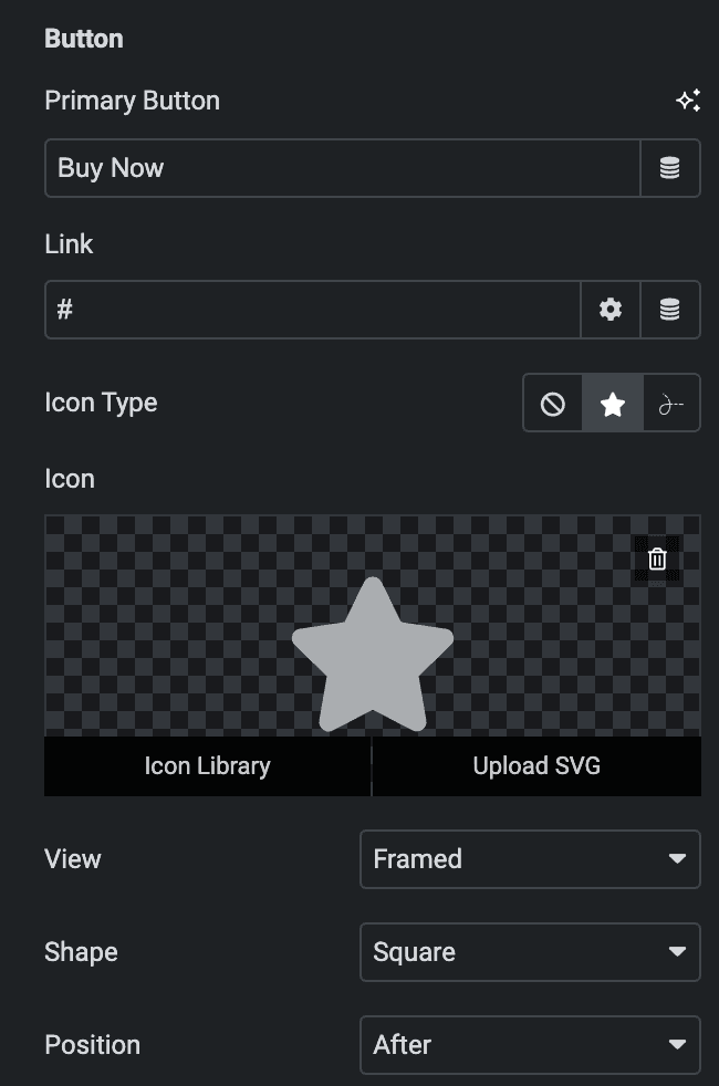
Button
- Primary Button: Enter the text for primary button.
- Link: Enter the URL to link with the button.
- Icon Type: Choose from a list of Icons, Images, or Lottie animations.
- Icon
- Icon: Select from the Font Awesome icon library or upload an SVG image.
- Lottie Animation
- Source: Choose the source of the Icon by either adding an External URL or selecting a media file.
- Loop: Enable the loop option to display the animation continuously.
- Reverse: Activate the reverse option to display the animation in reverse order.
- Icon
- View: Select from default, stacked, or framed display options.
- Shape: Select either a Circle or Square shape for the stack or frame.
- Position: Choose a position from After or Before.
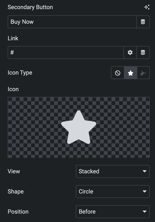
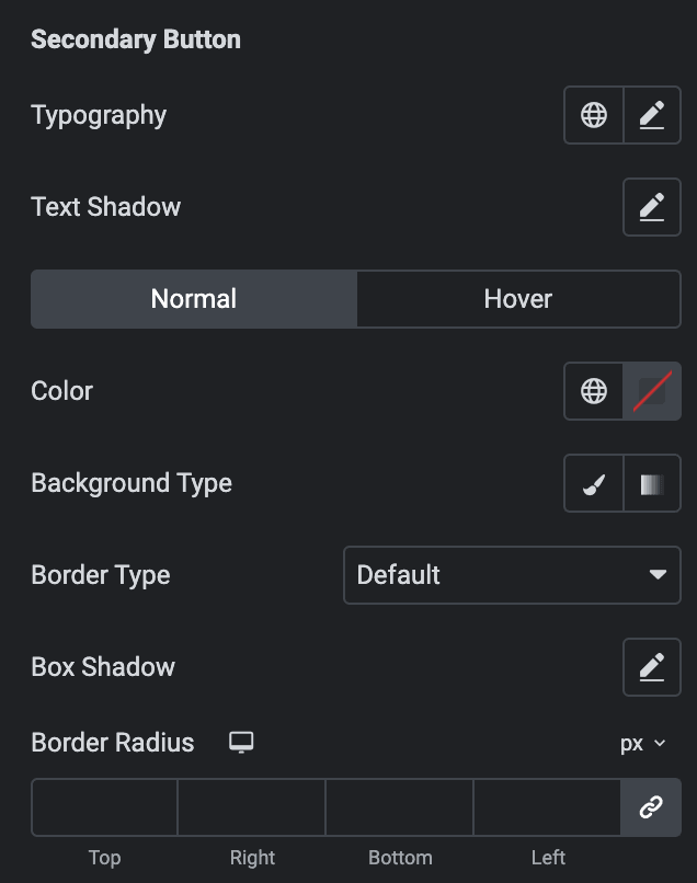
Secondary Button: As mentioned earlier, you can find the same feature settings here for your reference.
Style
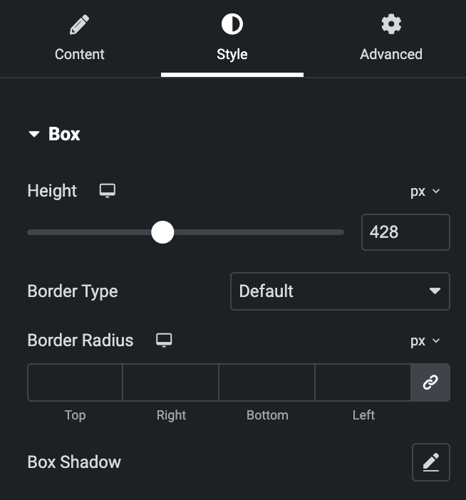
Box
- Height: Enter the height of box.
- Border Type: Select the border Type.
- Border Radius: Set the border-radius.
- Box Shadow: Set the box shadow.
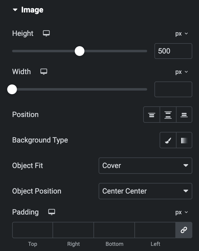
Image
- Height: Enter the height of image(applicable for Split Layout).
- Width: Enter the width of image(applicable for Split Layout).
- Position: Choose a position from the Top, Bottom, or Center(applicable for Split Layout).
- Background Type: Choose either a Classic or a Gradient.
Classic
- Color: Choose the color for the background.
- Image: Either upload an image or select a dynamic tag for display.
Gradient
- Color: Select the color for the background.
- Location: Determine the position of the color on the background by specifying their location in percentage.
- Second Color: Select the second color for the background.
- Location: Determine the position of the second color on the background by specifying their location in percentage.
- Type: Select either Radial or Linear.
- Radial
- Position: Set the position.
- Linear
- Angle: Set the angle using DEG, GRAD, RAD, and TURN.
- Radial
- Object Fit: Choose from Cover or fill.
- Object Position: Select the position.
- Padding: Set the padding.
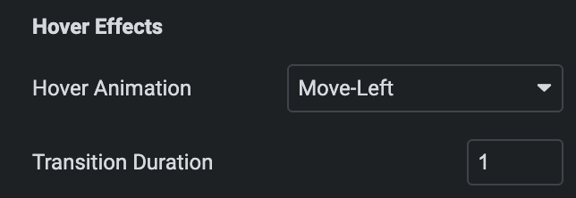
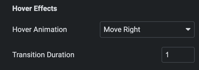
Hover Effects
- Hover Animation: Select the image animation in the hover state.
- Transition Duration: Set the transition duration.
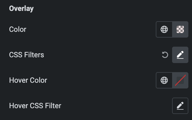
Overlay
- Color: Select the color of overlay.
- CSS Filters: Set the CSS filter property.
- Hover Color: Select the hover color of overlay.
- Hover CSS Filters: Set the CSS filter property in hover state.
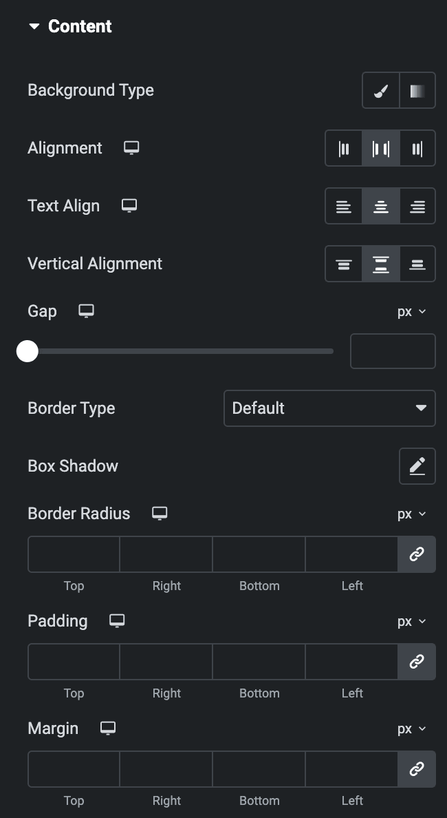
Content
- Background Type: As mentioned above, Choose either a Classic or a Gradient. Check Here.
- Alignment: Select the alignment of content.
- Text Align: Select the alignment of text.
- Vertical Alignment: Select the vertical alignment of text(applicable for Split Layout).
- Gap: Specify the gap between content.
- Border Type: Select the border type.
- Box Shadow: Set the box shadow.
- Border Radius: Set the border radius.
- Padding: Set the padding.
- Margin: Set the margin.
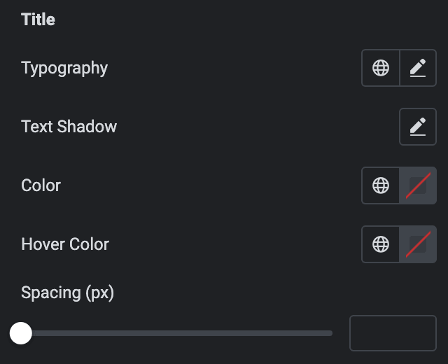
Title
- Typography: Set the typography.
- Text Shadow: Set the text shadow.
- Color: Select the color of title.
- Hover Color: Select the hover color of title.
- Spacing(px): Specify the space between title and other content.
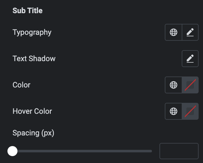
Sub Title
- Typography: Set the typography.
- Text Shadow: Set the text shadow.
- Color: Select the color of sub title.
- Hover Color: Select the hover color of sub title.
- Spacing(px): Specify the space between sub title and other content.
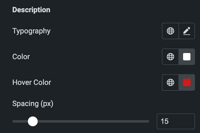
Description
- Typography: Set the typography.
- Color: Select the color of description.
- Hover Color: Select the hover color of description.
- Spacing(px): Specify the space between description and other content.
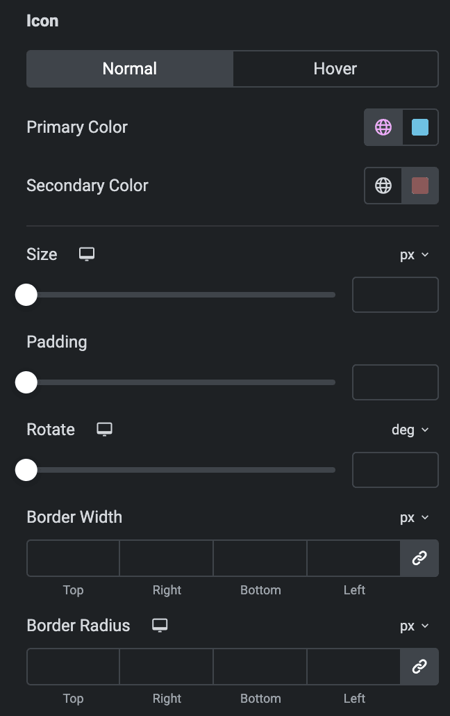
Icon
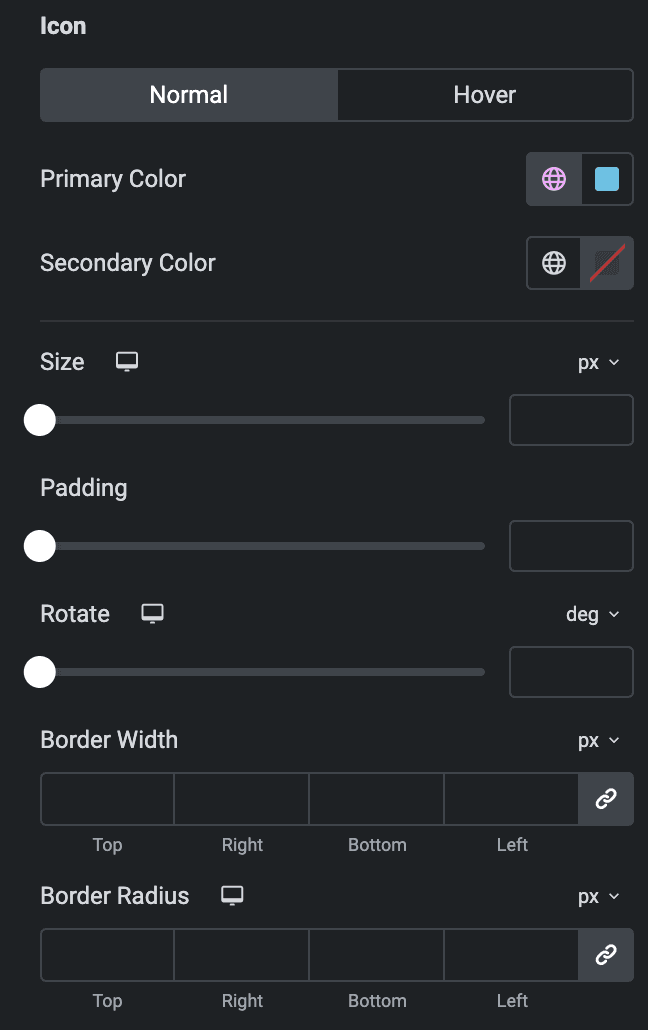
Normal
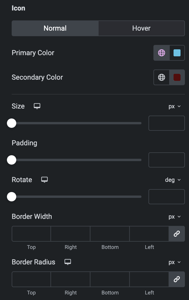
- Primary Color: Choose the primary color for the icon.
- Secondary Color: Choose the secondary color for the icon.
Hover
Styling controls for the hover state are available under this section. These settings will be applied when Someone hovers the icon.
- Size: Set the size of the Icon.
- Padding: Set the padding.
- Rotate: Set the rotation of your Icon.
- Border Width: Set the border’s width.
- Border Radius: Set the border’s radius.
Hover Effects
Note: These options are only applicable if the Cover layout is selected.
- Hover Animation: Select the hover animation of content.
- Transition Duration: Set the transition duration.
Button
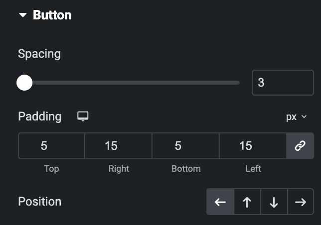
- Spacing: Specify the space between the buttons.
- Padding: Set the padding.
- Position: Choose position from Left, Up, Down, and Right.
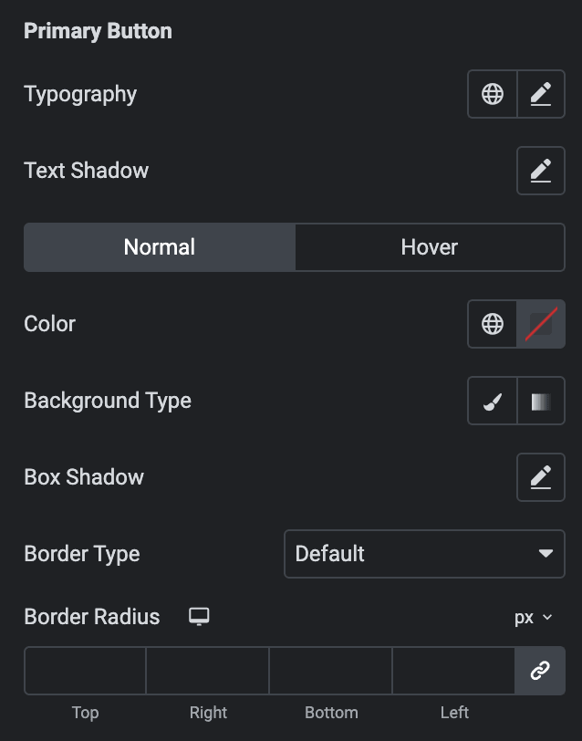
- Typography: Set the typography.
- Text Shadow: Set the text shadow.
Normal
- Color: Select the color or button.
- Background Type: As mentioned above, Choose either a Classic or a Gradient. Check Here.
- Box Shadow: Set the box shadow.
- Border Type: Select the border type.
Hover
Styling controls for the hover state are available in this section. These settings will be applied when Someone hovers the button.
- Border Radius: Set the border radius.
Icon: As we mentioned above, the styling controls the icon. Check Here.
Secondary Button: As we mentioned above, the same styling features for buttons. Check Here.
Icon: As we mentioned above, the styling controls the icon. Check Here.
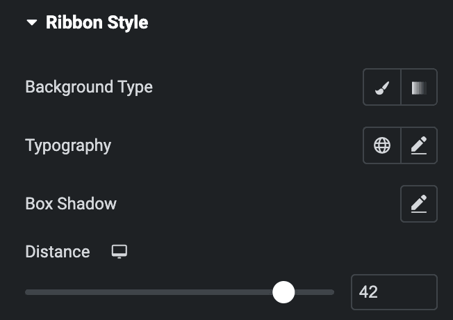
Ribbon Style
Note: These options are only applicable if the Ribbon option is enabled in the Content section.
- Background Type: As mentioned above, Choose either a Classic or a Gradient. Check Here.
- Typography: Set the typography.
- Box Shadow: Set the bpx shadow.
- Distance: Specify the distance of ribbon.
Check out the Demo page of Call To Action.
