Widgets
Content Ticker
A Content Ticker is a cool widget on a website that shows you the latest popular news and posts. It looks great with its animations and can move automatically or when you hover your mouse over it. You can easily move through the content using arrows. It’s a stylish way to stay updated with interesting information on a website.
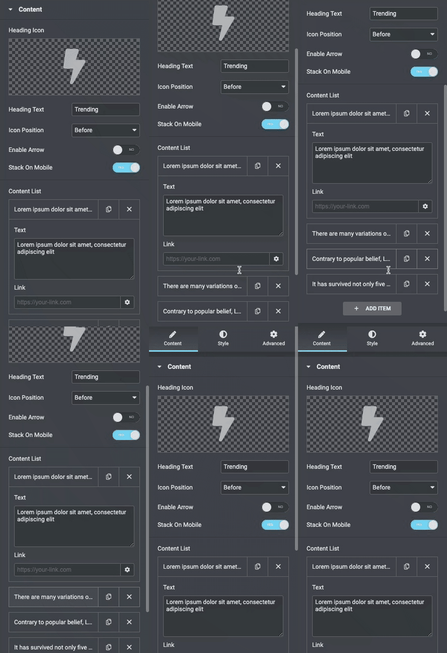
Content
Content
- Heading Icon: Set the icon for the heading of the content ticker.
- Heading Text: Enter the text for heading.
- Icon Position: Set the position either before or after the icon.
- Enable arrow: Enable next and previous arrows.
- Stack on mobile: Enable it to stack the content ticker on mobile.
Content List
- Text: Set the content of the content ticker.
- Link: Set the link of the content ticker.
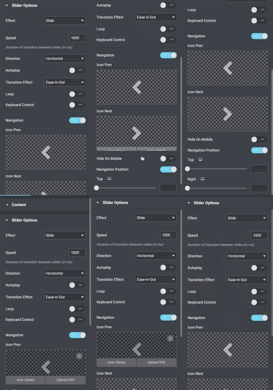
Slider Options
- Effect: Choose the effect from options available.
- Speed: Set the speed of the slider in milliseconds.
- Direction: Set the direction from horizontal or Vertical.
- Autoplay: Enable the option to autoplay.
- Duration: Set the duration.
- Transition Effect: Choose the transition from the following effects.
- Loop: Enable/Disable to give loop effect.
- Keyboard Control: Enable/Disable to show or hide.
- Navigation: Enable navigation to navigate on either slide.
- Icon Prev: Choose an icon from the options.
- Icon Next: Choose an icon from the options.
- Hide on Mobile: Enable the option to hide the navigation on mobile.
- Navigation position: Enable navigation to set position.
- Top: Set the position of the icon from the top.
- Right: Set the position of the icon from the right.
Style
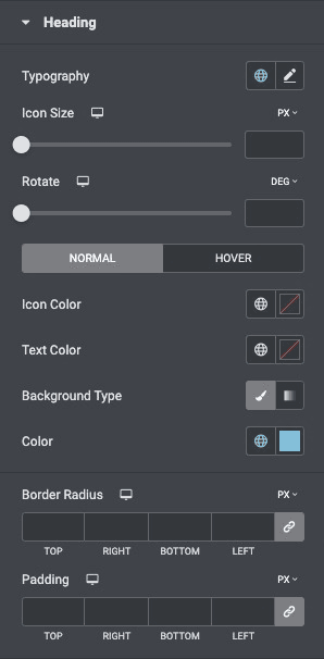
Heading
- Typography: Set the typography of the heading.
- Icon Size: Set the size of the icon.
- Rotate: Rotate the navigation in degrees.
- Icon Color: Set the color of the icon.
- Text Color: Set the color of the text.
- Color: Set the color of the heading.
- Background Type: Choose the background type of the heading.
- Border radius: Set the border radius of the heading.
- Padding: Set the padding.
Slider
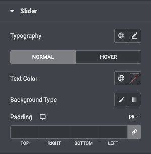
- Typography: Set the typography of the slider on normal and hover state.
- Text Color: Set the color of the text.
- Background Type: Choose the background type of the heading.
- Padding: Set the padding.
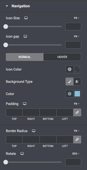
Navigation
- Icon Size: Set the size of the icon.
- Icon Gap: Increase or decrease the icon gap.
- Icon Color: Set the color of the icon.
- Background Type: Set the background for the navigation.
- Color: Set the color for the navigation.
- Padding: Set the padding of the navigation.
- Border radius: Set the border radius of navigation.
- Rotate: Rotate the navigation in degrees.
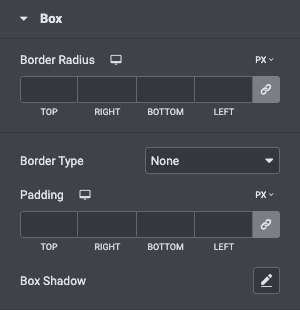
Box
- Border Radius: Set the border radius of the box.
- Border Type: Choose from the following options available.
- Padding: Set the padding.
- Box Shadow: Set the box-shadow of box.
Check out a demo page of Content Ticker.

