Coupon Code
This widget simplifies the process of copying coupon codes to the clipboard for users. It enhances your ability to convert website visitors into customers, leads, or email subscribers by creating attractive discount code pop-ups and coupon displays.
It comes in various layouts such as slide, scratch, or standard form, allowing you to choose the style that suits your website best. Whether you’re offering static or WooCommerce coupons, you can customize the layout and order of your content to fit your preferences.
Additionally, you have the flexibility to apply styling to match your website’s design. Overall, this widget streamlines the redemption process for promotions, making it easier for users to take advantage of your offers and ultimately boosting your sales and engagement.
The Coupon Code widget features the following controls.
Content
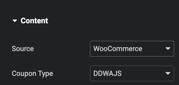
- Source: Select source from Static or WooCommerce.
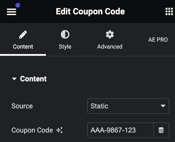
- Static
- Coupon Code: Enter the Coupon code.
- Static
Please check our detailed article on “How to create Coupons in WooCommerce”?
- WooCommerce
- Coupon Type: Select the WooCommerce coupon type.
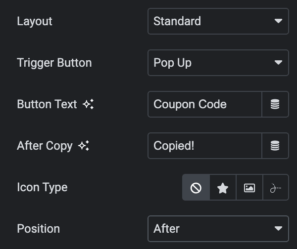
- Layout: Select layout from Standard, Scratch, or Slide.
- Standard
- Trigger Button: Select the trigger button from the click or show pop-up.
- Button Text: Enter the text for coupon code button.
- After Copy: Enter the text that will show after copying the coupon code.
- Icon Type: Choose from a list of Icons, Images, or Lottie animations.
- Icon
- Icon: Select from the Font Awesome icon library or upload an SVG image.
- Image
- Image: Either upload an image or select a dynamic tag for display.
- Image size: Choose the size for your icon image display.
- Lottie Animation
- Source: Choose the source of the Icon by either adding an External URL or selecting a media file.
- Loop: Enable the loop option to display the animation continuously.
- Reverse: Activate the reverse option to display the animation in reverse order.
- View: Select from default, stacked, or framed display options.
- Shape: Select either Circle or Square shape for the stack or frame.
- Icon
- Position: Select the position of icon from after or before.
- Standard
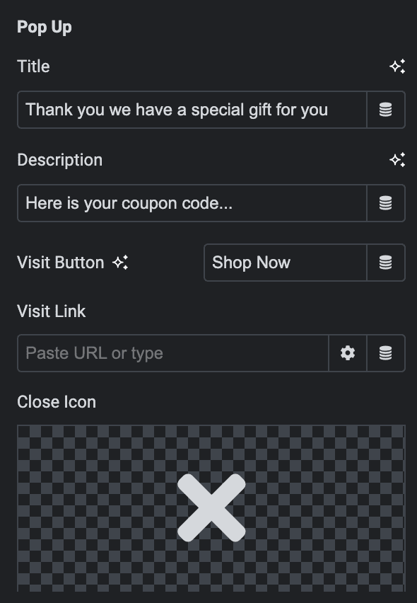
- Preview Modal: Enable the option to style back side on editor mode(applicable for scratch and slide layout).
- Show Expire Date: Enable the option to display expire date.
- Expire Date: Select the expire date.
- Expire Message: Enter the personalized expire message(To set an expiration date in a message, use “%% %%” as shown in the image below).
- Height: Specify the height of box(applicable for scratch and slide layout).
- Width: Specify the width of box(applicable for scratch and slide layout).
- Timing(ms): Specify the time to display back side.
- Show Code: Enable the option to display the code.
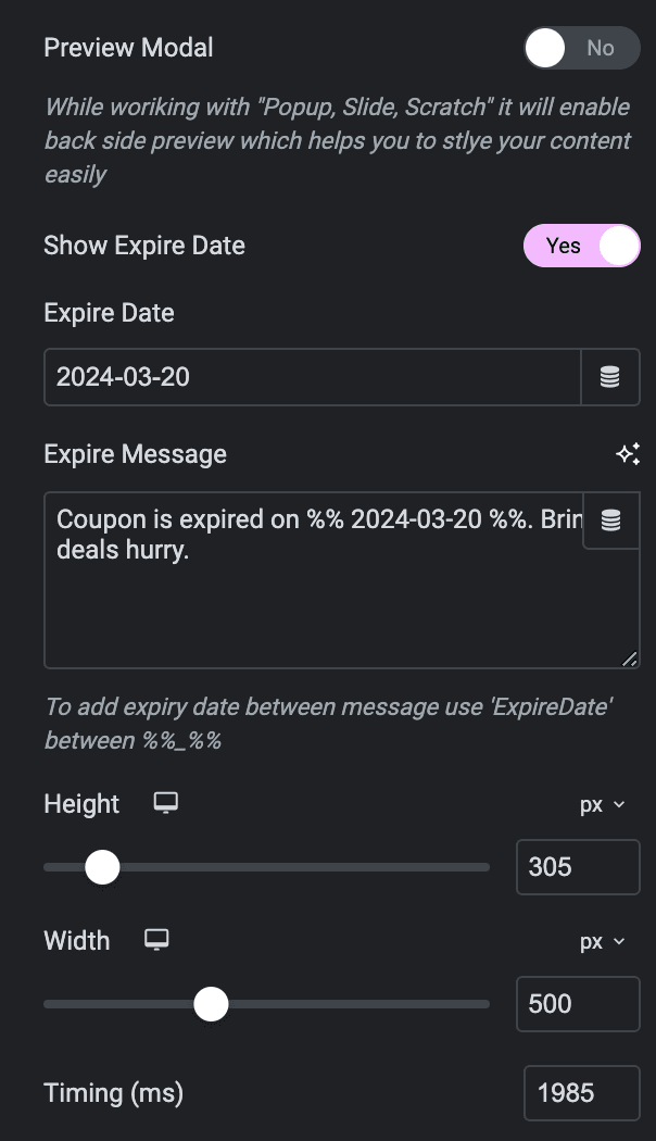
Front Slide(applicable for Slide Layout)
- Title: Enter the title for front slide.
- Description: Enter the description for front slide.
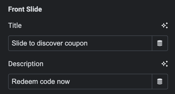
Back Slide(applicable for Slide & Scratch Layout)
- Title: Enter the title for back slide.
- Description: Enter the description for back slide.
- Copy Button: Enter the text for coupon code button.
- After Copy Button: Enter the text that will show after copying the coupon code.
- Visit Button: Enter the call to action button text.
- Visit Link: Enter the URL that will open after clicking on the button.
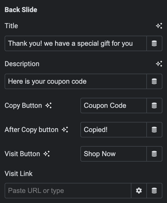
Pop Up(applicable for standard layout & Choose Pop up as Trigger)
- Title: Enter the title of popup.
- Description: Enter the description of popup.
- Visit Button: Enter the call to action button text.
- Visit Link: Enter the URL that will open after clicking on the button.
- Close Icon: Select the close button icon.
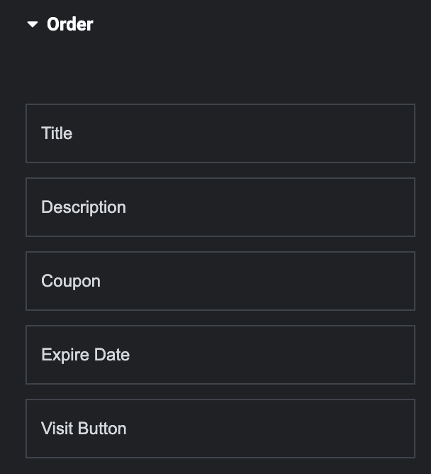
Order
Note: If you arrange these elements in a certain order while dragging and dropping them, the ones you place higher will show up first on the webpage. This helps you have more control over how your webpage looks and which elements appear more prominently.
Choose the order of displaying individual elements by drag and drop the items, such as
- Title
- Description
- Coupon
- Expire Date
- Visit Button
Style
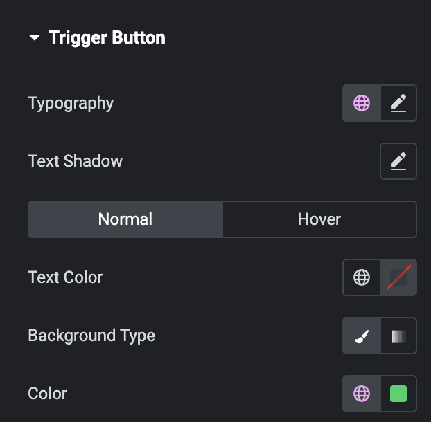
Trigger Button(applicable for Standard Layout & Pop up Trigger)
- Typography: Set the typography of trigger button.
- Text Shadow: Set the text shadow.
Normal
- Color: Select the text color of trigger button.
- Background Type: Choose either a Classic or a Gradient.
- Classic
- Color: Choose the color for the background.
- Image: Either upload an image or select a dynamic tag for display.
- Repeat: Specify the repeat pattern for the background image.
- Display size: Choose between contain, cover, and auto options, or add custom values for the background display size.
- Image Size: Choose the size of the image, from thumbnail to full.
- Position: Set the position of the background image.
- Attachment: Choose either scroll or fixed.
- Gradient
- Color: Select the color for the background.
- Location: Determine the position of the color on the background by specifying their location in percentage.
- Second Color: Select the second color for the background.
- Location: Determine the position of the second color on the background by specifying their location in percentage.
- Type: Select either Radial or Linear.
- Radial
- Position: Set the position.
- Linear
- Angle: Set the angle using DEG, GRAD, RAD, and TURN.
- Radial
- Classic
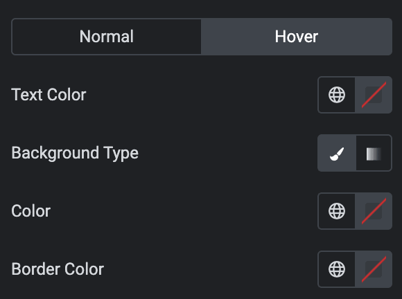
Hover
Styling controls for the hover state are available under this section. These settings will be applied when Someone hovers the button.
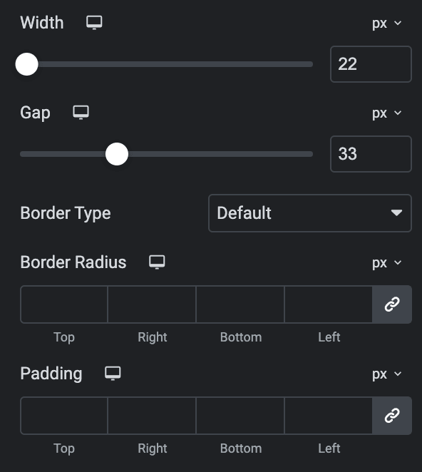
- Width: Specify the width of button.
- Gap: Specify the gap between the button text and the icon.
- Border Type: Select the border type.
- Border Radius: Set the border radius.
- Padding: Set the padding.
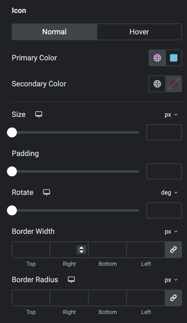
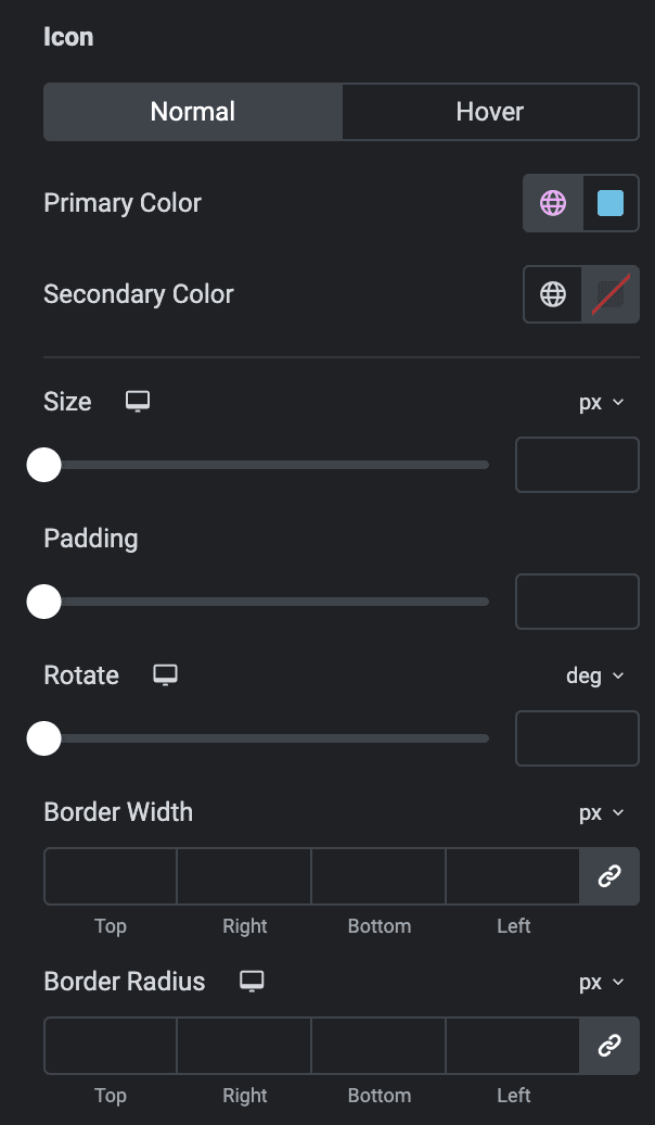
Icon
- Primary Color: Choose the primary color for the icon.
- Secondary Color: Choose the secondary color for the icon.
Hover
Styling controls for the hover state are available under this section. These settings will be applied when Someone hovers the icon.
- Size: Set the size of the Icon.
- Padding: Set the padding for the Icon.
- Rotate: Set the rotation of your Icon in degrees.
- Border Width: Set the border’s width.
- Border Radius: Set the border’s radius.
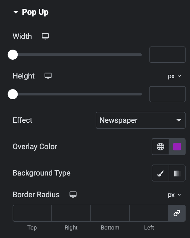
Pop Up(applicable for Standard Layout & Pop up as Trigger)
- Width: Specify the width of pop up box.
- Height: Specify the height of pop up box.
- Effect: Select the effect of pop up display.
- Overlay Color: Select the background overlay color.
- Background Type: As we mentioned above, you can select either Classic or Gradient. Click here.
- Border Radius: Set the border radius.
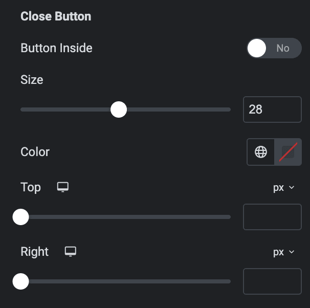
Close Button
- Button Inside: Enable the option to show the close button within the box.
- Size: Set the size of close button.
- Color: Select the color of close button.
- Top: Specify the gap from top.
- Right: Specify the gap from right.
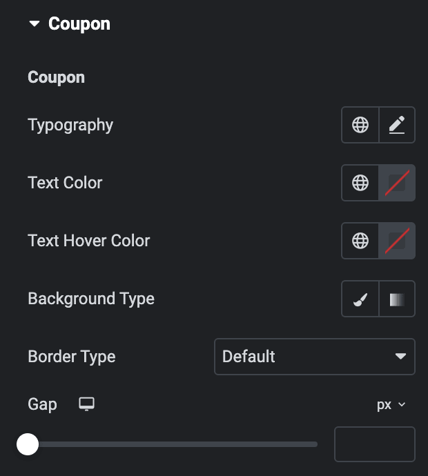
Coupon
Coupon
- Typography: Set the typography of coupon code.
- Text Color: Select the text color of coupon code.
- Text Hover Color: Select the text color of coupon code when hover state.
- Background Type: As we mentioned above, you can select either Classic or Gradient. Click here.
- Border Type: Select the border type.
- Gap: Specify the gap from coupon code to copy button.
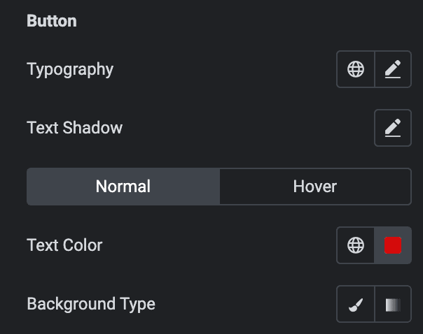
Button
- Typography: Set the typography of copy button.
- Text Shadow: Set the text shadow.
Normal
- Text Color: Select the text color of copy button.
- Background Type: As we mentioned above, you can select either Classic or Gradient. Click here.
Hover
Styling controls for the hover state are available under this section. These settings will be applied when Someone hovers the button.
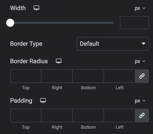
- Width: Specify the width of button.
- Border Type: Select the border type.
- Border Radius: Set border radius.
- Padding: Set the padding.
Icon
As we mentioned above, you can pick from a variety of options for how icons look. Click here.
Back
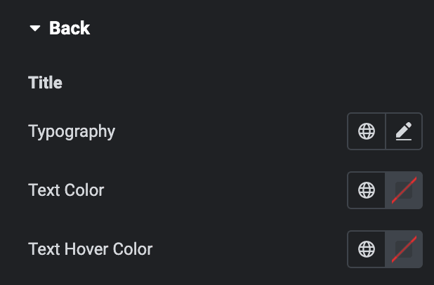
Title
- Typography: Set the typography of title.
- Text Color: Select the text color of title.
- Text Hover Color: Select the text color of title when hover state.
Description
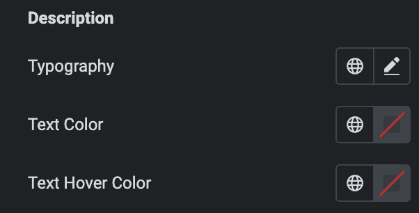
- Typography: Set the typography of description.
- Text Color: Select the text color of description.
- Text Hover Color: Select the text color of description when hover state.
Redirect Button
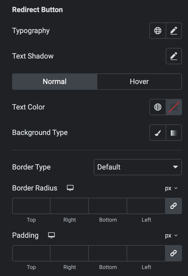
- Typography: Set the typography of redirect button.
- Text Shadow: Set the text shadow.
Normal
- Text Color: Select the text color of button.
- Background Type: As we mentioned above, you can select either Classic or Gradient. Click here.
Hover
Styling controls for the hover state are available under this section. These settings will be applied when Someone hovers the button.
- Border Type: Select the border type.
- Border Radius: Set the border radius.
- Padding: Set the padding.
Expire Date
Expire Date
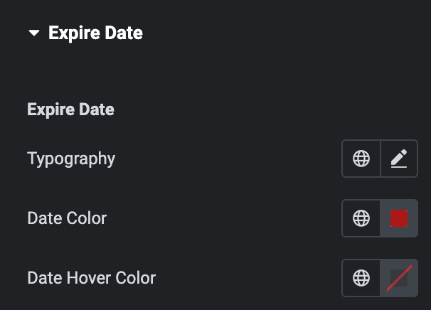
- Typography: Set the typography of expire date.
- Date Color: Select the expiration date color.
- Date Hover Color: Select the expiration date color when hover state.
Label
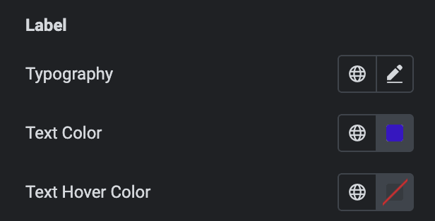
- Typography: Set the typography of expire date message.
- Text Color: Select the text color of expire date message.
- Text Hover Color: Select the text color of expire date message when hover state.
