Devices
A Devices is a handy widget for showcasing information on various types of devices, such as mobile phones, tablets, laptops, and desktop computers.
You can customize the widget by adding backgrounds from color, images, or videos sourced from popular platforms like YouTube, Vimeo, Wistia, or Self hosted videos. This enables you to enhance the visual appeal of the widget to match your preferences or branding.
Additionally, you can choose whether or not to allow scrolling within the widget, and you can add text and various types of icons, including icons and Lottie, as part of your content within the device frames.
The Devices widget features the following controls:
Content
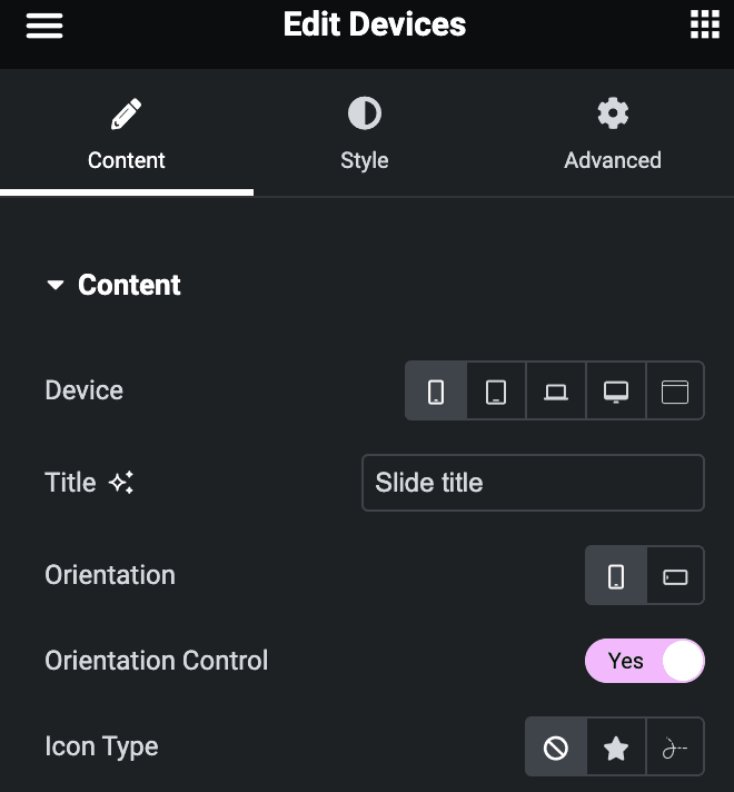
- Device: Select devices from Mobile, Tablet, Laptop, Desktop, Browser.
- Tablet Device: Select the tablet device(applicable for Tablet Device only).
- Laptop Device: Select the laptop device(applicable for Laptop Device only)
- Desktop Device: Select the desktop device(applicable for Deskto[ Device only)
- Browser Themes: Choose from Dark or Light(applicable for Browser theme Device only)
- Title: Enter the title.
- Orientation: Select orientation from Portrait or Landscape(applicable for Mobile & tablet)
- Orientation Control: Enable the option to turn on the orientation mode(applicable for Mobile & tablet).
- Icon Type: Choose an icon from Lottie or an icon.
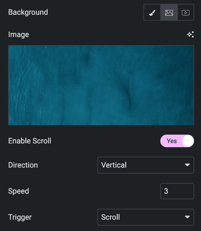
- Background: Choose a background from Color, Image, or Video.
- Color
- Color: Select the background color.
- Color

- Image
- Image: Upload a background image.
- Enable Scroll: Select the option to enable the scrolling.
- Direction: Select direction from horizontal or Vertical.
- Speed: Specify the speed.
- Trigger: Choose trigger from Hover or Scroll.
- Video
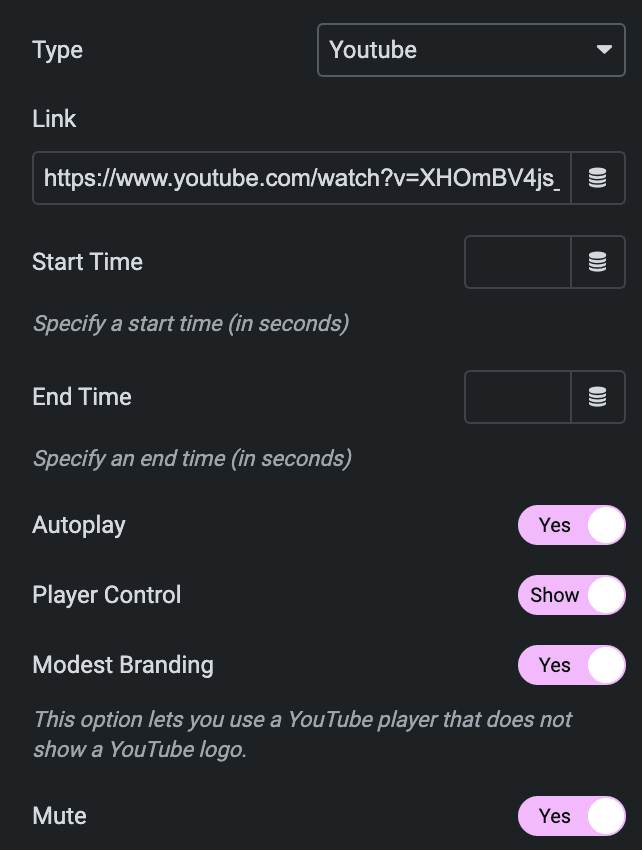
- Type: Choose from YouTube, Vimeo, Wistia, or Self-Hosted.
Youtube
- Link: Enter the YouTube video link.
- Start time: Enter the video’s start time in seconds.
- End Time: Enter the video’s end time in seconds.
- Autoplay: Enable the option to autoplay the video while onload.
- Related Videos From: Select either from the Current Video Channel or Any Random Video.
- Player Control: Enable the option to display player controls like play, pause, volume, and more.
- Modest Branding: Enable the option to disable the YouTube logo from displaying in the control bar.
- Mute: Allow the option to mute the video.
Vimeo
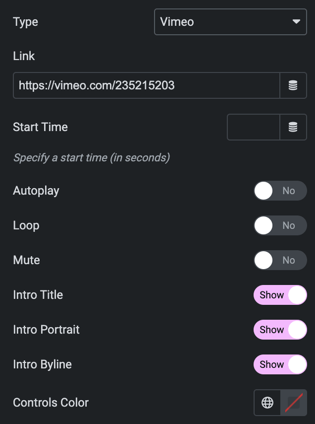
- Link: Enter the video link.
- Start time: Enter the start time of a video.
- Autoplay: Enable the option to autoplay the video while onload.
- Loop: Enable the option to play video continuously.
- Mute: Allow the option to mute the video.
- Intro Title: Display the video’s Title.
- Intro Portrait: Display author’s profile image.
- Intro Byline: Display the video’s author’s name.
- Controls Color: Select the color for video player controls.
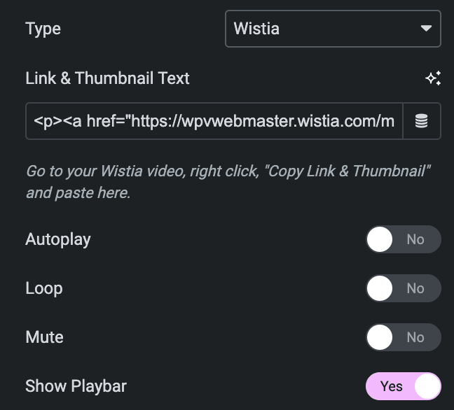
Wistia
- Link & Thumbnail Text: Enter the link and thumbnail text from the respective wistia’s video.
- Autoplay: Enable the option to autoplay the video while onload.
- Mute: Allow the option to mute the video.
- Loop: Enable the option to play video continuously.
- Show Playbar: Enable the option to display the progress bar of the video.
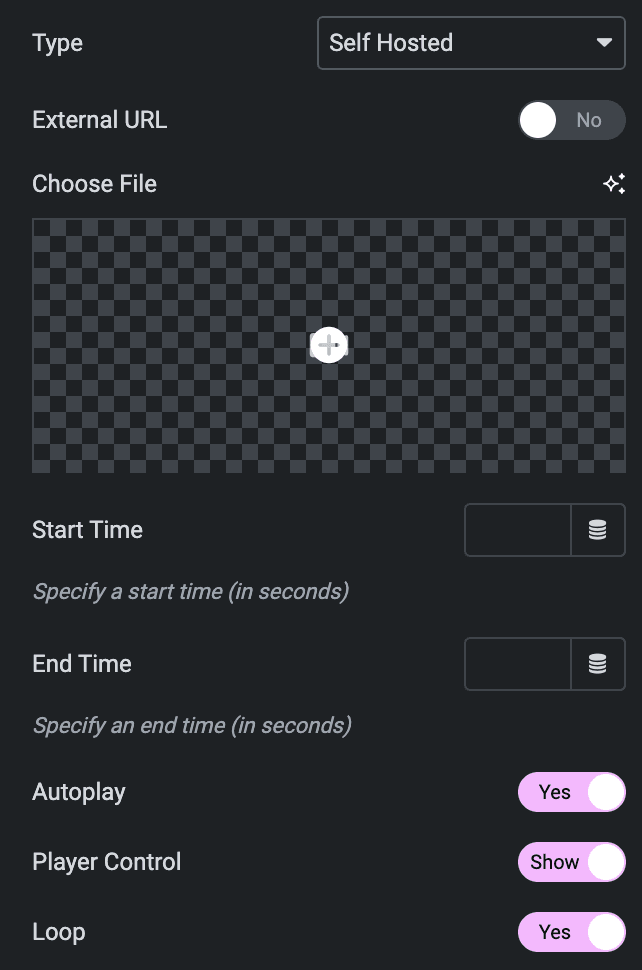
Self Hosted
- External URL: If you have an external URL of the video, you can enable this option.URL: Insert a URL of the video
- Choose File: If there is no external link to the video, you can upload the video.
- Start time: Set the start time of a video.
- End Time: Set the end time of a video.
- Autoplay: Enable the option to autoplay the video while onload.
- Player Control: Enable the option to display player controls like play, pause, volume, and more.
- Loop: Enable the option to play video continuously.
- Aspect Ratio: Select the aspect ratio.
Style
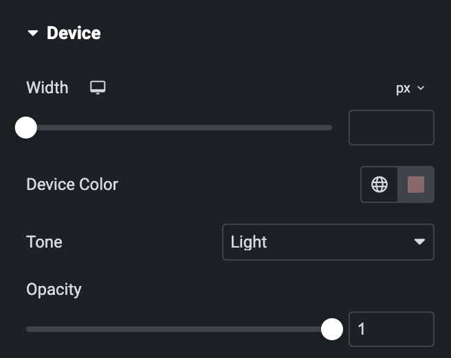
Device
- Width: Specify the width of device.
- Device Color: Select the color of device.
- Tone: Choose a tone from light or dark.
- Opacity: Specify the opacity value.
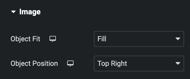
Image
Note: These options are applicable when Image is selected as background.
- Object Fit: Choose from fill, cover, or contain.
- Object Position: Select the image position.
Content
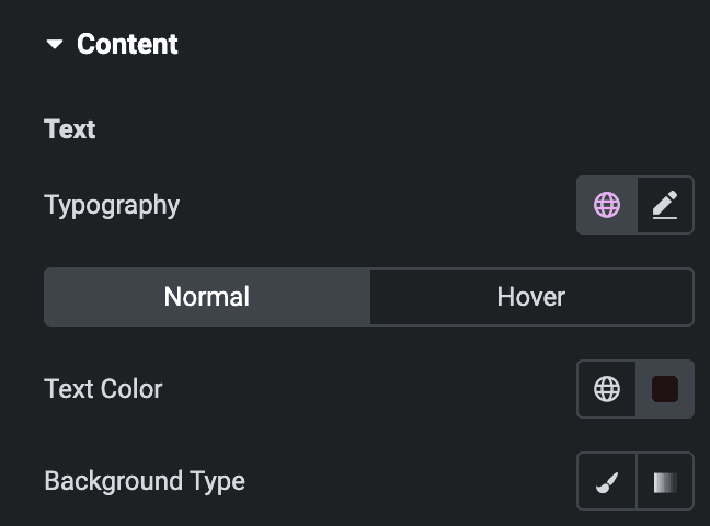
Text
- Typography: Set the typography.
Normal
- Text Color: Select the text color of text.
- Background Type: Choose from Classic or Gradient.
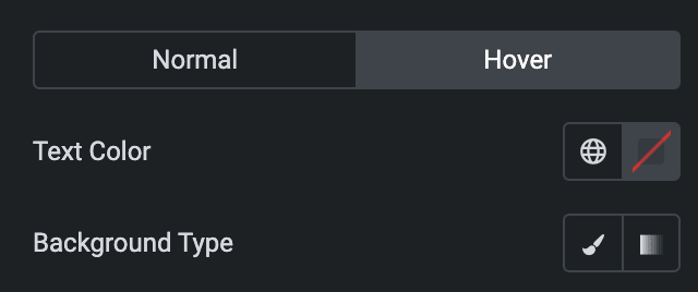
Hover
Styling controls for the hover state are available under this section. This will work when someone hovers the content.
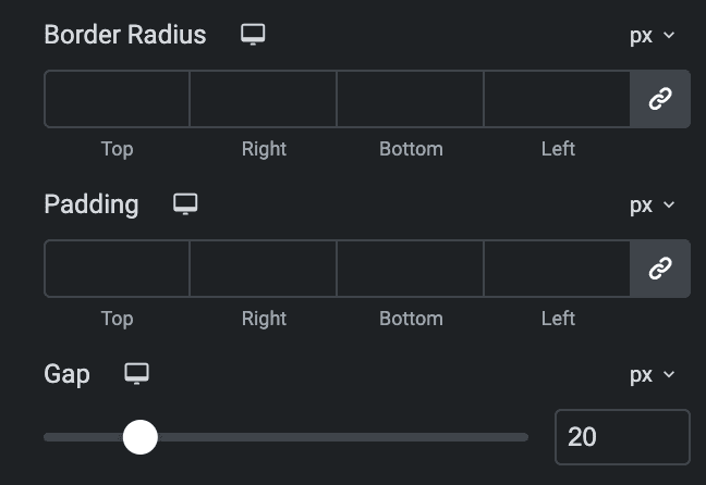
- Border Radius: Set the border radius.
- Padding: Set the padding.
- Gap: Specify the gap between content.
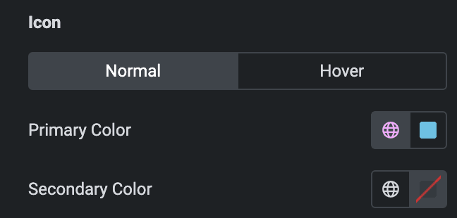
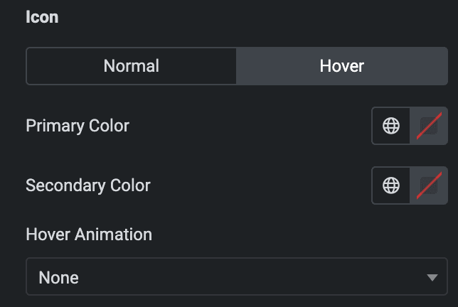
Icon
Normal
- Primary Color: Select the primary color of icon.
- Secondary Color: Select the secondary color of icon.
Hover
Styling controls for the hover state are available under this section. This will work when someone hovers the icon.
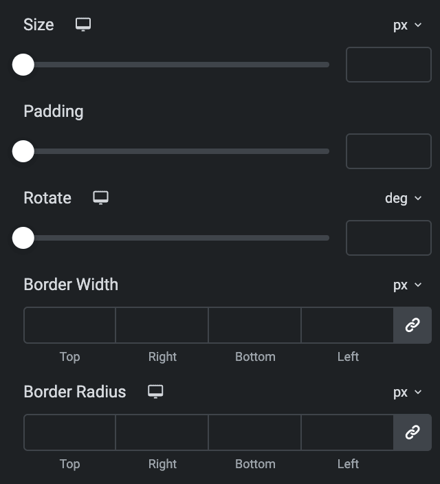
- Size: Set the size of the Icon using %, EM, REM, VW, or PX.
- Padding: Set the padding for the Icon.
- Rotate: Set the rotation of your Icon in degrees.
- Border Width: Set the border’s width using %, EM, REM, VW, or PX.
- Border Radius: Set the border’s radius using PX,%, EM, or REM.
Orientation
- Size: Specify the size of orientation.
- Color: Select the color of orientation.
Check out the Demo page of Devices.

