Widgets
Dual Button
The Dual Button widget is handy for your website. It lets you put two good-looking buttons on your page, and you can choose how they look. You can even add a personalized separator between the buttons. These buttons will make your website look cooler and more modern, and they’re a fun way for visitors to interact with your site.
Content
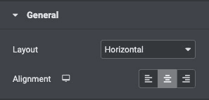
General
- Layout: Set Horizontal and Vertical layouts of the buttons.
- Alignment: Align the button to the left, center, right, or justified with its column.
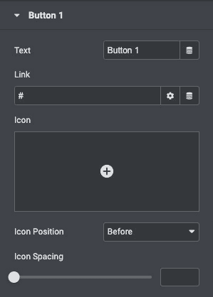
Button
- Text: Enter the button’s text.
- Link: Set the URL for the button’s link. Set the link to either open in a new window or to add nofollow to the link.
- Icon: Select a FontAwesome icon to display on the button.
- Icon Position: Set the icon before or after the button text.
- Icon Spacing: Adjust the space between the icon and the button text.
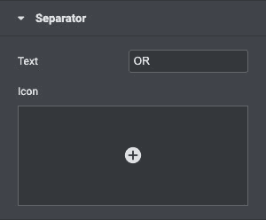
Separator
- Text: Give the connector icon text.
- Icon: Choose an icon for the separator.
Style
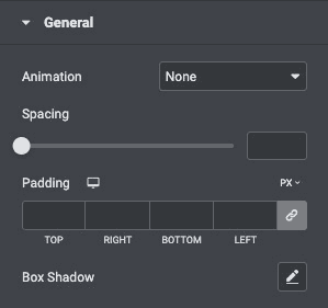
General
- Animation: Click on the Hover tab to set a Hover Animation.
- Spacing: Set the spacing between buttons.
- Padding: Change the padding settings of the button.
- Box Shadow: Set options to apply a box shadow on the button.
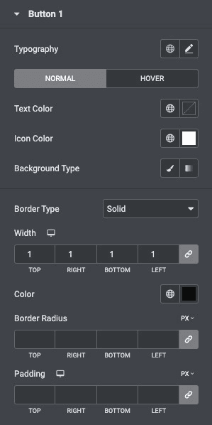
Button
- Typography: Change the default typography options for the button’s text.
- Text Color: Select the color of the button’s text.
- Icon Color: Choose a color for the icon.
- Background Type: Select the button’s color for Normal and Hover states.
- Border Type: Select the type of border to use around the button.
- Border Width: Control the thickness of the border around the button.
- Border Color: Choose the border’s color.
- Border Radius: Set the border radius to control corner roundness.
- Padding: Change the padding settings of the first button.
Separator
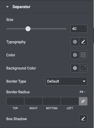
- Size: Set the size of the separator icon.
- Typography: Set the typography options for the separator text.
- Color: Choose a color for the separator icon and text.
- Background Color: Choose the background color of the separator.
- Border Type: Set the border type.
- Border Radius: Set the border radius to control corner roundness.
- Box Shadow: Set options to apply a box shadow on the button.
Check out the Demo page of Dual Button.
