Widgets
Filterable Gallery
This widget is useful for making beautiful image collections on your website. You can organize your pictures into different categories and then use clickable buttons to see specific groups. Filterable Gallery widget offers advanced options to show off your work and style your portfolios. You can even add a cool overlay effect to make your gallery more appealing. It also includes features like lightboxes for better image viewing and a masonry layout to arrange your images neatly.
Content
General
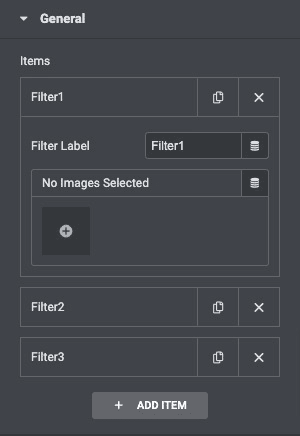
Click on the “Add Item” button to add filters. Give the filter a proper name, then add multiple images to the filter item.
- Filter Label: Enter the label to filter.
- Images: Upload an image gallery.
Settings
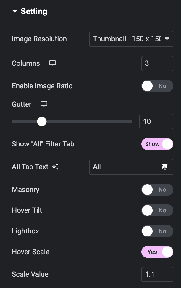
- Image Size: Set the image size from thumbnail to full , or enter a custom size.
- Columns: Set how many columns will be displayed per row from 1 to 6.
- Enable Image Ratio: Control the space between each image in a row.
- Gutter: Adjuat the gutter margin accordingly.
- Show All Filter tab: If set to Yes, enter the desired label. “All” is the default.
- All Tab Text: Enter the text that display All tab.
- Masonry: Enable it to display images seamlessly.
- Hover Tilt: Enable to get a tilted effect on hover.
- LightBox: Choose to display images in a lightbox.
- Hover Scale: Enable or disable the hovering scale.
- Scale Value: Enter the scale value.
Overlay Setting
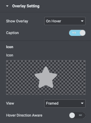
- Show Overlay: Select when the Overlay effect appears for the images like OnHover, Always, Hide on Hover, or Never.
- Caption: Hide or Show Captions.
- Icon: Select an icon to be displayed on hover.
- View: Choose the default icon view, or select Stacked or Framed.
- Hover Direction Aware: Enable the option to apply the overlay based on hover direction settings.
- Overlay Speed: Specify the overlay speed.
Style
General
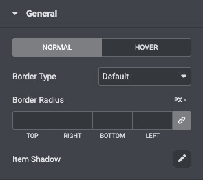
- Border Type: Choose the thickness of the border for Normal and hover state.
- Border Radius: Control the corner roundness of the image border.
- Item Shadow: Enable this option if you want to access the advanced shadow settings for the items and need to apply shadow for them.
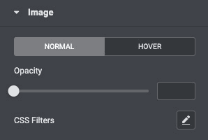
Image
- Opacity: Set the Opacity for the image.
- CSS Filters: Set CSS Filters, selecting from Blur, Brightness, Contrast, and Saturation for Normal and Hover states.
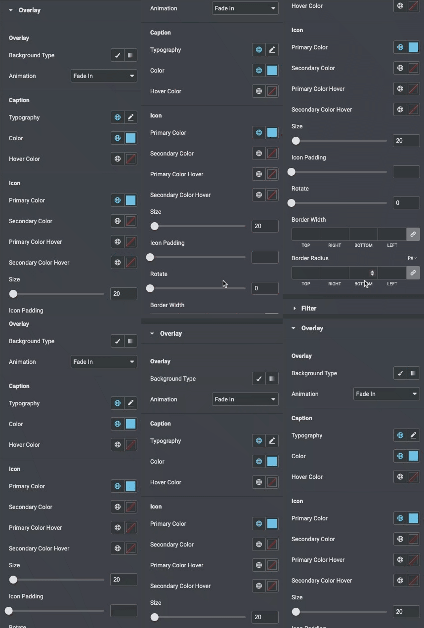
Overlay
- Background Type: Choose a classic or gradient type for the widget overlay.
- Animation: Choose the overlay’s Entrance or Exit animation upon hover.
- Color: Choose the Description’s color.
- Typography: Set the typography options for the Caption.
- Primary Color: Choose the primary color of the icon.
- Secondary Color: Choose the secondary color of the icon.
- Primary Color Hover: Choose the primary color of the icon on the hover state.
- Secondary Color Hover: Choose the secondary color of the icon on the hover state.
- Size: Choose the size of the icon.
- Icon Padding: Set the amount of padding around the icon.
- Rotate: Rotate the icon to any angle.
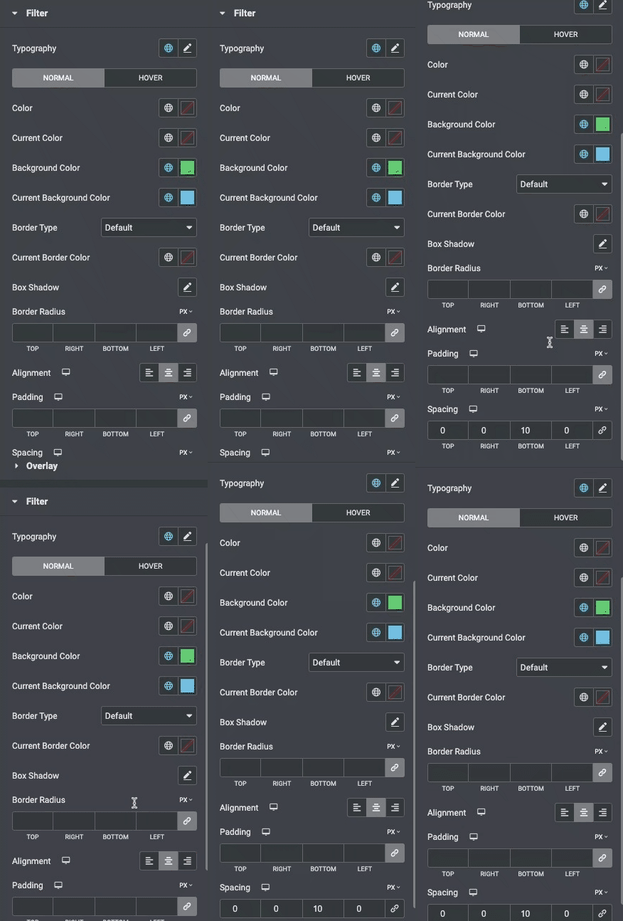
Filter
- Typography: Set the typography options for the Filter bar text.
- Color: Choose the color of the Filter bar text for Normal, Hover states.
- Current Color: Choose the color of the Filter bar text for active states.
- Background Color: Choose the background color of the Filter bar for Normal, Hover, and states.
- Current Background Color: Choose the background color of the Filter bar for active states.
- Border Type: Set the type of border, choosing from None, Solid, Double, Dotted, Dashed, or Groove.
- Curent Border Color: Choose the border color for the active item.
- Box Shadow: Set the box shadow.
- Border Radius: Set the border radius, to control corner roundness.
- Alignment: Align the bar to the left, right, or center.
- Padding: Control the amount of space between the Filter text and the gallery images.
- Spacing: Control the amount of space between Filter text items.
Check out the Demo Page of Filterable Gallery.

