Floating Element
It is a powerful widget that enhances your webpage’s visual appeal and engagement by presenting various elements in a unique and captivating manner. With this widget, you can effortlessly showcase icons, images, Lottie animations, and personalized text, allowing for a dynamic and immersive user experience.
One of the standout features of this widget is its extensive customization options, enabling you to tailor the appearance of each element to suit your specific needs. You have the flexibility to apply a range of effects, such as scaling, translating, rotating, and more, further enhancing your content’s visual impact and interactivity.
In addition, the Floating Element Widget can overlay text on images, providing a seamless way to convey information or context related to the visuals.
The “Floating Element” widget features the following controls.
Content
Floating Items
- Title: Enter the title.
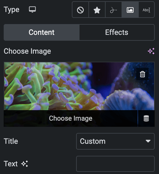
- Type: Choose an element from Icon, Lottie, Image, or Text.
Content
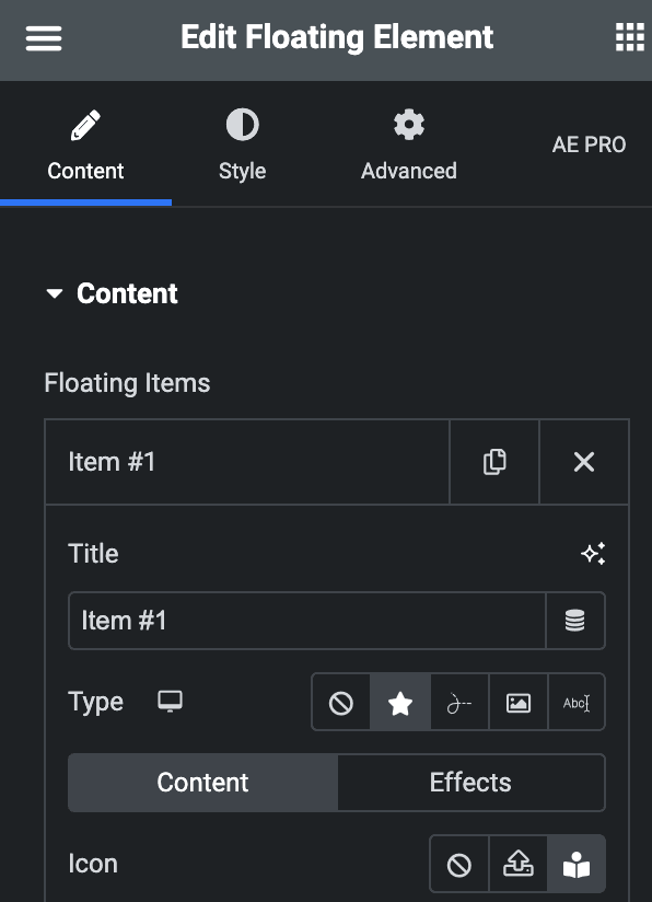
- Icon
- Icon: Either choose from icon library or upload a SVG.
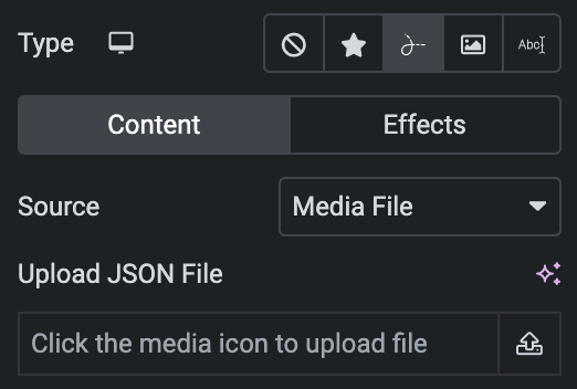
- Lottie Animation
- Source – Choose the source of the Icon by either adding an External URL or selecting a media file.
- Loop – Enable the loop option to display the animation continuously.
- Reverse – Enable the reverse option to display the animation in reverse order.
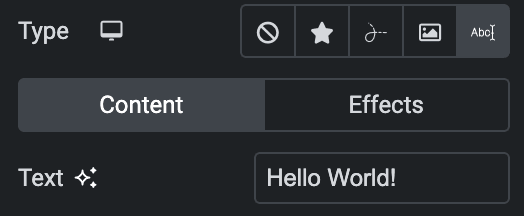
- Text
- Text: Enter the text to float.
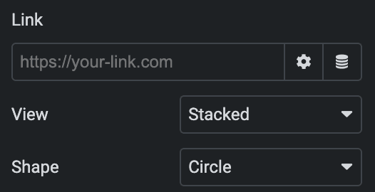
- Link: Enter the URL to link with an element.
- View – Select from default, stacked, or framed display options.
- Shape – Select either Circle or Square shape for the stack or frame view.
- Image
- Choose Image: Upload an image.
- Title: Select from title, caption, or custom text to elegantly overlay onto your image( The title and caption text will display the text that you provide when uploading the image).
- Text: Enter the text(applicable when selecting custom in the Title option).
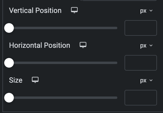
- Vertical Position: Specify the vertical position.
- Horizontal Position: Specify the horizontal position.
- Size: Specify the size.
Effects
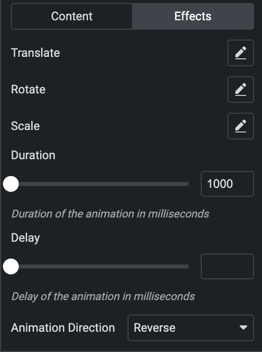
- Translate: Set up the translate properties.
- Rotate: Configure the rotation properties.
- Scale: Specify the scaling properties.
- Duration: Enter the animation duration in milliseconds.
- Delay: Specify the animation delay in milliseconds.
- Animation Direction: Select the animation direction from available options.
Settings
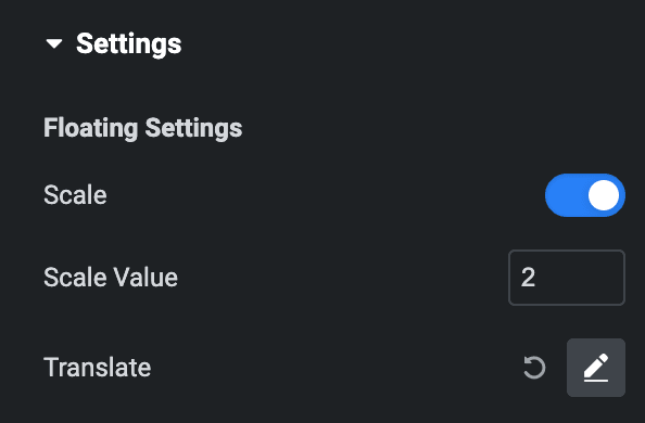
Floating Settings
- Scale: Enable the option to apply scaling.
- Scale Value: Specify the scaling value.
- Translate: Set the translate properties.
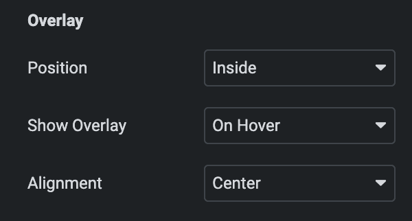
Overlay
- Position: Choose from inside or outside.
- Show Overlay: Choose the desired option for displaying overlay content(applicable if position is selected as Inside).
- Alignment: Select the alignment.
Style
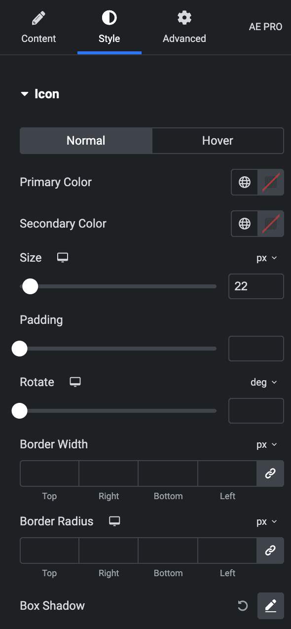
Icon
Normal
- Primary Color: Select the primary color of the icon.
- Secondary Color: Select the secondary color of the icon.
Hover
Styling controls for the hover state are available under this section. These settings will be applied when Someone hovers over the icon.
- Size: Set the size of the Icon.
- Padding: Set the padding for the Icon.
- Rotate: Set the rotation of your Icon in degrees.
- Border Width: Set the border’s width.
- Border Radius: Set the border’s radius.
- Box Shadow: Set the box shadow.
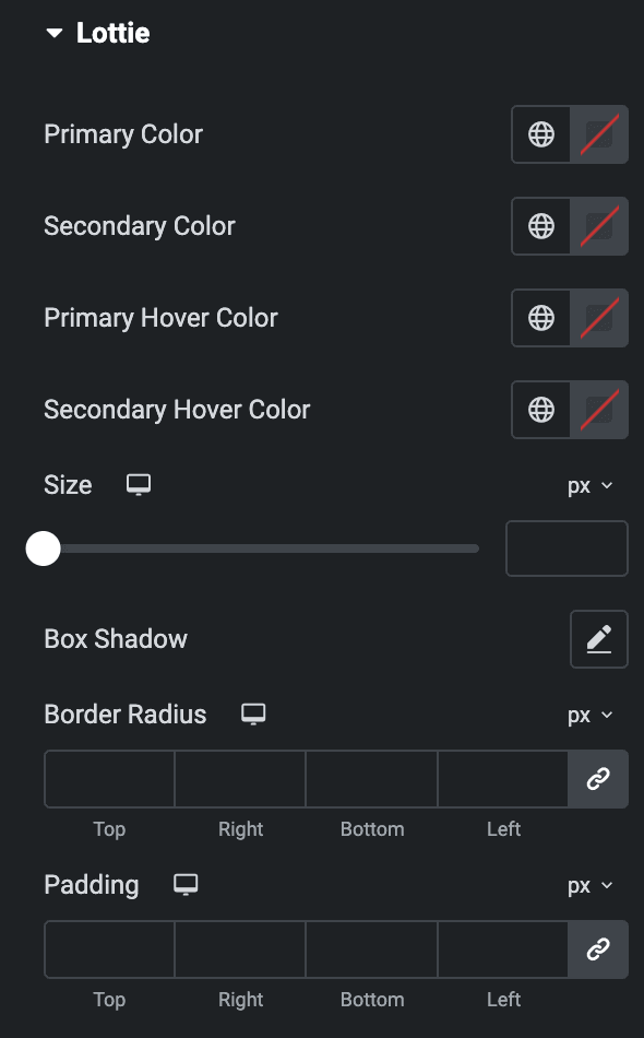
Lottie
- Primary Color: Select the primary color of Lottie.
- Secondary Color: Select the secondary color of Lottie.
- Primary Hover Color: Select the primary hover color of Lottie.
- Secondary Hover Color: Select the secondary hover color of Lottie.
- Size: Set the size of the Icon.
- Box Shadow: Set the box shadow.
- Border Radius: Set the border’s radius.
- Padding: Set the padding for the Icon.
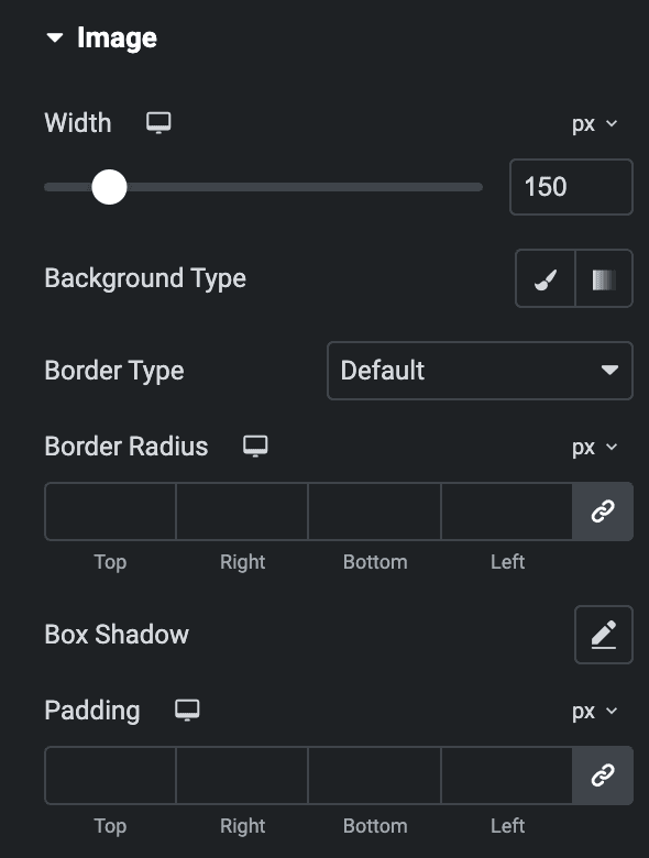
Image
- Width: Specify the width of the image.
- Background Type: Select either Classic or Gradient.
Classic
- Color: Choose the color for the background.
- Image: Either upload an image or select a dynamic tag for display.
Gradient
- Color: Select the color for the background.
- Location: Determine the position of the color on the background by specifying their location in percentage.
- Second Color: Select the second color for the background.
- Location: Determine the position of the second color on the background by specifying their location in percentage.
- Type: Select either Radial or Linear.
- Radial
- Position: Set the position.
- Linear
- Angle: Set the angle using DEG, GRAD, RAD, and TURN.
- Radial
- Type: Select either Radial or Linear.
- Border type: Select the border type.
- Border Radius: Set the border’s radius.
- Box Shadow: Set the box shadow.
- Padding: Set the padding.
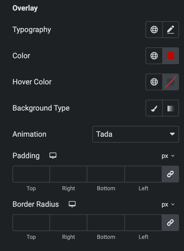
Overlay
- Typography: Set the typography.
- Color: Select the color of overlay content.
- Hover Color: Select the hover color of overlay content.
- Background Type: As we mentioned above, you can select either classic or gradient. Click Here.
- Animation: Select the animation.
- Padding: Set the padding.
- Border Radius: Set the border radius properties.
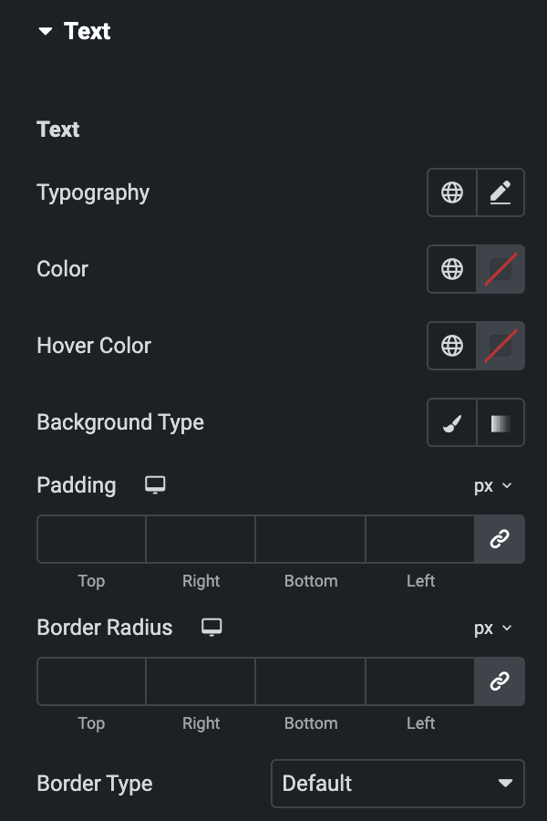
Text
- Typography: Set the typography.
- Color: Select the color of overlay content.
- Hover Color: Select the hover color of overlay content.
- Background Type: As we mentioned above, you can select either Classic or Gradient. Click Here.
- Padding: Set the padding.
- Border Radius: Set the border radius properties.
- Border Type: Select the border type.
Check out the Demo page of Floating Element.

