Image Hotspot
An Image Hotspot is like a special widget for images that lets you add hidden information. It’s like having small notes or messages attached to different parts of the image. When you move your mouse over these messages or click on them, they pop up and show you more details.
This widget is really versatile. You can decide how these messages appear, like when you move your mouse over them or when you click on them. You can also make them look better by adding icons or images to them.
You can use images, icons, or even Lottie as markers, and they can have cool animations, too. You can even put buttons on the tooltip that you can click on to do something, and if you want to hide the tooltip, you can add a “close” button. It’s a stylish and useful way to share extra information with people using pictures.
The Image Hotspot widget features the following controls.
Content
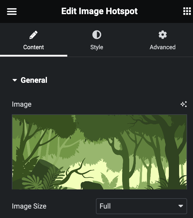
General
- Image: Upload the image.
- Image Size: Select the image size.
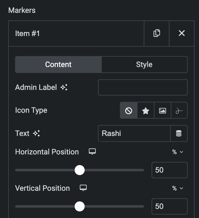
Markers
Content
- Admin Label: Enter the label.
- Icon Type: Choose from Icon, Lottie, or Image.
- Text: Enter the text.
- Vertical Position: Enter the vertical position.
- Horizontal Position: Enter the horizontal position.
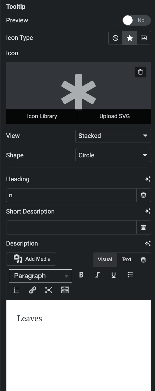
Tooltip
- Preview: Enable the option to preview the tooltip in editor mode.
- Icon Type: Choose from Image or Icon.
- Heading: Enter the heading of tooltip.
- Short Description: Enter the short description of tooltip.
- Description: Enter the description of tooltip.
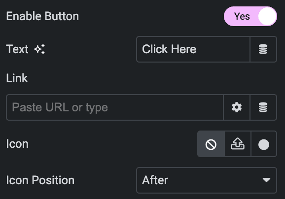
- Enable Button: Activate the option to display the button in tooltip.
- Text: Enter the button text.
- Link: Enter the URL to link with button.
- Icon: Select the icon for button.
- Icon Position: Choose icon position from Before or After the text.
Style(for individual item)
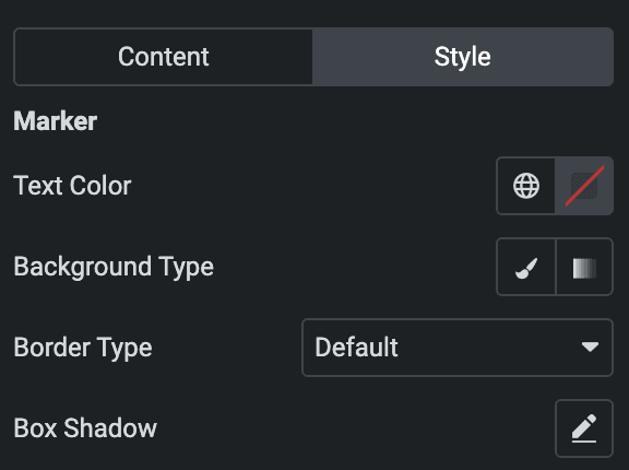
Marker
- Text Color: Select the text color of marker.
- Background Type: Select from classic or gradient.
- Border Type: Select the border type.
- Box Shadow: Set the box shadow.
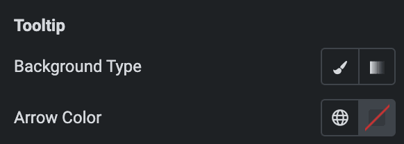
Tooltip
- Background Type: Select from classic or gradient.
- Arrow Color: Select the color of tooltip arrow.
Content Background
- Background Type: Select from classic or gradient.

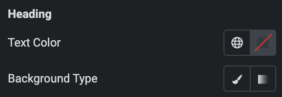
Heading
- Text Color: Select the text color of heading.
- Background Type: Select from classic or gradient.
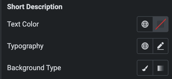
Short Description
- Text Color: Select the text color of short description.
- Typography: Set the typography.
- Background Type: Select from classic or gradient.
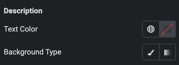
Description
- Text Color: Select the text color of description.
- Background Type: Select from classic or gradient.
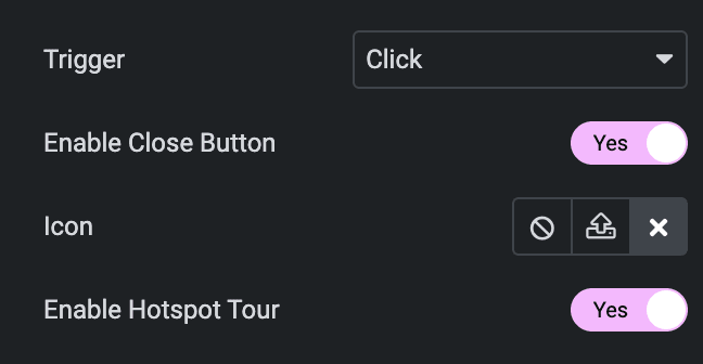
Note: When you choose ‘hover‘ as the Trigger option, the button, close button, and Hotspot tour in the tooltip won’t work.
- Trigger: Select the trigger option from Hover or Click.
- Enable Close Button: Select the option to display the close button.
- Icon: Select the close button icon.
- Enable Hotspot Tour: Select the option to display the Hotspot tour.
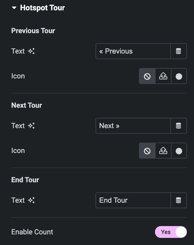
Hotspot Tour
Note: These options are only applicable when the Hotspot Tour option is enabled.
Previous Tour
- Text: Enter the text of previous tour.
- Icon: Select the icon of previous tour.
Next Tour
- Text: Enter the text of next tour.
- Icon: Select the icon of next tour.
End Tour
- Text: Enter the text of end tour.
- Enable Count: Enable the option to display count.
Style
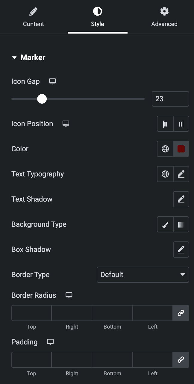
Marker
- Icon Gap: Specify the gap between marker’s text and icon.
- Icon Position: Select position from left or right.
- Color: Select the color of text.
- Text Typography: Set the typography.
- Text Shadow: Set the text shadow.
- Background Type: Select from classic or gradient.
- Box Shadow: Set the box shadow.
- Border Type: Select the border type.
- Border Radius: Set the border radius.
- Padding: Set the padding.
Icon
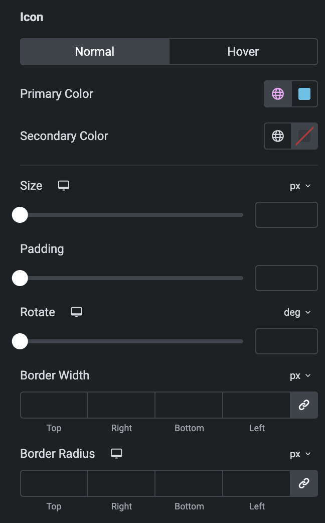
Normal
- Primary Color: Select the primary color of icon.
- Secondary Color: Select the secondary color of icon.
Hover
Styling controls for hover state are under this section. This will be applied when someone hovers the icon.
- Size: Specify the size of icon.
- Padding: Set the padding.
- Rotate: Set the rotation.
- Border Width: Specify the width of border.
- Border Radius: Set the border radius.
Animation
- Animation: Select the animation of markers.

Tooltip
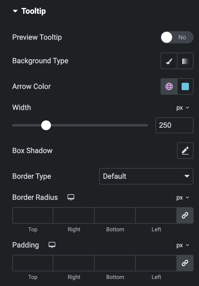
- Preview Tooltip: Enable the option to preview the tooltip in editor.
- Background Type: Choose from classic or gradient.
- Arrow Color: Select the arrow color.
- Width: Specify the width.
- Box Shadow: Set the box shadow.
- Border Type: Select the border type.
- Border Radius: Set the border radius.
- Padding: Set the padding.
Image/Icon
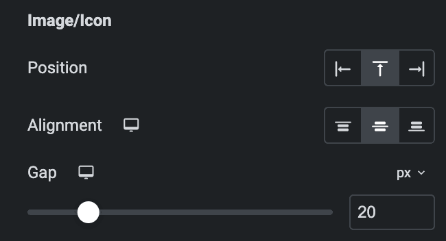
- Position: Select position from left, right, or top.
- Alignment: Select alignment from start, center, or end.
- Gap: Specify the gap between icon and text.
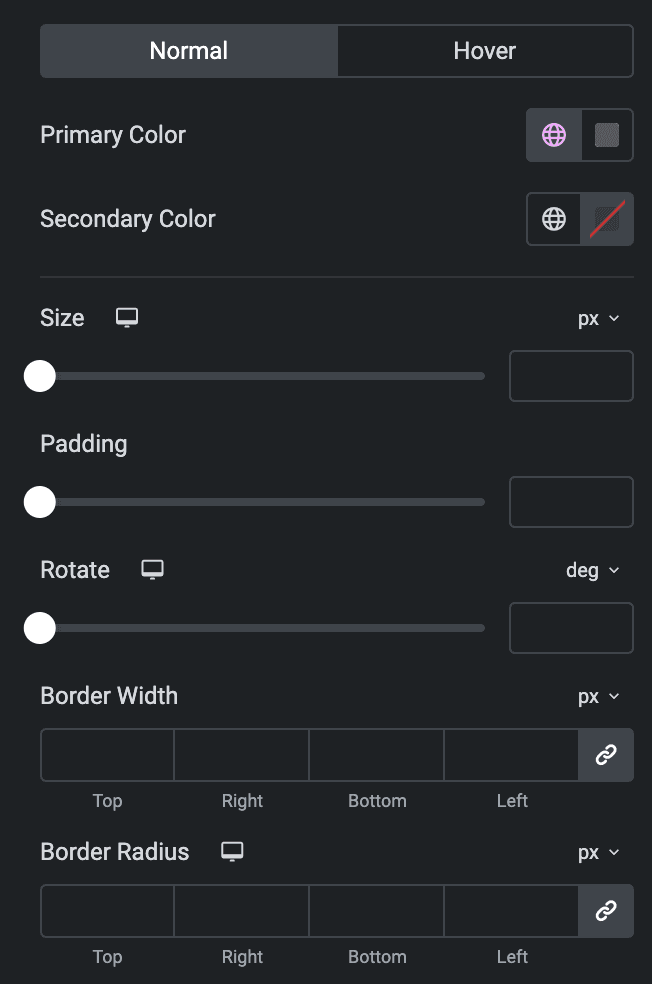
Normal
- Primary Color: Select the primary color of icon.
- Secondary Color: Select the secondary color of icon.
Hover
Styling controls for the hover state are under this section. This will be applied when someone hovers the icon.
- Size: Specify the size of icon.
- Padding: Set the padding.
- Rotate: Set the rotation.
- Border Width: Specify the width of border.
- Border Radius: Set the border radius.
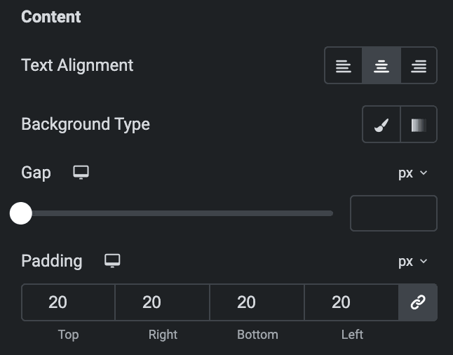
Content
- Text Alignment: Select the text alignment from left, center, or right.
- Background Type: Choose from Classic or Gradient.
- Gap: Specify the gap between content.
- Padding: Set the padding.
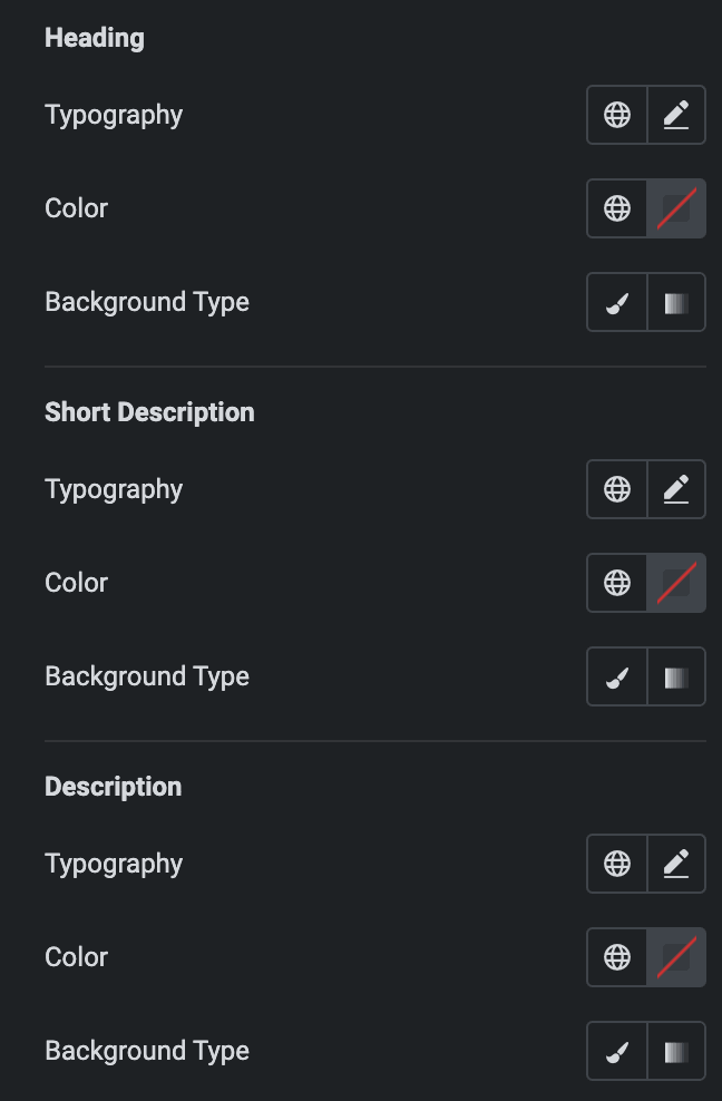
Heading
- Typography: Set the typography.
- Color: Select the color of heading.
- Background Type: Choose from Classic or Gradient.
Short Description
- Typography: Set the typography.
- Color: Select the color of short description.
- Background Type: Choose from Classic or Gradient.
Description
- Typography: Set the typography.
- Color: Select the color of description.
- Background Type: Choose from Classic or Gradient.
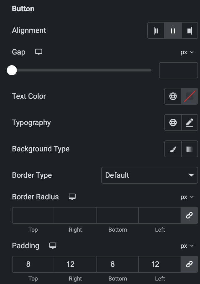
Button
- Alignment: Select the button alignment from left, center, or right.
- Gap: Specify the gap between button and text.
- Text Color: Select the text color of button.
- Typography: Set the typography.
- Background Type: Choose from Classic or Gradient.
- Border Type: Select the border type.
- Border Radius: Set the border radius.
- Padding: Set the padding.
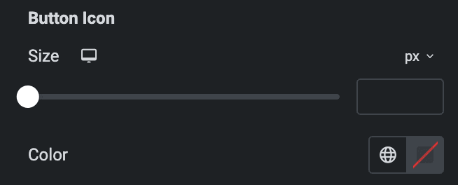
Button Icon
- Size: Specify the size of button icon.
- Color: Select the color of icon.
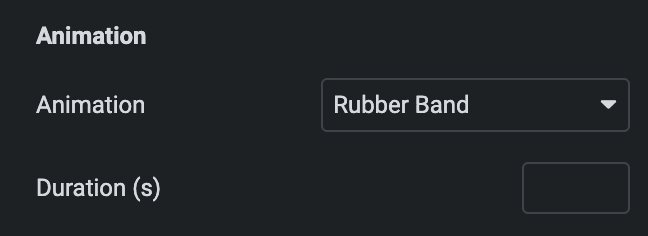
Animation
- Animation: Select the animation of tooltips.
- Duration: Enter the duration of animation.
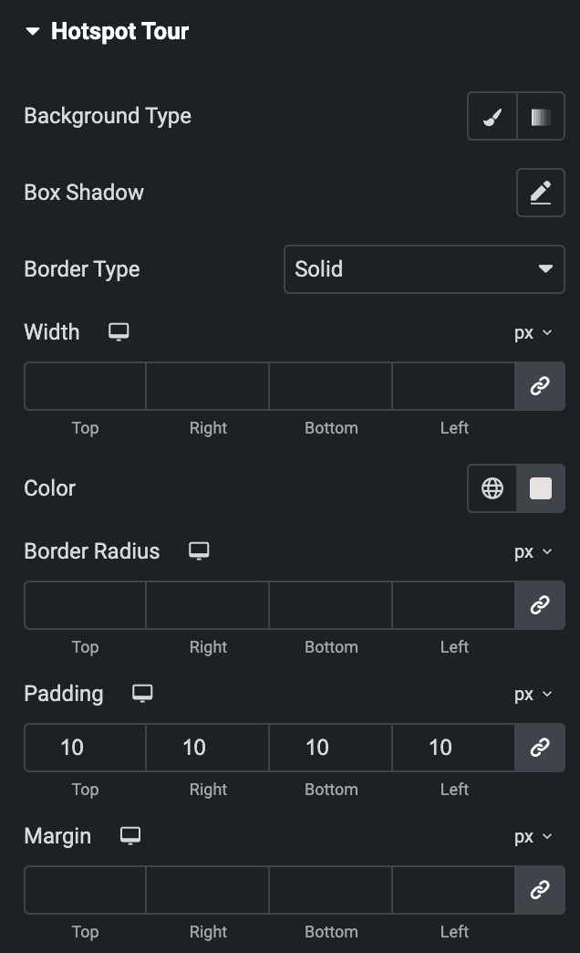
Hotspot Tour
Note: These options are only applicable when the Hotspot Tour option is enabled.
- Background Type: Choose from Classic or Gradient.
- Box Shadow: Set the box shadow.
- Border Type: Select the border type.
- Border Radius: Set the border radius.
- Padding: Set the padding.
- Margin: Set the margin.
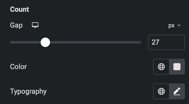
Count
- Gap: Specify the gap between count and other content.
- Color: Select the color of count.
- Typography: Set the typography.
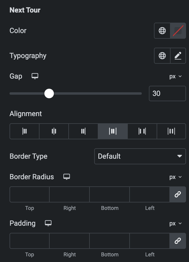
Next Tour
- Color: Select the color of next tour.
- Typography: Set the typography.
- Gap: Specify the gap between next tour and other content.
- Alignment: Select the alignment of next tour.
- Border Type: Select the border type.
- Border Radius: Set the border radius.
- Padding: Set the padding.
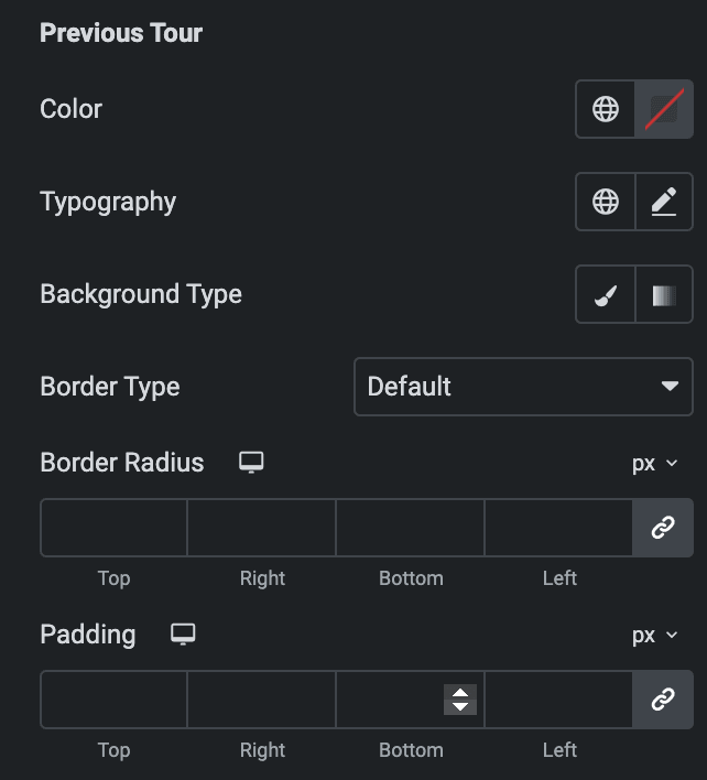
Previous Tour
- Color: Select the color of previous tour.
- Typography: Set the typography.
- Background Type: Choose from Classic or gradient.
- Border Type: Select the border type.
- Border Radius: Set the border radius.
- Padding: Set the padding.
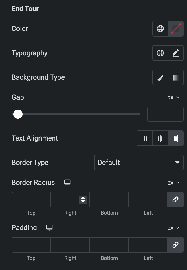
End Tour
- Color: Select the color of end tour.
- Typography: Set the typography.
- Background Type: Choose from Classic or gradient.
- Gap: Specify the gap between end tour and other content.
- Text Alignment: Select the alignment from left, center, or right.
- Border Type: Select the border type.
- Border Radius: Set the border radius.
- Padding: Set the padding.
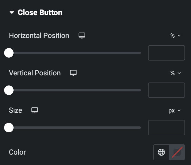
Close Button
Note: These options are only applicable when the Close Button option is enabled.
- Horizontal Position: Select the horizontal position of close button.
- Vertical Position: Select the vertical position of close button.
- Size: Specify the size of close button icon.
- Color: Select the color of close button.
Check out the Demo page of Image Hotspot.

