Widgets
Image Scroll
Our widget allows you to address the challenges of presenting long images such as web page screenshots, panorama shots, and more on your website. With this widget, showcasing your images becomes a breeze, allowing you to present them in a brand new and attractive way.
It offers multiple trigger options, giving you complete control over how your images scroll. Additionally, you can even choose to enable reverse scrolling, further enhancing the interactivity and user experience.
The “Image Scroll” widget features the following controls:
Content
Content
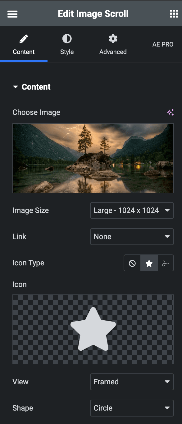
- Choose Image: Upload the image which you want to scroll.
- Image Size: Choose the size of image.
- Link: Select either Media File or Custom URL.
- Media File
- LightBox: Choose either you want to enable LightBox.
- Custom URL
- URL: Enter the URL which you want to link.
- Media File
- Icon Type: Choose from Icon or Lottie.
- Icon
- Icon: Select the icon from icon library or upload an SVG.
- View: Choose either Stacked or Framed.
- Shape: Choose either Square or Circle.
- View: Choose either Stacked or Framed.
- Icon: Select the icon from icon library or upload an SVG.
- Lottie
- Source – Choose the source of the Icon by either adding an External URL or selecting a media file.
- Loop – Enable the loop option to display the animation continuously.
- Reverse – Activate the option to display the animation in reverse order.
- Icon

Settings
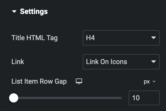
- Image Height: Enter the height of Image.
- Direction: Select the direction in which you would like to scroll the image.
- Speed: Specify the desired speed for scrolling the image.
- Reverse: Enable the option to scroll image in reverse direction(applicable when selected Hover as Trigger)
- Trigger: Select trigger option either from Hover or Scroll.
- Enable Overlay: Activate the option to enable the overlay.

Style
Icon
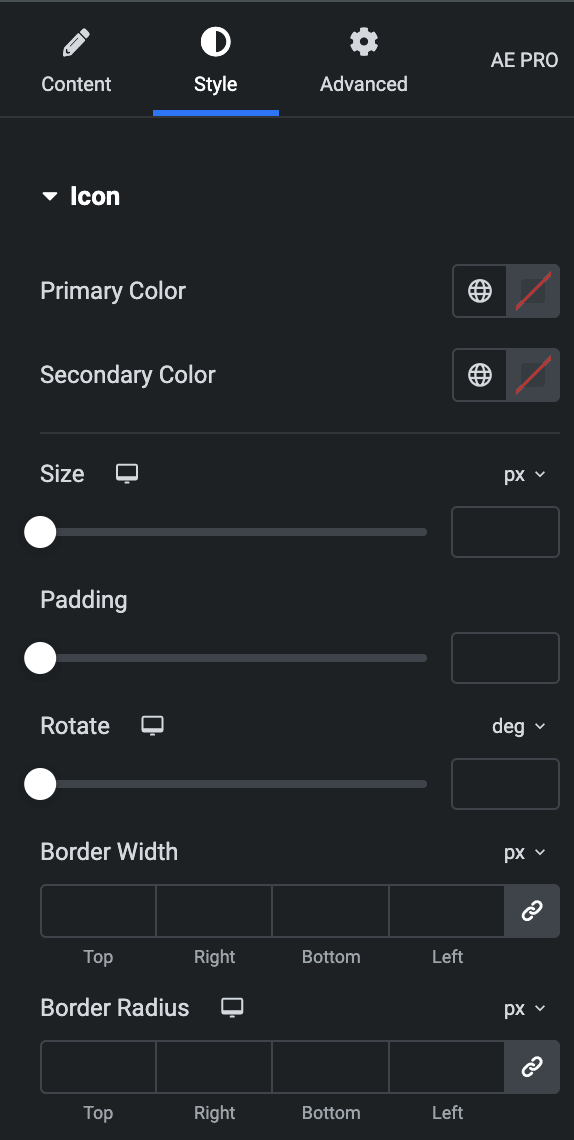
- Primary Color: Choose the primary color for icon.
- Secondary Color: Choose the secondary color for icon.
- Size: Set the size of the Icon.
- Padding: Set the padding for the Icon.
- Rotate: Set the rotation of your Icon.
- Border Width: Set the border’s width.
- Border Radius: Set the border’s radius.

Overlay
Note: This option is only available when Overlay is enabled under the Settings Section.
- Background Type: Choose either a Classic or a Gradient.
- Classic
- Color: Choose the color for the background.
- Gradient
- Color: Select the color for the background.
- Location: Determine the position of the color on the background by specifying their location in percentage.
- Second Color: Select the second color for the background.
- Location: Determine the position of the second color on the background by specifying their location in percentage.
- Type: Select either Radial or Linear.
- Radial
- Position: Set the position.
- Linear
- Angle: Set the angle using DEG, GRAD, RAD, and TURN.
- Radial
- Classic

General
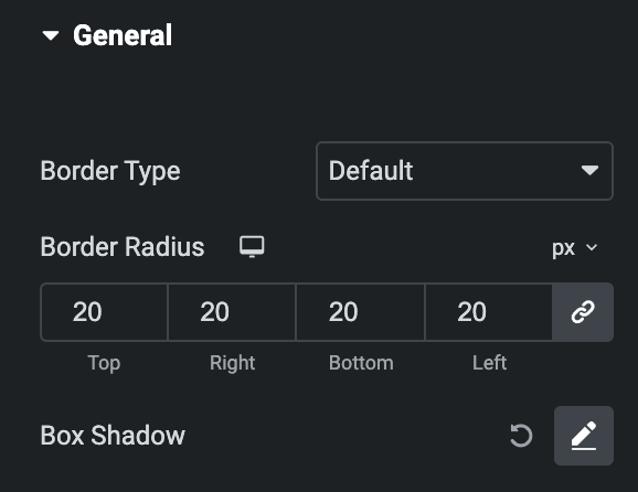
- Border Type: Select the border type.
- Width: Set the width.
- Color: Select the color of border.
- Border Radius: Set the border radius.
- Box Shadow: Set box shadow.

Check out the Demo page of Image Scroll.

