Widgets
Image Stack
An “Image Stack” is a cool and interactive way to showcase pictures, text, icons, or Lottie on your website. It lets you arrange your content like a stack of cards and reveal them when someone hovers their mouse over them. This makes your website look interesting and grabs people’s attention.
You can also include captions, titles, or your own special messages as a tooltip that appears when someone hovers over these items. You can decide where these messages show up on the items. So, if you have lots of stuff to show on your website, using an Image Stack can make it look awesome!
The Image Stack widget features the following controls:
Content
Content
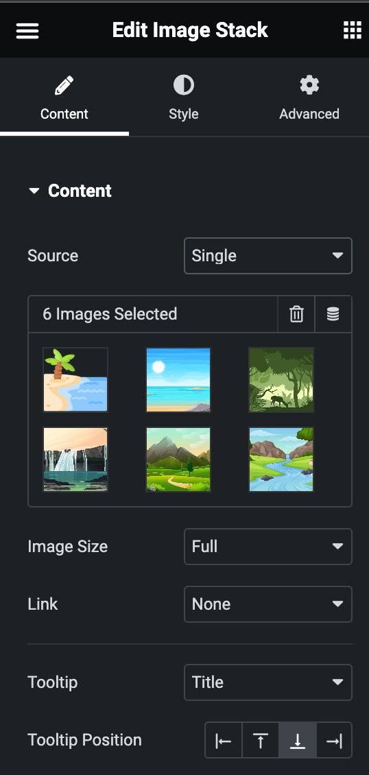
- Source: Choose either from Single or Repeater.
- Single
- Images: Select the image you want to display.
- Image Size: Select the size of an image.
- Link: Choose either Media File or Custom URL.
- Tooltip: Select the option from Title, Caption, or Custom to display a tooltip.
- Tooltip Position: Select the position of the tooltip.

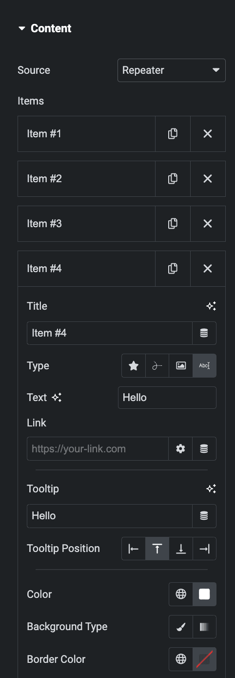
- Repeater
- Items
- Title: Enter the title.
- Type: Choose what you want to display from Image, Icon, Text, and Lottie.
- Link: Enter the URL to link with the item.
- Tooltip: Enter the text for the tooltip.
- Tooltip Position: Select the position for the tooltip.
- Color: Select the color of the tooltip text and icon.
- Background Type: Choose either Classic or Gradient.
- Border Color: Select the border color.

- Show Placeholder: Select the option to hide the placeholder.
- Image Size: Select the size of image.

Style
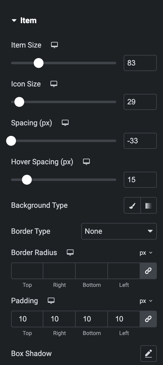
Item
- Item Size: Select the size of the item.
- Icon Size: Set the size of an icon.
- Spacing: Set the spacing between items.
- Hover Spacing: Enter the hover spacing between items.
- Background Type: Select from Color/Image or Gradient.
- Border Type: Set the border.
- Border Radius: Set the border radius.
- Padding: Set the padding.
- Box Shadow: Set the box shadow.

Text(applicable for Repeater Soucre Type)
- Typography: Set the typography of text.

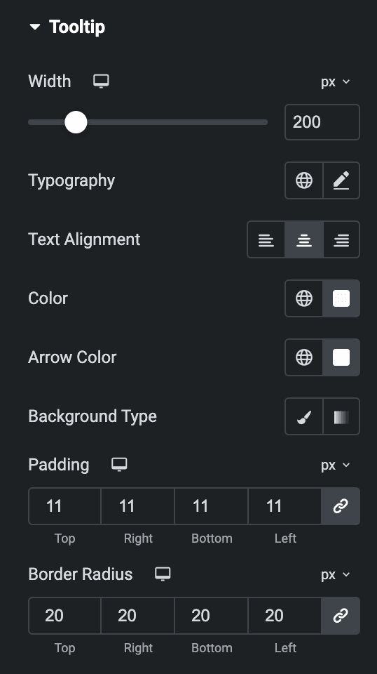
Tooltip
- Width: Set the width of a tooltip.
- Typography: Set the typography.
- Text Alignment: Select the alignment from Left, Center, or Right.
- Color: Select the color of the tooltip text.
- Arrow Color: Select the arrow color of tooltip.
- Background Type: Select either Classic or Gradient.
- Padding: Set the padding.
- Border Radius: Set the border radius.

Check out the Demo page of Image Stack.

