Info Group
This widget is the perfect solution for organizing and presenting information in a clear and structured manner on your website. With this versatile widget, you can effortlessly group related pieces of information, making it easier for your users to access and understand content.
It is great for showing extra info on your webpage without taking up too much space. You can reveal the additional information by clicking on a box, button, or both. It lets you arrange the info neatly in a grid and offers lots of options to make it look just the way you want. You can even add a close button using an icon to hide the extra details when you’re finished.
You have the option to display your content in different ways, like using a Saved Container, Saved Section, AE Template, Saved Page, or even writing your own content. Plus, you can choose whether or not to show the button, and you can customize how the button looks and behaves.
The Info Group widget features the following controls:
Content
General
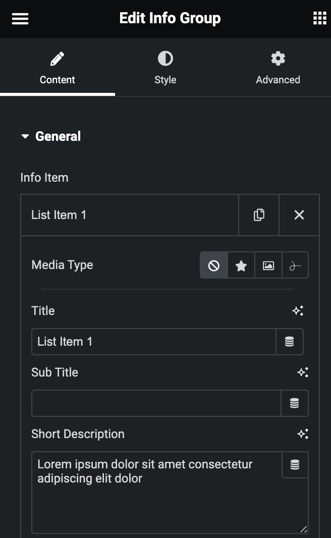
- Info Item
- Media Type: Select from icon, image, or Lottie.
- Title: Enter the title.
- Sub Title: Enter the sub title.
- Short Description: Enter the short description.
- Description
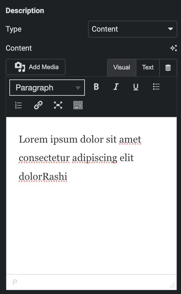
- Type: Select the option to display the content.
Content
- Content: Enter the text.
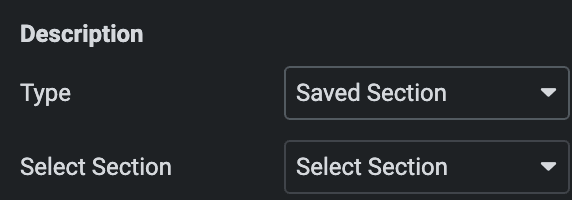
Saved Section
- Select Section: Select the section to display the content.
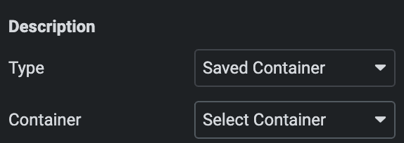
Saved Container
- Select Container: Select the container to display the content.
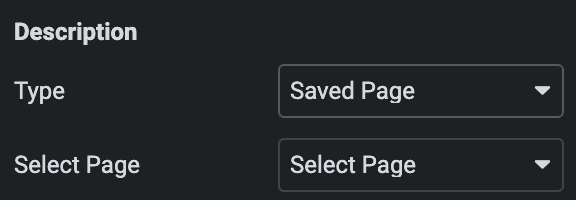
Saved Page
- Select Page: Select the page to display the content.
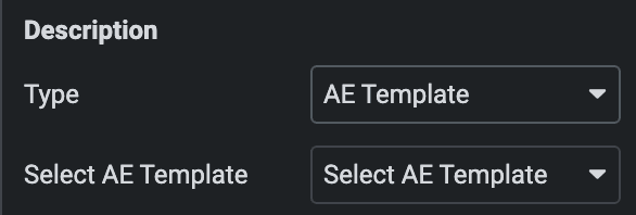
AE Template
- Select AE Template: Select the AE Template to display the content.
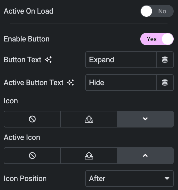
- Active On Load: Enable the option to active items while on load.
- Enable Button: Enable the option to display the button.
- Button Text: Enter the button text.
- Active Button Text: Enter the active button text.
- Icon: Select the icon for button.
- Active icon: Select the icon for button while in active state.
- Icon Position: Specify the position of icon.
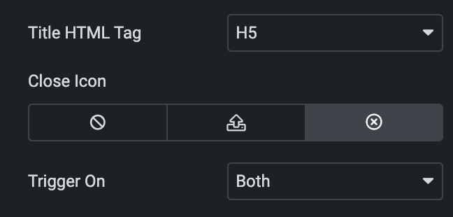
- Title HTML Tag: Select the HTML tag of title.
- Close Icon: Select the icon for the close button.
- Trigger On: Choose how extra information triggers by clicking a button, a box, or both.
Grid
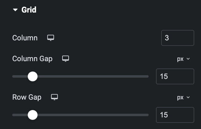
- Column: Specify the number of columns you want in one row.
- Column Gap: Specify the gap between columns.
- Row Gap: Specify the gap between rows.
Style
Item
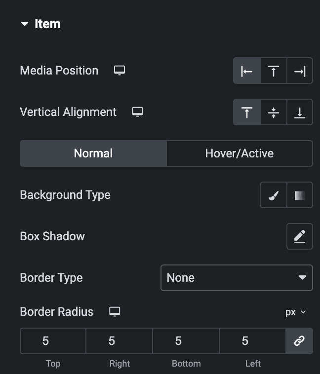
- Media Position: Select media position from Left, Top, or Right.
- Vertical Alignment: Select vertical alignment from Top, Middle, or Bottom.
Normal
- Background Type: Select from classic or gradient.
- Box Shadow: Set the box shadow.
- Border Type: Select the border type.
Hover
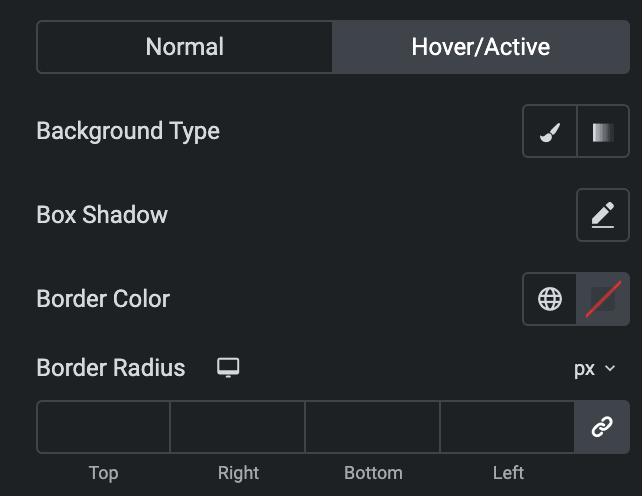
Styling controls for the hover state are available under this section. This will be applied when someone hovers the item box.
- Padding: Set the padding.
Media
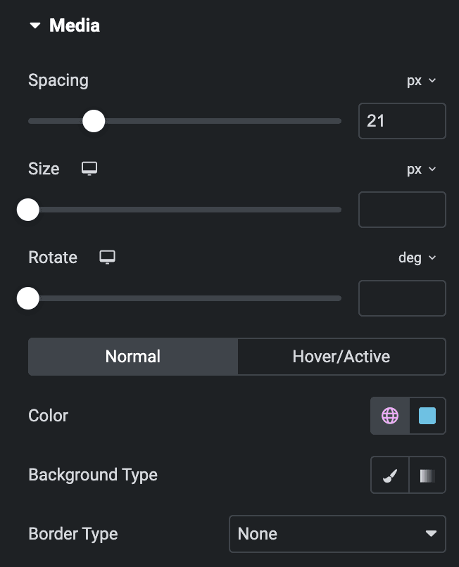
- Spacing: Specify the gap between media and text.
- Size: Specify the size of media.
- Rotate: Set the rotation properties.
Normal
- Color: Select the color of media.
- Background Type: Select from classic or gradient.
- Border Type: Select the border type.
Hover
Styling controls for the hover state are available under this section. This will be applied when someone hovers the item box.
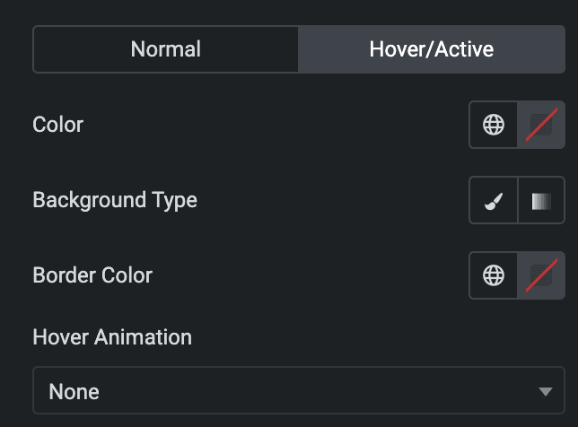
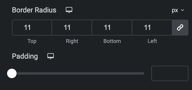
- Border radius: Set the border radius.
- Padding: Set the padding.
Content
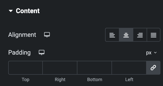
- Alignment: Select content alignment from Left, Center, Right, or Justify.
- Padding: Set the padding.
Title
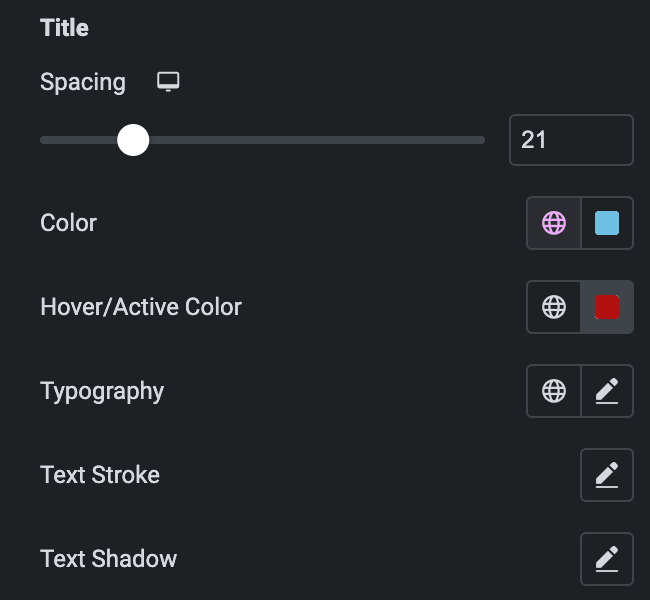
- Spacing: Specify the gap between the title and other text.
- Color: Select the text color of title.
- Hover/Active Color: Select the color of title when in hover or active state.
- Typography: Set the typography.
- Text Stroke: Set the text stroke.
- Text Shadow: Set the text shadow.
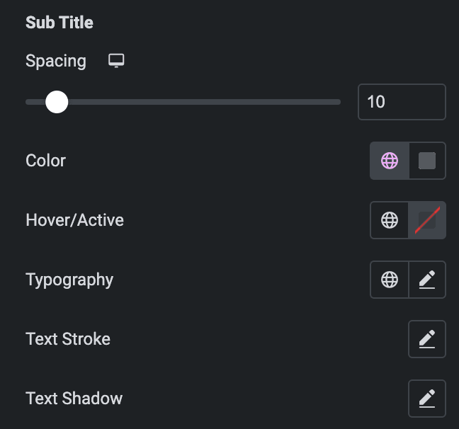
Sub Title
- Spacing: Specify the gap between the description and other text.
- Color: Select the text color of description.
- Hover/Active Color: Select the color of description when in hover or active state.
- Typography: Set the typography.
- Text Stroke: Set the text stroke.
- Text Shadow: Set the text shadow.
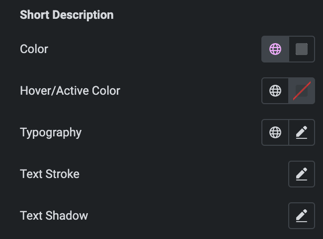
Short Description
- Color: Select the text color of short description.
- Hover/Active Color: Select the color of short description when in hover or active state.
- Typography: Set the typography.
- Text Stroke: Set the text stroke.
- Text Shadow: Set the text shadow.
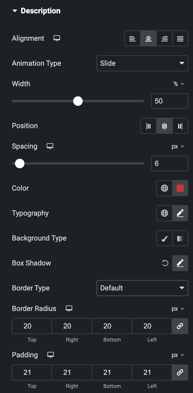
Description
- Alignment: Select alignment from Left, Center, Right, or Justify.
- Animation Type: Select animation either Fade or Slide.
- Width: Specify the width of description box.
- Position: Select the description position from Left, Center, or Right.
- Spacing: Specify the space between description box and item box.
- Color: Select the color of description.
- Typography: Set the typography.
- Background Type: Select from Classic or Gradient.
- Box Shadow: Set the box shadow.
- Border Type: Select the border type.
- Border Radius: Set the border radius.
- Padding: Set the padding.
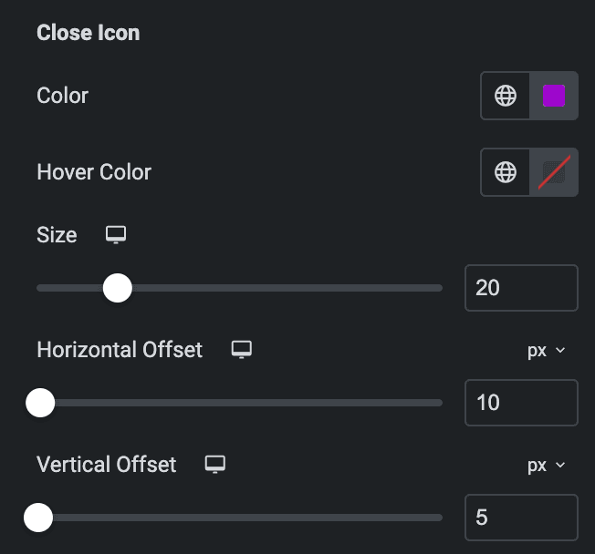
Close Icon
- Color: Select the color of close button icon.
- Hover Color: Select the hover color of close button icon.
- Size: Specify the size of icon.
- Horizontal Offset: Set the horizontal offset value.
- Vertical Offset: Set the vertical offset value.
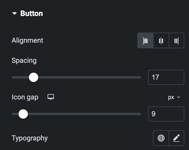
Button
- Alignment: Select the button alignment from Left, Center, or Right.
- Spacing: Specify the space between button and text.
- Icon gap: Specify the space between button and button icon.
- Typography: Set the typography.
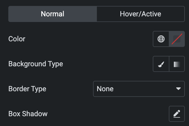
Normal
- Color: Select the color of button text.
- Background Type: Select from classic or gradient.
- Border Type: Select the border type.
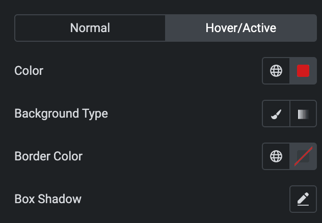
Hover
Styling controls for the hover state are available under this section. This will be applied when someone hovers the button.
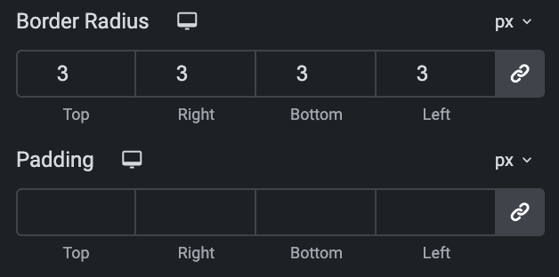
- Border Radius: Set the border radius.
- Padding: Set the padding.
Check out the Demo page of Info Group.

