Radial Charts
The Radial Charts is an effective widget for comparing datasets of information in a visual and organized manner. It offers three different types of charts: Pie chart, Doughnut chart, and Polar chart, each with its own unique advantages.
With the ability to display a legend, the chart becomes an even more powerful tool for streamlining comparison work and achieving a higher level of accuracy in data analysis.
Whether you’re looking to highlight similarities or differences between data sets, Radial Charts can provide a clear and concise overview that is easy to interpret and understand.
The “Radial Charts” widget features the following controls:
Content
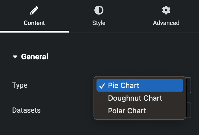
General
- Type: Choose from Pie, Doughnut, or Polar charts to present your data.
- Datasets: Specify the number of datasets you wish to compare.
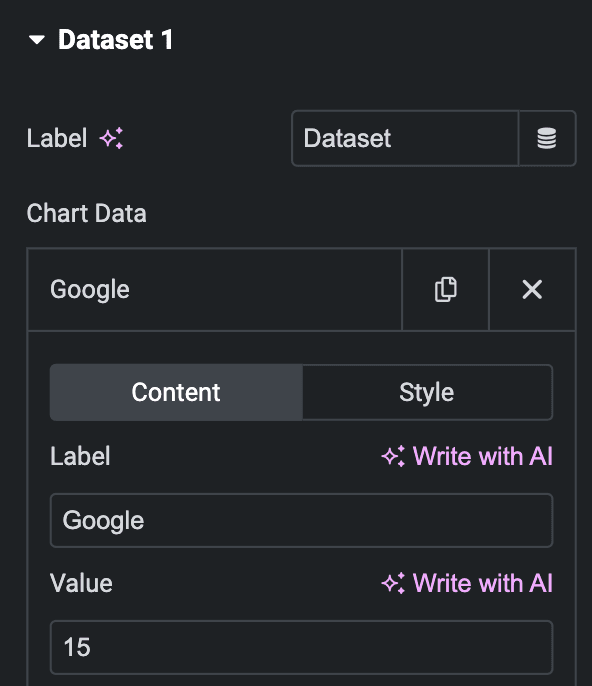
Dataset1
- Label: Enter the label of the dataset or select the dynamic tag option.
- Chart Data
- Content
- Label: Enter the label.
- Value: Enter the value.
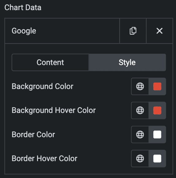
- Style(Individual item)
- Background Color: Select the background color.
- Background Hover Color: Select the background hover color.
- Border Color: Select the border color.
- Border Hover Color: Select the border hover color.
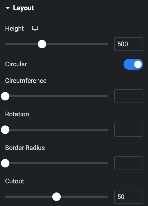
Layout
- Height: Specify the height of the chart.
- Circular: Enable the circular mode if desired.
- Circumference: Specify the circumference of the chart.
- Rotation: Indicate the rotation for the chart.
- Border Radius: Set the border radius.
- Cutout: Specify the cutout value(Only for Doughnut Chart).
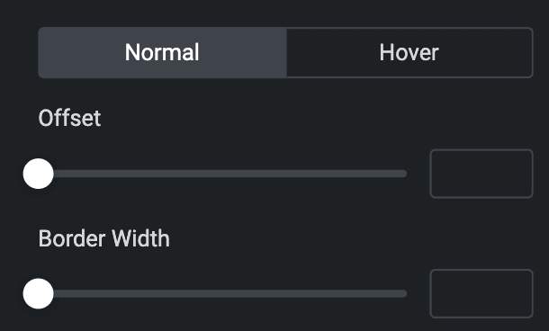
Normal
- Offset: Set the offset.
- Border Width: Set the border width.
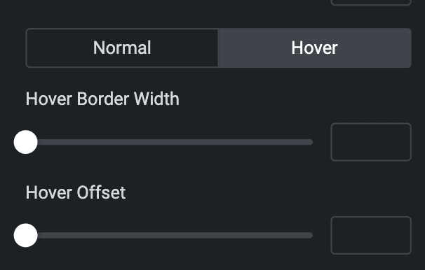
Hover
- Hover Border Width: Set the border hover width.
- Hover Offset: Set the offset hover.
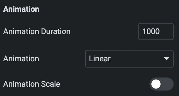
Animation
- Animation Duration: Enter animation duration.
- Animation: Choose the animation style.
- Animation Scale: Enable the option for animation scale.
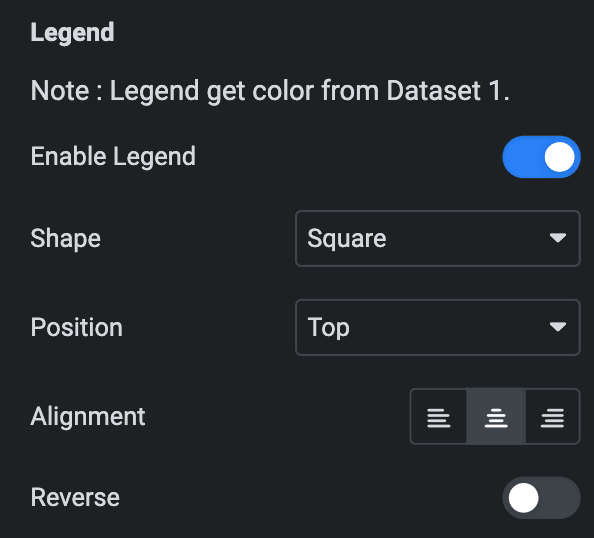
Legend(It will get color from Dataset 1 only)
- Enable Legend: Enable the legend if desired.
- Shape: Specify the shape for the legend, either Square or Circle.
- Position: Specify the position of the legend
- Alignment: Set the alignment of the legend.
- Reverse: To view the legend in reverse order, activate the corresponding option.
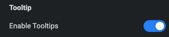
Tooltip
- Enable Tooltips: Enable the option if desired.
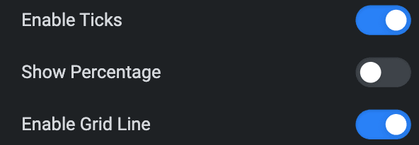
- Enable Ticks: To view the ticks, enable the corresponding option(Only for Polar Chart).
- Show Percentage: Enable the option to show percentage value(Only for Polar Chart).
- Enable Grid Line: To view the Grid line, activate the corresponding option(Only for Polar Chart).
Style
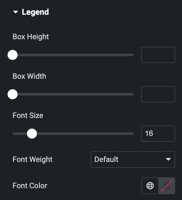
Legend
- Box Height: Set the height of the box.
- Box Width: Set the width of the box.
- Font Size: Specify the font size.
- Font Weight: Set the font weight.
- Font Color: Select the color of the text.
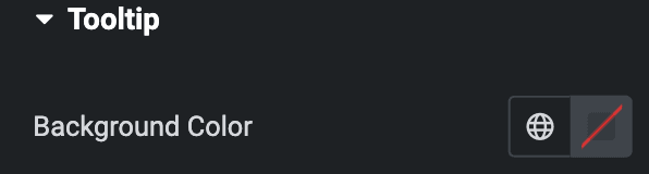
Tooltip
- Background Color: Select the background color for the tooltip.
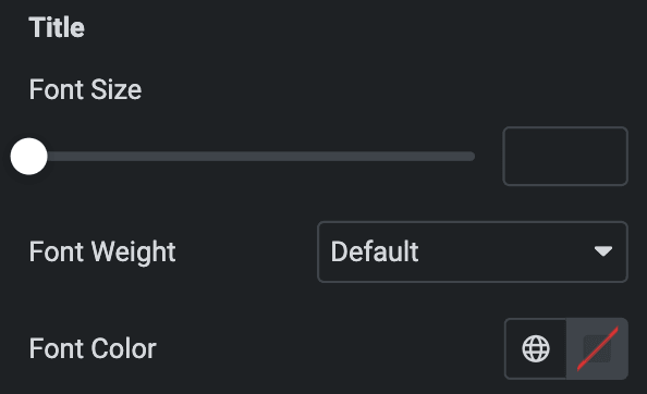
Title
- Font Size: Specify the font size.
- Font Weight: Set the font weight.
- Font Color: Select the color of the text.
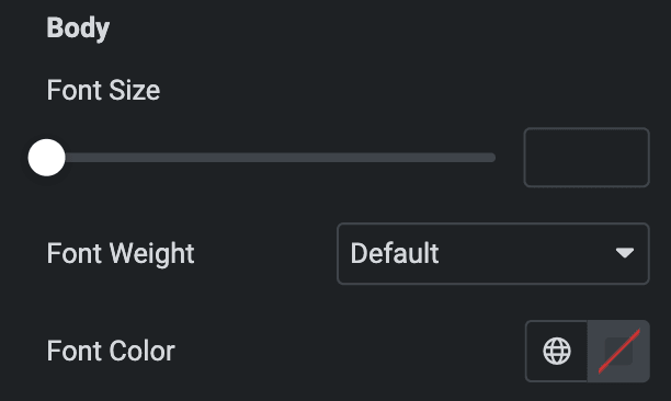
Body
- Font Size: Specify the font size.
- Font Weight: Set the font weight.
- Font Color: Select the color of the text.
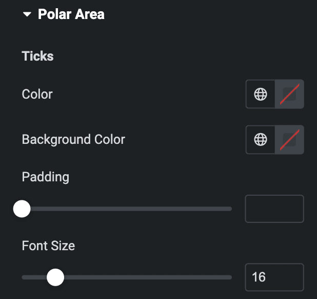
Polar Area
Note: This is only applicable for Polar Chart.
Ticks
- Color: Select the color of the ticks.
- Background Color: Select the background color of the ticks.
- Padding: Set the padding.
- Font Size: Set the font size.
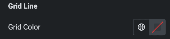
Grid Line
- Grid Color: Specify the color of the grid line.
Check out the Demo page of Radial Charts.
