Table Of Content
This widget serves as useful for web developers seeking to enhance the user experience by incorporating a table of contents on their web pages. It streamlines the process of generating a table of contents by automatically detecting and utilizing the headings within your content.
One of its standout features is the ability to selectively include or exclude specific headings from the table of contents. This level of control allows you to tailor the Table Of Content to your exact needs. Furthermore, if you only wish to create a table of contents for a particular section of your webpage, you can easily achieve this by specifying the container’s class name.
In situations where your headings are lengthy, the widget provides an option to wrap them in the table of contents. This thoughtful feature ensures that your design remains sleek and aesthetically pleasing. To make navigation even more user-friendly, you can opt to make the table of contents sticky, staying visible as users scroll. Additionally, the option to collapse the table of contents helps maintain a clean and perfect look until users choose to expand it.
The Table Of Content widget features the following controls.
Content
General
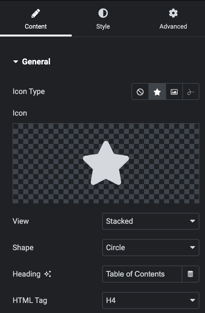
- Icon Type: Choose from a list of Icons, Images, or Lottie animations.
- Icon
- Icon: Select from the Font Awesome icon library or upload an SVG image.
- Image
- Image: Either upload an image or select a dynamic tag for display.
- Image size: Choose the size for your icon image display.
- Lottie Animation
- Source: Choose the source of the Icon by either adding an External URL or selecting a media file.
- Loop: Enable the loop option to display the animation continuously.
- Reverse: Activate the reverse option to display the animation in reverse order.
- Icon
- View: Select from default, stacked, or framed display options.
- Shape: Select either a Circle or Square shape for the stack or frame.
- Heading: Enter the heading.
- HTML Tag: Select the HTML tag for heading.
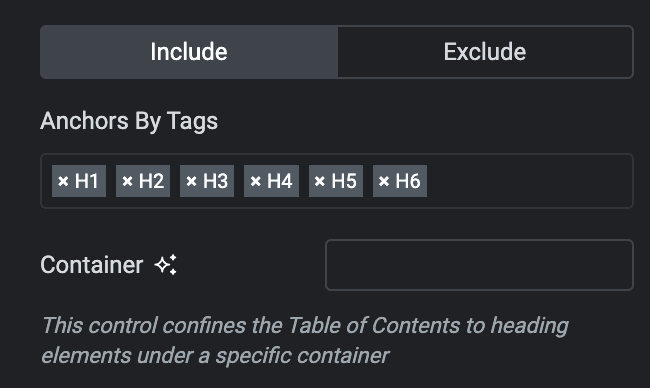
Include
- Anchors by Tags: Select the tags you want to include in the Table of Contents.
- Container: Specify the container class name so that the table of contents will only be made for that container.
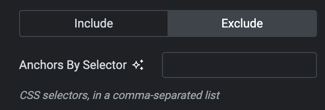
Exclude
- Anchors by Selector: Enter the CSS selector you want to exclude and use commas to separate them.
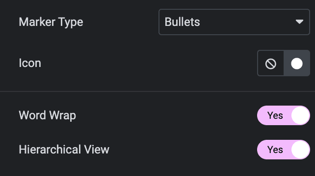
- Marker Type: Select marker type from the Counter and Bullets.
- Icon: Select the icon for marker.
- Word Wrap: Activate the option to enable the word wrap.
- Hierarchical View: Enable the option to display the hierarchical view.
Settings
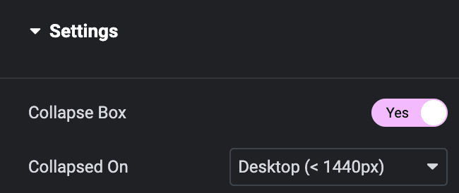
- Collapse Box: Enable the option to collapse the table of content.
- Collapsed On: Select the device where you want to make the table of contents collapse.
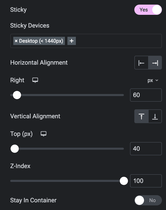
- Sticky: Enable the option to make sticky.
- Sticky Devices: Select the device where you want to make the table of contents sticky.
- Horizontal Alignment: Choose from left or right.
- Right: Specify the position from the right(applicable when horizontal alignment is selected as right).
- Left: Specify the position from the left(applicable when horizontal alignment is selected as right).
- Vertical Alignment: Choose from top or bottom.
- Top: Specify the position from the top(applicable when vertical alignment is selected as top).
- Bottom: Specify the position from the bottom(applicable when vertical alignment is selected as bottom).
- Z-Index: Specify the z-index value.
- Stay in Container: Enable the option to make the table of contents stay on the screen until a specific container.
- Follow Headings: Enable the option to follow the table of contents heading.
- Offset: Specify the offset value.

Navigation
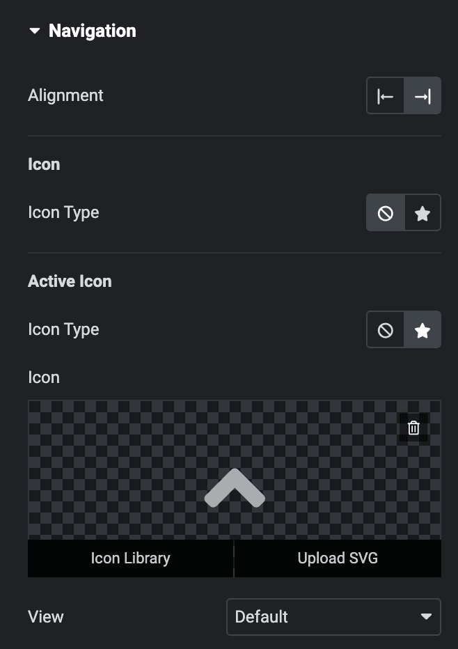
- Alignment: Select navigation alignment from left or right.
Icon
- Icon Type: Select the icon from icon library.
Active Icon
- Icon Type: Select the icon from icon library for the active state.
Style
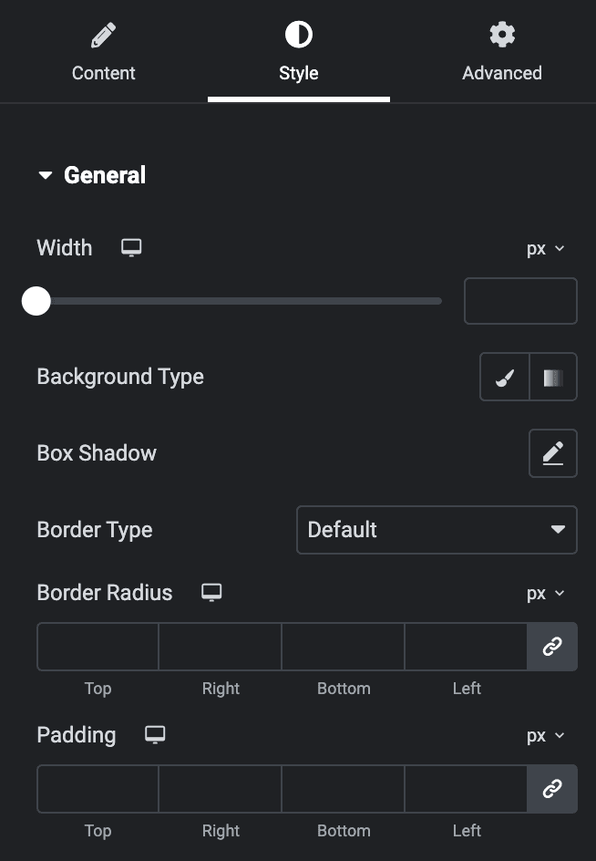
General
- Width: Specify the width of box.
- Background Type: Choose either a Classic or a Gradient.
Classic
- Color: Choose the color for the background.
- Image: Either upload an image or select a dynamic tag for display.
Gradient
- Color: Select the color for the background.
- Location: Determine the position of the color on the background by specifying their location in percentage.
- Second Color: Select the second color for the background.
- Location: Determine the position of the second color on the background by specifying their location in percentage.
- Type: Select either Radial or Linear.
- Radial
- Position: Set the position.
- Linear
- Angle: Set the angle using DEG, GRAD, RAD, and TURN.
- Radial
- Box Shadow: Set the box shadow.
- Border Type: Select the border type.
- Border Radius: Set the border-radius.
- Padding: Set the padding.
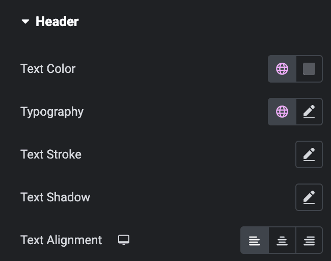
Header
- Text Color: Select the text color of heading.
- Typography: Set the typography.
- Text Stroke: Set the text stroke properties.
- Text Shadow: Set the text shadow properties.
- Text Alignment: Select text alignment from left, middle, or right.
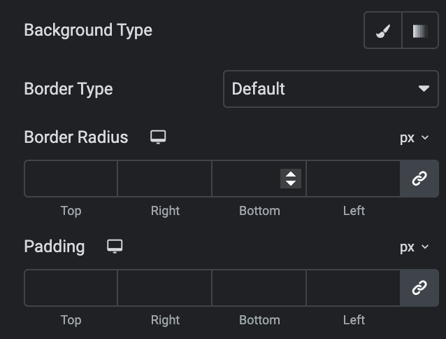
- Background Type: As we mentioned above, choose from classic or gradient. Click Here.
- Border Type: Select the border type.
- Border Radius: Set the border-radius.
- Padding: Set the padding.
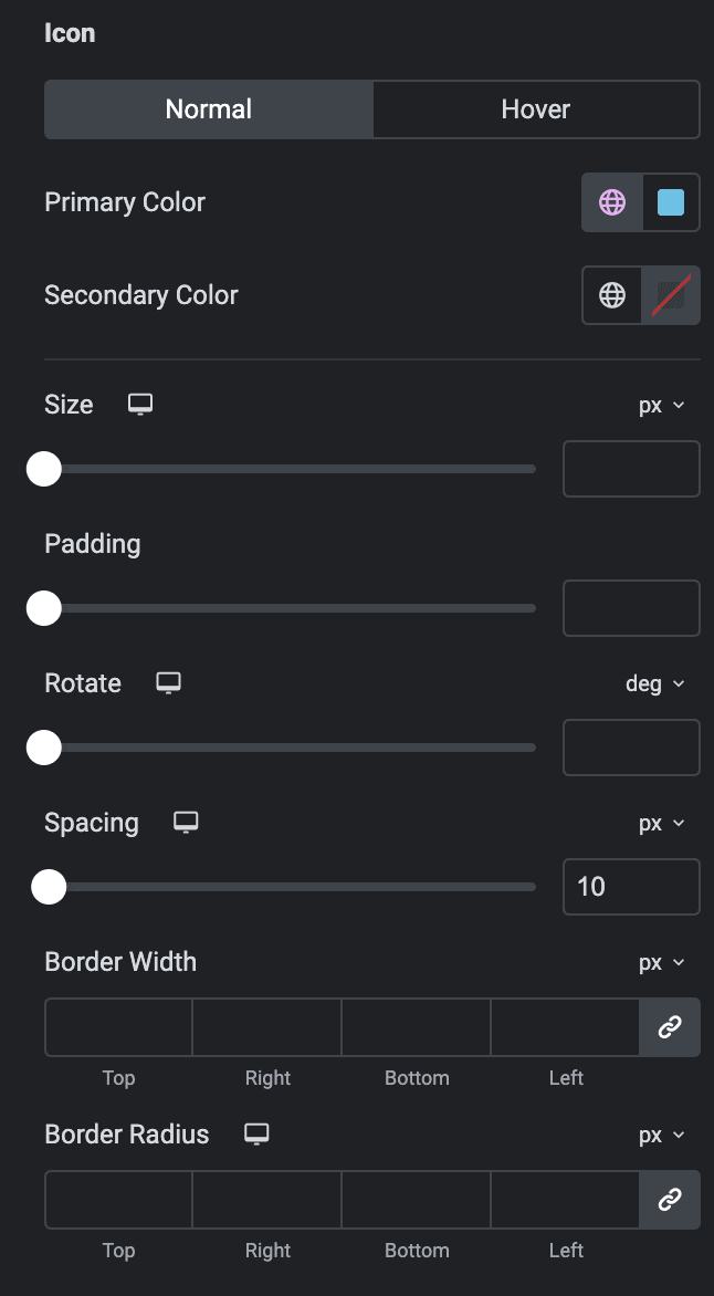
Icon
- Normal
- Primary Color: Select the primary color of icon.
- Secondary Color: Select the secondary color of icon.
Hover
Styling controls for the hover state are available under this section. These settings will be applied when Someone hovers the icon.
- Size: Set the size of the Icon.
- Padding: Set the padding for the Icon.
- Rotate: Set the rotation of your Icon in degrees.
- Spacing: Set the spacing.
- Border Width: Set the border’s width.
- Border Radius: Set the border’s radius.
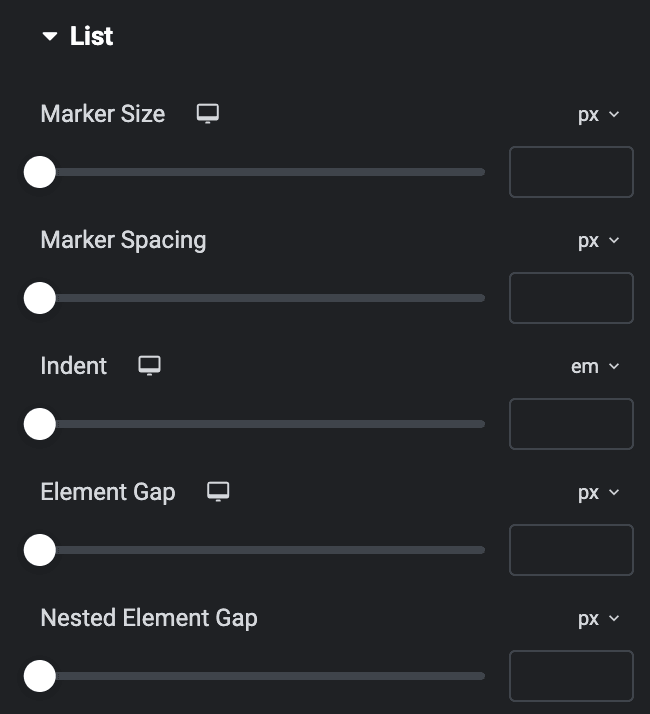
List
- Marker Size: Specify the size of marker.
- Marker Spacing: Specify the spacing between markers.
- Indent: Specify the indent value.
- Element Gap: Specify the gap between elements.
- Nested Element Gap: Specify the gap between nested elements.
- Typography: Set the typography.
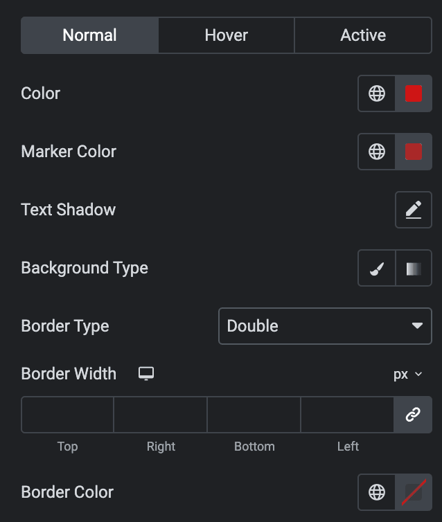
Normal
- Color: Select the color of text.
- Marker Color: Select the color of marker.
- Text Shadow: Set the text shadow properties.
- Background Type: As we mentioned above, choose from classic or gradient. Click Here.
- Border Type: Select the border type.
- Border Width: Specify the border width.
- Border Color: Select the border color.
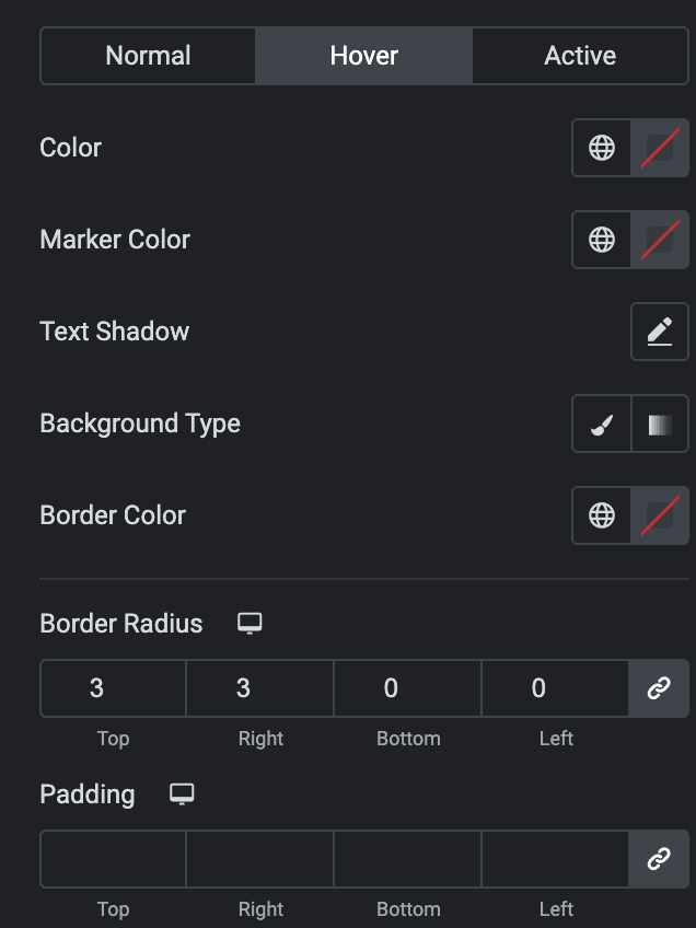
Hover
- Color: Select the color of text.
- Marker Color: Select the color of marker.
- Text Shadow: Set the text shadow properties.
- Background Type: As we mentioned above, choose from classic or gradient. Click Here.
- Border Color: Select the border color.
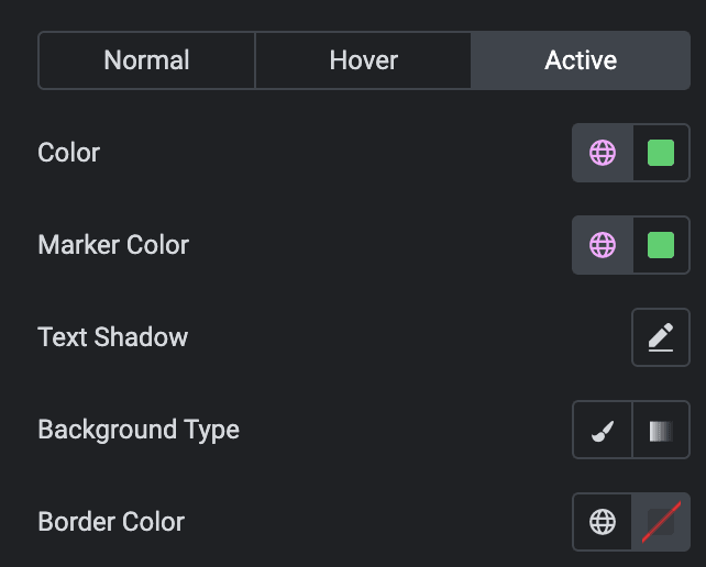
Active
- Color: Select the color of text.
- Marker Color: Select the color of marker.
- Text Shadow: Set the text shadow properties.
- Background Type: As we mentioned above, choose from classic or gradient. Click Here.
- Border Color: Select the border color.
- Border Radius: Set the border radius.
- Padding: Set the padding.
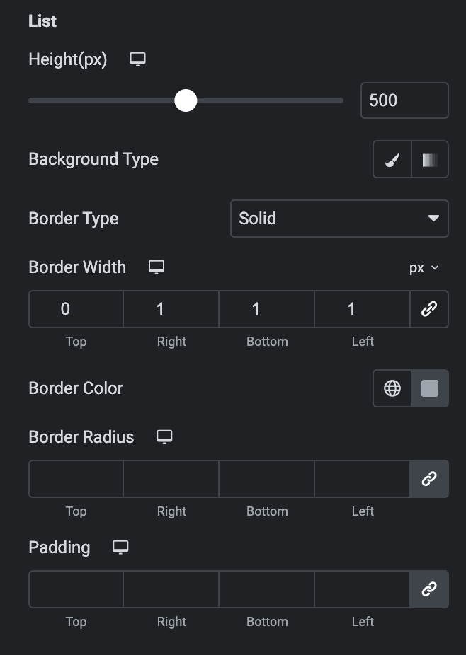
List
- Height: Specify the height of list.
- Background Type: As we mentioned above, choose from classic or gradient. Click Here.
- Border Type: Select the border type.
- Border Radius: Set the border radius.
- Padding: Set the padding.
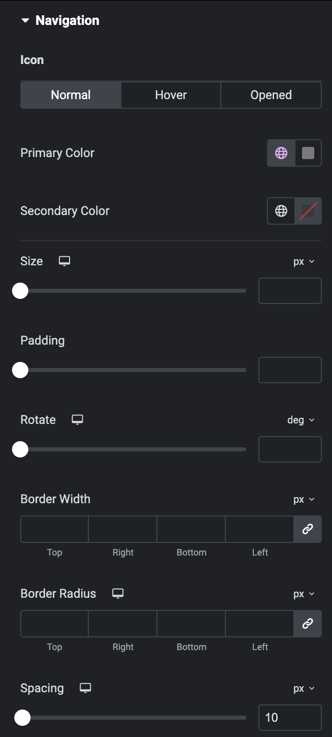
Navigation
Icon
Normal
- Primary Color: Choose the primary color for the icon.
- Secondary Color: Choose the secondary color for the icon.
Hover
Styling controls for the hover state are available under this section. These settings will be applied when Someone hovers the icon.
Active
Styling controls for the active state are available under this section. These settings will be applied when the icon is in an active state.
- Size: Set the size of the Icon.
- Padding: Set the padding for the Icon.
- Rotate: Set the rotation of your Icon in degrees.
- Border Width: Set the border’s width.
- Border Radius: Set the border’s radius.
- Spacing: Set the spacing.
