Testimonial
This widget makes it easy to showcase lots of customer reviews in an organized and attractive way. It helps make your business look trustworthy and can convince more people to buy your products or services. With the slider, you can choose from different preset styles and even customize them to make your testimonials stand out.
To make the reviews seem real, you can add details about the people who wrote them, such as their avatar, image, job title, and more. Additionally, you can also choose the order in which the testimonial’s content appears so you can put the most important ones at the top and make them stand out.
The “Testimonial” widget features the following controls.
Content
Content
- Preset Layout: Select the preset layout from available styles.
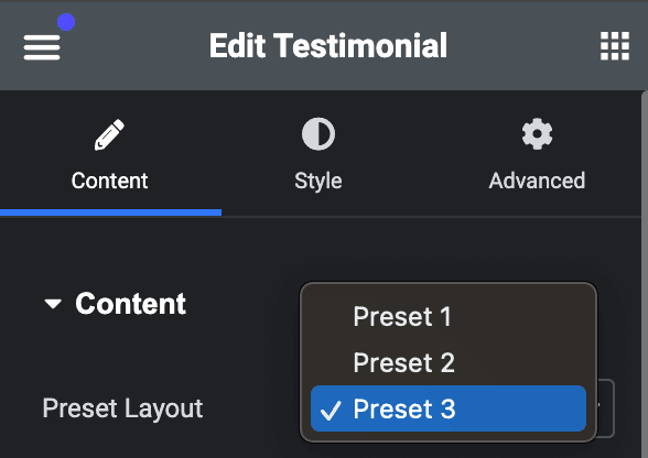
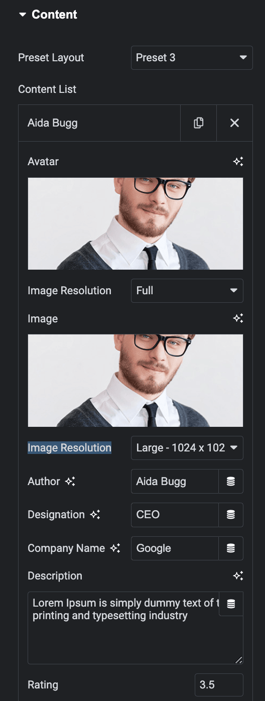
- Content List
- Avatar: Upload an avatar image of user.
- Image Resolution: Select the resolution of avatar image.
- Image: Upload an image of user(applicable for preset 2 and preset 3 layout).
- Image Resolution: Select the resolution of an image.
- Author: Enter the author’s name.
- Designation: Enter the author’s designation.
- Company Name: Enter the author’s company’s name.
- Description: Enter the description.
- Rating: Specify the rating number.
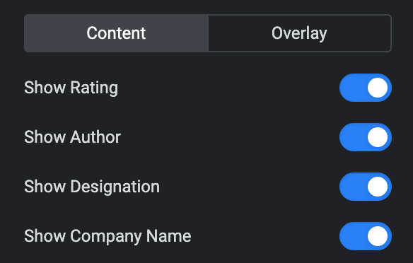
Content
These options are only applicable to the Preset 3 layout.
- Show Rating: Enable the option to display the rating.
- Show Author: Enable the option to display the author’s name.
- Show Designation: Enable the option to display the author’s designation.
- Show Company Name: Enable the option to display the company’s name.
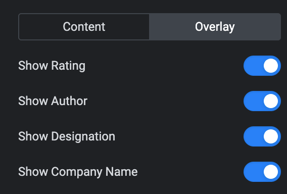
Overlay
These options are only applicable to the Preset 3 layout.
- Show Rating: Enable the option to display the rating in overlay.
- Show Author: Enable the option to display the author’s name in overlay.
- Show Designation: Enable the option to display the designation in overlay.
- Show Company Name: Enable the option to display the company’s name in overlay.
Rating
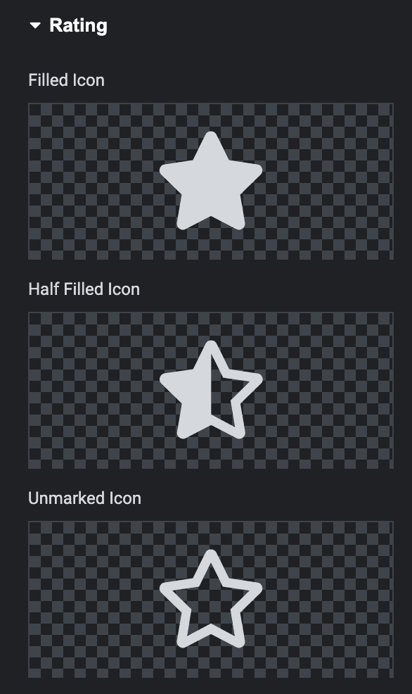
- Filled Icon: Select the filled icon.
- Half Filled Icon: Select the Half filled icon.
- Unmarked Icon: Select the unmarked icon.
Slider Options
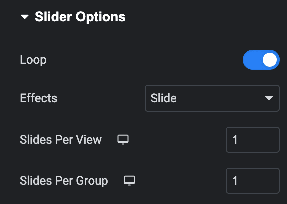
- Loop: Enable the loop option to display the slides continuously.
- Effects: Select effects from Slide, Coverflow, Fade, or Flip.
- Slides Per View: Specify the number of slides
- Slides Per Group: Specify how many slides should move together when navigating through the slider.
Setting
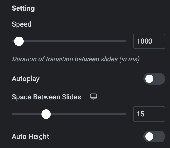
- Speed: Set the transition speed when moving one slide to the next.
- Autoplay: Activate the option to enable autoplay while onload.
- Space Between Slides: Specify the space between slides.
- Pause On hover: Enable the option to pause slides during hover.
- Auto Height: Enable the option to set the auto height.
Pagination
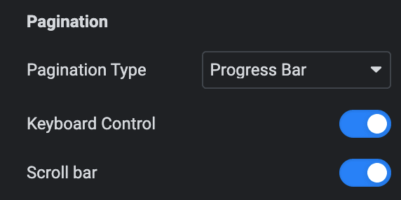
- Pagination: Set the pagination type.
- Clickable: Enable the option to make arrows clickable(only applicable for Bullets Pagination type).
- Keyboard Control: Activate the option to enable keyword control.
- Scroll bar: Enable the option to display the scroll bar.
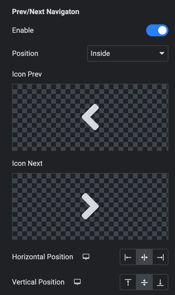
Prev/Next Navigation
- Enable: Enable the option to display navigation.
- Position: Choose either from Outside or Inside.
- Icon Prev: Set the previous icon from the available icons.
- Icon Next: Set the next icon from available icons.
- Horizontal Position: Select the horizontal position of navigation.
- Vertical Position: Select the vertical position of navigation.
Order
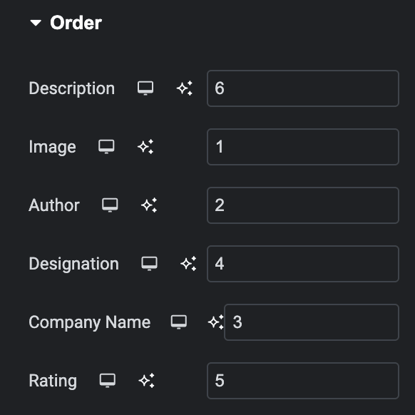
Choose the order of displaying individual elements, such as
- Description
- Image(for Preset 1)
- Author
- Designation(for Preset 1)
- Company Name(for Preset 1)
- Rating
Note: If any of these elements have a lower priority than others, they can be placed first on the webpage. This feature gives you greater control over the visual hierarchy of your webpage.
Style
Preset
Box
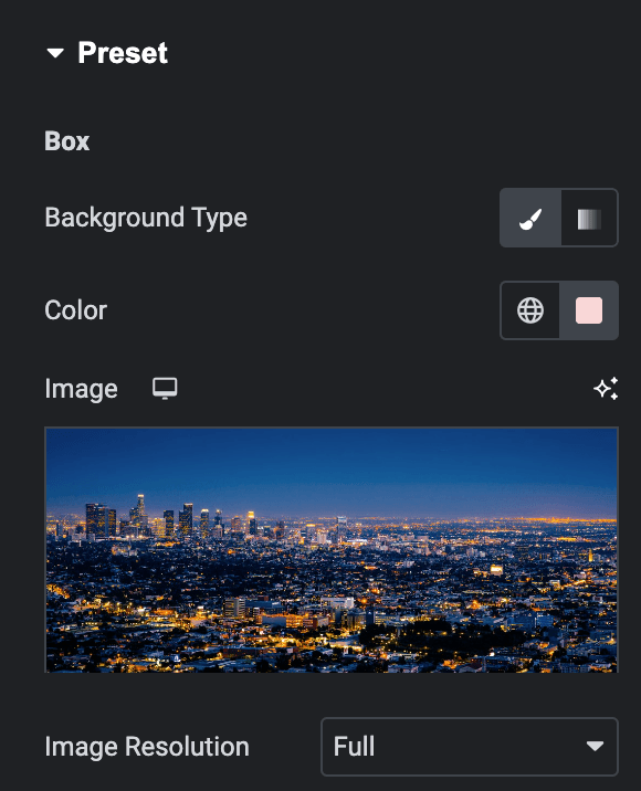
- Background Type: Please choose between a classic or gradient background type for the panel.
- Classic
- Color: Choose the color for the background.
- Image: Either upload an image or select a dynamic tag for display.
- Classic
- Gradient
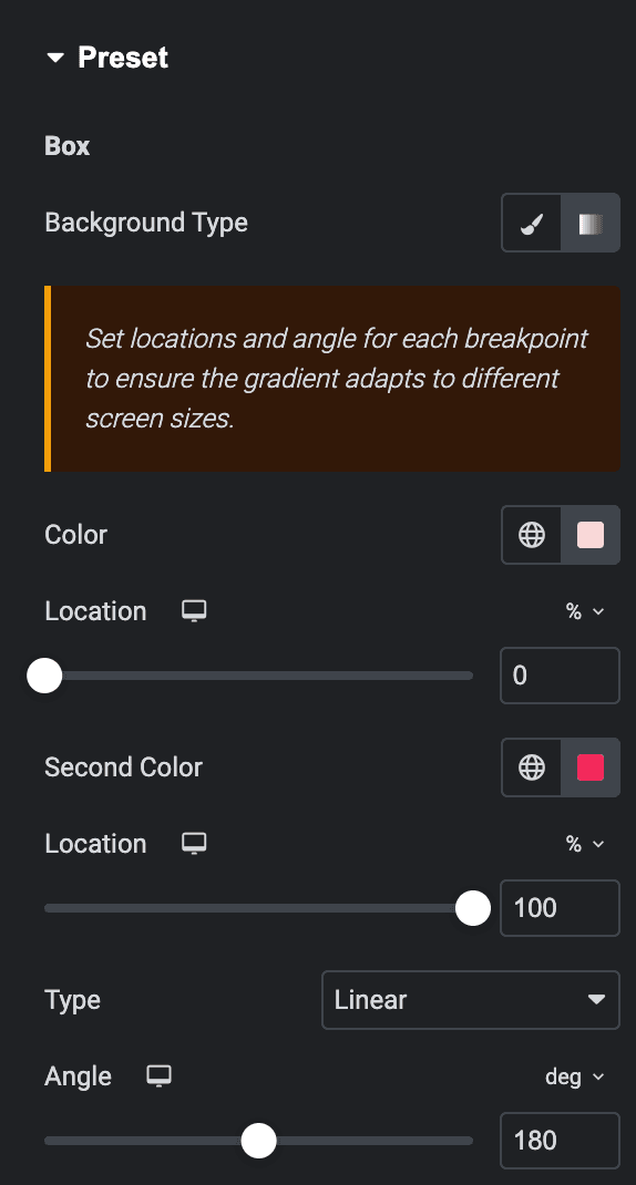
- Color: Select the color for the background.
- Location: Determine the position of the color on the background by specifying their location in percentage.
- Second Color: Select the second color for the background.
- Location: Determine the position of the second color on the background by specifying their location in percentage.
- Type: Select either Radial or Linear.
- Radial
- Position: Set the position.
- Linear
- Angle: Set the angle using DEG, GRAD, RAD, and TURN.
- Radial
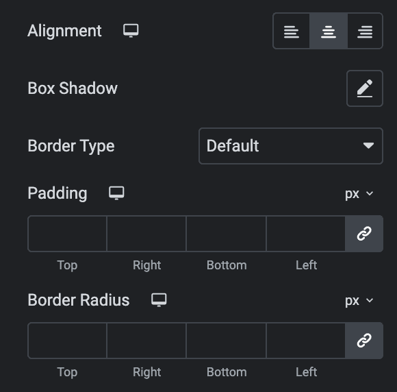
- Alignment: Select the alignment(applicable for preset 1 layout).
- Box Shadow: Set the box shadow.
- Border Type: Select the border type.
- Padding: Set the padding.
- Border Radius: Set the border radius.
Content
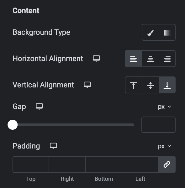
These options are applicable for Preset 2 and 3 layouts.
- Background Type: As we mentioned above, you can choose from Classic or Gradient. Check here.
- Horizontal Alignment: Select the horizontal alignment.
- Vertical Alignment: Select the vertical alignment.
- Gap: Specify the gap between content.
- Padding: Set the padding.
Avatar
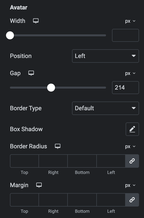
- Width: Specify the width of an avatar.
- Position: Select position from left or right(applicable for preset 2 and 3).
- Gap: Specify the gap between the avatar and other content(applicable for presets 2 and 3).
- Border Type: Select the border type.
- Box Shadow: Set the box shadow.
- Border Radius: Set the border radius.
- Margin: Set the margin(applicable for preset 2)
Image
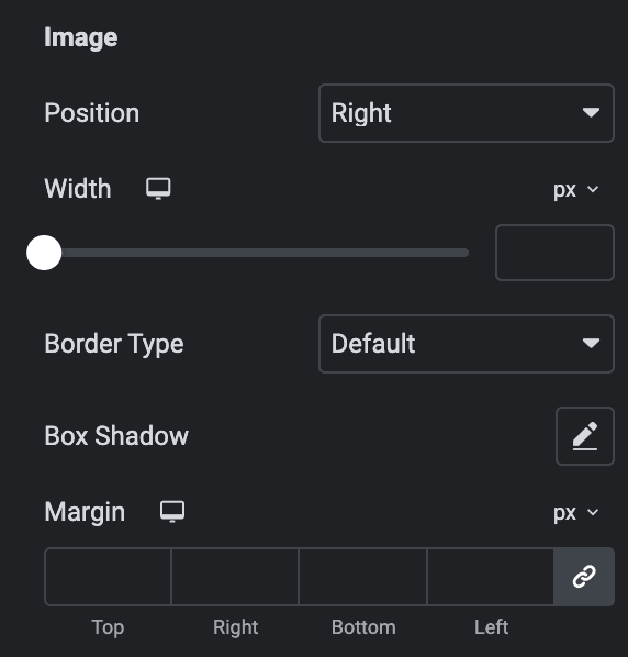
These options are applicable for Preset 2 and 3 layout.
- Hide Image Below: Choose when you want to hide the image(applicable for preset 2 layout).
- Position: Select the position from left or right.
- Width: Specify the width of image.
- Border Type: Select the border type.
- Box Shadow: Set the box shadow.
- Margin: Set the margin.
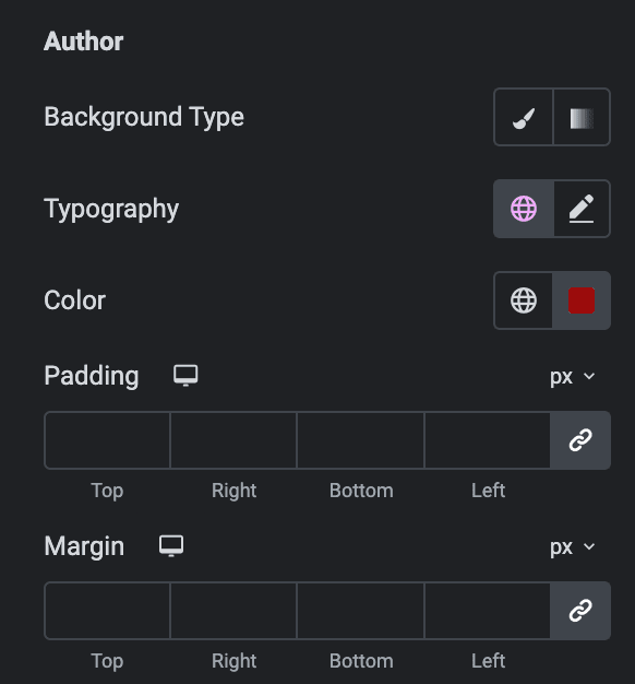
Author
- Background Type: As we mentioned above, you can choose from Classic or Gradient. Check here.
- Typography: Set the typography.
- Color: Select the color of author’s name.
- Padding: Set the padding.
- Margin: Set the margin.
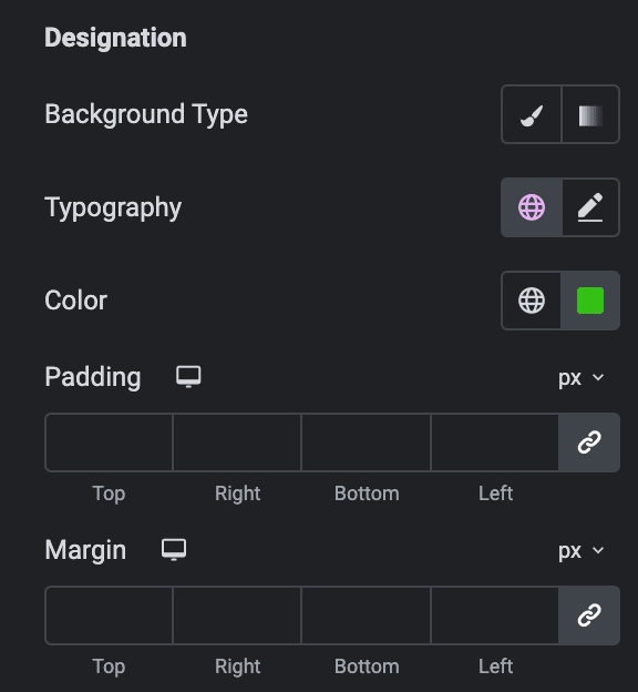
Designation
- Background Type: As we mentioned above, you can choose from Classic or Gradient. Check here.
- Typography: Set the typography.
- Color: Select the color of designation.
- Padding: Set the padding.
- Margin: Set the margin.
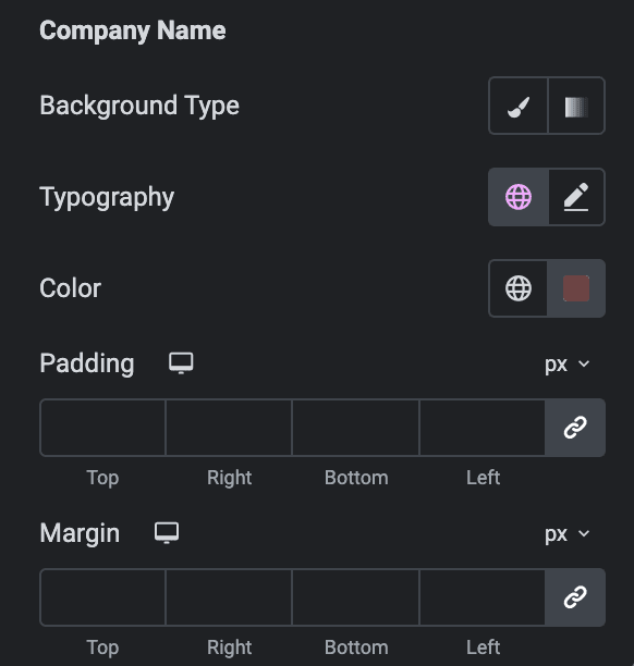
Company Name
- Background Type: As we mentioned above, you can choose from Classic or Gradient. Check here.
- Typography: Set the typography.
- Color: Select the color of company name.
- Padding: Set the padding.
- Margin: Set the margin.
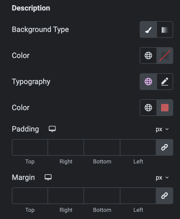
Description
- Background Type: As we mentioned above, you can choose from Classic or Gradient. Check here.
- Typography: Set the typography.
- Color: Select the color of description.
- Padding: Set the padding.
- Margin: Set the margin.
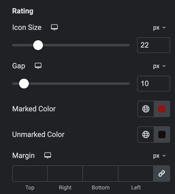
Rating
- Icon Size: Specify the icon size of rating.
- Gap: Specify the gap between icons.
- Marked Color: Select the marked icon color.
- Unmarked Color: Select the unmarked icon color.
- Margin: Set the margin.
Slider
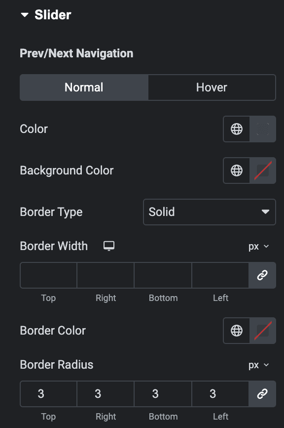
Prev/Next Navigation
Normal
- Color: Select the color of navigation icon.
- Background Color: Select the background color of navigation icon.
- Border Type: Set the border.
- Border Radius: Set the border radius.
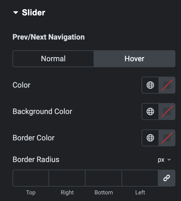
Hover
Styling for hover state are available under this section. It will be applied when someone hovers the prev/next icons.
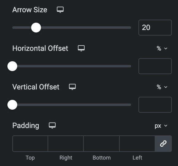
- Arrow Size: Specify the size of icon.
- Horizontal offset: Enter the horizontal offset value.
- Vertical Offset: Enter the vertical offset value.
- Padding: Set the padding.
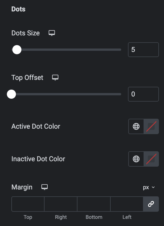
Dots
Note: These options are applicable when Bullets is selected as Pagination Type.
- Dots Size: Specify the dots size.
- Top Offset: Specify the top offset value.
- Active Dot Color: Select the dot active color.
- Inactive Dot Color: Select the dot inactive color.
- Margin: Set the margin.
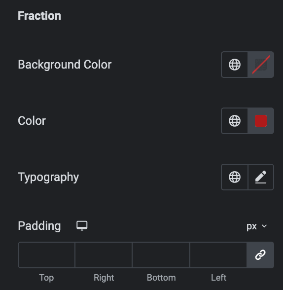
Fraction
Note: These options are applicable when Fraction is selected as Pagination Type.
- Background Color: Select the background color or fraction pagination.
- Color: Select the color or fraction pagination.
- Typography: Set the typography.
- Padding: Set the padding.
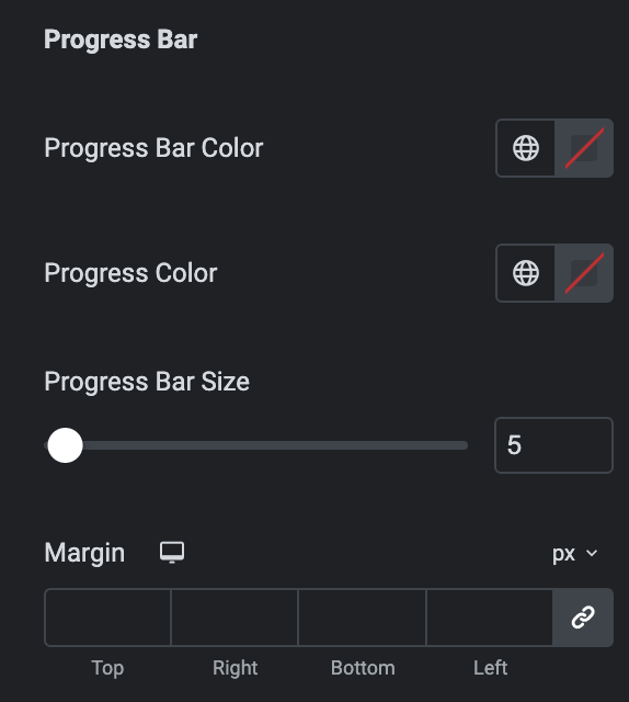
Progress Bar
Note: These options are applicable when the Progress Bar is selected as Pagination Type.
- Progress Bar Color: Select the color or progress bar.
- Progress Color: Select the color of progress.
- Progress Bar Size: Specify the progress bar size.
- Margin: Set the margin.
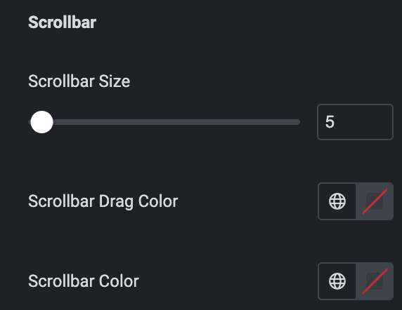
Scroll Bar
- Scrollbar Size: Specify the size of scroll bar.
- Scrollbar Drag Color: Select the drag color of scroll bar.
- Scrollbar Color: Select the color of scroll bar.
Overlay
These options are applicable to the Preset 3 layout.
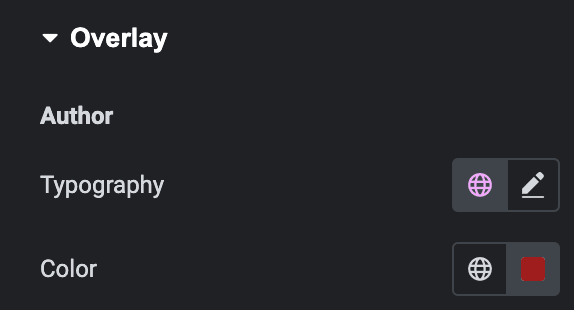
Author
- Typography: Set the typography.
- Color: Select the color of author in overlay.
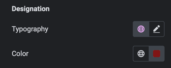
Designation
- Typography: Set the typography.
- Color: Select the color of designation in overlay.
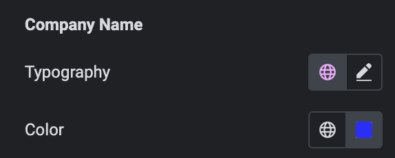
Company Name
- Typography: Set the typography.
- Color: Select the color of company name in overlay.
Rating
- Icon Size: Specify the rating icon size.
- Gap: Specify the gap between rating icons.
- Marked Color: Select the marked icon color.
- Unmarked Color: Select the unmarked icon color.
- Margin: Set the margin

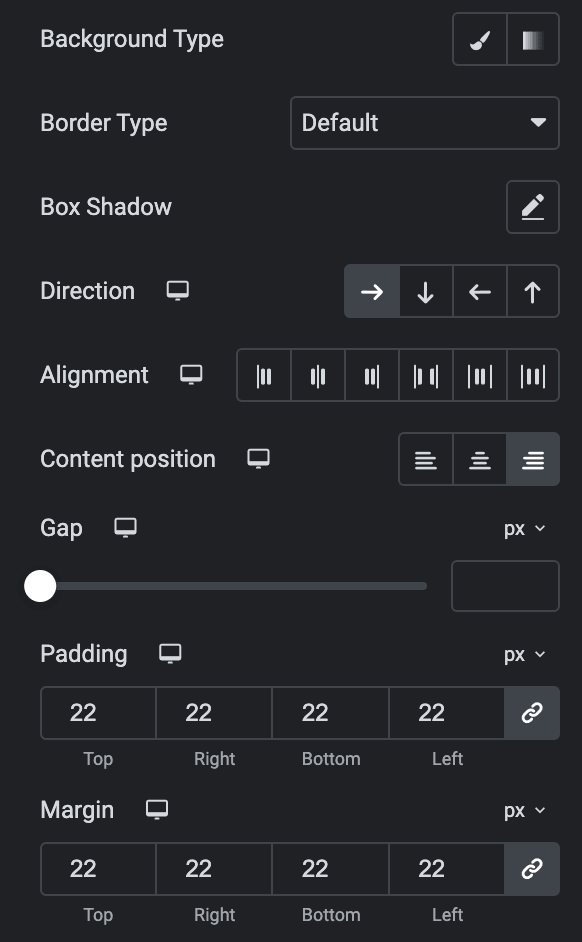
- Background Type: As we mentioned above, you can choose from Classic or Gradient. Check here.
- Border Type: Select the border type.
- Box Shadow: Set the box shadow.
- Direction: Select the direction of content.
- Alignment: Select the alignment of content.
- Content Position: Select the content position(applicable for row direction).
- Gap: Specify the gap between content.
- Padding: Set the padding.
- Margin: Set the margin.
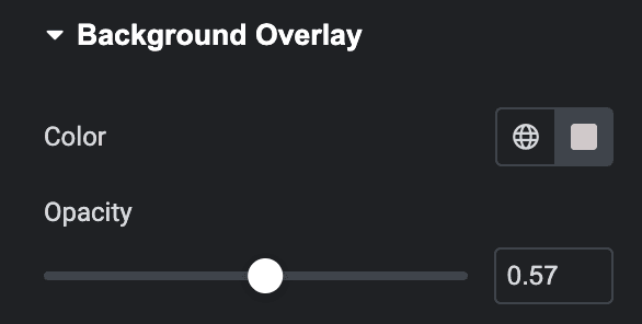
Background Overlay
- Color: Select the background overlay color.
- Opacity: Specify the opacity.
Check out the demo page for the Testimonial.

