Widgets
Text Scroll
The Text Scroll is a simple and effective widget that displays scrolling content on your website. With this widget, you can add multiple pieces of content that smoothly scroll in the direction you choose—left or right. You have full control over the scrolling speed and can customize the style to match your website’s design.
Whether you’re highlighting announcements, showcasing offers, or creating an engaging user experience, the Text Scroll widget makes it easy to grab your visitors’ attention.
The “Text Scroll” widget features the following controls.
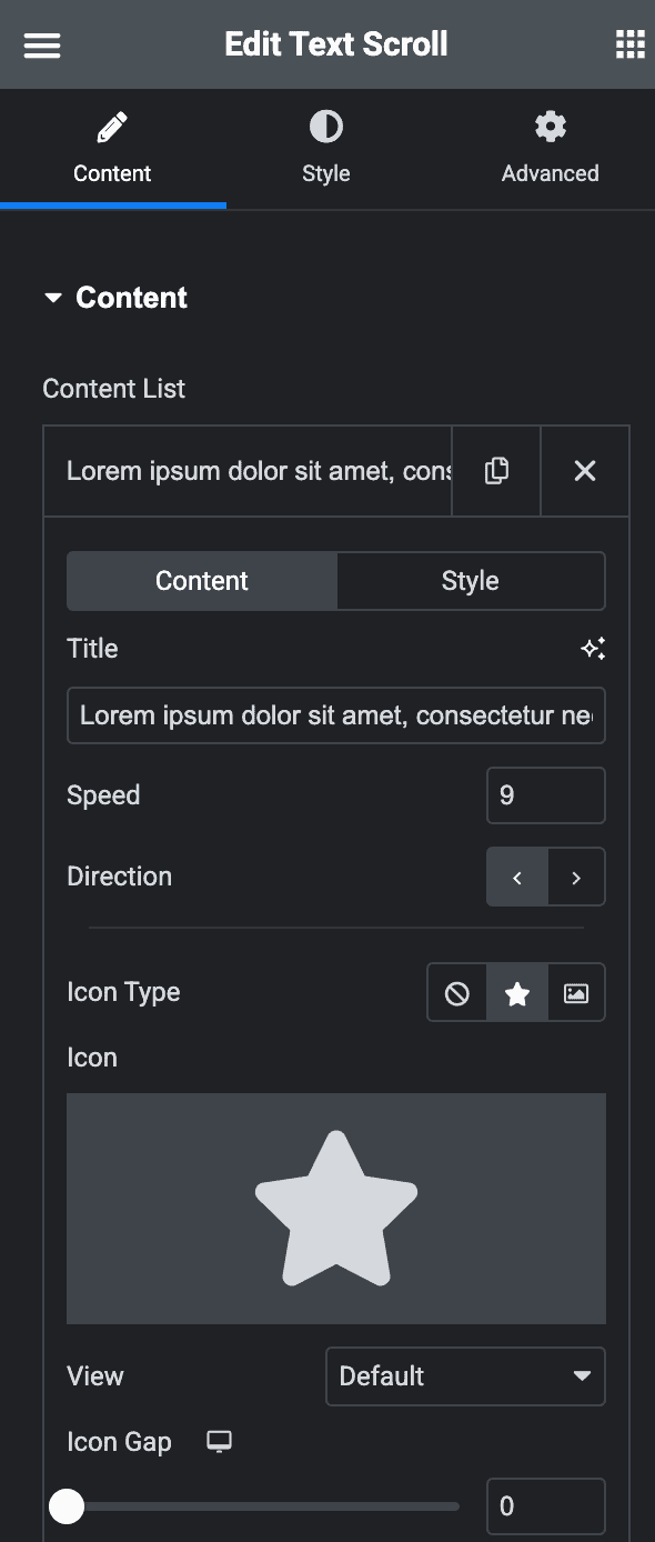
Content
Content
Content List
Content
- Title: Add the content you want to scroll.
- Speed: Set how fast the content should scroll.
- Direction: Choose whether the content scrolls from left to right or right to left.
- Icon Type: Pick an icon or an image to display.
- Icon Gap: Adjust the space between the text and the icon.
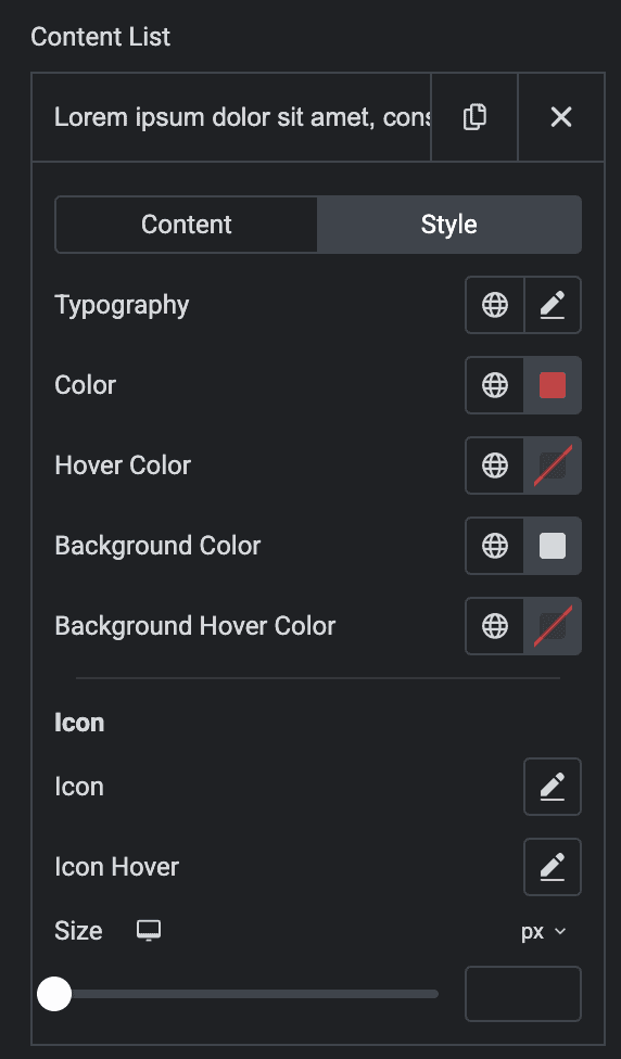
Style(for individual item)
- Typography: Set the typography.
- Color: Select the color of content.
- Hover Color: Select the color for your content text when users hover over it.
- Background Color: Set the background color for the content box.
- Background Hover Color: Choose the background color for the content box when users hover over it.
- Icon: Style the icon to match your design.
- Icon Hover: Style the icon when users hover over it.
- Size: Adjust the size of the icon.
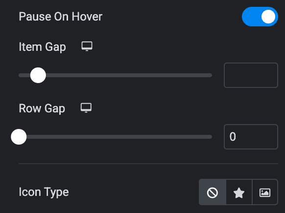
- Pause on Hover: Turn on this option to stop the scrolling when someone hovers over the text.
- Item Gap: Specify the gap between the items.
- Row Gap: Specify the gap between the rows.
- Icon Type: Select from icon or image.
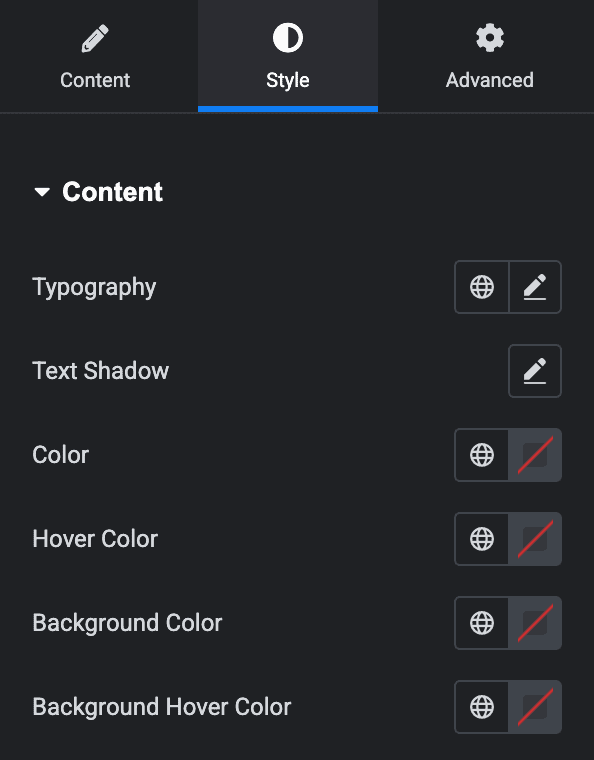
Style
Content
- Typography: Set the typography.
- Text Shadow: Apply the shadow effect to text.
- Color: Select the color of content.
- Hover Color: Choose the color of content for hover state.
- Background Color: Select the background color of content box.
- Background Hover Color: Choose the background color of content for hover state.
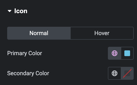
Icon
Normal
- Primary Color: Select the primary color of icon.
- Secondary Color: Select the secondary color of icon.
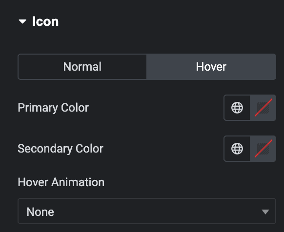
Hover
Styling controls for the hover state are available under this section. These settings will be applied when Someone hovers the icon.
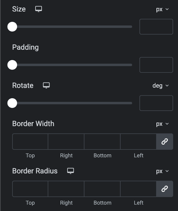
- Size: Specify the size of icon.
- Padding: Set the padding.
- Rotate: Adjust the rotation.
- Border Width: Specify the border width.
- Border Radius: Set the border radius.
