Thumbnail Slider
It is a fantastic widget that brings a dynamic and engaging element to your website design. With this widget, you can easily create eye-catching image sliders with thumbnail previews.
One of the standout features of this widget is its flexibility. You have the freedom to position the thumbnail images exactly where you want them: at the top, bottom, and inside.
The Thumbnail Slider widget features the following controls.
Content
General
Note: You can only use the “Inside Thumbnail Position” feature in the Pro Version.
- Thumbnail Position: Select the position as Top, Bottom, or Inside.
- Width: Enter the width of thumbnail.
- Horizontal Position: Select the horizontal position from Left, Center, or Right.
- Vertical Position: Select the vertical position from Top, Bottom, or Middle.
- Horizontal Offset: Specify the value of horizontal offset.
- Vertical Offset: Specify the value of vertical offset.
Slides
Image
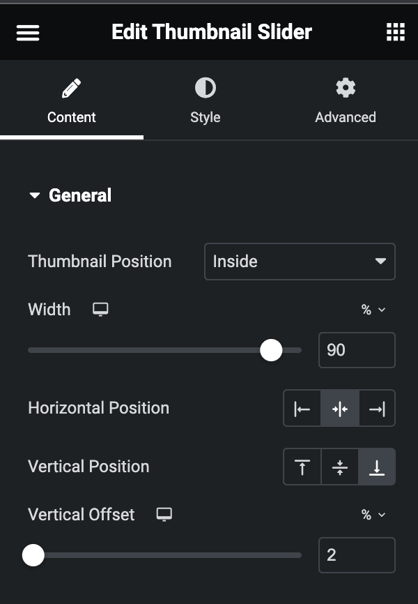
- Image: Upload the image.
- Custom Thumbnail Image: Upload the custom thumbnail image if needed.
Content
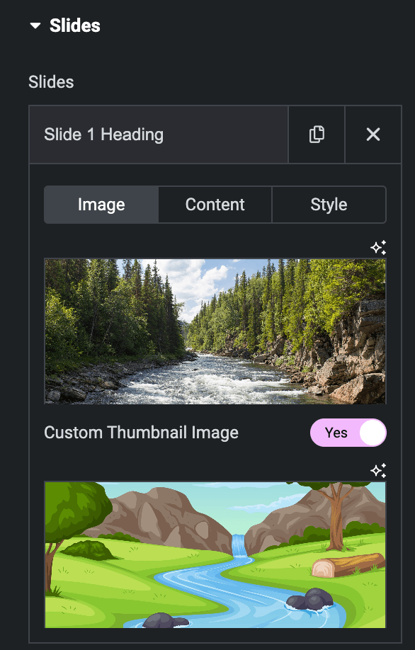
- Heading & Description: Enter the heading and description.
- Button Text: Enter the text for the button.
- Link: Enter the URL to link with a button.
Style(for individual Slide)
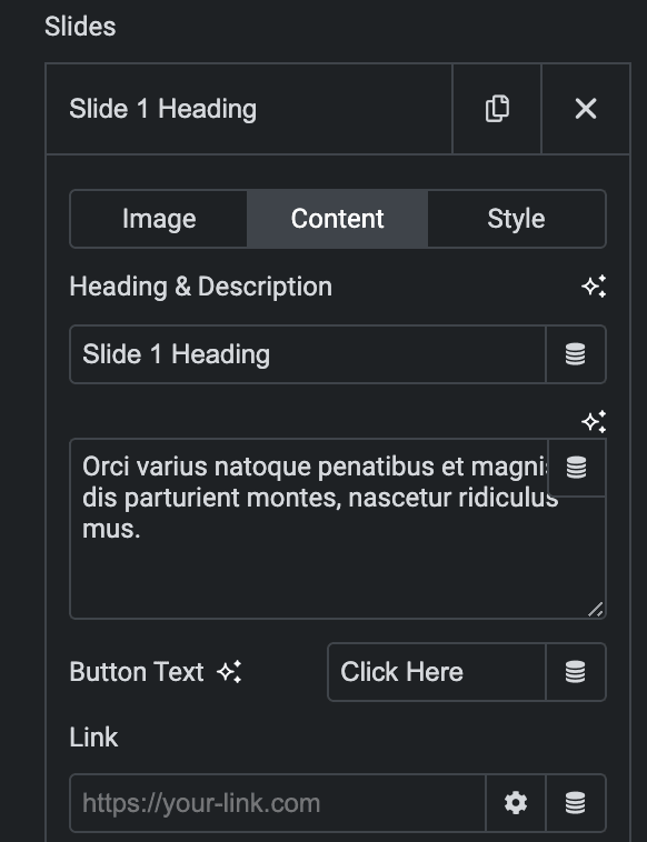
- Custom: Enable the option to apply style.
- Horizontal Position: Select the horizontal position of slide content.
- Vertical Position: Select the vertical position of slide content.
- Text Align: Select alignment from Left, Center, and Right.
- Content Background Color: Select the background color of content box.
- Heading Color: Select the heading color.
- Heading Typography: Set the typography.
- Description Color: Select the description color.
- Description Typography: Set the typography.
- Button Color: Select the button color.
- Button Typography: Set the typography.
- Overlay
- Overlay Color: Choose the color for overlay.
- Blend Mode: Select the blend mode.
- Text Shadow: Set the text shadow.
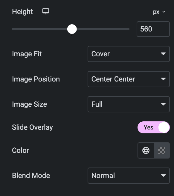
- Height: Specify the height of slider.
- Image Fit: Select from Contain, Cover, or Auto.
- Image Position: Select the position of image.
- Image Resolution: Select the resolution of image.
- Slide Overlay: Enable the option to apply overlay on image.
- Color: Select the color.
- Blend Mode: Select the blend mode.
Thumbnails
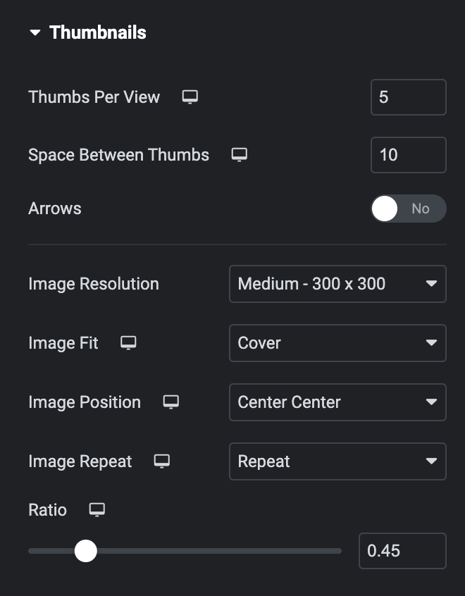
- Thumbs Per View: Enter the number of image thumbnails to view. By default, three thumbs are displayed.
- Space Between Thumbs: Adjust the spacing between the thumbnails.
- Arrows: Enable this option to add navigational arrows to the thumbnail slider.
- Image Resolution: Set the image resolution within the thumbnails.
- Image Fit: Choose from the following options.
- Image Position: Set image positioning.
- Image Repeat: Choose from the following options.
- Ratio: Set the image ratio.
Slider Options
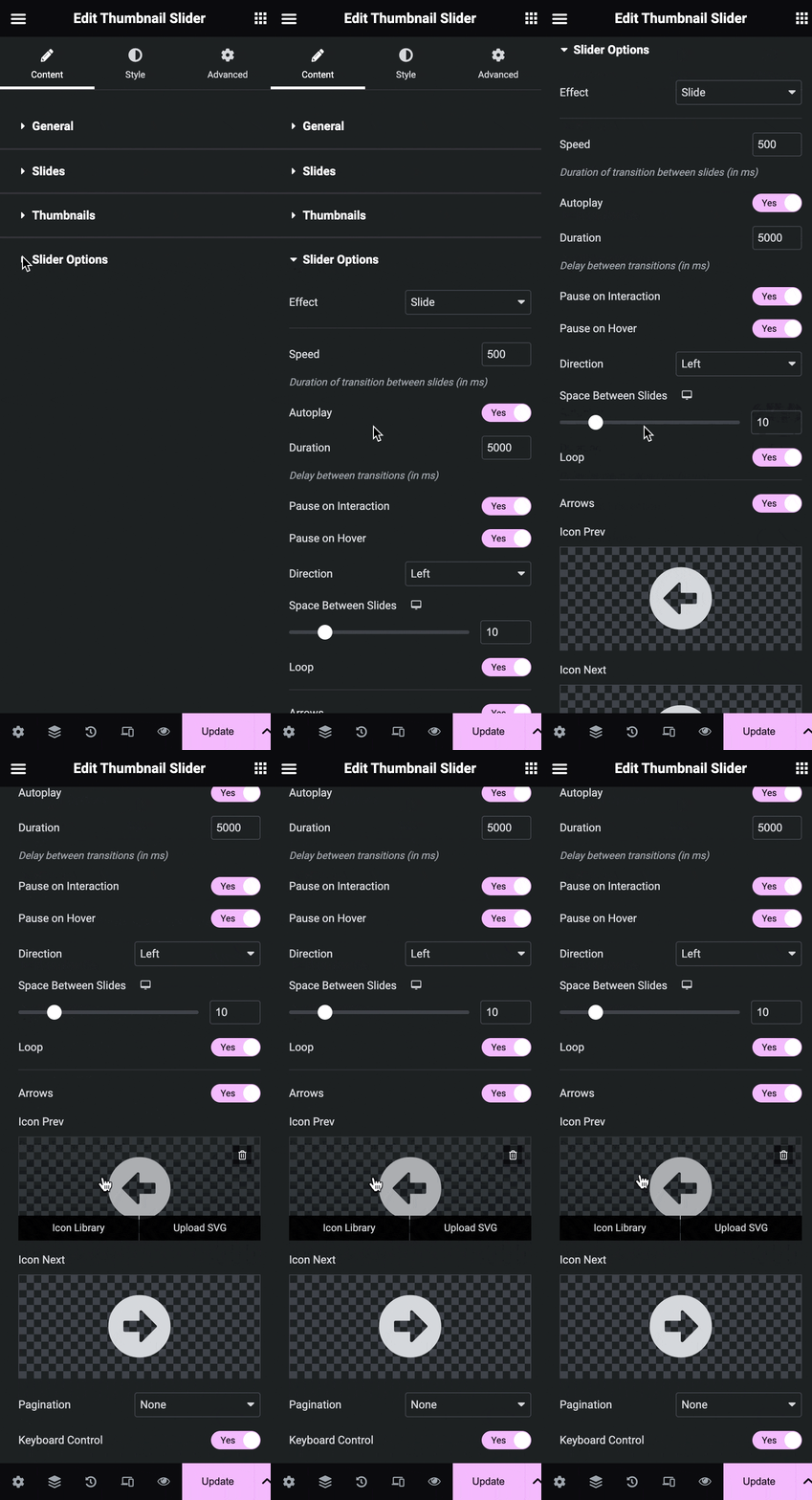
- Effect: Choose how each slide transitions, either Slide or Fade.
- Speed: Set the time between each slide. This time is in milliseconds, so 1000 ms equals 1 second.
- Autoplay: Show or hide autoplay.
- Duration: Set the time it takes for each slide to appear.
- Pause On Interaction: Select whether or not to pause autoplay when a user interacts with the carousel.
- Pause On Hover: Select whether or not to pause autoplay when a user hovers on the carousel.
- Direction: Set slider direction from the left or right.
- Space Between Slides: Set the space between slides
- Loops: Show the carousel in a continuous loop, infinitely.
- Arrow: Choose to show or hide the navigation arrows.
- Icon Prev: Add the previous icon.
- Icon next: Add the next icon.
- Pagination: Select None, Dots, Fraction, or Progress.
- Keyboard Control: Enable the option to apply keyboard control.
Style
Slides
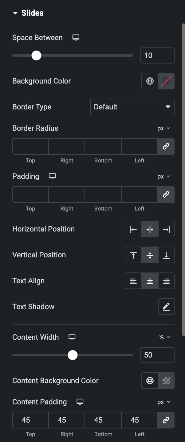
- Space Between: Set the space between slides and thumbnails.
- Border Type: Select the type of border to use around the slides. Select from none, solid, dotted, dashed, and groove.
- Border Radius: Set the border radius to control corner roundness.
- Padding: Set the padding.
- Horizontal Position: Set the horizontal positioning of the text within the slides.
- Vertical Position: Set the vertical positioning of the text within the slides.
- Text Align: Align the text on the slides to the left, center, or right.
- Text Shadow: Apply shadow on the text.
- Content Width: Set the width of the text content in the slide.
- Content Background Color: Choose a background color for the text content.
- Content Padding: Set the content padding accordingly.
Heading
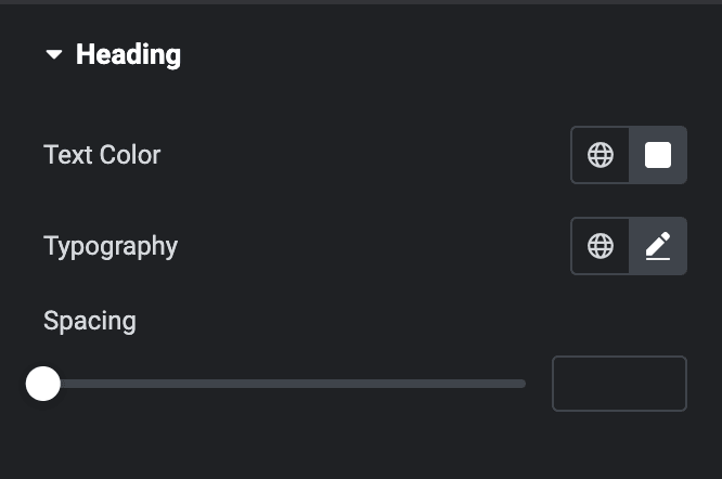
- Text Color: Choose an appropriate color for the heading text.
- Typography: Set the typography options for the heading text.
- Spacing: Adjust the spacing between the heading text and description.
Description
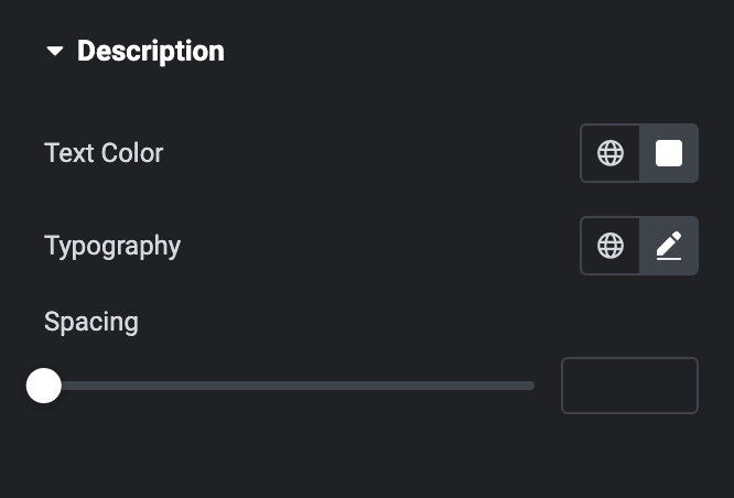
- Text Color: Choose an appropriate color for the text.
- Typography: Set the typography options for the text in the description.
- Spacing: Adjust the spacing between the description and the button.
Button
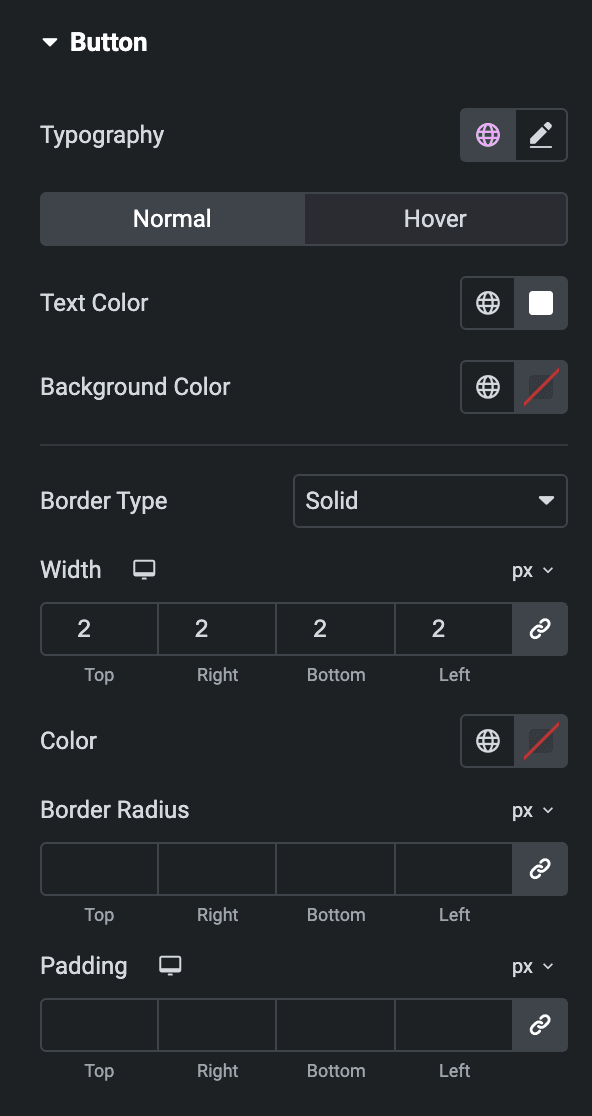
- Typography: Set the typography options for the button text.
Normal
- Text Color: Choose the color for the text.
- Background Color: Choose the button’s background color.
Hover
Styling controls for the hover state are available under this section. This will be applicable when someone hovers on the button.
- Border Type: To give a border around the button, choose the border type from none, solid, dotted, dashed, or groove.
- Border Width: Set the border width.
- Border Color: Select the color of border.
- Border Radius: Set the border radius.
- Padding: Set the padding.
Slider Navigation
Arrows
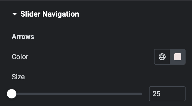
- Color: Choose a color for the navigational text.
- Size: Adjust the size of the navigation text.
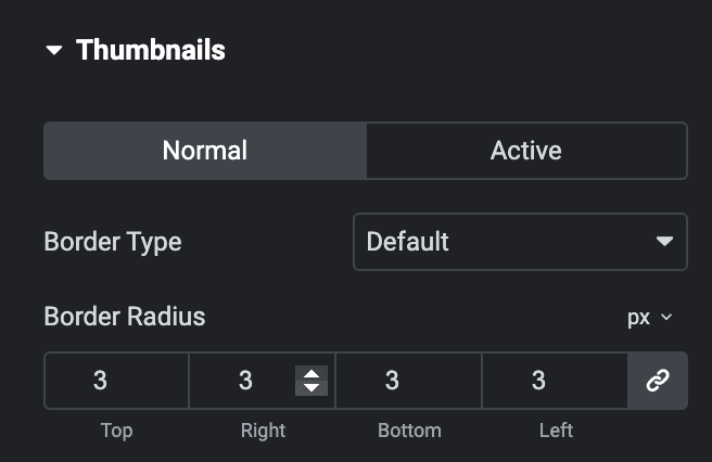
Thumbnails
Normal
- Border Type: Select the type of border to use around the thumbnails.
- Border Radius: Set the border radius to control corner roundness.
Active
- Border Color: Select the color of border.
- Border Radius: Set the border radius to control corner roundness.
Check out the Demo page of Thumbnail Slider.

