Video Box
The Video Box widget is a powerful tool for displaying videos on your website. It supports five different video platforms: YouTube, Vimeo, Dailymotion, Wistia, and Self-Hosted, each with its own set of exclusive customization features. With this widget, you can add details about the video and choose whether or not to display the YouTube logo.
Additionally, you can use the mask image and overlay feature to add a custom design to the video player. It also offers advanced options, such as the ability to display sticky videos. In addition, you have full control over the video’s start and end time.
It includes video schema for all video types, improving SEO and helping search engines to understand the video’s content. With its versatile features, the Video Box widget makes it easy to showcase videos on your website in a professional and engaging way.
The “Video Box” widget features the following controls:
Content
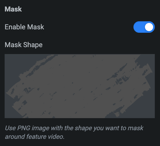
Video
- Video Type: Choose from YouTube, Vimeo, Dailymotion, Wistia, or Self-Hosted.
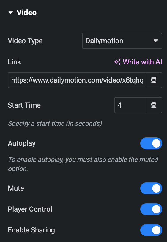
Youtube
- Link: Enter the YouTube video link.
- Start time: Enter the video’s start time in seconds.
- End Time: Enter the video’s end time in seconds.
- Autoplay: Enable the option to autoplay the video while onload.
- Related Videos From: Select either from Current Video Channel or Any Random Video.
- Player Control: Enable the option to display player controls like play, pause, volume and more.
- Modest Branding: Enable the option to disable the YouTube logo from displaying in the control bar.
- Mute: Allow the option to mute the video.
- Privacy Mode: Enabling this feature prevents YouTube from storing visitor information on your website until they play the video.
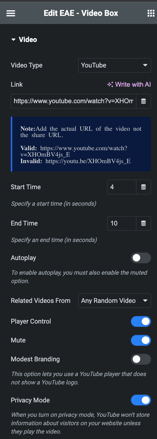
Vimeo
- Link: Enter the video link.
- Start time: Enter the start time of a video.
- Autoplay: Enable the option to autoplay the video while onload.
- Loop: Enable the option to play video continuously.
- Mute: Allow the option to mute the video.
- Intro Title: Display video’s Title.
- Intro Portrait: Display author’s profile image.
- Intro Byline: Display the video’s author’s name.
- Controls Color: Select the color for video player controls.
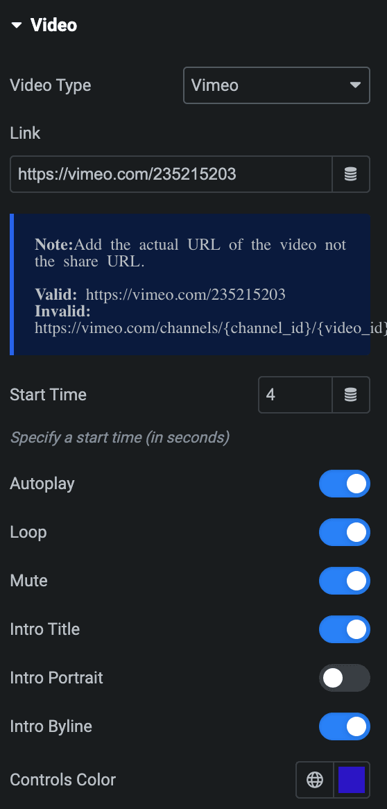
Wistia
- Link & Thumbnail Text: Enter the link and thumbnail text from the respective wistia’s video.
- Autoplay: Enable the option to autoplay the video while onload.
- Mute: Allow the option to mute the video.
- Loop: Enable the option to play video continuously.
- Show Playbar: Enable the option to display the progress bar of the video.
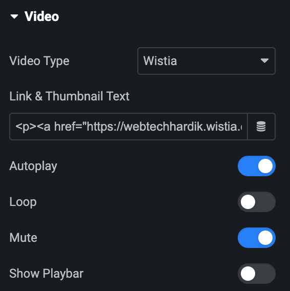
Dailymotion
- Link: Enter the link of video.
- Start Time: Set the video’s start time.
- Autoplay: Enable the option to autoplay the video while onload.
- Mute: Allow the option to mute the video.
- Player Control: Enable the option to display player controls like play, pause, volume and more.
- Enable Sharing: Activate the option to display the share button.
Self Hosted
- External URL: If you have an external URL of the video, you can enable this option.
- URL: Insert an URL of the video
- Choose File: If there is no external link of the video, you can upload the video.
- Start time: Set the start time of video.
- End Time: Set the end time of video.
- Autoplay: Enable the option to autoplay the video while onload.
- Loop: Enable the option to play video continuously.
- Player Control: Enable the option to display player controls like play, pause, volume and more.
- Mute: Allow the option to mute the video.
- Download Button: Activate the option to enable video downloading(display if Lighbox option is disabled).
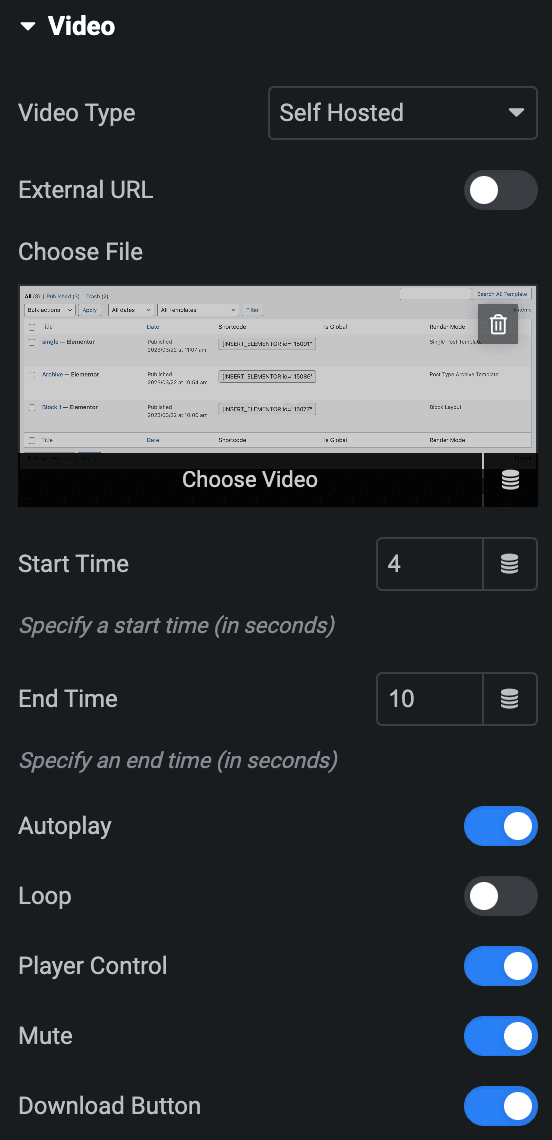
Video Options
Note: Autoplay will not work in Lightbox.
- Aspect Ratio: Select the aspect ratio for video.
- Lightbox: Enable the option to apply Lightbox settings(not applicable for Dailymotion Video Type).
- FullScreen: Activate the option to display the lightbox in fullscreen.
- Enable Share: Enable the option to display share button on lightbox.
- Hash URL: Enable the option to give a unique id to lightbox.
- Gallery ID: Enter the unique id for lightbox.
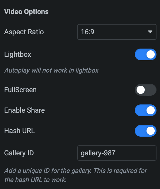
Video Details
- Enable Video Details: Enable the option to show video details if needed.
- Title: Enter the title of video.
- Description: Enter the description of video.
- Preview Video Details: Enable the option to display video details layout properly. It will work in editor mode only.
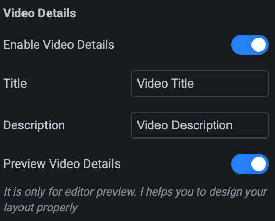
Mask
- Enable Mask: Activate the option to enable the mask.
- Mask Shape: Select the mask image.
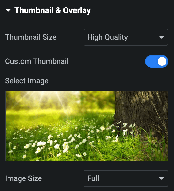
Thumbnail & Overlay
- Thumbnail Size: Select the size of thumbnail(Only for Youtube Video type).
- Custom Thumbnail: Enable the option to set the thumbnail to the video.
- Select Image: Select the image for thumbnail.
- Image Size: Select the size of the Image.
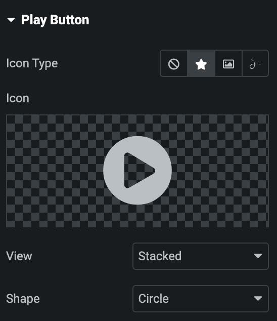
Play Button
- Icon Type: Choose from a list of Icons, Images, or Lottie animations.
- Icon
- Icon: Select from the Font Awesome icon library or upload an SVG image.
- Image
- Image: Either upload an image or select a dynamic tag for display.
- Image size: Choose the size for your icon image display.
- Lottie Animation
- Source – Choose the source of the Icon by either adding an External URL or selecting a media file.
- Loop – Enable the loop option to display the animation continuously.
- Reverse – Activate the reverse option to display the animation in reverse order.
- Icon
- View – Select from default, stacked, or framed display options.
- Shape – Select either Circle or Square shape for the stack or frame.
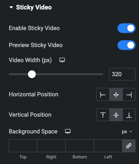
Sticky Video
- Enable Sticky Video:
- Preview Sticky Video: Enable the option to display preview details of sticky video.
- Video Width: Enter the sticky video width in px.
- Horizontal Position: Select from Left, Center, or Right.
- Vertical Position: Select from Top, Middle, or Bottom.
- Horizontal Offset: Enter the horizontal offset using px or %(Display when horizontal position is set to Left or Right).
- Vertical Offset: Enter the vertical offset using px or %(Display when vertical position is set to Top or Bottom).
- Background Space: Set the background space to video.
Close Button
- Enable: Display the close button on sticky video.

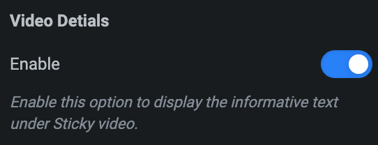
Video Details
Note: This option is only applicable if the Video Details option is enabled in Video Section.
- Enable: Display the video details under sticky video.
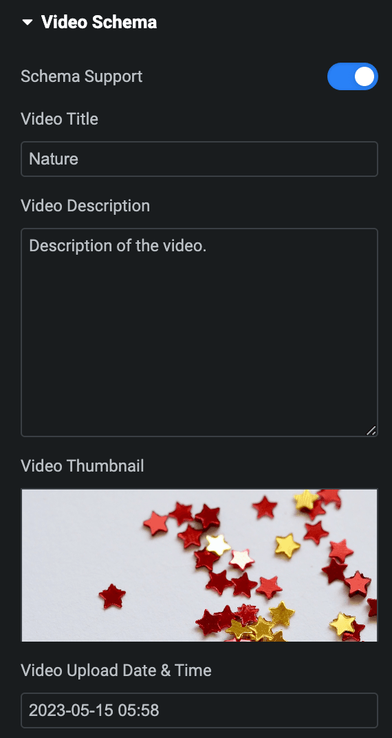
Video Schema
- Schema Support: Enable the option to set schema for video.
- Video Title: Enter the title of video.
- Video Description: Enter the description of video.
- Video Thumbnail: Select the thumbnail image for video schema(applicable if Custom Thumbnail option is not enabled in Thumbnail & Overlay section).
- Video Upload Date & Time: Enter the upload date & time of video.
Style
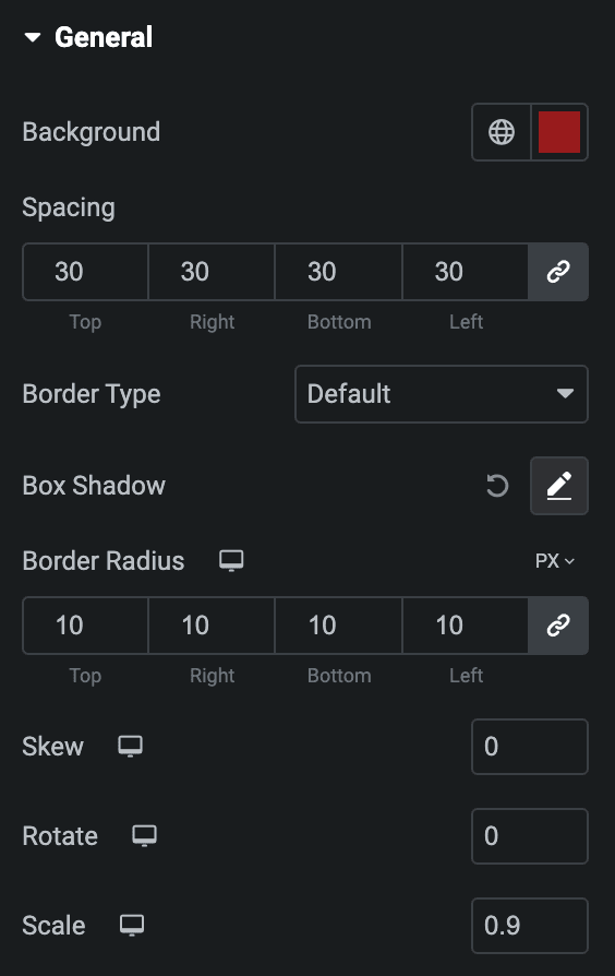
General
- Background: Select the background color of the box.
- Spacing: Set the spacing between box to video.
- Border Type: Select the border type.
- Width: Set the width of border.
- Color: Select the color of border.
- Box Shadow: Set the box shadow properties.
- Border Radius: Set the border radius.
- Skew: Enter the value to skew(Max Value is 2).
- Rotate: Enter the value to rotate.
- Scale: Enter the value to scale(Max Value is 2).
Overlay
- Background Type: Select either Classic or Gradient.
- Classic
- Color: Choose the color for the background.
- Image: Either upload an image or select a dynamic tag for display.
- Gradient
- Color: Select the color for the background.
- Location: Determine the position of the color on the background by specifying their location in percentage.
- Second Color: Select the second color for the background.
- Location: Determine the position of the second color on the background by specifying their location in percentage.
- Type: Select either Radial or Linear.
- Radial
- Position: Set the position.
- Linear
- Angle: Set the angle using DEG, GRAD, RAD, and TURN.
- Radial
- Classic

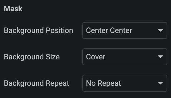
Mask
Note: This option is only applicable if the Mask option is enabled in Video Section.
- Background Position: Select the background position of mask image.
- Background Size: Select background size from Auto, Cover, or Contain.
- Background Repeat: Select the background repeat property.
Info Bar
Note: This option is only applicable if the Video Details option is enabled in Video Section.
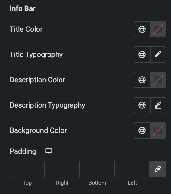
- Title Color: Select the color of title.
- Title Typography: Set the typography of title.
- Description Color: Select the color of description.
- Description Typography: Set the typography of description.
- Background Color: Select the background color for info bar.
- Padding: Set the padding.
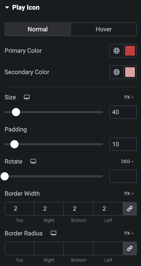
Play Icon
Normal
- Primary Color: Select the primary color of icon.
- Secondary Color: Select the secondary color of icon.
- Size: Set the size of the Icon using %, EM, REM, VW, or PX.
- Padding: Set the padding for the Icon.
- Rotate: Set the rotation of your Icon in degrees.
- Border Width: Set the border’s width using %, EM, REM, VW, or PX.
- Border Radius: Set the border’s radius using PX,%, EM, or REM.
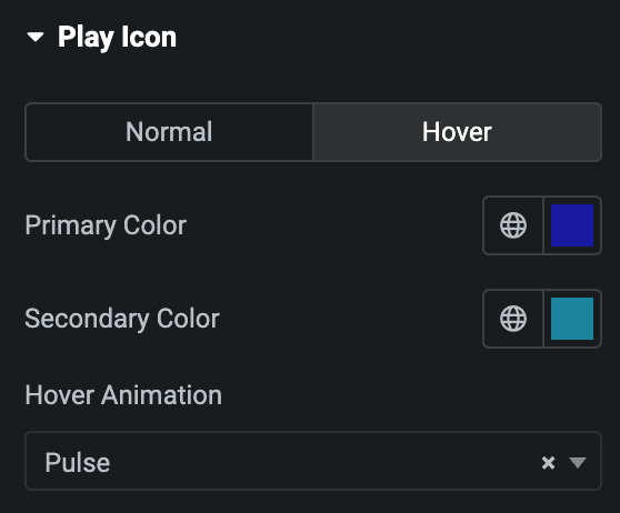
Hover
Styling controls for the hover state are available under this section. These settings will be applied when Someone hovers the play button.
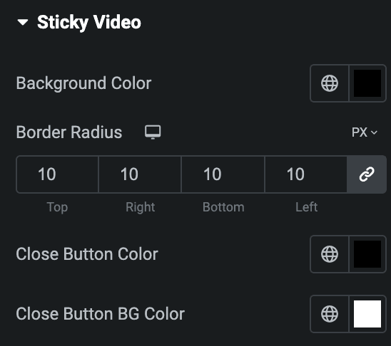
Sticky Video
Note: This option is only applicable if the Sticky Video option is enabled under Sticky Video Section.
- Background Color: Select the background color for sticky video.
- Border Radius: Set the border radius.
- Close Button Color: Select the color for close button.
- Close Button BG Color: Select the background color of close button.
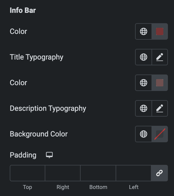
Info Bar
This option is only applicable if the Video Details option is enabled in Video and Sticky Video Sections. It toggles previously mentioned details pertaining to video details.
- Color: Select the color of title.
- Title Typography: Set the typography of title.
- Color: Select the color of description.
- Description Typography: Set the typography of description.
- Background Color: Select the background color for info bar.
- Padding: Set the padding.
Check out the Demo page of Video Box.

